Report on a New Drawing Style
The artist’s recent work demonstrates a shift toward a simplified, graphic approach that emphasizes clarity and symbolic weight. The essence of this style is distillation: forms are reduced to their most essential outlines, resulting in a visual language that balances legibility with expressive potential.
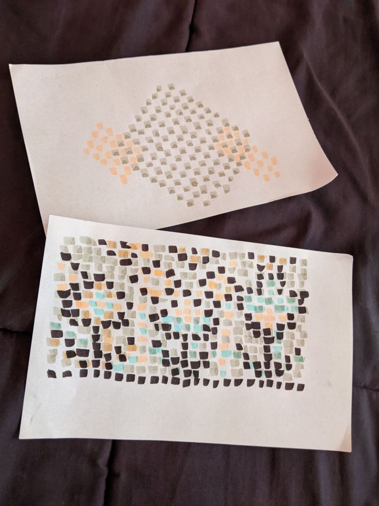
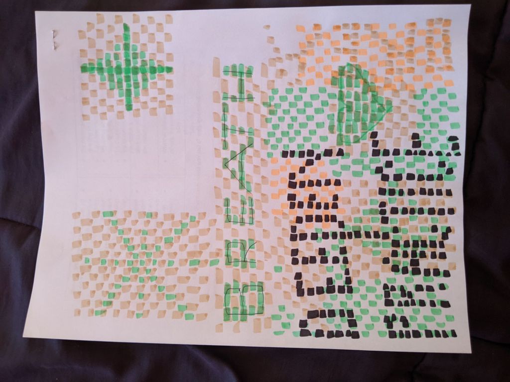
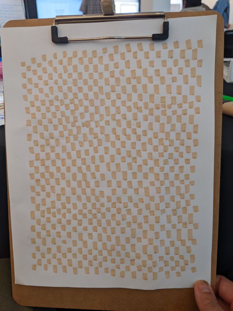
This development was partly prompted by the artist’s participation in training sessions that required filling large poster surfaces with texture. The challenge of scale and coverage led to a systematic exploration of marks that could carry both density and clarity.
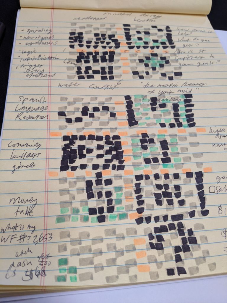
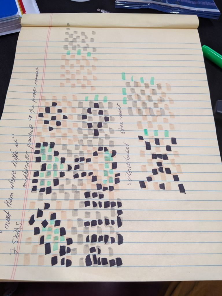
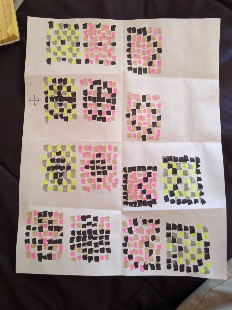
Color plays a carefully defined role in the process. The palette is limited and deliberate: muted tones form a grid-like structure, black establishes the primary outlines, and fluorescent highlighters act as accent points. The effect recalls a diagrammatic system, where rules of organization are visible, but with occasional breaks that introduce play and experimentation.
Viewers encounter images that feel emoji-like in their simplicity, evoking accessibility, directness, and even a scientific clarity. The work often resembles graphic design more than traditional art, prioritizing legibility while leaving space for expressive deviations. This balance suggests a grammar of form—an ordered set of visual rules—that the artist can intentionally disrupt.
Conceptually, the process revolves around distillation, encapsulated in the artist’s idea that a complex concept can be boiled down into 49 squares. This numerical framework serves as both a discipline and a constraint, forcing ideas into a reduced but resonant format.
Looking ahead, the artist sees this style expanding into narrative and functional applications. Potential directions include illustrated presentations, educational tools, and card games. The style’s icon-like quality positions it well for integration into the language of daily life, where symbols, grids, and diagrams shape communication.
