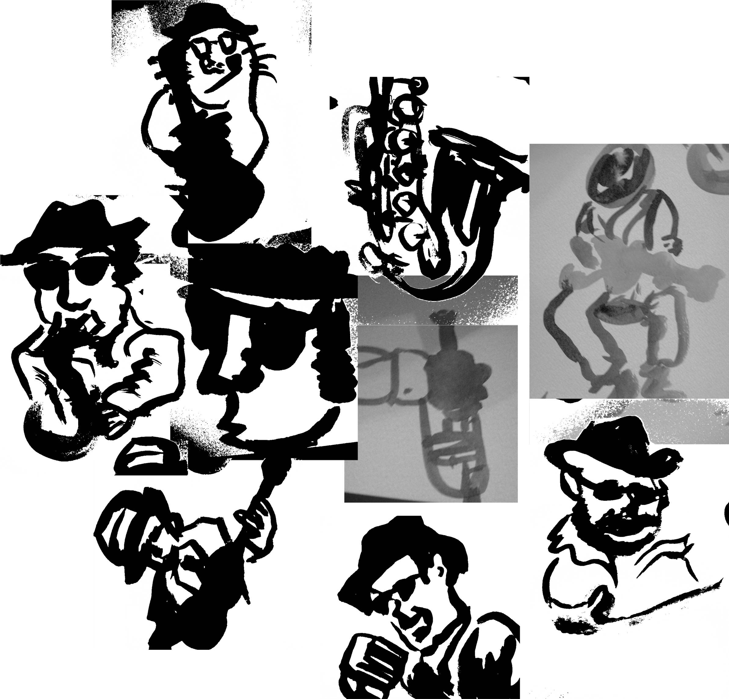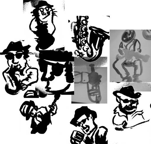
I started working on the final for this class. I chose the Chicago Blues Festival option. I originally was intrigued by the Rodeo event and thought about how I could make that fun for me, and I realized that the audience and I have nothing in common. I am not sure about these assignments where there’s a choice of who my audience is. Will I have such a clear choice in the real world? Do I want to challenge myself? Or play to my strengths? (I like my “blues manatee” in the top left corner of this sketch session.)
Update 11-28:
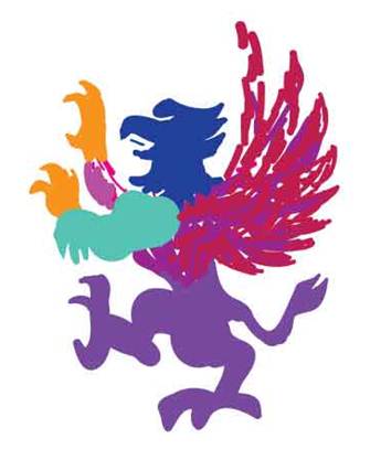
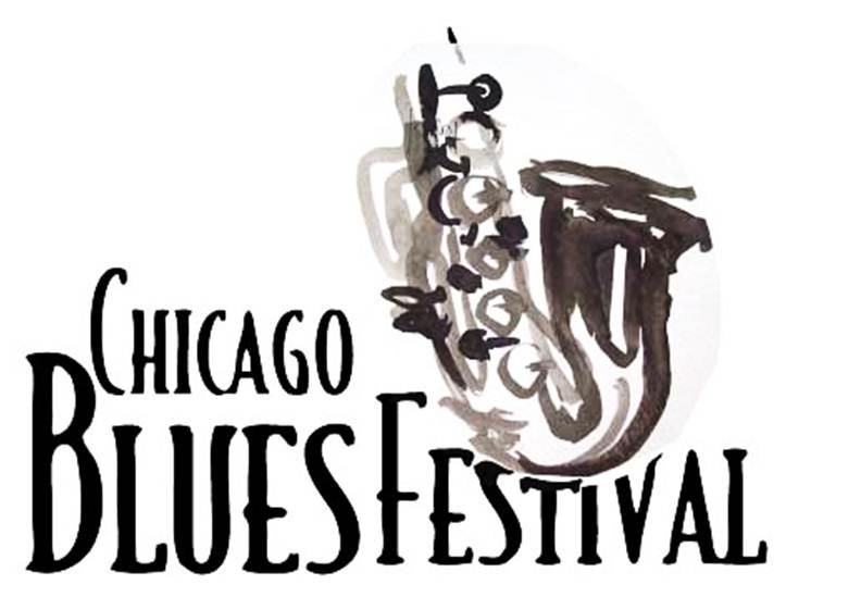
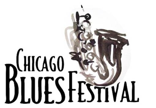
Here’s my logo for this event. Font: Calligraphy Set by Wiescher.
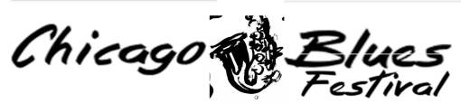
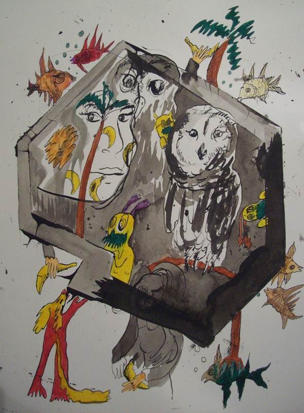
I think Jill was disappointed when she saw my sketches painted with ink and brush. I could hear it when she said “blah blah blah, just like the Mouse Book Cafe logo.” Arg. I couldn’t help myself. Perhaps that’s what drew me to this particular event. I could paint something nice for it. But, yeah, I feel more comfortable with a brush in my hand than a sharpie (god, for some reason, it smelled really strong today). My poster ideas were too cutesy. I proclaimed to want to use the message of “generational storytelling,” but each composition was too cutesy, too complicated, too overbaked. (I think the campbell’s tomato soup tribute was the final nail in the coffin of my poster thumbnail set.) She appreciated the artistic randomness in my use of the ink and brush, but I don’t want to be predictable, but I fear I don’t have a lot of skills to work with. (I’ll clean up this font in illustrator later.)
Update 12-4:
Rough Draft of my Poster. Keep it simple.
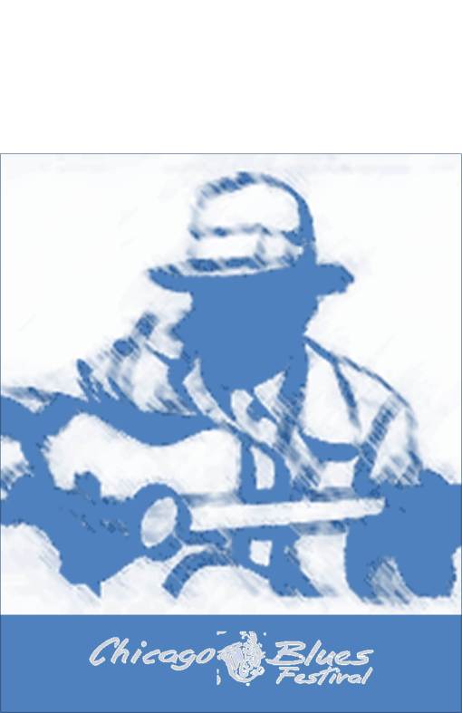
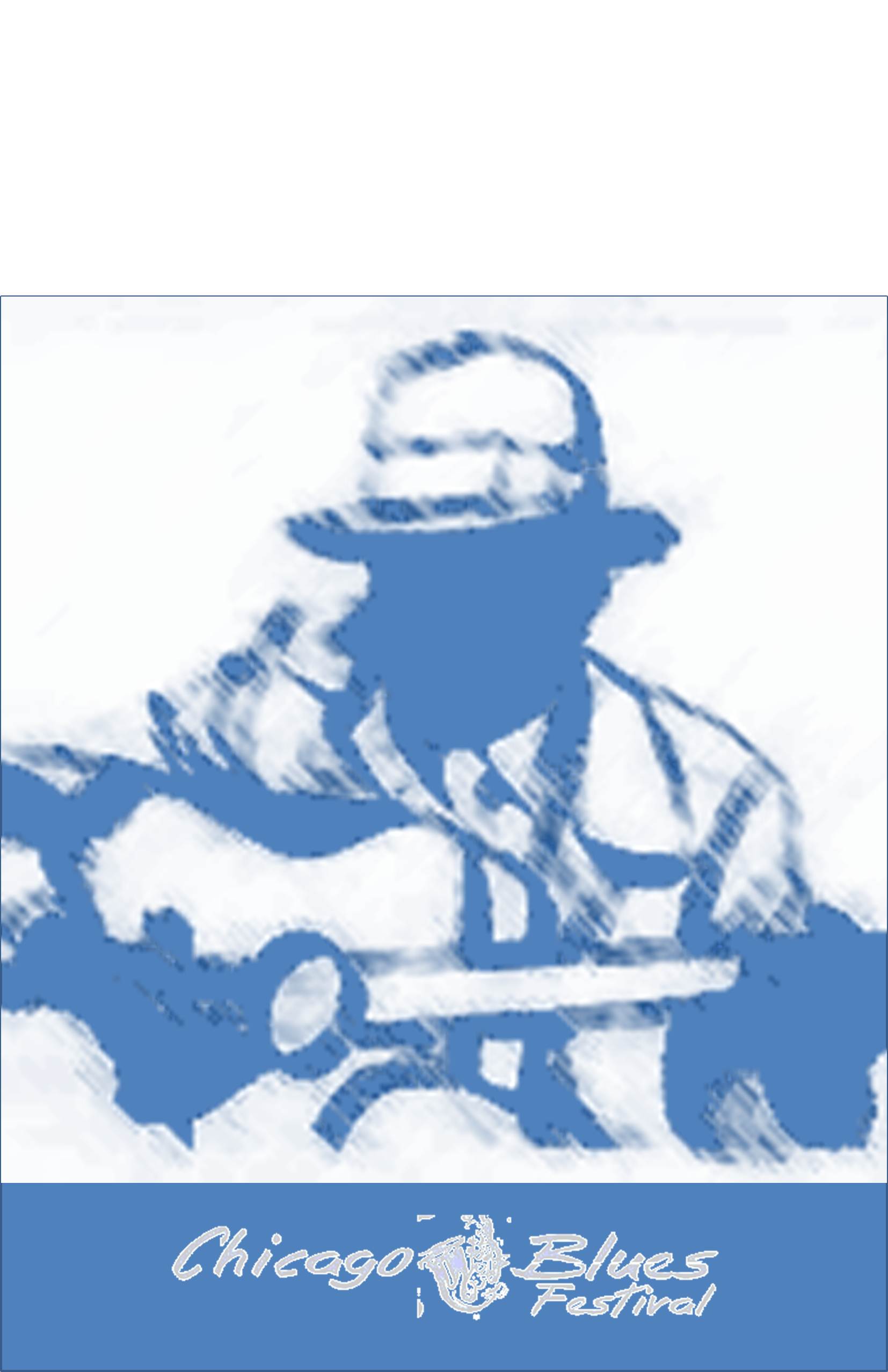
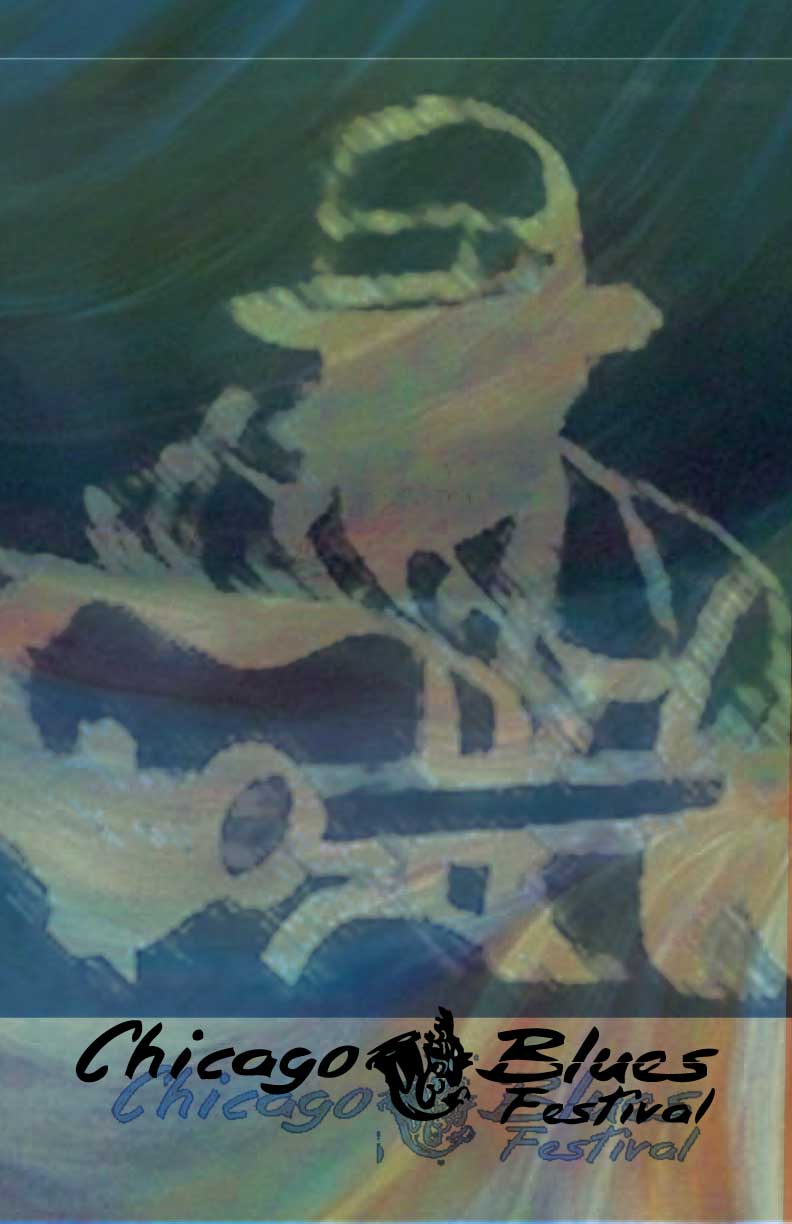
Update 12-6: Computer Power! Playing with transparency effects. Used this painting for texture in the background.
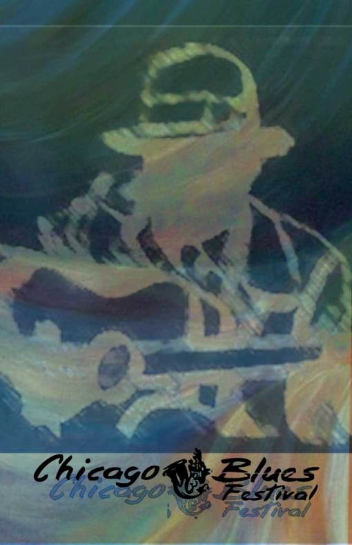
Critique: Bad design, bad font for logo, zero integration. She noted that I slapped it together, the word “festival” dangling unreasonably. She made the suggestion to find a little cubby for the word “chicago” to fit in as smaller text. The words I heard Jill say most today “Think Holistically.” She told me to consider some “historically relevant fonts. I made a huge improvement.
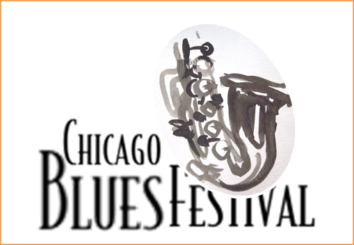
(Still a little unfinished. I don’t think I have the right software for designing at home.)
There.
Update 12-10:
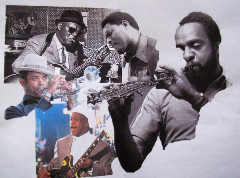
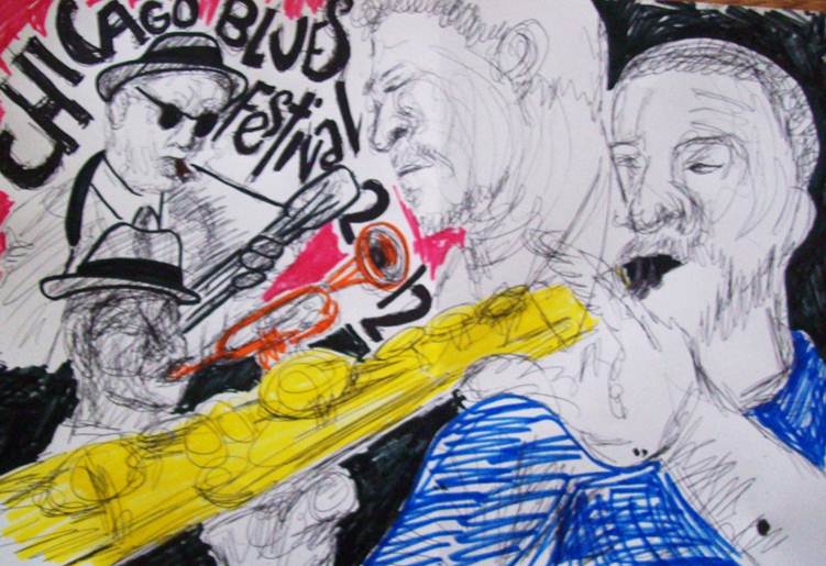
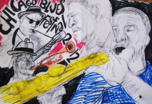
(Reference photos from the internet) I thought to make a swirly line drawing for the poster, but after I finished it, the poster didn’t feel finished, so I am going to paint the thing after all.

Update 12-11:
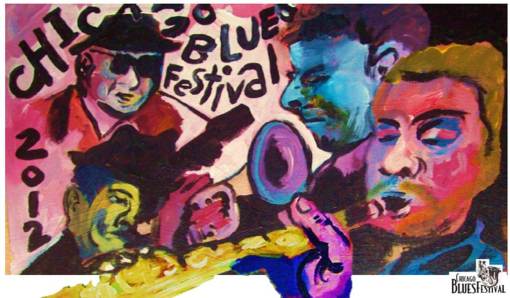
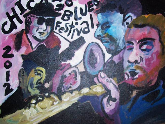
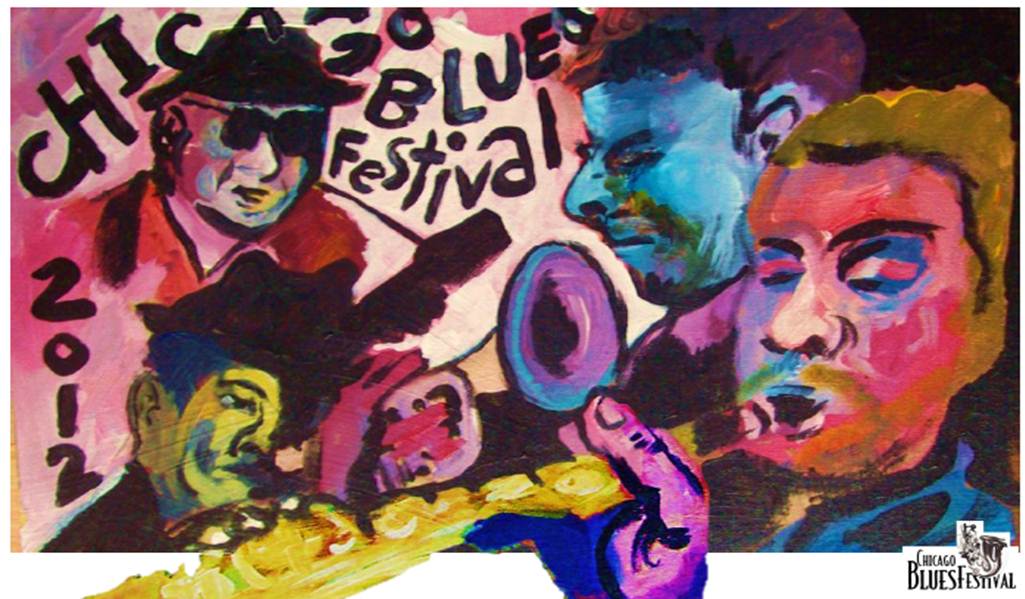
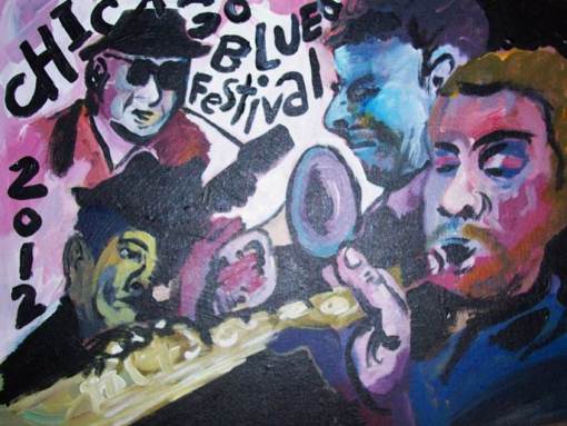
Painted it. I’ve already had a comment saying it’s pretty dark for a poster, but I like it. On canvas board (12×18) with acrylic. I still need to crop it for tabloid size.
Update 12-14:
Since I am home sick, Jill said I could send in my poster as a pdf and so I edited it in powerpoint. Yeah, I tweaked the colors a bit. I was planning on cropping and pasting after xeroxing the painting and inverting the colors on the logo so I could place it in a dark corner, but I ended up framing the poster to allow for the white logo to be not so disjointed from the poster. I wasn’t satisfied how it was before. As a fully colored thing with no white, it was too dark for a poster and didn’t feel like something designed. I really like how it turned out.