People commented on my costume that I wore to school today. I think it’s especially fun because it’s not recognizable to everyone. The people that say something about it do it in hushed tones like they’re in on a secret joke. Any mimicry has a kind of funniness to it. I took notes on people that remarked. Next to their name in my book is an equal sign and the word “alright.”
Kismet Arts Tangent
Art Collective
-

I submitted this for critique today. I explained that I decided to combine the elements of the automotive industry and Zebra into the concept of car tourism, the vertical lines acting as tree silhouettes and zebra stripes. The consensus was that I should lose the tire-shapes, offset the vehicle outline to create movement, change the outline to a more realistic and theme-related car model, and a classmate pointed out that the shapes by the ear had more interest; it looked like a road going between two mountains. So I went home and (on powerpoint, because I am not fluent in much else) I designed this (quick prototype), which I consider a huge improvement:
-
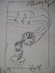
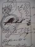
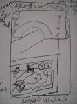
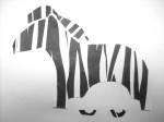
Inspired and fitted for this article, my mid-term for drawing class is to create four 4×4 and one 10×14 ink illustrations. It’s important to have the square ones be somewhat thematic and all of them to convey the same (if not essentially my) style. I drew these thumbnails (the teacher imagines we’ll be making quite a few to hone in on the best solution) and I noticed some themes as I read and drew the article. With all the ridiculous charicatures of people and as the Sandia Mountains as a background location, how can I not end up with something overtly Ralph Steadmanian?
Some themes– throughout the 10 page article, the prose is punctured with
architecture: mention of adobe house structure, the SCAD (suspended catch air device) labeled “Zero Gravity” (which is a daring thing if I have ever heard one), the fMRI scanners, the skyscraper metaphoranimals: asp catepillar, humpback whale, snails (3), turtle, tiger, dog, rat, songbird, elephant, hummingbird, fish in a bubble
morbid: a little girl’s fractured skull and spine, the rhythm of a helmet bouncing on sidewalk, being bit by poisonous catepillars, jumping off a roof
portraits: Brian Eno’s pixelated-edge-glasses, Eagleman’s square-toed ankle boots and mod sideburn, the longponytailed girl with small circular glasses, the guy wearing a black shirt with a purple sword on it, Francis Crick’s “senile” facade,
artifacts: the broken russian watch, the card-deck sized chromometer, the scrawled multi-colored formulas on the erasable green walls, the EEGs
-
I had some fun with construction paper. All that graphic design knowledge coming into play right here.
-
The assignment: Create a white still-life and using only shading techniques, (think of lines that you do make as edges) and use any material you like, though charcoal is quite handy.
-

Credit to Alan Shapiro for this image that I will transform in Illustrator. And God for making beautiful birds.Adobe Illustrator class’ next assignment –color–

Step one: Create line drawing the old fashioned way (with a Sharpie).

Step Two and a Billion after that:
Create layer with the drawing and lock it. Over it, use pen tool and shapes tools to make the bird. Delete drawing. Get really confused about live paint and try to mend gaps in drawing. Use the color bucket to create colors and then select presets to color the bird with more “complementary” hues. Give up on trying to create line interest with the strokes due to all the layers of shapes that didn’t come through in the painting process. Abandon ship while it still looks okay. I am deathly afraid of deleting and saving and what else that the program does to mess with all the points, anchors and handles that are already on the darn thing. I can’t say this is the most simple thing to do, but I am sick of looking at a screen and I can’t figure out out to simplify this thing (this web of points, swoops, directions that are so intricately linked, though not visible in final view). Sigh. -
Approaching a project with different techniques is a surefire way to challenge yourself and get ideas. Here’s a kiwi rendered, color-blocked and drawn (with emphasis on interesting line quality– I could have done this better, but I like the nib perhaps too much at this point).
Assignment for this week: ”
Render & Stylize. Work with an Animal and make it into a symbol/icon. Use tracing paper, look at positive/negative space, distort, exaggerate, simplify, stylize, create a feeling of dimensionality to distill the essence of the subject chosen. Simplify your work, giving it grace and/or movement, You will acquire an Animal and an Industry through random Selection. You will need to create a stylized animal icon which is appropriate for your industry. While your final solution needs to be black, consider different media in your process; Xerox machine, marker on newsprint, charcoal, texture, scribbling. You will go through different iterations of tracing/exagerating/reducing as you continue to refine and stylize your animal. While your intermediate steps can be rough, your final comp needs to be crystal clear, black and white. You will need to show your initial sketch as well as the final iteration, on 2, 8.5” X 11” sheets of paper. Finished work due in next class.”
I have to figure out something “Zebra” and “Automotive.”
Here’s what I got so far.
Update: 10-27 Here’s a couple more. I really can’t get away from these striking stripes.


-

By using Adobe Photoshop to clean up the scan of a handrawn Mr. Yoks, (make it pure black and white, refine the edges a bit) and running Adobe Illustrator CS5.1’s livetrace feature, taking that and setting (and locking) that as a guide for the pen tool, I created this super crisp drawing. I am constantly impressed with technology. I am impressed with how oblivious I was of this combination of features to make something truly sharp (what I see in my mind when I set out to make the drawings.)


