Skip to content

Kismet Arts Tangent

Art Collective

    • Kismet Arts Tangent
    • About
    • Blog
    • Contact
    • Donate

recent posts

  • Photo shoot with Kayleigh Shawn
  • Testimonials
  • Fractures Poem
  • Poetry
  • Pixel art products

  • Instagram
  • Art Director

    October 22, 2011

    I directed this shoot for my new media photography assignment. My photographer was Erika Belanich. More from this series to come.

    10-29– update:

    I printed this on a photo printer. My final project for this module.

    I slightly edited some of these, but I mostly like the raw untouched images.

    sharing options:

    • Share
    • Share on Tumblr (Opens in new window) Tumblr
    • Print (Opens in new window) Print
    • Share on LinkedIn (Opens in new window) LinkedIn
    • Share on X (Opens in new window) X
    • Share on Reddit (Opens in new window) Reddit
    • Share on Pinterest (Opens in new window) Pinterest
    • Share on Facebook (Opens in new window) Facebook
    • Email a link to a friend (Opens in new window) Email
    Like Loading…
  • Window Light Assignment

    October 22, 2011

    Here are the edited photographs from last week’s shoot with Canadian Mike. It turned out well. (I submitted an unedited version of mikewindow2 and the class didn’t say anything about it because there was some time management issues and we just needed to plow through the end of the critique.) I was very impressed with the other student’s work. They took advantage of glass’ transparent, yet reflective quality and captured ready-made collages, some with such beautiful touches like fallen autumn leaves that recede into a girl’s sweater or palm tree fronds that meld into a wild dark hairdo.

    sharing options:

    • Share
    • Share on Tumblr (Opens in new window) Tumblr
    • Print (Opens in new window) Print
    • Share on LinkedIn (Opens in new window) LinkedIn
    • Share on X (Opens in new window) X
    • Share on Reddit (Opens in new window) Reddit
    • Share on Pinterest (Opens in new window) Pinterest
    • Share on Facebook (Opens in new window) Facebook
    • Email a link to a friend (Opens in new window) Email
    Like Loading…
  • Drawing Paper and Ink Ideas

    October 21, 2011

    Long past couple of days… not enough sleep, I suppose. Yesterday, I drew paper, crumpled paper. It was to get some practice looking at abstract shadows, making no assumptions on how it’s supposed to look. Exercises in seeing. One drawing was created using a paper stump dipped in charcoal dust and another was done when I used eraser bits on a charcoal covered page.

    Today in New Media class, I learned the miracle-working powers of Adobe Lightroom and the magic of fancy expensive cameras. All the details are in that file, they just need some Blacks, or Light Refill or slide the toggle on the exposure scale. Check that histagram! It’s all a beautiful thing.

    In a very Project Runway fashion, we came up with ideas for what black is (the theme is Black) and then we narrowed it down to 11 words (1 word per group) and now I have an “ink” inspired black-themed photograph due by next friday, and I have been assigned a partner with whom I can collaborate with… or not. I think I might. I have some great ideas that I would like to bounce off of someone.

    sharing options:

    • Share
    • Share on Tumblr (Opens in new window) Tumblr
    • Print (Opens in new window) Print
    • Share on LinkedIn (Opens in new window) LinkedIn
    • Share on X (Opens in new window) X
    • Share on Reddit (Opens in new window) Reddit
    • Share on Pinterest (Opens in new window) Pinterest
    • Share on Facebook (Opens in new window) Facebook
    • Email a link to a friend (Opens in new window) Email
    Like Loading…
  • Cut and Paste, For Real

    October 19, 2011

    I purchased a self-healing mat. It is made out of a certain kind of material that apparently negatively affects the users reproductive health. There was a warning label on the package saying so and to wash your hands immediately afterward… Ehew. You’d think there’d be a better alternative at this point, disposable ones? Better orgnization in cut-making? You-tube videoes on how to coat your cutting board with a thin protective layer (cutting board condom?).  Anyways, art involves risk. I was cutting up my paper and felt like a true graphic designer, using a cork-backed metal ruler and standing over my desk as I made each incision. No final product today. I have that queasy unsure feeling, that little bit of fear a person has when she is trying something new. Right now, my poster is a pile of shards.

    sharing options:

    • Share
    • Share on Tumblr (Opens in new window) Tumblr
    • Print (Opens in new window) Print
    • Share on LinkedIn (Opens in new window) LinkedIn
    • Share on X (Opens in new window) X
    • Share on Reddit (Opens in new window) Reddit
    • Share on Pinterest (Opens in new window) Pinterest
    • Share on Facebook (Opens in new window) Facebook
    • Email a link to a friend (Opens in new window) Email
    Like Loading…
  • Pen and Nib Drawing

    October 18, 2011

    I’m bleary-eyed from staring at a piece of paper for an hour. The time flew as I listened to KEXP and put my nib to the paper. That’s right, nib. It’s the metal part that costs a buck fifty at your local art store. It’s beautiful. The lines made by the India ink are so delicate. I learned left to right is better (ink gets all over your hand’s side if you go the other way). With my pad of watercolor paper tilted, I enjoyed the action of going from the paper to the ink well and then back to the paper, creating secret notes to be hidden from my subject. My subject is a bunch of dead dahlias. I felt like they looked more like a study than a composition. I will try again tomorrow.

    sharing options:

    • Share
    • Share on Tumblr (Opens in new window) Tumblr
    • Print (Opens in new window) Print
    • Share on LinkedIn (Opens in new window) LinkedIn
    • Share on X (Opens in new window) X
    • Share on Reddit (Opens in new window) Reddit
    • Share on Pinterest (Opens in new window) Pinterest
    • Share on Facebook (Opens in new window) Facebook
    • Email a link to a friend (Opens in new window) Email
    Like Loading…
  • Illustrator Spaceship

    October 18, 2011

    This is my first assignment for my Adobe Illustrator Class. It was critiqued in class today. Some peeps really liked the vertical craters. I told the class my shpeal about how I created the background by making lots of triangles and the “draw inside” option for the moon, and spaceship. This was a fun project because one of the parameters was that we couldn’t use the pen tool. The instructor appreciated my style saying it was something mixed of art nouveau and retro and she doesn’t know what, but she likes it and it “worked.” During the critique I got to see 30 other versions of this project. Some spaceships had animal pilots, child-imagination inspired shapes, and fabulous designs from the creator’s imagination. Some traced pictures of spaceships which is not an unremarkable feat either.

    sharing options:

    • Share
    • Share on Tumblr (Opens in new window) Tumblr
    • Print (Opens in new window) Print
    • Share on LinkedIn (Opens in new window) LinkedIn
    • Share on X (Opens in new window) X
    • Share on Reddit (Opens in new window) Reddit
    • Share on Pinterest (Opens in new window) Pinterest
    • Share on Facebook (Opens in new window) Facebook
    • Email a link to a friend (Opens in new window) Email
    Like Loading…
  • My Typey McFaceface

    October 17, 2011


    Today, I submitted this word art for the assignment of making the word like the word and my teacher said and I quote “It is very sucessful.” I don’t know how art can be sucessful in the sense that the best art is (in my opinion) done for it’s own sake and external influences, and things like sucess trivialize the angst and alienation in the art I like. But, yes, this time, I am very pleased that she was very pleased. One student said it reminded her of bubblegum. Score! I hope a candy company likes this and buys up a lowly first-year’s design.


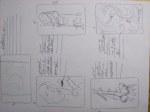
    Today’s in-class assignment: Make your name inspired by the word assigned. At my table, there were words like “chamelon” … you know, I can’t remember what else, it was so long ago. Mine was acrobat. The worksheet has a rectangle for your design captioned with “My name is… and I am an acrobat.” Or whatever. I brainstormed, first clicking with the circus element and making the three A’s in my name circus tents, but then I thought, the high wire would be an excellent baseline for my letters. I thought to make the letters actual silhouettes of acrobats, but after reading the instructions for the assignment again, I saw that wasn’t the intention of the assignment. What can placement, scale and additive elements imply without being to literal or icon-based? So, my final design has the victorian tear-drop finial, serifs for feet, and a bicylcle wheel for the counter.

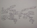
    Today in class, the teacher talked about Ed Fella and Paula Scher. This video is really inspiring. A point pointed out: Sure, her design for citi bank only took a few seconds after the concept meeting. Oh, and thirty-four years. When someone does something fast it doesn’t necessarily indicate that it’s a bad idea. It perhaps means that they are just that intuned the particular assignment. We take all that we have with us, intellectually, when we step into a classroom or a studio, and that work produced there is because of all the points, the infinite number of points that one must pass through in a line to get to that particular terminus. I love looking at graphic designers’ work that is just for them. The teacher showed “slides” of Scher’s personal work, and there is an element of play and an element of craft that shows that the artist wanted to make it because it’s fun.

    sharing options:

    • Share
    • Share on Tumblr (Opens in new window) Tumblr
    • Print (Opens in new window) Print
    • Share on LinkedIn (Opens in new window) LinkedIn
    • Share on X (Opens in new window) X
    • Share on Reddit (Opens in new window) Reddit
    • Share on Pinterest (Opens in new window) Pinterest
    • Share on Facebook (Opens in new window) Facebook
    • Email a link to a friend (Opens in new window) Email
    Like Loading…
  • Floating

    October 14, 2011

    In New Media class today, we talked about photography. We poured over our photos from last week. The teacher with his veteran eye, giving his critique on each one, mostly a softy. He said I did nice work. He had nothing bad to say after I explained why there was a school bus in the portrait of Charan (I didn’t post this picture because the file is too big and it is still in RAW and on a mac at the school. I haven’t had the know-how to import it to this blog.) Was my photo that prosaic that he didn’t even want to fix it? He kept emphasizing how important it is in photography to get new and unusual photographs because our world is currently saturated with images.

    We spent what seemed like an hour pouring over professional photographs, exemplifying our next assignment: window light. Our teacher Robbie really geeks out over a good photograph (he kept boasting how his pet quality was a good close crop). We as a class admired the crisp lines and soft lighting and interesting detail brought out by the sly reflector that any skilled photographer should have in her toolbelt. Each photograph he preseneted had a special wow component, details in reflections,  controlled flares, interesting repetition.

    This afternoon, I did some more folded-paper reliefs. I am planning on collaging them for my poster due in a couple of weeks.

    sharing options:

    • Share
    • Share on Tumblr (Opens in new window) Tumblr
    • Print (Opens in new window) Print
    • Share on LinkedIn (Opens in new window) LinkedIn
    • Share on X (Opens in new window) X
    • Share on Reddit (Opens in new window) Reddit
    • Share on Pinterest (Opens in new window) Pinterest
    • Share on Facebook (Opens in new window) Facebook
    • Email a link to a friend (Opens in new window) Email
    Like Loading…
Previous Page Next Page

Blog at WordPress.com.


Loading Comments...
 

    • Subscribe Subscribed
      • Kismet Arts Tangent
      • Join 104 other subscribers
      • Already have a WordPress.com account? Log in now.
      • Kismet Arts Tangent
      • Subscribe Subscribed
      • Sign up
      • Log in
      • Report this content
      • View site in Reader
      • Manage subscriptions
      • Collapse this bar
    %d