Skip to content

Kismet Arts Tangent

Art Collective

    • Kismet Arts Tangent
    • About
    • Blog
    • Contact
    • Donate

recent posts

  • Photo shoot with Kayleigh Shawn
  • Testimonials
  • Fractures Poem
  • Poetry
  • Pixel art products

  • Instagram
  • Contour Drawing

    October 13, 2011


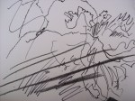
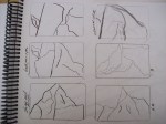
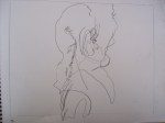
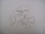
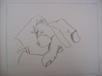
    Pages from my sketchbook today. The lesson: blind contours. It was difficult resisting the urge to look at what I was drawing, but I am glad I didn’t. These spontaneous looking squiggles look like something that came out of the fourth dimension (not time, but the one perpendicular to the third dimension). We talked about line quality and the next assignment is to draw something from nature.

    The critique of the negative space project ran smoothly. Some presented compositions with the hard edges of a chair silhouette abstracted by close cropping while others submitted shapes of potted plants on stools or shelves. A student commented that she liked the constrast of the hard crispe lines of negative space, the austere constrast of the white and black in comparison to the organic lines of the plant-shapes. And another really appreciated the geometric qualities of the stools and table legs, how their interstices implied a personality. That’s the nice thing about the class. Everyone has their own preferences and things that just really get them.

    sharing options:

    • Share
    • Share on Tumblr (Opens in new window) Tumblr
    • Print (Opens in new window) Print
    • Share on LinkedIn (Opens in new window) LinkedIn
    • Share on X (Opens in new window) X
    • Share on Reddit (Opens in new window) Reddit
    • Share on Pinterest (Opens in new window) Pinterest
    • Share on Facebook (Opens in new window) Facebook
    • Email a link to a friend (Opens in new window) Email
    Like Loading…
  • Sticky, indeed.

    October 12, 2011

    This is my word (and a specific font I’m leaning towards). Already, I have questioned if I spelled it right and I am wondering if I should be more literal and find a font with connected twig silhouettes. (Get it?) Why do I have a word? This assignment:

    “Type has it’s own voice and personality. Choose an appropriate typeface for the assigned adjective or noun. Adapt, distress, deconstruct or personalize the typeface chosen to create a visual representation of the assigned word. Incorporation of icons and/or images within the visual representation is permitted but try to limit the use of imagery to a minimum. You can start in pencil, xerox, construction paper cut outs, etc but the finished work must be in black an white on an 9” x 12” sheet of white paper. Work will be due 9 a.m. in the next class for review and group discussion.”

    sharing options:

    • Share
    • Share on Tumblr (Opens in new window) Tumblr
    • Print (Opens in new window) Print
    • Share on LinkedIn (Opens in new window) LinkedIn
    • Share on X (Opens in new window) X
    • Share on Reddit (Opens in new window) Reddit
    • Share on Pinterest (Opens in new window) Pinterest
    • Share on Facebook (Opens in new window) Facebook
    • Email a link to a friend (Opens in new window) Email
    Like Loading…
  • Negative Space

    October 12, 2011


    Today I took this still life…


    And completed the negative space assignment. Claire (the drawing teacher) said that if the shapes don’t line up perfectly, it showed that the student did the assignment by drawing the shapes in between and not the objects themselves. Well, I did this assignment extra right then because you can’t really tell that middle shape is a vase anymore.

    sharing options:

    • Share
    • Share on Tumblr (Opens in new window) Tumblr
    • Print (Opens in new window) Print
    • Share on LinkedIn (Opens in new window) LinkedIn
    • Share on X (Opens in new window) X
    • Share on Reddit (Opens in new window) Reddit
    • Share on Pinterest (Opens in new window) Pinterest
    • Share on Facebook (Opens in new window) Facebook
    • Email a link to a friend (Opens in new window) Email
    Like Loading…
  • Glesh

    October 12, 2011

    I made this thing today, out of folded white printer paper. I have a project due in a couple of weeks and I was trying out a paper folding thing. I had this idea to make a poster out of pipecleaners, but when I researched Peter Behrens (my assigned poster topic) I decided to go for something a bit more modern. I was walking with this in my hands on my way home today and I thought it was like an alien communique, a map of a language we don’t have the sensitivity to understand. Glesh because that’s what it deserved to be called. The category on my blog here should be called “Art?” emphasis on the question mark.

    sharing options:

    • Share
    • Share on Tumblr (Opens in new window) Tumblr
    • Print (Opens in new window) Print
    • Share on LinkedIn (Opens in new window) LinkedIn
    • Share on X (Opens in new window) X
    • Share on Reddit (Opens in new window) Reddit
    • Share on Pinterest (Opens in new window) Pinterest
    • Share on Facebook (Opens in new window) Facebook
    • Email a link to a friend (Opens in new window) Email
    Like Loading…
  • Lessons from Failure

    October 11, 2011


    How to make Artistic Poop: Lessons from Failure. (1) buy the cheapest –and yet, due to their cute name (black cat), they make it into the shopping cart– ink. (2) Use the clumsiest crayola brush (3) Enjoy a tiny view finder which frames your picture-in-the-making so delicately, that the tiniest of sways from your non-drawing hand makes the whole composition wonky. (4) The ink in the cup is prettier than what it produces on the paper. (5) Draw. Go ahead and try. Draw what you see, draw what you thought you saw and then looked back and it was a figment pigment. (6) Color in the negative as per the assignment and admire teh poopzors.

    sharing options:

    • Share
    • Share on Tumblr (Opens in new window) Tumblr
    • Print (Opens in new window) Print
    • Share on LinkedIn (Opens in new window) LinkedIn
    • Share on X (Opens in new window) X
    • Share on Reddit (Opens in new window) Reddit
    • Share on Pinterest (Opens in new window) Pinterest
    • Share on Facebook (Opens in new window) Facebook
    • Email a link to a friend (Opens in new window) Email
    Like Loading…
  • Playing With Illustrator

    October 11, 2011

    I think every time I play with illustrator– so many effects!– I will post them. It’s amazing what I consider visually pleasing. Perhaps my narcissicism is kicking in (everything I do is beautiful).


    sharing options:

    • Share
    • Share on Tumblr (Opens in new window) Tumblr
    • Print (Opens in new window) Print
    • Share on LinkedIn (Opens in new window) LinkedIn
    • Share on X (Opens in new window) X
    • Share on Reddit (Opens in new window) Reddit
    • Share on Pinterest (Opens in new window) Pinterest
    • Share on Facebook (Opens in new window) Facebook
    • Email a link to a friend (Opens in new window) Email
    Like Loading…
  • Letter Personality

    October 10, 2011


    “In class exercise: The theme for today is type and expression. Use your initials to reflect your personality.” I created these. After doing some brainstorming with words (instead of thumbnails) I felt like I had a better grasp of what I wanted to acheive.

    Reporting from earlier today: I had put mounting my designs on the black cardboard until it was about thirty minutes before class. If you have ever seen a design reality show, there are always designers (most of them) scrambling around at the last minute, scampering off to the sewing room or the spray-mount room for their final tasks. Everyone in the production lab was really generous with their supplies and distracted congeniality. I got it done, but with some lessons learned about spray adhesive and what it can’t do for you. All in all, though, I enjoyed having a convenient spray than gluesticking an 11×17 by hand.

    The presentation and critique section of today’s class was very delightful. Every time there’s an assignment due, it’s like an art show. I get to walk around and admire everyone’s interpretation of the assignment. Some people had beautiful modern compositions with bold splashes of color and futuristic font. We were all very impressed with Johnny who had created two excellent pieces– one a dark deep ocean with black tendrils creeping in from the bottom of the design, and the other, a soft, yet ominous fall of snowflakes. My favorite explanation of the design and word choice came from Scott, who talked about how the pattern conveys an architectural landscape where patterns sort of repeat but never stay the same, and he captioned it “object, object.” He justified that by saying how sometimes with things repeat so much they tend to abstract themselves and become unfamiliar, like you forget out to spell the word or the sounds sound extra funny. A word that always does that to me is “soup.”


    A self-portrait entitled “waiting for the bus stop”

    sharing options:

    • Share
    • Share on Tumblr (Opens in new window) Tumblr
    • Print (Opens in new window) Print
    • Share on LinkedIn (Opens in new window) LinkedIn
    • Share on X (Opens in new window) X
    • Share on Reddit (Opens in new window) Reddit
    • Share on Pinterest (Opens in new window) Pinterest
    • Share on Facebook (Opens in new window) Facebook
    • Email a link to a friend (Opens in new window) Email
    Like Loading…
  • Designs for tomorrow

    October 9, 2011


    Designs for tomorrow. I have made these posters today and I really love them. I think they display of a certain amount of understanding about Gestalt principles.  I might be a little afraid of color, but I think they look mighty sharp. Each one is based off the “stable and dynamic” designs from last week. I like how they retained their respective descriptors, though they are still interesting and the assignment didn’t say that they had to.

    sharing options:

    • Share
    • Share on Tumblr (Opens in new window) Tumblr
    • Print (Opens in new window) Print
    • Share on LinkedIn (Opens in new window) LinkedIn
    • Share on X (Opens in new window) X
    • Share on Reddit (Opens in new window) Reddit
    • Share on Pinterest (Opens in new window) Pinterest
    • Share on Facebook (Opens in new window) Facebook
    • Email a link to a friend (Opens in new window) Email
    Like Loading…
Previous Page Next Page

Blog at WordPress.com.


Loading Comments...
 

    • Subscribe Subscribed
      • Kismet Arts Tangent
      • Join 104 other subscribers
      • Already have a WordPress.com account? Log in now.
      • Kismet Arts Tangent
      • Subscribe Subscribed
      • Sign up
      • Log in
      • Report this content
      • View site in Reader
      • Manage subscriptions
      • Collapse this bar
    %d