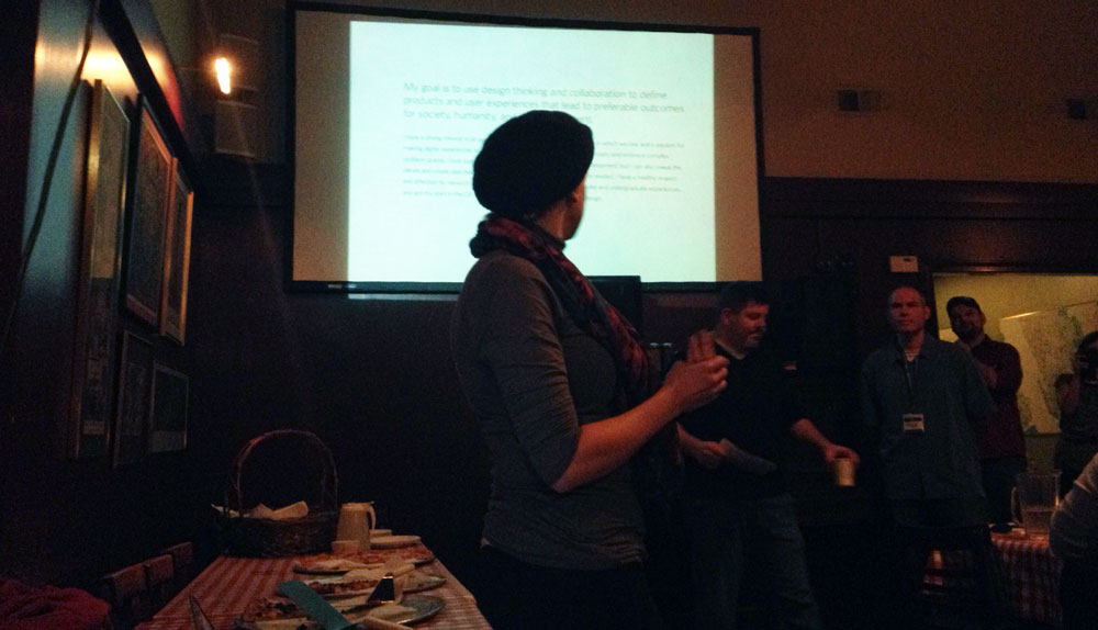
• Last night, I attended my first Seattle Information Architecture & User Experience Meetup. A big thanks to Misty Weaver, @meaningmeasure, for hosting.

    It was nice seeing familiar faces, my ol’ web design teacher, my technologist mentor and fellow alumni and precious students from Seattle Central Creative Academy. This was part two of a two part meetup. An encore really, considering the first part was considered to be very useful. (I didn’t attend part 1 but I heard it was a good time.)

    This Meetup, two brave volunteers, Kate Hotler and Andrew Szydlowski discussed their experience as if in an interview with the presenters, Troy Parke (@UXHow) and Patrick Neeman (@usabilitycounts).

    Andrew Szydlowski presenting his scene byways project
    Andrew Szydlowski presenting his scene byways project

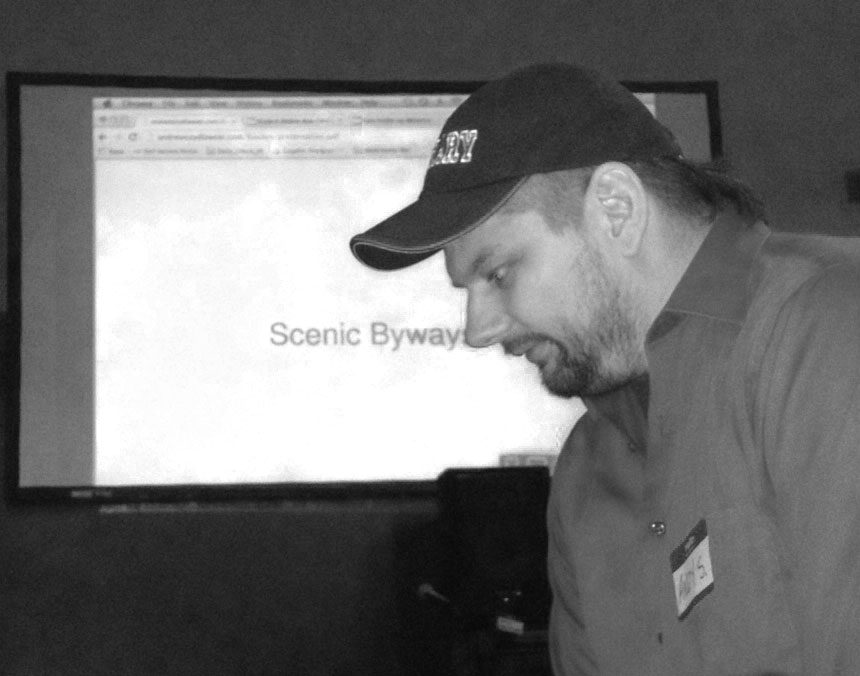
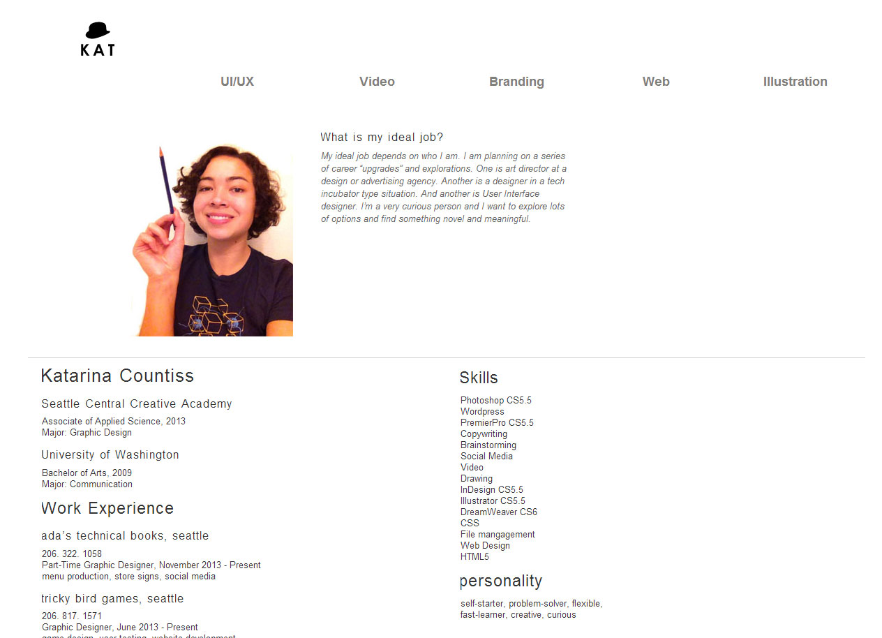
    Andrew went up first. He guided the audience through his website portfolio (complete with a self-portrait made in Visio). Andrew showed us his project of byways, complete with a javascript map, the whole time Patrick and Troy playing the role of the entrepreneur of a start-up. They asked questions, What were your challenges, Who is the user, How did you know this project was successful, How did you determine this project’s success.

    The feedback for Andrew was limited due to the format of the interview. The interviewers commented on how his LinkedIn wasn’t up to date and the site link didn’t direct the presentation to the correct part of the site. Troy talked at some length about how Andrew didn’t tell a positive enough story about his project. It’s not about what you could have done. Not to say that Andrew did poorly. He addressed the interviewers questions and presented an impressive project. He didn’t try to be the unicorn, but acknowledged he could learn a few skills for the role. A part of presenting your work is telling a good story ad ending on a positive note. Sometimes that takes some creative research and focusing on some positive qualititative aspects.

    “What is a wireframe and why is it valuable?” This is an important question, especially if you can communicate that to an employer that perhaps thinks, I don’t know what UX is, but I know I need it.

    Kate Hotler looking stylish in a beret, presenting next to the pizza table
    Kate Hotler looking stylish in a beret, presenting next to the pizza table

    Kate Hotler had a Behance portfolio, but also showed a slide presentation. The first few slides being introductory and the next few slides showing her project, a learner response system. She came into the project a little later, after a few decisions had been made, like the going native. Questions thrown at her: What would you have done if you were included from the beginning, How would you sign in, How did you handle accessibility, How did you test with users, How was this a success? One of Kate’s challenges was that she had to create a flow that would make sense if it was broken up because of the nature of the program. She spoke to some of the challenges of working with developers in an agile workflow. There were compromises made regarding how much time it took to implement versus the user experience gains from that improvement.

    The feedback Kate received was mostly presentation. She needed to project her voice a little more for the room (though some could argue that certain aspects of the interview were extraordinary, I think that being heard in different situations is important.) Her LinkedIn had a typo (just one, but yikes!) and The intro statement slide was verbose with small type. Kate should have played up her personal background as a teacher to be a value in the context of the system that is used by teachers. Kate also mentioned her working with a project manager and at that point it needed clarification on whose ideas are whose. More talk of process would help illuminate who Kate is as a UX designer.

    Strategy: Have a conversation with your interviewer. Firstly, they will research who you are with all the powers of Google. Patrick said “I want to know everything about them.” And of course, Google them back. If you have their name, you have everything. Work to establish some common ground, or at least know the roles of the people interviewing you.

    In UX interviews especially, there are questions behind the questions. They want to see how far back you go. When the prompt is design an ATM, they want to test you to see the process you use. Do you immediately think about your users?

    Stick to your story. Be a storyteller. Your interviewer wants to hear challenges you faced and the results you achieved,. Practice interviewing unti lyou can tell 3-4 (sometimes two is enough) projects really well, so well that you can anticipate questions and work the answers into your presentation. Being a mind-reader (or at least seeming like one) is a trait of a good UX designer.

    dora

    The next slide on Troy and Patrick’s deck was a bright happy picture of Dora the Explorer. “Be like Dora,” they said. This goes two ways. Firstly, she says “Let’s stop and think.” In the interview they want to know how you think. It’s not a speed contest, if you need a moment, take it. If you can talk it out even better. If the situation calls for it, go to the whiteboard.

    Secondly, she has a backpack and so can you. Maybe not literally, but in your arsenal if you have a mobile iteration, you’re doing good. If you can show documentation, great.

    Make-Good-Art_thumb

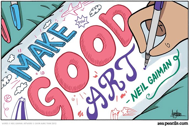
    The next slide: Make Good Art. -Neil Gaiman. In the interview and in life, you should care. Share your passion for UX. Show your interviewers that you’re the real deal. Your interviewer is not only considering your skills but your compatibility with the existing team. Are you going to get along with people, are you going to fit with the existing culture.

    Question: What’s the ideal LinkedIn? See template, SEO and portfolio. Concise descriptions, here’s what I did and this is the results. Embrace your background, you can’t hide who you are.

    Question: Tailor presentation or website? They want to get to know who they’re talking to. Help them out. Apply yourself into the context and layer in your experience. Your scope of your presentation should vary if it’s a project manager or a designer that you’re talking to.

    Question: What about design choices? During the mock interview, less emphasis was put on design choices, partially because of the background of both candidates did not emphasize that, but also because of the audience. In a real interview, interviewers will want to dial down deep and you need to be prepared. Treat your interviewer’s time as precious.

    Question: Results? Should you omit bad parts unless asked about? No, be honest and tell a real story. You might walk into less than ideal situations and that’s how we learn and grow. Show a project where you had an experience and how you learned from it. Sometimes we need to get creative in describing positive outcomes with qualitative reviews. Sometimes the market just isn’t there for your product, but that doesn’t mean there’s nothing good about the project.

    Question: Do you want to be a generalist or a specialist? There is always a search for that mythical unicorn that does everything, but most UX designers are T-shaped —What makes a good UX designer? – UX for the masses— and are good at a few things and appreciate and understand the other aspects. Be honest about what you can do. First focus on strengths and then show well-roundedness. Try to be good at one thing then expand out. If you’re in school (or if you’re not

    Question: How to deal with NDA (Non-disclosure agreement)? Troy gave the example of a UX designer who couldn’t really talk about a project, but she hat a great skill to tell the story using elaborate metaphor without the actual product details. Rule is don’t show it. You want to gain the trust of your employer. If you need to buff up your portfolio, try some side projects. Local hack-a-thons and start-up weekend recommended.

  • Today, I went to a graphic design internship interview. It’s been a while since I’ve interviewed, the last time being for the job I currently have, but I thought an internship would be nice to get some new skills and experiences under my belt with the 15 or so hours a week I have to play with.

    I scored this interview via seattle art/media/design jobs classifieds “intern” – craigslist. I have this bookmarked in my browser and click on it every few days. Interesting seeing what’s out there. Sometimes a gallery position intrigues me, but I remind myself that I like working with people and gallery internships are somewhat limited.

    After a small exchange with my interviewer who is a Senior Graphic Designer at the company, it was established that wi-fi wasn’t going to be an option, nor having a computer available, so I would need to bring a device loaded with a pdf version of my portfolio. I’m glad I checked! The last and almost successful interview I had for a marketing position was me navigating my site on the interviewer’s office computer, not the best way to go. So, I prepared a simple document, landscape paper, unsure if I would be able to procure a tablet, or decide last minute to print it out. Now knowing I have access to a tablet for these kinds of events, I will size the pdf I make to an iPad resolution.

    After arriving five minutes early (go me!), I jumped into the question, so tell me about yourself. And then, the portfolio showing. I was grateful to my friend who had lent me his iPad. It worked pretty well, though I confessed to my interviewer that it wasn’t mine and it was obvious when I tried triple-clicking the screen to get my menu bar. I learned that iPads are nice for showing work. After I got the pdf to work by emailing it to myself, opening the pdf in the email app, and then using the “open in iBooks” option, it went well. My interviewer did the driving, which is kind of gratifying because it means she’s interacting with my work, even if it’s just a side-swiping way.

    I showed a pdf, then tried showing my (Parts of a Cell | A Moment of Science on Vimeo) had to stop after I realized that internet wasn’t going to be an option. Funny how we take that for granted these days. After going through the presentation (I included some process work, sketches, word association, iterations), she asked the usual questions. What are my strengths/weaknesses, What is a compliment I receieved about my work, how do I stay organized. And then some fun questions like “If you were a color, what would it be?” I said purple at first and then got more specific. Yes, I am kind of abashed when I say my color-identity is also Pantone’s Color of the Year for 2014, Radiant Orchid. Is this my year for graphic design? Does that mean next year, will be passé? I said that my favorite font is Garamond– it has a kind of nostalgia for me. I painted some quotes in Garamond before I really knew that I wanted to be a graphic designer. It was kind of my gateway font. It also reminds me of France. I’m a Francophile– especially when it’s gray, it feels like a cloudy day in Paris. I told her that. She liked that sentiment enough to write it down. But she did ask if I liked Garamond 2 or 3 or what? and I was like… um. Original? http://papress.com/thinkingwithtype/resources/Garamond_Showing.pdf I can now tell you I like ITC Garamond the best. It’s like a nice armchair. It’s a little wider, thicker, but it adds to the subtle luxury.

    After her questions, she noted that I was a strong candidate and I’ll hear from her next week and then asked me if I had any questions. I asked my usual set, who will I be working with, what is your internal communications like and what do you like about your job, and then I did something I haven’t done before. I asked for a little critique regarding the interview we just had/towards the end of having. She obliged graciously saying that she appreciated that I was “well-spoken” and she generally liked my work. She wanted to see more. She said that it’s good to have 9-12 pieces but no more than 15. That’s when I pulled out the second pdf.

    I explained to her that a few times (which is most times) I’ve interviewed they told me to pick three pieces to talk about. Maybe, it’s a recruiter trick. Anyways, I planned originally to have a limited pdf to focus on a few amount of pieces, but I got a little worried and then created a second pdf with more work. So, we did a quick go through of the second pdf. We bonded over one of my posters. Class Ad Trio | Katablog. She said that she understood why I used the jar as a visual metaphor and it was more intriguing than the item that replaced it in the next iteration. My heart was warmed a little, that same way when you make an obscure joke and one person chuckles and that person in that moment is your new best friend.
    She said that she thought that that I was well-prepared, but she wasn’t there when I was like “how do you view a pdf on this thing?” this morning. But, I nodded and thanked her. Why spoil the illusion? She noted that everyone’s doing electronic portfolios these days, but she enjoys holding portfolio books, or at least some print pieces. She knows a good book is really expensive to produce, so she didn’t count it against me. I related to her in that moment. I’m a graphic designer, too. Sometimes, the thrill of production comes with holding it in your hand, maybe caressing your cheek with the textured paper. I am planning on bringing something next time. Put it in my monthly budget, so I can give my interviewer some tactile experience.
  • colorpalettesI was just going through one of my color boards on pinterest (color2.) and I wanted to make some palettes for easy use when projects come up in the future. I love this collection. I think color combinations can communicate a lot. The interesting life of a graphic designer. We treat color palettes and fonts as friends, but a strange friendship. They are friends that we can turn to when a design challenge arises, but until then, we just gaze at them thinking their day will come, maybe soon, maybe not.


  • Did you know that they leave scientists in charge of the covers for science journals? Sometimes, they turn to graphic designers and explain to them how a thing works so they can depict it in a catchy image. I am one of such graphic designers. I’m still a little astounded that I had to make all of these design choices and yet communicate with the scientist about how it all worked together and what it all meant. Complex doesn’t necessarily mean beautiful. And, beautiful doesn’t always equate to meaning.

    extrudeThis isn’t the cover. This is what happened when extrude/revolve tool accidentally took hold of one of my carbon molecules while I was making a sheet of graphene in Illustrator. #glitchart


  • flowerI made this painting today. It’s a present for someone’s 85th birthday. After finding out her favorite flower is a chrysanthemum, I bought this lovely bouquet of flowers from Trader Joe’s and made this. I’ve been thinking about patterns. Especially organic and imperfect patterns that have a certain flow to them as if they are being pushed by a gentle breeze. This was a fun challenge because I needed to make the elements stand out from the complex background.


  • Resume Page
    Resume Page
    Home Page
    Home Page

    I recently got a haircut and a new job and I felt it was important to update the ol’ portfolio. I previously directed the user straight to my UX projects page. This made the navigation confusing for them because they didn’t realize that they were already in a subsection of the site immediately after arriving. All of my pages had the “logo squares” representing each project and it felt a little impersonal and the photo needed updating on the resume page. I took new photos and included a pencil because I think of it as an important tool that I use and I think it would be fun for people to realize that even after all this computer program learning, I start with a pencil every time. The current layout creates some weird negative space and I’m not sure how I want to deal with it yet. It’s like a Canadian flag. :/ Which is not a bad thing really. There’s a sense of evenness and you want to focus in the middle.

    (Earlier Post Relating to This Project)

  • One of the unique hand-drawn holiday cards
    One of the unique hand-drawn holiday cards

    This year I wanted to get away from the classic iconography of Christmas. I have been influenced by my new job at a technical bookstore, lots of math and science inklings floating around inside my head. Fragments of knowledge starting to rise to the surface as I revisit cravings of a technical mind, though there is still some nonsense to be had. This is what comes out. A motif arises, a friend refers to it as little target logos or alien eyes.

    I created 50 cards (out of which I consider 49 to be usable) from the Strathmore Creative Cards, Fluorescent White with Deckle, 5″ x 6-7/8″, 50-Pack using Pigma® Micron® 05 Burgundy, Hunter Green and Black. I essentially doodled on them, wanting to have each card be different yet part of a series. It was interesting to repeat things that I liked about the design as I progressed, drawing one card at a time, mimicking some kind of weird evolution pattern.

  • About – What Would I Say? Facebook App

    There was this time when I interacted with this website. It combs your Facebook statuses (stati?) and then spits them into this false amalgamation and the results are nearly poetic.

    stichI stitched together the output of this Facebook app. I thought it was an interesting experience to be subjected to the stuff I put out on social media with this What Would I Say? app. It was difficult at first for me to trust it. Facebook Apps seem a little shady. But after reading the about, I kind of gave into its narcissistic appeal. But, instead I was offered a window into what a status might intrigue. If that makes any sense. Perhaps an insight to what I like without realizing it. I do think a lot about fashion.