Here’s some of my video research. I think it’s important to categorize them in the things that set them apart. Things done exquisitely well. Things that resonate. I’ll add to this list as I continue my journey into this music video culture, rich with references and stimuli.
Released: 1987 Director: Sophie Muller
The surreal video, which was one of a series made for every song on the ‘Savage’ album, sees Lennox play an oppressed housewife who breaks down, transforming herself into a Marilyn Monroe-esque vixen. Best bit: Annie Lennox’s opening monologue.
Released: 2012 Director: Everynone
Clips side by side of contrasting natures. A sun vs. a light bulb, a newborn crying vs. an old dying man. Best bit: When the twins switch sides.
Released: 2003 Director: Johan Renck
Featuring female impersonator Rickard Engfors lip-sinking to the track as the entertainment at the annual meeting of a local Swedish football club, this mesmerizing video is tense, beautiful and haunting. Best bit: Band member Olof Dreijer’s dance moves. <the glamour and strangeness of the female impersonator clashes with the setting>
Taking inspiration from Ray Davies’ ‘Starmaker’, the video follows a girl as she dreams and has nightmares. The low-budget, psychedelic special effects have made the video one of the band’s best known.
Best bit: The shot with the classic mirror trick in the bathroom. <my favorite part: from 3:10-3:25)>
(Insert Presentation Here– I am planning on putting the presentation here as a slideshare when/if I get the files from my team.)
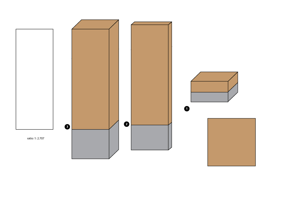
Volunteer park sign structures based of the ratio of the doorway at the Seattle Asian Art Museum
Today, we had the presentations for our wayfinding projects. Joyce was really nervous, but Annie seemed really calm. I had never worked with these people before, but looking back on it, it was a really great experience. I was very fortunate to be on a team with a sense of style. This is the presentation that was shown to the class. It was designed by Joyce. She said that she has never designed a presentation before and I thought it was a great talent of hers that lay undiscovered until now. She also pitched most of the presentation which is amazing because she is known for often getting a little giggly, but she was charming and entertaining as well as informative about the park, our impressions of it and how to improve it.
Annie did the design for the wayfinding structures. She was very smart about its design but also the file (which I needed to implement the photoshop comp) was put together in a very easy and comprehensive way to implement it. All the signs were done in the same illustrator file and the wood texture under the text. Working on the photoshop comps were really fun. It’s nice to see an idea be a part of a photographic surrounding, a sketch come to life. After the presentation, there was a comment made saying how good the photoshop comps were, but I think it was the sequence of photos. The before and after photos make it seem rather surprising, as if it was a magic poof and the structure replaced the previous one, like 1-2-3-design. Photoshop magic.
I did the illustrator comp representing the three dimensions of the structure and its cement base. Thinking about it, I realized I should have designed for the presentation, better. We talked about how we developed a “system” for the structures. The one numbered “3” was the first one we talked about. We didn’t have a separate slide for talking about “4” so in the heat of the moment of presentation, it was a forgotten element. 4 is the plaque solution that would be used for titling features like memorial trees and lily ponds. The lesser attractions. In the future, I would have made a comprehensive image and then each version pulled out. Joyce had to go back to the other slide to talk about its dimensions that wasn’t apparent in the photoshop comp. A cube from the front looks like a rectangle and vice versa.
After the presentation as part of the critique, there was some issues with the map, how it could use a legend, note the directional orientation/potential inaccessibilty of some parts of the road indicated.
(Blogger’s note: I put “Wayfinding” in the category of User Experience. This is a unique assignment and I doubt I’ll get many wayfinding projects when I find a job in the industry.)
@arcadenw, A 501(c)(3) nonprofit, ARCADE’s mission is to incite dialogue about design and the built environment. Patterns and Identities: Data Visualization as Interface by Arcade
ARCADE event.
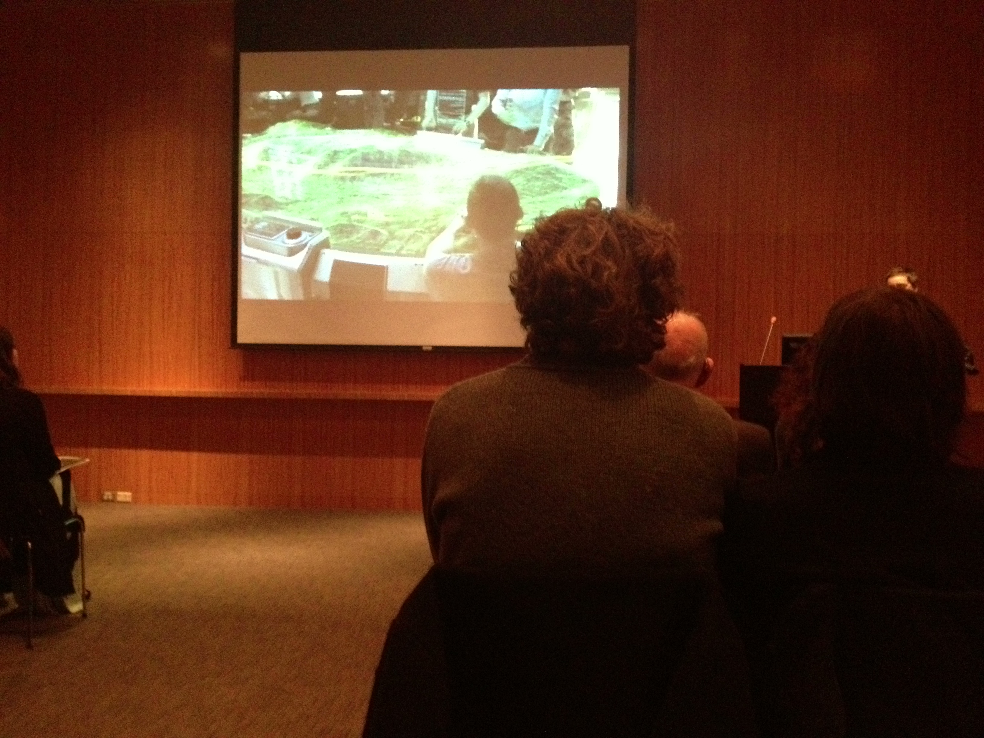
Photo from the sold-out event in Seattle Art Museum’s Board Room.
Christian Marc Schmidt started his talk in the Board Room at Seattle Art Museum last Thursday (Valentine’s Day!) with a supercut of science fiction interfaces. They seem so futuristic, so innovative. Are we really so far from that in our current interface technology?
Kinect – Xbox.com., Oblong G-Speak, Leap Motion and Google Glass are a few of the leading companies in creating innovation in the world of interface. The increase in storage capacity among other things are indicators and facilitators of the future of technology, leading to more processing more to make these complex interactions a reality.
The information overload is also a drive to create better interfaces. We must make sense of all the data/information we have available. Good interfaces to data visualization leads to understanding of things that matter. It should find information you care about and connect information you care about. In the intersection of understanding and interaction, Data visualization is more than an infograph, its a tool for research, analysis and communication.
Schmidt talks about three pillars of Data Visualization, Context, Comparison and Control.
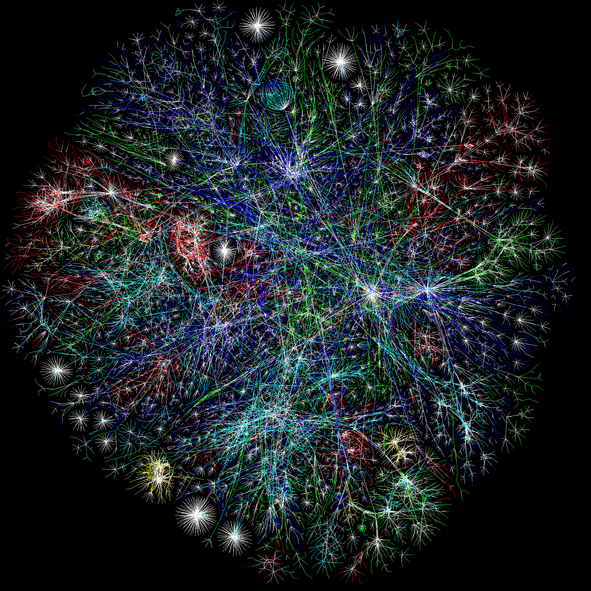
Context (ex. The Opte Project. Below is a visualization of the Internet)
Context, boundaries of information. This picture represents the context, the whole picture. With this perspective (to use the metaphor, zoomed out), we can see patterns, outliers and gaps, comprehend complexities. Perhaps, with this kind of image, it makes something big and abstract seem controllable in its scope. Do we feel like we control our world better when we can make tiny pictures of it?
This is a way to see indiviual data points in relation to each other. Ways to compare– Schmidt lists 5 ways in this acronym LATCH (L- Location, A- Alphabet, T- Time, C- Category, H- Hierarchy) and he reports that some speculate on a sixth way that doesn’t fit in the acronym, N, for network.
Sometimes Data Visualization asks more questions than solves. Or sometimes lets you make connections. The Juxtaposition of elements fuels curiosity rather than quelches it. Ben Fry’s graph of Fortune 500 profit. What happens those days when the graph severely plunges?
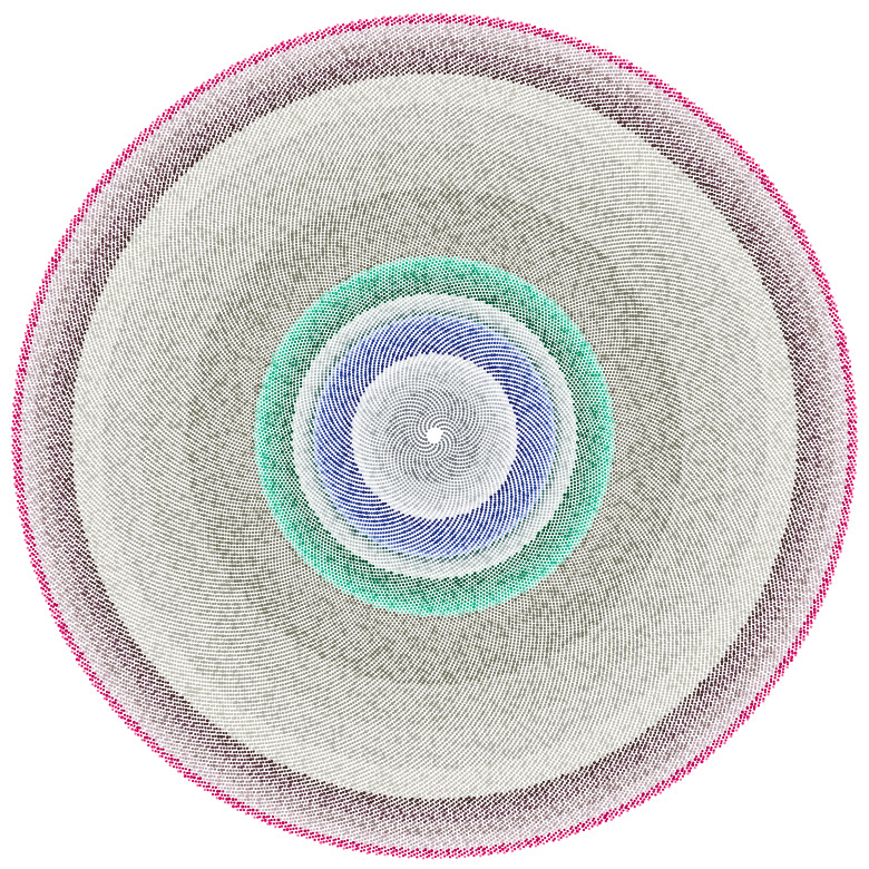
Control (ex. Amy Keeling’s Shift –which is an amazing visualization articles published on the front page of The New York Times– and Gap Minder, a TED talk)
Amy Keeler’s Shift. Organizing articles chronologically and by topic. Using Color and Position.
This aspect is about being able to find insights in the data, create stories. A lot of success relies on an effective interface, similar to the problems solved by wayfinding for the real space, interface is sign posts and bread crumbs for an abstract space.
Schmidt goes on to talk about his experience in Data Visualization projects:
Pentagram’s One Laptop Per Child– Visualizing Social Interaction
SUGAR interface screenshot showing the feature of connecting to nearby laptops.
The laptop used in this project, giving many children access to technology is an education program. SUGAR (Sugar is the core of the OLPC Human Interface) came about through a “people-first” design mentality. Color is used in a meaningful way, uniquely identifying users, the icons, the OX, represents people. The laptops come with a mesh network which enables connections to nearby computers and encourages real-time collaborative activities. They did no research or user testing early on. It proved mostly fine, but there were some early insights like “keep icons in view.” Prior, the user had to “roll-over” the frame to see their activity bar (see above). The folder metaphor doesn’t exist in the project organization structure, instead it’s organized chronologically and shows the activity icons and the unique people involved.
Identity conveyed through information. Dynamic captions, being able to zoom out to the collection and zoom in to the work and explore features like process videos of individual pieces. This is a great example how architecture informs a design. A side note, people thought that the directory screens indicating the floors of the space were interactive (but they were not). People’s expectations of screens have increased.
Schmidt goes on to talk about his experimental Data Visualization projects:
The Image of the City by Kevin Lynch inspired this work. Where Kevin Lynch created archetypal maps of a city using people’s mental maps, Schmidt and Safrin made a word map.
“The city is a composite of impressions. Beyond the built environment, it is a constantly changing pastiche of associations and experiences—not just of the people who inhabit it, but of the larger community. New York City, in particular, has two realities: the reality of the physical environment, and the reality of the idea—of what the city and its diverse neighborhoods signify. Inseparably intertwined, these two realities constantly continue to inform each other. Pastiche is a dynamic data visualization that maps keywords from blog articles to the New York neighborhoods they are written in reference to, geographically positioned in a navigable, spatial view. Keywords are assigned based on relevance and recency, surrounding their corresponding neighborhoods. The result is a dynamically changing description of the city, formed around individual experiences and perspectives.”
“By revealing the social networks present within the urban environment, Invisible Cities describes a new kind of city—a city of the mind. It displays geocoded activity from online services such as Twitter and Flickr, both in real-time and in aggregate. Real-time activity is represented as individual nodes that appear whenever a message or image is posted. Aggregate activity is reflected in the underlying terrain: over time, the landscape warps as data is accrued, creating hills and valleys representing areas with high and low densities of data.” This project was inspired by The Naked City by Guy Debord.
Questions:
What tools or frameworks are used to create works like these?
Schmidt answered Processing, an open sorce framework/javainterpreter for visual artists. Also, a lot of solutions are actually invented/designed for the specific project by companies who specialize in Data Visualization (read: proprietary solutions). http://www.netmagazine.com/features/top-20-data-visualisation-tools This article says
If you absolutely refuse to touch any code, I suggest Many Eyes or one of the fine FD sponsors, but if you’re looking to get your hands dirty, Processing is a great place to start.
Jer Thorp, whose work we saw not too long ago, posts this introduction tutorial for data visualization with Processing.
I’m going to start from scratch, work through some examples, and (hopefully) make some interesting stuff. One of the nice things, I think, about this process, is that we’re going to start with fresh, new data – I’m not sure what kind of things we’re going to find once we start to get our hands dirty. This is what is really exciting about data visualization; the chance to find answers to your own, possibly novel questions.
The examples are straightforward, the results are interesting, and most importantly, it gives you a lot to work off of with your own data and geometry. Hopefully it’s the first post of many.
Do we lose meaning with so much of a focus on data?
There could be more sophisticated topics. That’s part of the challenge.
Google, perhaps, has the best interface there ever needs to be for controlling information. (Blogger’s note: I didn’t write down the question word, for word, so I am just trying to decipher my notes at this point.)
Schmidt answered, that search is just the beginning. Then comes comparison/context. Like when looking for a pair of shoes to buy on the internet, finding a pair isn’t enough. It’s the comparing afterwards to comfort yourself in the knowledge that you are getting a good deal. Interfaces should always have two paths, search and browse.
There were some other questions. Is semantic “zoom” going to be the prevalent in the future? Yes, he said. Zoom gives you ability to adjust the scale of the data you’re looking at in a salient metaphor. Could the process be automated? Sure, but there’s a little bit of curation in data visualizaztion, mostly to eliminate the uninteresting like the “um’s” and “the’s.” Are interfaces like Pastiche going to go mainstream? No. It’s experimental. Good interfaces are accessible and user friendly. However, Pastiche could span task-oriented in applications.
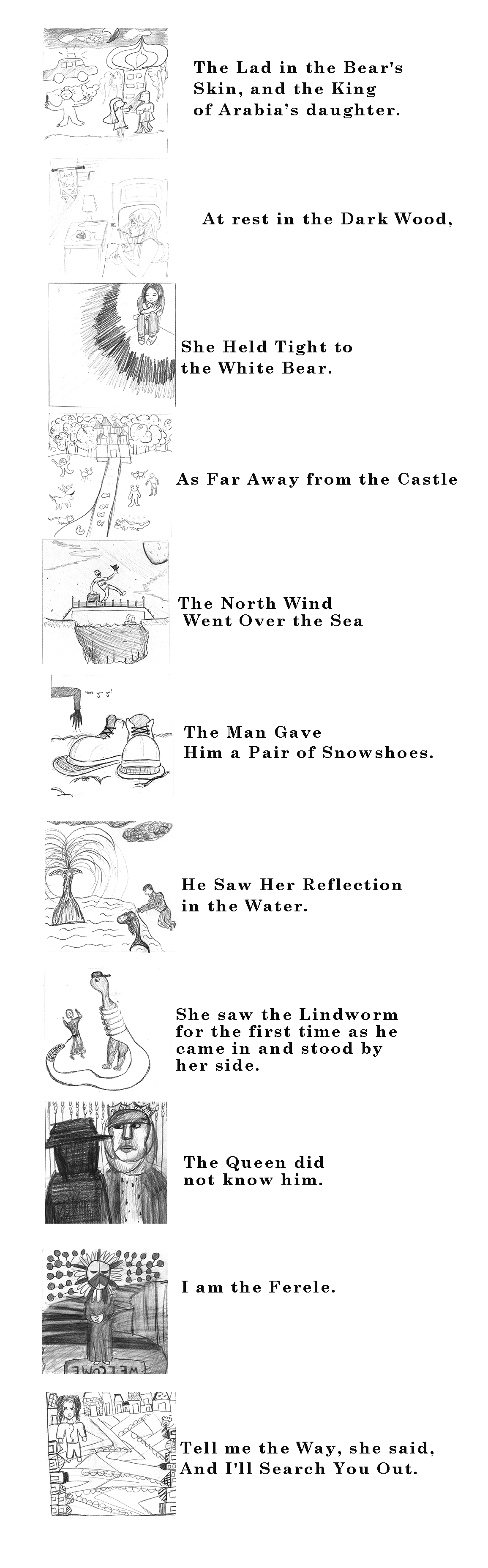
Today, inspired by this post about illustrations from 1914, each person was randomly assigned two lines from the captions of these illustrations/lines from a Scandinavian Fairy Tale and drew an illustration for that line. I put them together this bizarre story. We also did some blind contour drawing and imaginative collaboration drawing exercise– I should look up the name for that –game.
Last week, attendees of the Drawing Club meeting created some animations using tracing paper and pencil. Each person made a character. After scanning them in and taking some creative license, I’ve made this video. I am just beginning figuring out how to animate using Photoshop, Premiere Pro and After Effects. Here, I used the “Colorama” option on the background. The song is Creative Commons licensed: Wired (cdk Dub and Bass mix) by cdk.
I am so over this project. I love the video, but the process is brutal. I took most of Matt’s suggestions at our last meeting and put them into the video. Adding more footage was a pain. Editing footage, a b-reel, then talking it into black and white then putting it back into the .aep for the karaoke lettering wasn’t as easy as I thought. I didn’t label things as well as I thought. (See below) I thought it would be clear when I named something by version because then I would just go to the latest version, but what if the client wanted footage from an earlier version, which one… hmmm… And then the stuff that needed AfterEffects treatment says “need…” in the title, but then I would add it and so it would be a combination of things. It didn’t help that I put some files into a “misc” section of my drive. Ah, well. I will present this to Matt and get some more critiques.