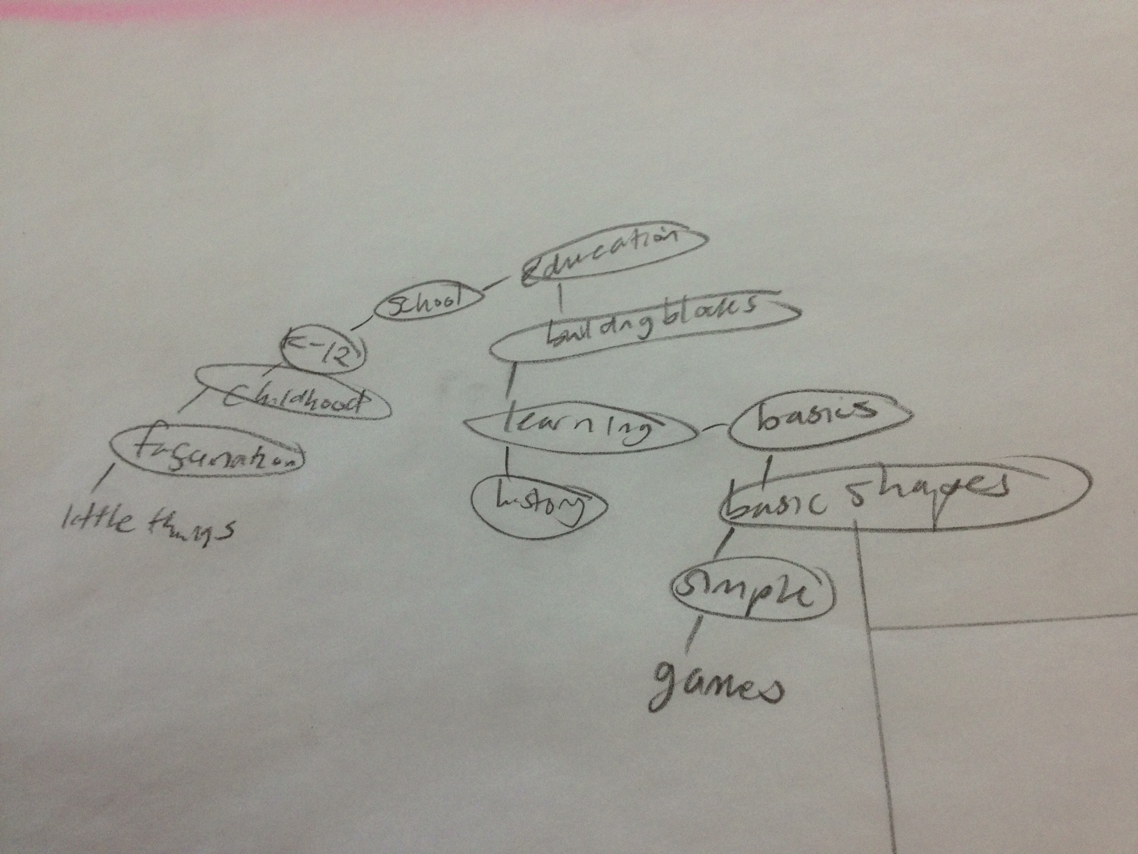
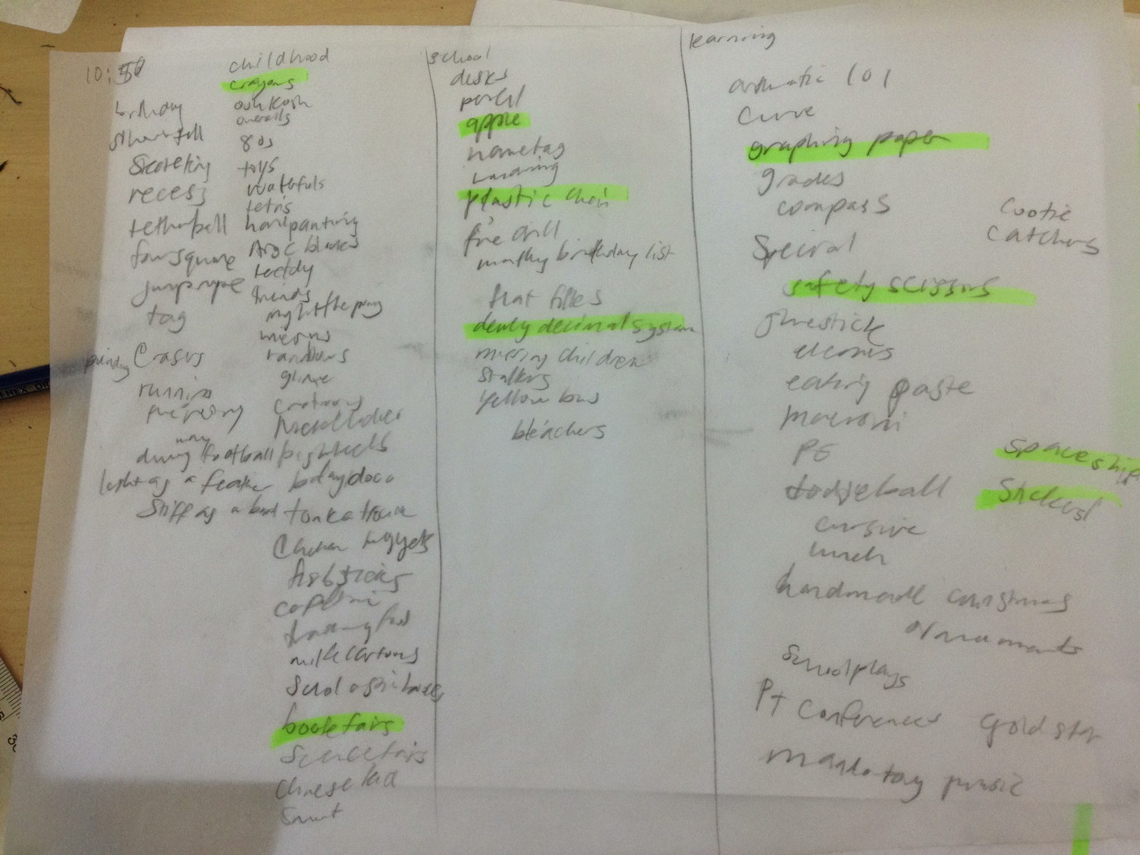
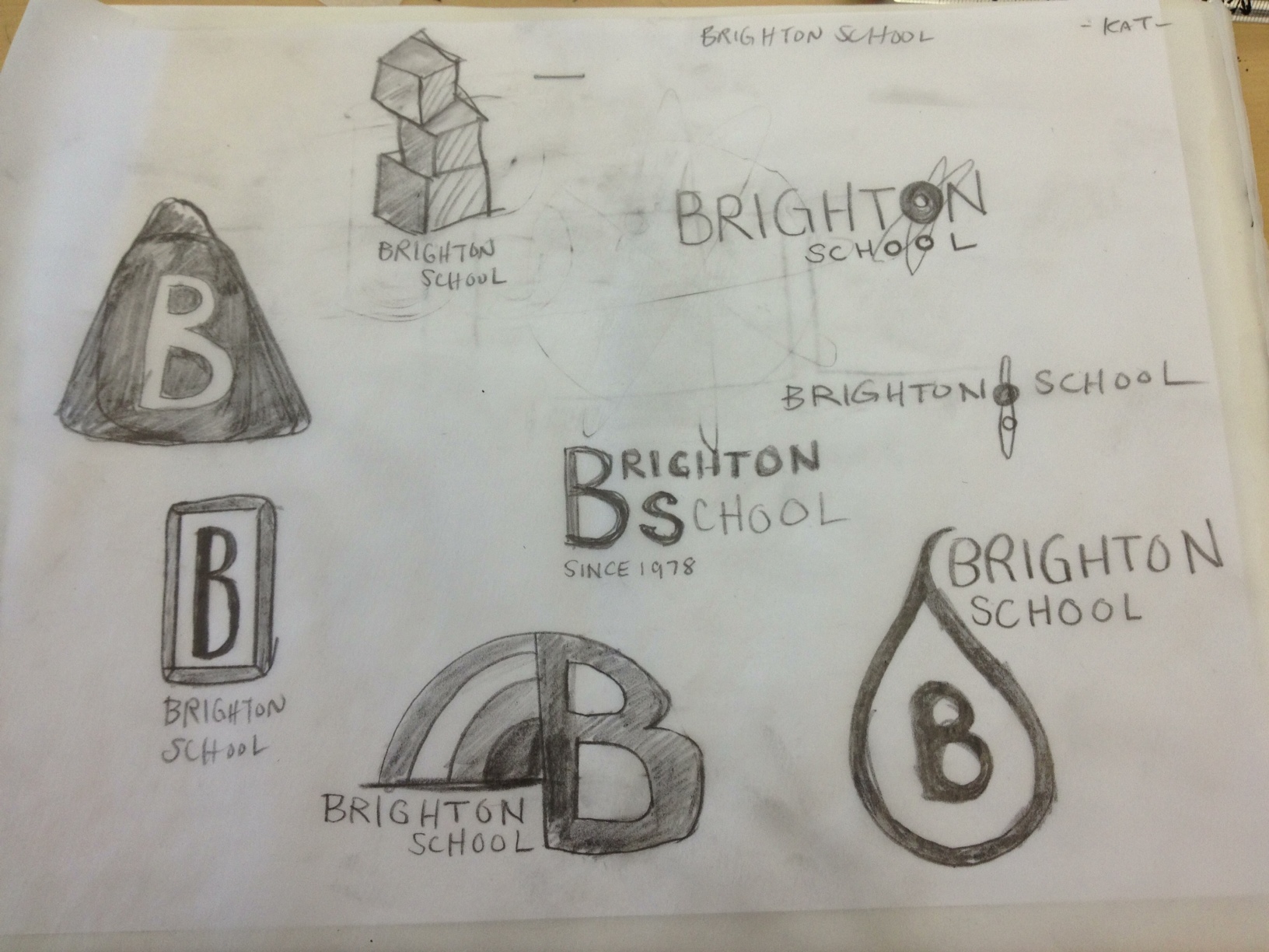
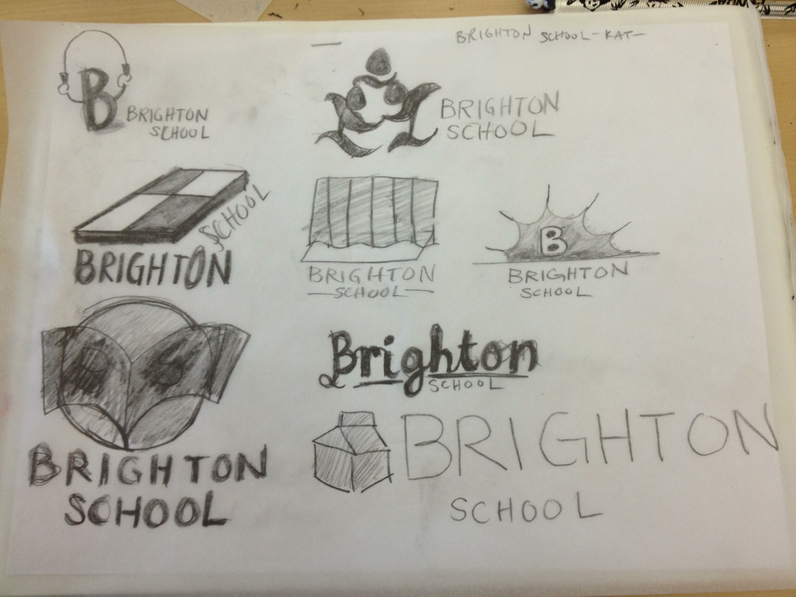
Skip to content

Kismet Arts Tangent

Art Collective

    • Kismet Arts Tangent
    • About
    • Blog
    • Contact
    • Donate

recent posts

  • Photo shoot with Kayleigh Shawn
  • Testimonials
  • Fractures Poem
  • Poetry
  • Pixel art products

  • Instagram
  • Brighton Logos to Burn

    January 16, 2013

    Today, after writing a creative brief, Tom asked the class to brainstorm and make thumbnails for our chosen corporate identities. After two hours, we had a critique. He looked at all of us and said that this is the stuff that we burn and forget about. He’s seen so many logos and he knows our future employers have seen so many logos. It’s going to be a few rounds of making logos and “burning them” before finding something strong and unique that will be able to stand the test of time.

    word map for brighton logo
    word map for brighton logo
    word list for brighton logo
    word list for brighton logo


    thumbnails for brighton logo2

    Photo2

    Photo3

    sharing options:

    • Share
    • Share on Tumblr (Opens in new window) Tumblr
    • Print (Opens in new window) Print
    • Share on LinkedIn (Opens in new window) LinkedIn
    • Share on X (Opens in new window) X
    • Share on Reddit (Opens in new window) Reddit
    • Share on Pinterest (Opens in new window) Pinterest
    • Share on Facebook (Opens in new window) Facebook
    • Email a link to a friend (Opens in new window) Email
    Like Loading…
  • Frustrations in WordPress

    January 16, 2013
    current state of wordpress blog
    current state of wordpress blog

    Current state of wordpress blog

    Today, I dove into wordpress. I thought it would be easy, but I realized that I didn’t know what I was doing fairly early on. Towards the end of my workday–why did I put this off until they day before it’s due?!– I found this beautiful window (see below) which is a portal into my stylesheet. I think it’s incredibly difficult and annoying to edit the files in dreamweaver and put them back with all of that php floating around in the code, so much prefer to do some hand-coding and get things done in the browser.

    working in the browser in wordpress
    working in the browser in wordpress

    I’m going to consider redesigning my mood board and getting the brand right because I don’t really know where I’m running this site. I still feel like I am finding out where the strings are connected like WordPress is a tangled marionette and someone has asked me to make it dance in a week. I’ll probably make massive progress tomorrow after I figure out the branding for my company.

    (Earlier Post Relating to This Project)

    sharing options:

    • Share
    • Share on Tumblr (Opens in new window) Tumblr
    • Print (Opens in new window) Print
    • Share on LinkedIn (Opens in new window) LinkedIn
    • Share on X (Opens in new window) X
    • Share on Reddit (Opens in new window) Reddit
    • Share on Pinterest (Opens in new window) Pinterest
    • Share on Facebook (Opens in new window) Facebook
    • Email a link to a friend (Opens in new window) Email
    Like Loading…
  • Drawing Club Meeting– Posters

    January 15, 2013
    drawing club posters
    drawing club posters

    Today’s attendance was less than usual. To boost numbers, we made drawing club posters. The assignment: draw something drawing itself.

    sharing options:

    • Share
    • Share on Tumblr (Opens in new window) Tumblr
    • Print (Opens in new window) Print
    • Share on LinkedIn (Opens in new window) LinkedIn
    • Share on X (Opens in new window) X
    • Share on Reddit (Opens in new window) Reddit
    • Share on Pinterest (Opens in new window) Pinterest
    • Share on Facebook (Opens in new window) Facebook
    • Email a link to a friend (Opens in new window) Email
    Like Loading…
  • What is a Good Poster?

    January 14, 2013
    Roxie Torres Thoreau Poster "It's Not what you look at that matters, it's what you see.
    Roxie Torres’ Thoreau Poster (unofficially voted best in show for our class’ first poster assignment)

    Friday, we brought in samples of posters. All kinds. A typographic poster, an event poster, a poster which educates/informs, a silk screened poster, a show poster, a interactive poster, a letterpressed poster, I brought one of each as did every other classmate and we looked at them in their respective groups. The posters seemed to fit within their genres because the media informs the poster. Letterpress is constricted by color, often characterized by using the grid and typography. Full-flood and knocked out type are difficult because of how the ink is spread. The informational posters needed the right content and context to seem valuable. They were sanserif mostly and the good ones had intriguing headlines. A good poster surprises you, goes above expectations a little. Expectations change from genre to genre. Expectations and Context: It could be fantastic in the right environment (read: Dentist’s office). Good: utilizing the medium, content and cohesion. Let the image and type interact or inform one another. It helps cement your idea into a full impact.

    Interactive Posters

    have you seen this dog?
    One of my favorite posters.

    Interactive is an interesting genre. It doesn’t mean websites, necessarily. The formula for a good interactive poster: good use of material (medium) + idea + expression + interaction. Some interactive posters invite the viewer to take something away (The Most Brilliantly Pointless Street Flyers | Happy Place.) With the evolution of technology, interactive posters are becoming more commonplace (read: QR codes). Sometimes, it’s about having a captive audience. Maybe the poster is on-site, like when you’re waiting at a bus station. An inexpensive dispenser of some kind might be just the hook that makes the brand memorable.

    Tell a Story
    A poster needs to be engaging. To do that it must be simplified so it gets to the heart of the message quick. Get rid of the stuff that doesn’t tell the story. You are taking your viewer on a little ride, they need to know where to start (1) emotional hook. Get them engaged visually with something striking. A poster that changes a space draws attention to it like a magnet. Try to research where your poster might ultimately be and try to engage the space. (2) Emerging text. Use scale, position, negative space, information hierarchy and consistency to guide them through the piece, telling the story with the punchline at the end. (3) The reward. Bad posters conceptually show too much. When telling your story, a little bit of a missing puzzle piece, something subtle will allow the reader to connect with it as if he or she is laughing along with you in a shared secret. Or something evoking like an ambiguous ending or provoking like a discordant juxtaposition that raises questions.

    “When I get an idea I ask myself three questions: ‘Is it beautiful? Is it smart? and does it meet the goal of the end use and the person who pays my bills?’” -Seymour Chwast

    sharing options:

    • Share
    • Share on Tumblr (Opens in new window) Tumblr
    • Print (Opens in new window) Print
    • Share on LinkedIn (Opens in new window) LinkedIn
    • Share on X (Opens in new window) X
    • Share on Reddit (Opens in new window) Reddit
    • Share on Pinterest (Opens in new window) Pinterest
    • Share on Facebook (Opens in new window) Facebook
    • Email a link to a friend (Opens in new window) Email
    Like Loading…
  • Research on Music Videos

    January 14, 2013

    Sprint 1: Research

    Link

    Director:
    Concept:
    Era:
    Notes:
    credits:

    9 Best Music Videos of 2012 | 9. Grimes, “Oblivion” | TIME.com.
    Director: Emily Kai Block
    Concept: Football Game/ Motorcross
    Era: 80’s, sparkly wardrobe, boombox, bulky headphones
    Notes: Recorded at a live event with unsuspecting extras?
    credits: beginning credits

    HYFR (Hell Ya Fucking Right) (Explicit) – YouTube.

    Director: Director X
    Concept: Bar-Mitzfah
    Era: Contemporary
    Notes: dancing, slo-mo
    credits: some intro text, credit to the director in the beginning and at the end

    Hot Cheetos & Takis [HD] – YouTube.

    Director: 13twentythree Photography
    Concept: Playground Rap
    Era: 80s rap culture
    Notes:  frequent cuts back and forth on the beat, children extras
    credits: title of song at the beginning, graffiti typeface for title and end credit to group Y.N. Rich Kids

    Jack White – Sixteen Saltines – YouTube.

    Director: AG Rojas
    Concept: Montage of Surreal Mischief
    Era: 90s
    Notes: special effects, body paint, children extras
    credits: none

    M.I.A. – Bad Girls – YouTube.

    Director:Romain Gavras
    Concept: (see below)
    Era: 80s ?
    Notes: drag racing
    credits: a copyright line, white on black at the end

    “Director Romain Gavras takes all the live-fast-die-young absurdities of rap videos—speeding cars, dazzling stunts and provocative women—and transports them to a bombed-out desert, where they are quickly rendered into nothing but gimmicks in a stunning satire. The result is a chaotic cavalcade of insane feats, wacky dance moves and, as is typical of M.I.A., a deeply political streak running through it. The most arresting image is of M.I.A. nonchalantly filing her nails on top of a car as it careens on two wheels, which is simultaneously invigorating, frightening— and completely bad ass.”

    via 9 Best Music Videos of 2012 | 4. M.I.A., “Bad Girls” | TIME.com.

    Explosions In The Sky – “Postcard From 1952” music video (HD) – YouTube.

    Director: Peter Simonite and Annie Gunn
    Concept: Nostalgia
    Era: 50s
    Notes: slo-mo, people and children playing
    credits: none

    Aimee Mann – Labrador – YouTube.

    Director: Tom Scharpling
    Concept: (See below)
    Era:
    Notes:
    credits: interview-news style credits

    The video stars John Hamm as an overbearing version of director Tom Scharpling—portraying him as a greasy huckster video director who wants to do a shot-for-shot remake of ‘Til Tuesday’s “Voices Carry.” (Students of the ’80s will recall that Til Tuesday was the group Mann fronted before her solo career.) In the video Mann balks at the concept, but claims she was tricked into signing a contract and is now obligated to go forward with it. The result is exactly what you’d expect: A mind-blowingly hilarious shot-for-shot remake of “Voices Carry” with Superchunk/The Mountain Goats’ drummer Jon Wurster standing in for the vaguely abusive boyfriend and a cameo by Ted Leo in an atrocious wig. The laugh-out-loud video is the perfect antidote to “Labrador,” the somewhat depressing song off of Mann’s Charmer LP about a hopelessly one-sided relationship.

    via 9 Best Music Videos of 2012 | 2. Aimee Mann, “Labrador” | TIME.com.

    Grimes – Genesis – YouTube.

    Director: Claire Boucher
    Concept: Surreal Post-Apocalypse?
    Era: 2010s
    Notes: live snakes, elaborate wardrobes, riding in a car, band of characters, dancing
    credits: dancing with fireworks

    Wilco – “Sunloathe” – YouTube.

    Director: Directed by Peter Glantz. Art by Nathaniel Murphy.
    Concept: Fantasy monsters
    Era: 70s
    Notes: made up critters, mixed media, clay-mation with traditional animation, patterns
    credits: animated name of song and band at beginning

    Kanye West [MERCY] ft. Big Sean, Pusha T, and 2 Chainz on Vimeo

    Director: NABIL
    Concept: Geometric space (parking lot?)
    Era: 2000s
    Notes: hide and reveal characters, black and white, surreal space
    credits: end copyright line

    Rufus Wainwright – Out of the Game on Vimeo

    Director: Phillip Andelman
    Concept: Librarian stuck at a bad day at work
    Era: 60s?
    Notes: Starring Helena Bonham Catter
    credits:

    Something I noticed about some of them: they give a reason for the video to end, snuffing out a flame, panning away,

    sharing options:

    • Share
    • Share on Tumblr (Opens in new window) Tumblr
    • Print (Opens in new window) Print
    • Share on LinkedIn (Opens in new window) LinkedIn
    • Share on X (Opens in new window) X
    • Share on Reddit (Opens in new window) Reddit
    • Share on Pinterest (Opens in new window) Pinterest
    • Share on Facebook (Opens in new window) Facebook
    • Email a link to a friend (Opens in new window) Email
    Like Loading…
  • Winter After Effects Quarter Mission Statement

    January 14, 2013

    WINTER AFTER EFFECTS PROJECT

    This quarter, I am planning on working with Matt Nyce and his band, WIMPS, to create a music video to their song “Nap.” From, mood boards, to story boards, to shooting, editing and producing the youtube video with links at the end of the video. I anticipate this (with some focus) will take 5 weeks, then in the following 4 weeks, I will make a video (with a similar process) for my portfolio website introducing myself like this one: : ) by Steven Harrington – YouTube.  Building off of my project last quarter, I will be using After Effects integrated with video to create a unique and engaging experience. Additionally, I’m working on concepting skills, working with others, art-direction, planning, video, technical challenges like uploading to YouTube, adding links and self-promotion.

    sharing options:

    • Share
    • Share on Tumblr (Opens in new window) Tumblr
    • Print (Opens in new window) Print
    • Share on LinkedIn (Opens in new window) LinkedIn
    • Share on X (Opens in new window) X
    • Share on Reddit (Opens in new window) Reddit
    • Share on Pinterest (Opens in new window) Pinterest
    • Share on Facebook (Opens in new window) Facebook
    • Email a link to a friend (Opens in new window) Email
    Like Loading…
  • Drawing Club Meeting

    January 10, 2013

    drawing-clubDrawing club. We drew this together. We did the collaborative drawing exercise, drawings that we took turns drawing one line at a time until a vague picture formed then each of us reinterpreted the drawing. This is a great exercise when you don’t know what to draw. The bottom drawings are when we worked on a picture for fifteen minutes then switched and added to the other person’s drawing.


    sharing options:

    • Share
    • Share on Tumblr (Opens in new window) Tumblr
    • Print (Opens in new window) Print
    • Share on LinkedIn (Opens in new window) LinkedIn
    • Share on X (Opens in new window) X
    • Share on Reddit (Opens in new window) Reddit
    • Share on Pinterest (Opens in new window) Pinterest
    • Share on Facebook (Opens in new window) Facebook
    • Email a link to a friend (Opens in new window) Email
    Like Loading…
  • Logo Practice: Prancing Pirate

    January 10, 2013

    As part of the first exercise for logo class, Tom had a list of random words and verbs, assigning to each student a new brand. The goal is a pictorial logo, my brand: Prancing Pirate. I generated word maps with some dictionary definitions and inspiration from Google Images search. I started off pretty cartoony and then slimmed them down to the essence.

    word map and initial sketching
    word map and initial sketching

    pirate-prancing2

    Tom said this is prancing.
    Tom said this is prancing.
    The logo (the client requested black and white)
    The logo (the client requested black and white)
    The final logo after Tom suggested some edits.
    The final logo after Tom suggested some edits.

    sharing options:

    • Share
    • Share on Tumblr (Opens in new window) Tumblr
    • Print (Opens in new window) Print
    • Share on LinkedIn (Opens in new window) LinkedIn
    • Share on X (Opens in new window) X
    • Share on Reddit (Opens in new window) Reddit
    • Share on Pinterest (Opens in new window) Pinterest
    • Share on Facebook (Opens in new window) Facebook
    • Email a link to a friend (Opens in new window) Email
    Like Loading…
Previous Page Next Page

Blog at WordPress.com.


Loading Comments...
 

    • Subscribe Subscribed
      • Kismet Arts Tangent
      • Join 104 other subscribers
      • Already have a WordPress.com account? Log in now.
      • Kismet Arts Tangent
      • Subscribe Subscribed
      • Sign up
      • Log in
      • Report this content
      • View site in Reader
      • Manage subscriptions
      • Collapse this bar
    %d