Skip to content

Kismet Arts Tangent

Art Collective

    • Fall Program
    • About
    • Blog
    • Contact

recent posts

  • Project Planning
  • Peppermint Products
  • Writing Prep List
  • Automatism
  • Latha’s Prattles

  • Instagram
  • What is a Good Poster?

    January 14, 2013
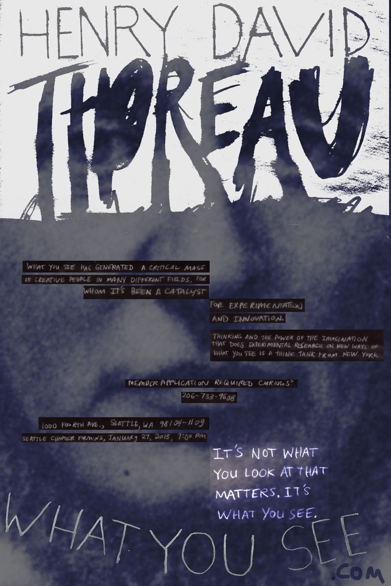
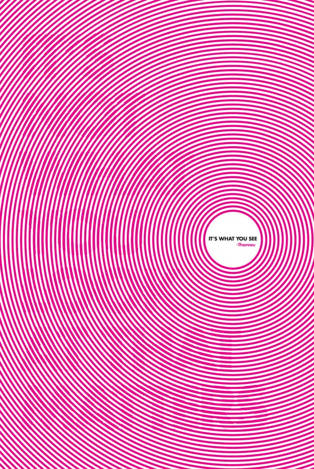
    Roxie Torres Thoreau Poster "It's Not what you look at that matters, it's what you see.
    Roxie Torres’ Thoreau Poster (unofficially voted best in show for our class’ first poster assignment)

    Friday, we brought in samples of posters. All kinds. A typographic poster, an event poster, a poster which educates/informs, a silk screened poster, a show poster, a interactive poster, a letterpressed poster, I brought one of each as did every other classmate and we looked at them in their respective groups. The posters seemed to fit within their genres because the media informs the poster. Letterpress is constricted by color, often characterized by using the grid and typography. Full-flood and knocked out type are difficult because of how the ink is spread. The informational posters needed the right content and context to seem valuable. They were sanserif mostly and the good ones had intriguing headlines. A good poster surprises you, goes above expectations a little. Expectations change from genre to genre. Expectations and Context: It could be fantastic in the right environment (read: Dentist’s office). Good: utilizing the medium, content and cohesion. Let the image and type interact or inform one another. It helps cement your idea into a full impact.

    Interactive Posters
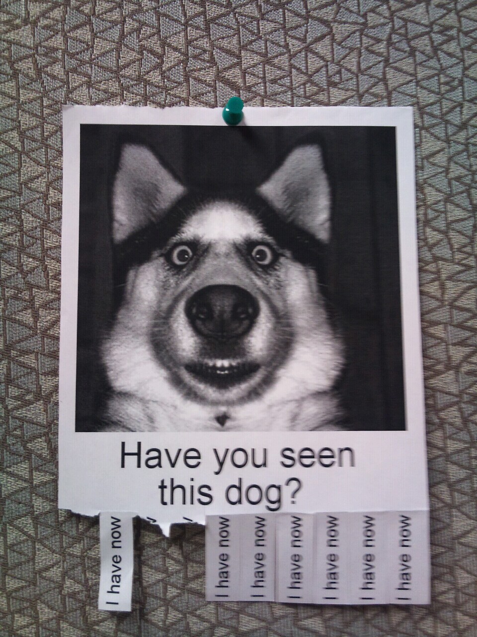
    have you seen this dog?
    One of my favorite posters.

    Interactive is an interesting genre. It doesn’t mean websites, necessarily. The formula for a good interactive poster: good use of material (medium) + idea + expression + interaction. Some interactive posters invite the viewer to take something away (The Most Brilliantly Pointless Street Flyers | Happy Place.) With the evolution of technology, interactive posters are becoming more commonplace (read: QR codes). Sometimes, it’s about having a captive audience. Maybe the poster is on-site, like when you’re waiting at a bus station. An inexpensive dispenser of some kind might be just the hook that makes the brand memorable.

    Tell a Story
    A poster needs to be engaging. To do that it must be simplified so it gets to the heart of the message quick. Get rid of the stuff that doesn’t tell the story. You are taking your viewer on a little ride, they need to know where to start (1) emotional hook. Get them engaged visually with something striking. A poster that changes a space draws attention to it like a magnet. Try to research where your poster might ultimately be and try to engage the space. (2) Emerging text. Use scale, position, negative space, information hierarchy and consistency to guide them through the piece, telling the story with the punchline at the end. (3) The reward. Bad posters conceptually show too much. When telling your story, a little bit of a missing puzzle piece, something subtle will allow the reader to connect with it as if he or she is laughing along with you in a shared secret. Or something evoking like an ambiguous ending or provoking like a discordant juxtaposition that raises questions.

    “When I get an idea I ask myself three questions: ‘Is it beautiful? Is it smart? and does it meet the goal of the end use and the person who pays my bills?’” -Seymour Chwast
    sharing options:

    • Share
    • Share on Tumblr (Opens in new window) Tumblr
    • Print (Opens in new window) Print
    • Share on LinkedIn (Opens in new window) LinkedIn
    • Share on X (Opens in new window) X
    • Share on Reddit (Opens in new window) Reddit
    • Share on Pinterest (Opens in new window) Pinterest
    • Share on Facebook (Opens in new window) Facebook
    • Email a link to a friend (Opens in new window) Email
    Like Loading…
  • Research on Music Videos

    January 14, 2013

    Sprint 1: Research

    Link

    Director:
    Concept:
    Era:
    Notes:
    credits:

    9 Best Music Videos of 2012 | 9. Grimes, “Oblivion” | TIME.com.
    Director: Emily Kai Block
    Concept: Football Game/ Motorcross
    Era: 80’s, sparkly wardrobe, boombox, bulky headphones
    Notes: Recorded at a live event with unsuspecting extras?
    credits: beginning credits

    HYFR (Hell Ya Fucking Right) (Explicit) – YouTube.

    Director: Director X
    Concept: Bar-Mitzfah
    Era: Contemporary
    Notes: dancing, slo-mo
    credits: some intro text, credit to the director in the beginning and at the end

    Hot Cheetos & Takis [HD] – YouTube.

    Director: 13twentythree Photography
    Concept: Playground Rap
    Era: 80s rap culture
    Notes:  frequent cuts back and forth on the beat, children extras
    credits: title of song at the beginning, graffiti typeface for title and end credit to group Y.N. Rich Kids

    Jack White – Sixteen Saltines – YouTube.

    Director: AG Rojas
    Concept: Montage of Surreal Mischief
    Era: 90s
    Notes: special effects, body paint, children extras
    credits: none

    M.I.A. – Bad Girls – YouTube.

    Director:Romain Gavras
    Concept: (see below)
    Era: 80s ?
    Notes: drag racing
    credits: a copyright line, white on black at the end

    “Director Romain Gavras takes all the live-fast-die-young absurdities of rap videos—speeding cars, dazzling stunts and provocative women—and transports them to a bombed-out desert, where they are quickly rendered into nothing but gimmicks in a stunning satire. The result is a chaotic cavalcade of insane feats, wacky dance moves and, as is typical of M.I.A., a deeply political streak running through it. The most arresting image is of M.I.A. nonchalantly filing her nails on top of a car as it careens on two wheels, which is simultaneously invigorating, frightening— and completely bad ass.”

    via 9 Best Music Videos of 2012 | 4. M.I.A., “Bad Girls” | TIME.com.

    Explosions In The Sky – “Postcard From 1952” music video (HD) – YouTube.

    Director: Peter Simonite and Annie Gunn
    Concept: Nostalgia
    Era: 50s
    Notes: slo-mo, people and children playing
    credits: none

    Aimee Mann – Labrador – YouTube.

    Director: Tom Scharpling
    Concept: (See below)
    Era:
    Notes:
    credits: interview-news style credits

    The video stars John Hamm as an overbearing version of director Tom Scharpling—portraying him as a greasy huckster video director who wants to do a shot-for-shot remake of ‘Til Tuesday’s “Voices Carry.” (Students of the ’80s will recall that Til Tuesday was the group Mann fronted before her solo career.) In the video Mann balks at the concept, but claims she was tricked into signing a contract and is now obligated to go forward with it. The result is exactly what you’d expect: A mind-blowingly hilarious shot-for-shot remake of “Voices Carry” with Superchunk/The Mountain Goats’ drummer Jon Wurster standing in for the vaguely abusive boyfriend and a cameo by Ted Leo in an atrocious wig. The laugh-out-loud video is the perfect antidote to “Labrador,” the somewhat depressing song off of Mann’s Charmer LP about a hopelessly one-sided relationship.

    via 9 Best Music Videos of 2012 | 2. Aimee Mann, “Labrador” | TIME.com.

    Grimes – Genesis – YouTube.

    Director: Claire Boucher
    Concept: Surreal Post-Apocalypse?
    Era: 2010s
    Notes: live snakes, elaborate wardrobes, riding in a car, band of characters, dancing
    credits: dancing with fireworks

    Wilco – “Sunloathe” – YouTube.

    Director: Directed by Peter Glantz. Art by Nathaniel Murphy.
    Concept: Fantasy monsters
    Era: 70s
    Notes: made up critters, mixed media, clay-mation with traditional animation, patterns
    credits: animated name of song and band at beginning

    Kanye West [MERCY] ft. Big Sean, Pusha T, and 2 Chainz on Vimeo

    Director: NABIL
    Concept: Geometric space (parking lot?)
    Era: 2000s
    Notes: hide and reveal characters, black and white, surreal space
    credits: end copyright line

    Rufus Wainwright – Out of the Game on Vimeo

    Director: Phillip Andelman
    Concept: Librarian stuck at a bad day at work
    Era: 60s?
    Notes: Starring Helena Bonham Catter
    credits:

    Something I noticed about some of them: they give a reason for the video to end, snuffing out a flame, panning away,

    sharing options:

    • Share
    • Share on Tumblr (Opens in new window) Tumblr
    • Print (Opens in new window) Print
    • Share on LinkedIn (Opens in new window) LinkedIn
    • Share on X (Opens in new window) X
    • Share on Reddit (Opens in new window) Reddit
    • Share on Pinterest (Opens in new window) Pinterest
    • Share on Facebook (Opens in new window) Facebook
    • Email a link to a friend (Opens in new window) Email
    Like Loading…
  • Winter After Effects Quarter Mission Statement

    January 14, 2013

    WINTER AFTER EFFECTS PROJECT

    This quarter, I am planning on working with Matt Nyce and his band, WIMPS, to create a music video to their song “Nap.” From, mood boards, to story boards, to shooting, editing and producing the youtube video with links at the end of the video. I anticipate this (with some focus) will take 5 weeks, then in the following 4 weeks, I will make a video (with a similar process) for my portfolio website introducing myself like this one: : ) by Steven Harrington – YouTube.  Building off of my project last quarter, I will be using After Effects integrated with video to create a unique and engaging experience. Additionally, I’m working on concepting skills, working with others, art-direction, planning, video, technical challenges like uploading to YouTube, adding links and self-promotion.

    sharing options:

    • Share
    • Share on Tumblr (Opens in new window) Tumblr
    • Print (Opens in new window) Print
    • Share on LinkedIn (Opens in new window) LinkedIn
    • Share on X (Opens in new window) X
    • Share on Reddit (Opens in new window) Reddit
    • Share on Pinterest (Opens in new window) Pinterest
    • Share on Facebook (Opens in new window) Facebook
    • Email a link to a friend (Opens in new window) Email
    Like Loading…
  • Drawing Club Meeting

    January 10, 2013

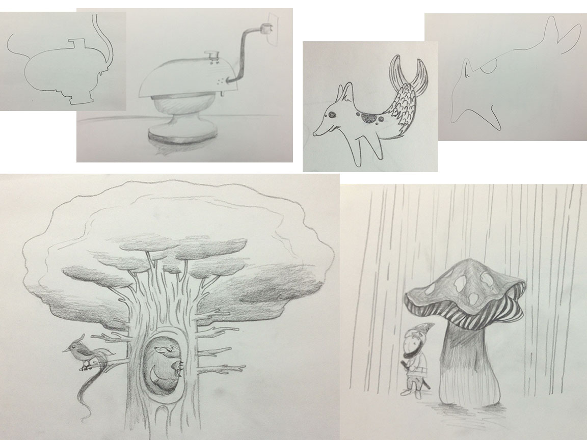
    drawing-clubDrawing club. We drew this together. We did the collaborative drawing exercise, drawings that we took turns drawing one line at a time until a vague picture formed then each of us reinterpreted the drawing. This is a great exercise when you don’t know what to draw. The bottom drawings are when we worked on a picture for fifteen minutes then switched and added to the other person’s drawing.


    sharing options:

    • Share
    • Share on Tumblr (Opens in new window) Tumblr
    • Print (Opens in new window) Print
    • Share on LinkedIn (Opens in new window) LinkedIn
    • Share on X (Opens in new window) X
    • Share on Reddit (Opens in new window) Reddit
    • Share on Pinterest (Opens in new window) Pinterest
    • Share on Facebook (Opens in new window) Facebook
    • Email a link to a friend (Opens in new window) Email
    Like Loading…
  • Logo Practice: Prancing Pirate

    January 10, 2013

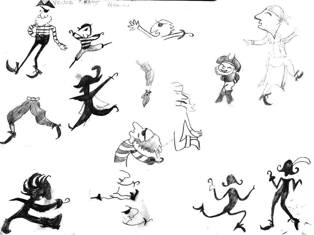
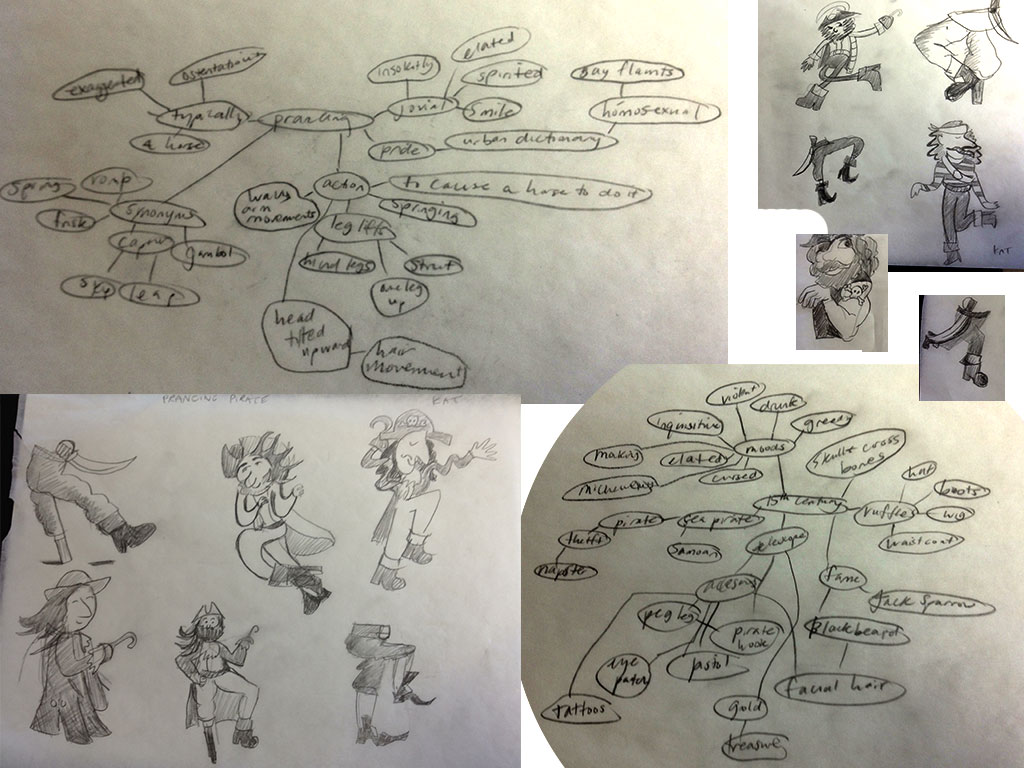
    As part of the first exercise for logo class, Tom had a list of random words and verbs, assigning to each student a new brand. The goal is a pictorial logo, my brand: Prancing Pirate. I generated word maps with some dictionary definitions and inspiration from Google Images search. I started off pretty cartoony and then slimmed them down to the essence.

    word map and initial sketching
    word map and initial sketching

    pirate-prancing2

    Tom said this is prancing.
    Tom said this is prancing.
    The logo (the client requested black and white)
    The logo (the client requested black and white)
    The final logo after Tom suggested some edits.
    The final logo after Tom suggested some edits.

    sharing options:

    • Share
    • Share on Tumblr (Opens in new window) Tumblr
    • Print (Opens in new window) Print
    • Share on LinkedIn (Opens in new window) LinkedIn
    • Share on X (Opens in new window) X
    • Share on Reddit (Opens in new window) Reddit
    • Share on Pinterest (Opens in new window) Pinterest
    • Share on Facebook (Opens in new window) Facebook
    • Email a link to a friend (Opens in new window) Email
    Like Loading…
  • Wayfinding Exercise #1: Seattle Central Audit

    January 8, 2013

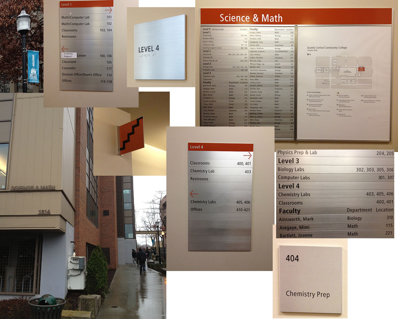
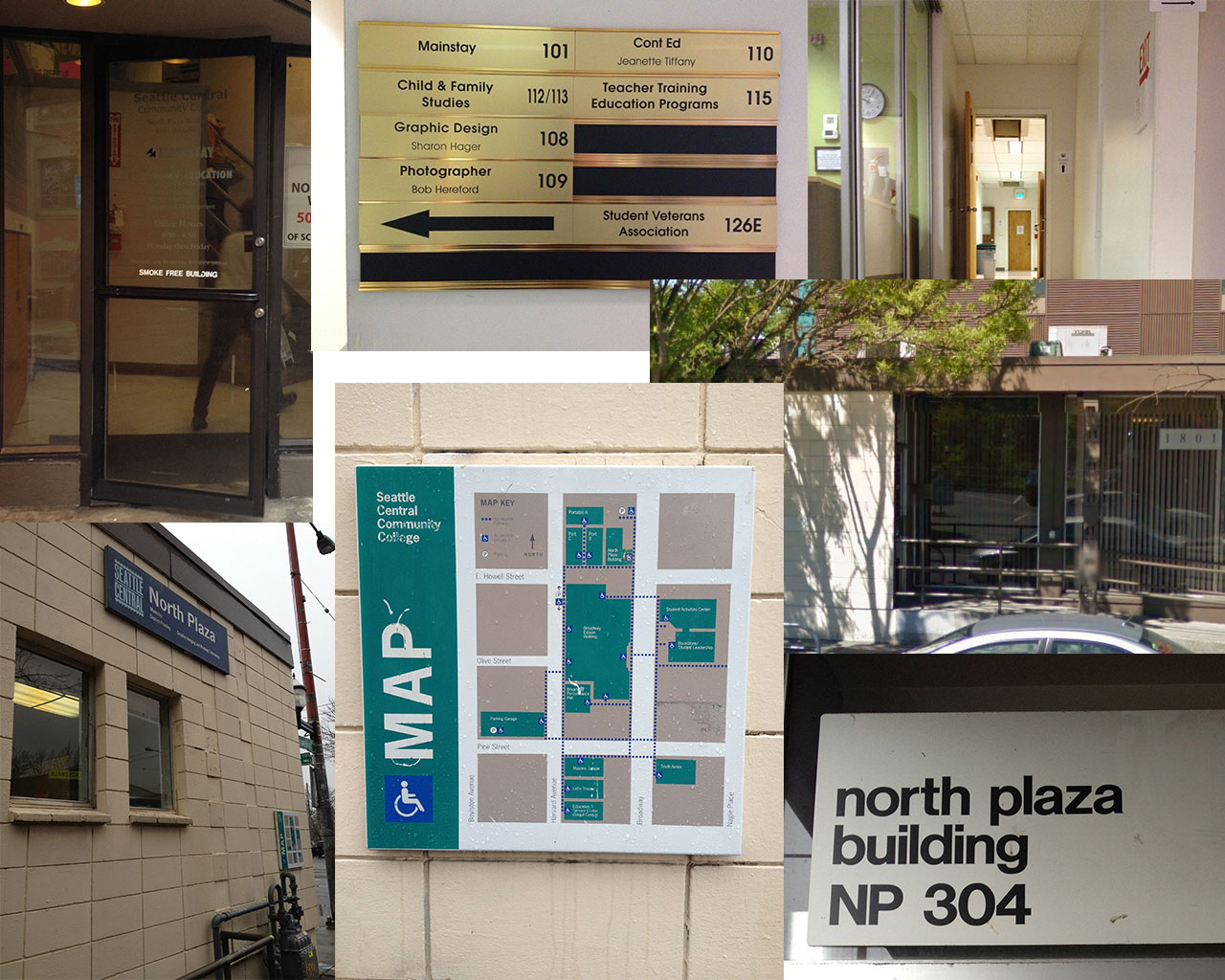
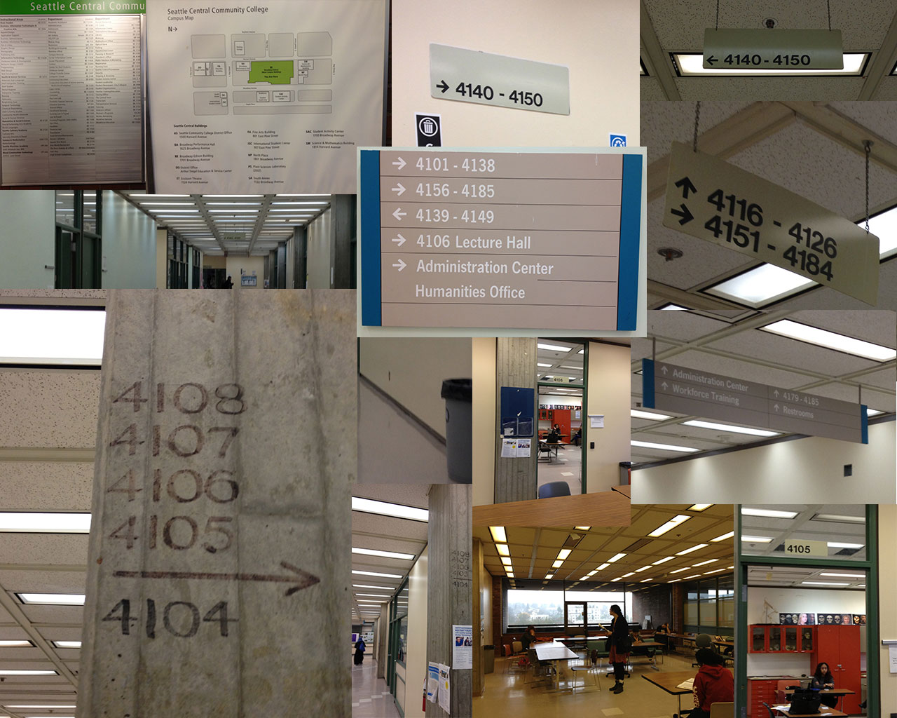
    Today in groups of two or three, students from the Environmental Graphic Design class scoured Seattle Central Community College and took notes on how easy (ridiculous) it was to find random classrooms. My team (Joyce and I) were assigned to find “SAM 404, NP 304 and BE 4105” from the North Back entrance (entrance most north and on the west side of the campus). The way this is phrased is really crucial because that is how room numbers are listed in registration, the room numbers’ abbreviated building designations, but the building signage is sometimes abbreviated, sometimes not.

    Pursuit of SAM 404
    Things that worked: Sign on side of the building facing, all caps bold permanent fixture. Banners that said “Welcome to Seattle Central” in blue. After entering building, the map and directory is on the right, official placard, clear map. We took the stairs (stairs had a sign in front of it, pretty clearly indicated stairs with a simple zig zag). Nice orange theme.

    Things that didn’t work: Building sign not at the entrance of Science and Math Building (also one must infer that SAM means Science and Math). SAM 404 not listed on directory (one must infer that it’s on the fourth floor due to standards). Once on the fourth floor, we had to go left to find further wayfinding signage (it’s right in front of the elevator, so if you go by elevator, it is a better experience). Signage in front of elevator not terribly helpful. Deciding to find the room number by looking at adjacent numbers then logically proceeding to the next one in sequence until we found it. We found “404A Chemical Storage” first then proceeded to “404 Chemical Prep.”

    Pursuit of SAM404
    Pursuit of SAM404

    Pursuit of NP 305
    Things that worked: There is signage on the North Plaza that says “NP” so we knew which building to circle for more information. Sign on side of the building facing east, all caps bold black permanent fixture says North Plaza. There’s a map affixed to the wall facing south on the building as well.

    Things that didn’t work: White lettering on glass on a door didn’t stand out too well. It turns out that the first floor isn’t connected to the third floor. There was signage indicating the various rooms on the first floor (gold placard), but no indications to stairs or no. Sign that says NP 305 in bold black san serif lettering only visible from handicap ramp which is the only way to get in.

    Pursuit of 304
    Pursuit of 304

    Pursuit of BE 4105
    Things that worked: Upon entering the main building from the north (one must infer that BE stands for Broadway Edison building which I don’t think people would assume, but there is a big all caps bold black permanent fixture says Broadway Edison). There’s a map and directory on the right after you enter. On the fourth floor signs outside of the elevator also clearly designed and helpful.

    Things that didn’t work: There’s a map and directory on the right after you enter, but it didn’t list BE 4105. The directory was arranged by department, finding the room numbers were difficult (and impossible for this particular location). We inferred that it was on the fourth floor and took the elevator and followed signage placed on the right which pointed down the corridor. There was a fork in the road with mutually excluding signage but also excluding our room number. We followed 4106 around which turned out to be a block, numbers following (in this order): room 4106G, 4106K, etc. We followed them around a corner where the trail seemed to run cold until I spotted magic marker on a cement pillar two feet above eye-level, which we followed to a “sack in a cell” and found 4105 (its sign hiding behind another cement pillar) in a corner next to a collection of desks.

    Pursuit of BE 4105
    Pursuit of BE 4105

    The Team’s Suggestions: All encompassing portable paper map with index that’s arranged by room number. Maps on each floor. A detailed map at the bottom of each building with a directory accounting for every room. Consistent conventions. We noticed the Science and Math building had consistent orange theme and more consistent signage (probably because it was built rather recently).

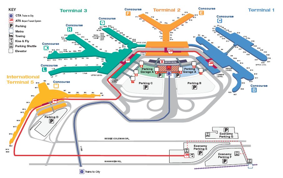
    1)There needs to be a map of North Plaza building with room numbers located near entrances so visitors realize that it is most efficient to enter at the east entrance for room 304 instead of the south entrance which doesn’t give any hints as to through connecting to 304.

    O'hare Terminal Map. It's easy to indicate location of a room. It's another thing to indicate its entrance.
    O’hare Terminal Map. It’s easy to indicate location of a room. It’s another thing to indicate its entrance.

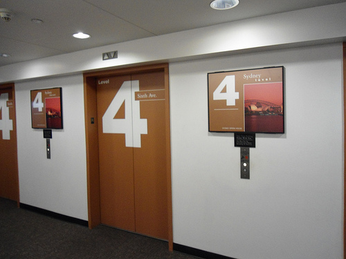
    2) Recommend bright color palate and mnemonic object for differentiating floor and building. (Hanging ceiling signs can’t be black and white; they blend into tiling and light fixtures. And white on grey does not stand out.)

    Pacific Place Parking Garage: Level 4 is Sydney and Orange
    Pacific Place Parking Garage: Level 4 is Sydney and Orange

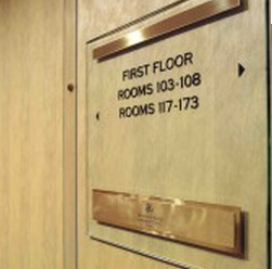
    3) Signage that lists specific room numbers individually loses some numbers that are also there. Perhaps something like Mayfair Hotel’s room signage.

    mayfair hotel room signage wayfinding
    mayfair hotel room signage

    sharing options:

    • Share
    • Share on Tumblr (Opens in new window) Tumblr
    • Print (Opens in new window) Print
    • Share on LinkedIn (Opens in new window) LinkedIn
    • Share on X (Opens in new window) X
    • Share on Reddit (Opens in new window) Reddit
    • Share on Pinterest (Opens in new window) Pinterest
    • Share on Facebook (Opens in new window) Facebook
    • Email a link to a friend (Opens in new window) Email
    Like Loading…
  • Thoreau Poster

    January 7, 2013

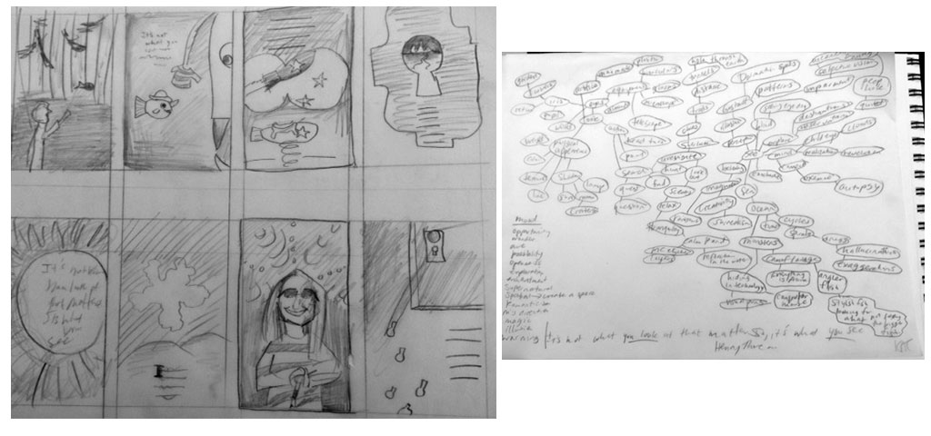
    posterbrainstormAssignment: “Design a 12 X 18 poster with the following quote: It’s not what you look at that matters, it‘s what you see. – Henry David Thoreau

    The quote must appear on the poster. You may do anything you like for illustration, photography, media, etc. Print scale to fit on a 12” x 18” paper for critique next week. You will also need to place your file as a .jpg in my drop folder. It should be 240 dpi and named as follows: Poster1_YourLastName.jpg Bring in your digital files of this poster for next week’s class.”

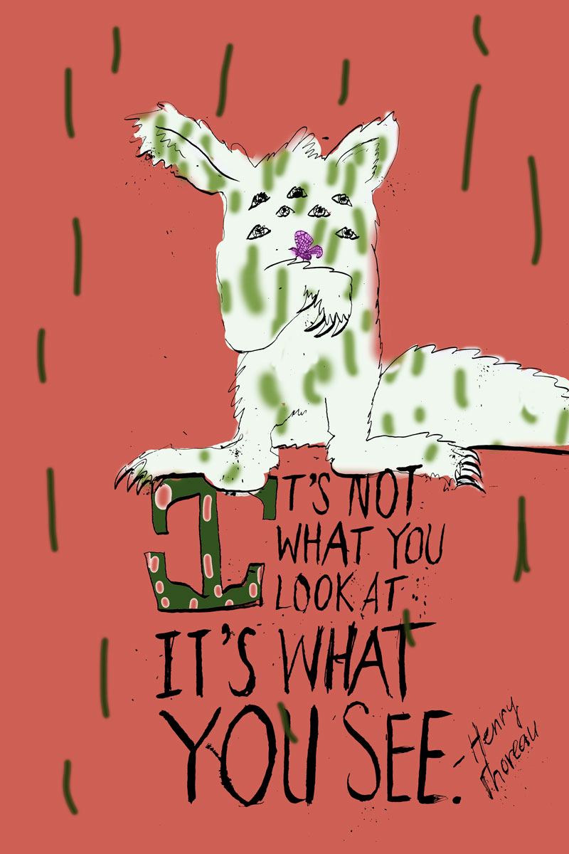
    I am not quite sure where to go with this. I brainstormed and put out some thumbnails but didn’t feel like anything was truly original. Here’s an attempt. After finishing, I realized I want to think about it some more. I like the idea of doing something wild, but I don’t think this is it. I am going to let my ideas cook a little more.

    It's not what you look at, it's what you see.

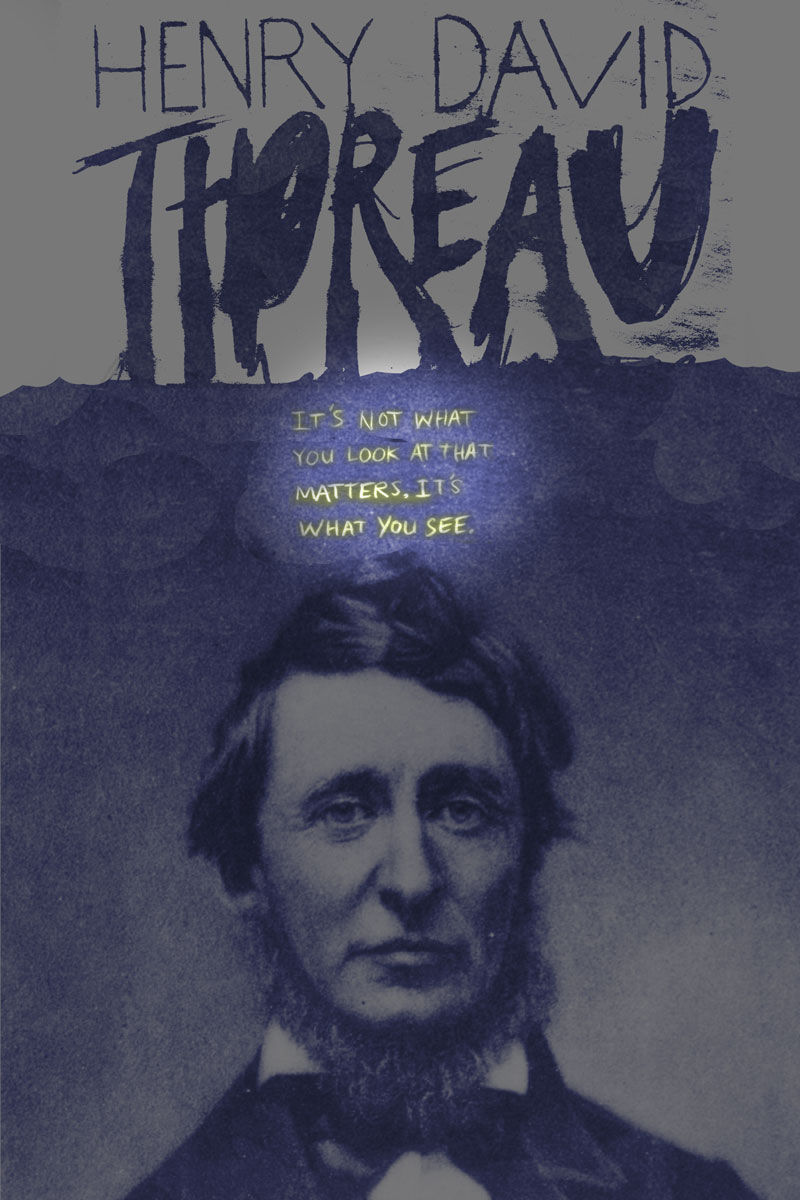
    Update 1-10-13: I think that this is kind of a difficult assignment because the quote’s so generic. I decided to make it biographical and put a picture of Thoreau (and get the quote right).

    thoreau

    Update 1-11-13: After critique, after Jill saying that I needed to integrate the type and the image more (and that the type has the “emotional hook”), Jill added more copy to the poster. It’s now an event poster for a think tank. Here’s the extra copy: “What You See is a think tank from New York that does experimental research on new ways of thinking and the power of the imagination.  What You See has generated a critical mass of creative people in many different fields, for whom it‘s been a catalyst for experimentation and innovation. Seattle chapter forming, January 27, 2013, 7:00 pm, 1000 Fourth Ave., Seattle, WA 98104-1109. Member application required. Curious? whatyousee.com 206-733-9608.”

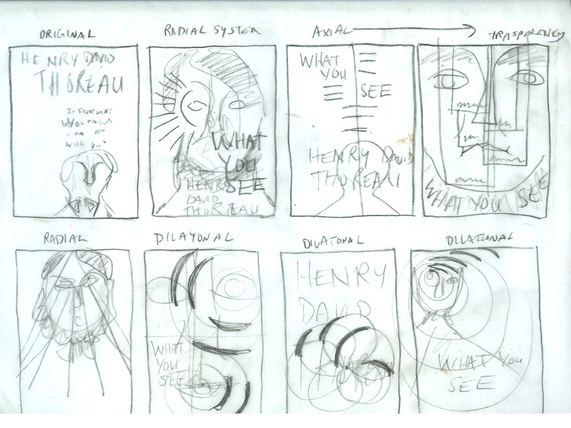
    She encouraged us to read an excerpt from Typographic Systems of Design: Kimberly Elam and then sketch out potential solutions for the new copy integrating with the poster.

    grids and thubnails

    thoreau3
    This poster uses an axial grid.


    sharing options:

    • Share
    • Share on Tumblr (Opens in new window) Tumblr
    • Print (Opens in new window) Print
    • Share on LinkedIn (Opens in new window) LinkedIn
    • Share on X (Opens in new window) X
    • Share on Reddit (Opens in new window) Reddit
    • Share on Pinterest (Opens in new window) Pinterest
    • Share on Facebook (Opens in new window) Facebook
    • Email a link to a friend (Opens in new window) Email
    Like Loading…
  • CDK: Web Design Phase 1

    January 7, 2013

    Assignment: Wordpress.org site

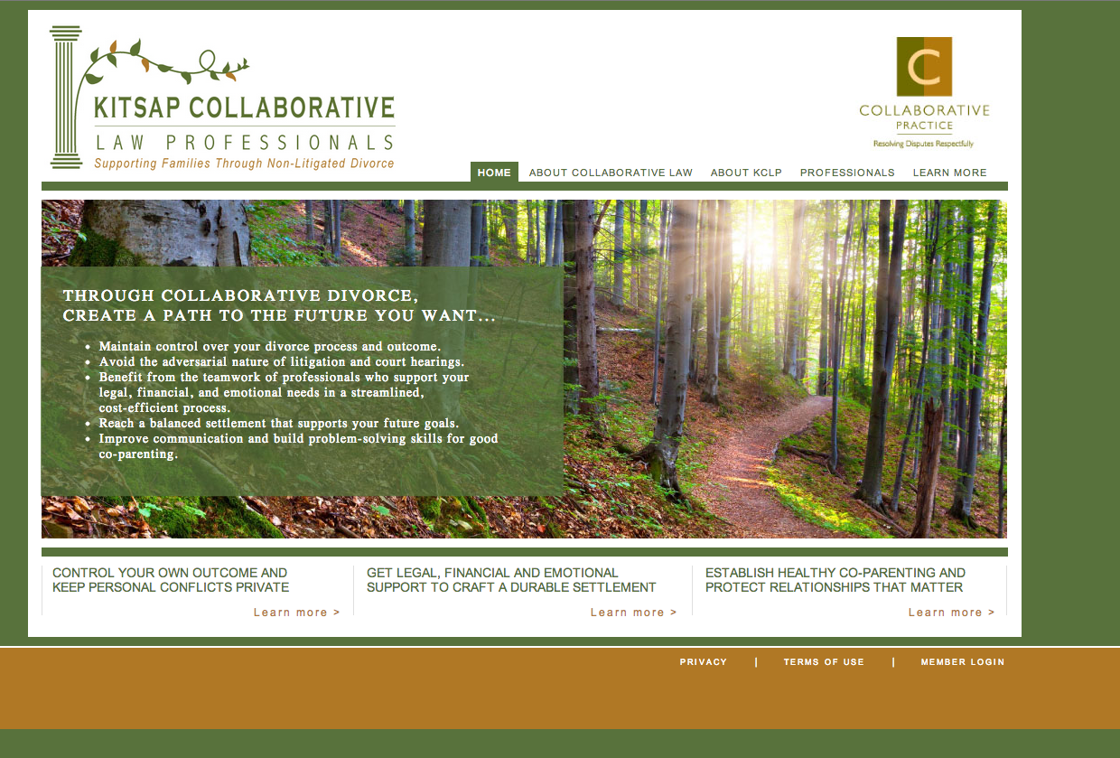
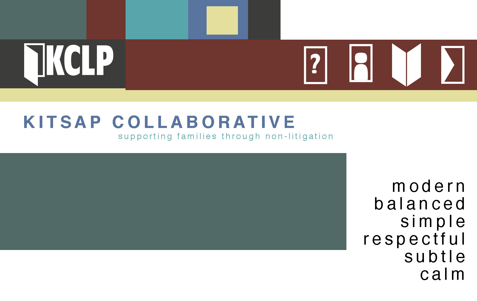
    I’m going to rebrand and restructure the information on this website: Kitsap Collaborative Law Professionals.

    Current look
    Current look

    Phase 1 of Web Design

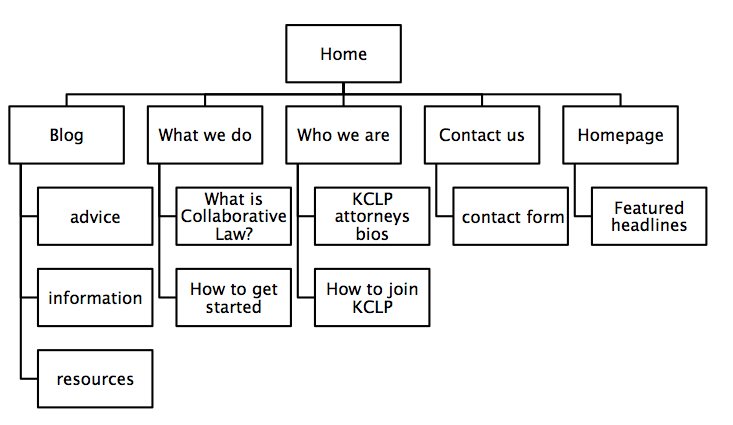
    1. structure information with user-centered considerations (Site Map) *Research the competitors (Links) and content (html)

    cdk site map
    cdk site map

    Financial Advisor Training – The Legacy Companies.

    Lawson Lundell: Business Law Firm | Western Canada.

    SJ Berwin | The International Law Firm.

    Axiom Law.

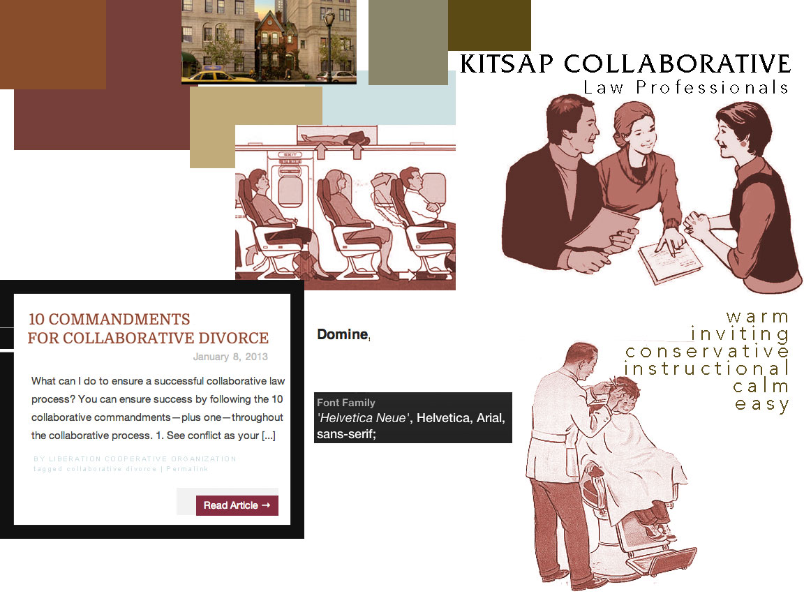
    2. communicate style and function Branding

    ckstyletile

    Update 1-10-13: After presenting to the class, the feedback was negative regarding the imagery and overall look I chose. I introduced it saying I wanted to bring back those cute pamphlets but I forgot how ridden they are with judgement and vestiges of a puritanical culture that would be scolding divorce, especially for women and the practical solution is to stick with mostly typography. The lovely Emily directed me to Matter where they use photography of people-less spaces, typography and color blocking to inform their audience.

    Screengrab of Matter.vc
    Screengrab of Matter.vc

    Update 1-21-13: Here’s a new style tile to go with my new approach. (I’m still exploring typographic options.)

    style-tile

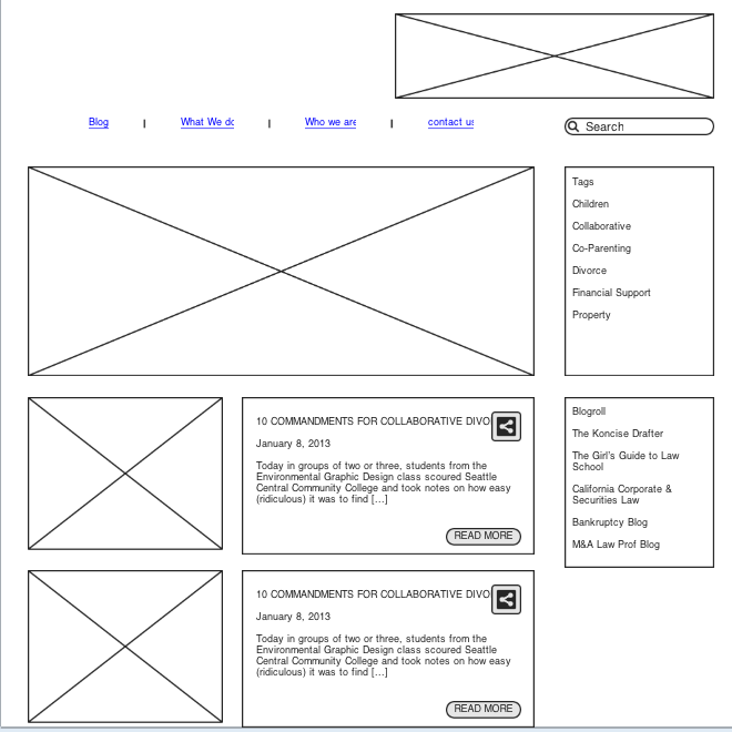
    3.wire-framing explore more efficient layouts (Don’t forget Advertisements!)

    wireframe cdk blog

    4. understand mobile strategy and other media requirements Client wants 3 layouts– mobile, tablet (landscape), and desktop

    3 layouts responsive

    sharing options:

    • Share
    • Share on Tumblr (Opens in new window) Tumblr
    • Print (Opens in new window) Print
    • Share on LinkedIn (Opens in new window) LinkedIn
    • Share on X (Opens in new window) X
    • Share on Reddit (Opens in new window) Reddit
    • Share on Pinterest (Opens in new window) Pinterest
    • Share on Facebook (Opens in new window) Facebook
    • Email a link to a friend (Opens in new window) Email
    Like Loading…
Previous Page Next Page

Blog at WordPress.com.

Loading Comments...
  • Subscribe Subscribed
    Kismet Arts Tangent
    Join 102 other subscribers

    Have a WordPress.com account? Log in now.

  • Kismet Arts Tangent
    View site in Reader
    Manage subscriptionsSign upLog in
    Report this content
    Collapse this bar
%d