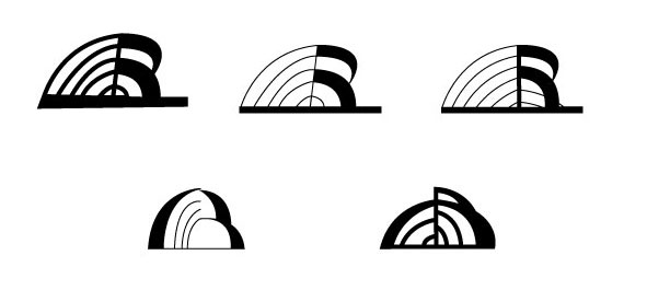
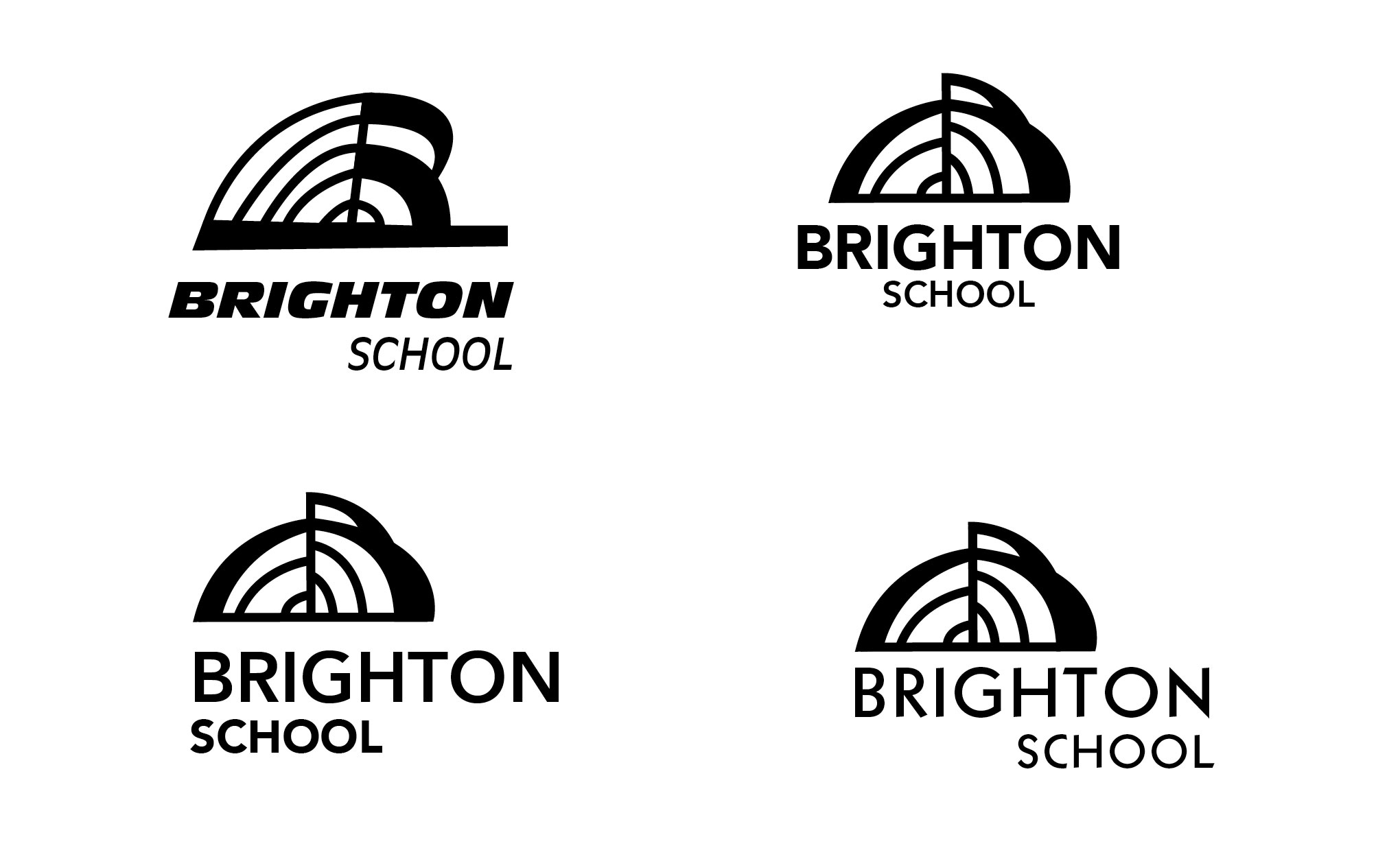
 After translating my sketches into vector, I eliminated a few that I thought had some potential. After adding type, I think the top left one is slightly too slanted and bottom heavy. I’m not sure about the type exactly, but I think it’s a promising inquiry and after tomorrow’s critique, I’ll have a better sense of how type interacts with an abstract mark.
Update: 1-30-13
Critique: shorten up the word so its edges align with the mark’s edges. March type with the irregularities of the logo. Make “school” bolder, it’s just hanging out down there.
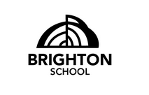
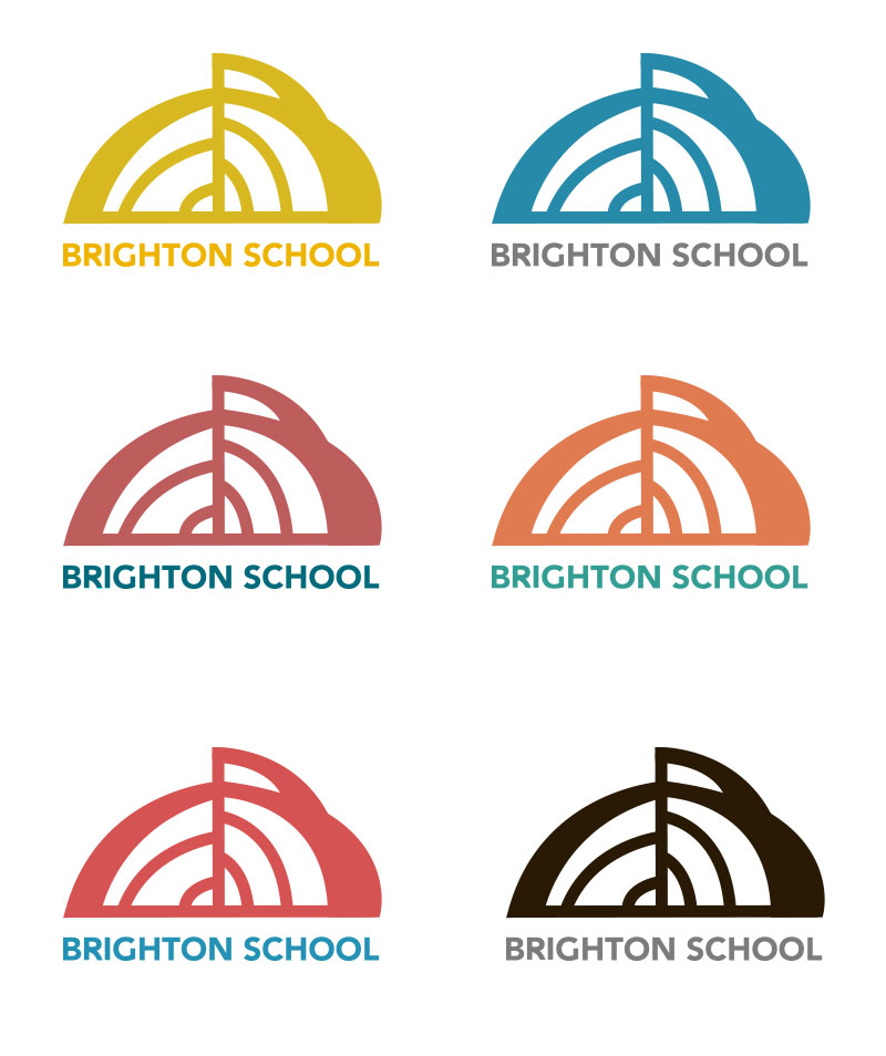
Edits: I adjusted some of the letter forms, note the “r” to match the roundness of the mark and I eliminated the step on the “g.” And put everything on one line and aligned the edges. And then to decide on color…


Leave a comment