My first iteration of the Brighton School Stationery suite.
Update 2-6-13: Critique and Edits
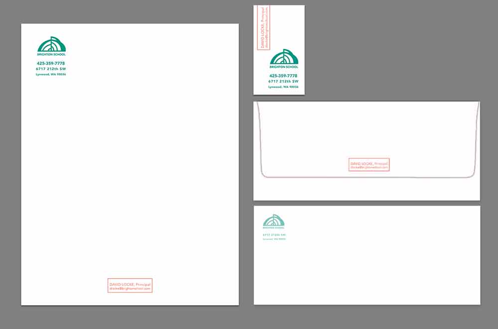
Tom “Frank-bombed” the class. Frank is this discerning older man from Alaska that has been around New York and the design scene in general and Tom invites him to critique to make us cry. I think it’s the opaqueness of Frank’s glasses’ clip-ons. Those orangey pink reflections hide a stare, or a pair of sleeping eyes… hard to tell sometimes. But, he really knows his stuff and isn’t afraid to tell you (multiple times, I might add) the phrase “I don’t know why you did this. This makes no sense.” That’s the part where I was like, “awww…” I thought I had done okay. He didn’t like the “rubber stamp” look of how I treated the red part and the logo was crowded by the other text through color and proximity.
Here’s my redesign. I like the orange and green. It’s like a sun coming up from a grassy lawn of letters.


Leave a comment