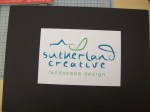
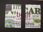
This morning, my mind was blown by the small god-gift of the perfect pattern. I was browsing at Blick’s Art Supply, looking for the right off-white paper for Sutherland Creative’s letterhead –I chose Lily! — When I was also keeping an eye open for a lining for my envelope. The design of my suite so far was someone sparsely populated and if there was one thing that could be busy, it was the inside of the envelope (and I decided that I wanted to line it with a specialty paper versus just printing double-sided– mostly because I don’t trust school printers). I considered a 10.99 white lacy paper, but my frugality won out. I considered a bright green fibrous paper, but something about it seemed garish and the muted teal frumpy. I browsed the origami paper, courted by some patterns, but not enough to by their counterparts (damn sets!). A cove of clearance almost forgotten in the back of the store became one of those patches of grass where it looks like sunlight is streaming through a blanket of clouds like a transmission from the heavens. There sitting so modestly, was the cutest pattern– practically the same colors as my logo! — And matching my newly discovered Lily-colored paper, I was the happiest girl in the world. It was the missing link, giving my mood board and my stationery a tether of color and texture. (It’s always lovely to see a mood board and product match in a non-literal way.)
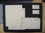
Seeing everything in its polished stage, lined envelope, sturdy business card, aligned labels, I felt like a magician, pulling a designed suite out of my hat. I’m surprised it’s alive and I am curious how it got there. I guess that’s what learning is. When done right, it feels like you were channeling mystical forces for your power, and you were, and you call that source, teacher.
POST CRITIQUE
Today’s presentation took long enough to happen. I had confidence I didn’t deserve. I took my 15×20 presentation boards to the room. Firstly there were two easels. Confusing. Should I stand close to my audience, or not? A thing to know about my audience. It was a German dude. Just one guy, a designer. Another designer was present but the former presentations took up the time she had to spare for us lowly first-years, so I was presenting to a man wearing a black sweater and thick black rimmed glasses. Someone who obviously knows more than me, I mean, he shops at the clothing store that all successful designers shop at. (That’s how they all look the same, chic and clad in black, sometimes with a splash of color, if you’re a lady.)
He sat there with the camera off (Douglas Sutherland would never see this presentation) and I felt like the kid at the ballet recital whose not worth her parent’s love. They tell you that they are busy, hard-working, making money so they can feed you later, but what it comes down to is abandonment. The whole quarter of sketching, copy/pasting, showing the class my ineptitude in various arenas, and for all that, hoping metabolizing the feedback I would make something my dad could be proud of and he doesn’t show. He was never going to show and he told me that, but it really hits you how fake school can be. These class projects– they can try to make it seem like there’s something real and practical about this project, someone whose brand is going to change because of your ideas, your vision, but it’s the Matrix. Robot designers going through their library of knowledge.
Here’s what the bespectacled German said to me after I uttered my shameful line, “Any questions?” He firstly commented that it was admirable that I went for a hand drawn type (firstly incorrect, I pen tooled it, roughly tracing over a script I found online) and I hesitated to ask if I had done a good job with that custom font, but I worried interrupting, thinking that might be the only remotely positive feedback I got this session.
He commented on my little seedlings, saying that he understands the concept, but the bits are too similar to each other to eloquently represent it. He thought the lines up top had too much weight similarity with the words “Sutherland creative” and additionally thought that the shift in font size on my packet label left some consistency to be desired. I didn’t want to argue. It’s true. If you are going to make those choices about font size, there has to be a frame of reference. Each paragraph on that label was a different font, and I am realizing that in a designer’s mind, even if it’s Helvetica, paragraphs, all of varying sizes, is like a circus. A bad one at that. So, I will try not to be such a typography floozy– stay true to some kind of normal.
He said my seed packet didn’t match anything aesthetically. The punched out words on the front made him inquire: do you have different versions of the logo? Do I… what? I had the request from the client in the creative brief to include bright green. I don’t mind that, but how do you integrate the same color in two versions where one is the opposite of the other but bright green can’t carry itself. It’s an accent! So, yes I could have other versions if I could toss out bright green. I could have other versions if I cut the client’s name in half! What expectations do designer’s feed these people? Is that an industry standard? Bastardize the logo? That was something I was acutely aware of in this project, but even then… is the color scheme sacred? Or is the outline of the logo the only thing that needs to be consistent when creating a brand.
My package didn’t prominently feature the website for the company. I stared at this thing for hours, tweaking the logo, the copy, etc. and I never thought how I would use it if I wasn’t so inundated with this person’s company. What if I was a stranger who never heard of Sutherland Creative (a name I now can never delete from my hard-drive), how would I look at this package, and would I think the whole time, this is cute and all, but where’s the goddamn website?!
Alas. Now, I know. It’s my first time and all, but still I didn’t know there would be this much blood. My heart went into many parts of this and was crumbled and tossed into the garbage like a bad logo design. I can move on from this. Knowing what I know, I’ll make the font consistent, the logo interesting and the information apparent. I’ll be better, you’ll see. You’ll be proud of me. I thought the rules of design were more like suggestions. I feel like a little kid who wanders from her parents just to see where the boundaries are.