Skip to content

Kismet Arts Tangent

Art Collective

    • Fall Program
    • About
    • Blog
    • Contact

recent posts

  • Project Planning
  • Peppermint Products
  • Writing Prep List
  • Automatism
  • Latha’s Prattles

  • Instagram
  • Clear Mist

    February 7, 2012

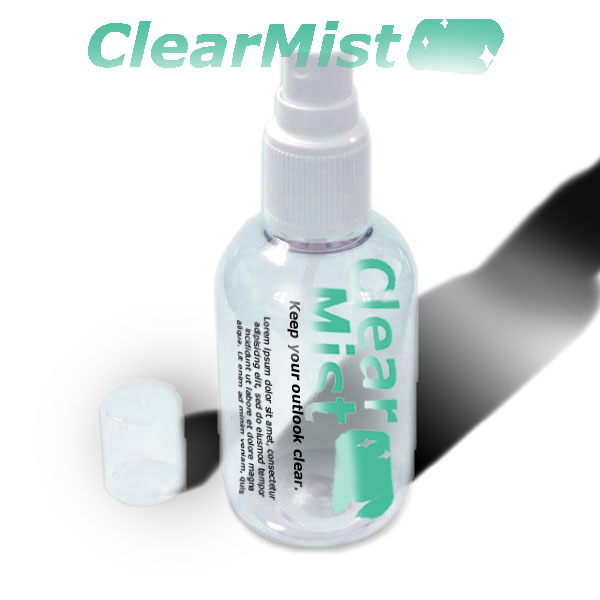
    I made this logo for a friend of mine. He is currently going to UW Business school and the students of a marketing class grouped up and found/made up products to brand and market.

    Clear Mist is a car window defogging spray whose main message is of eco-friendliness. The group in this case gave me a little feedback regarding the leaves in the logo (how they were distracting, and in the end, we opted for a fade of the type, to give it a misty feeling.

    Here’s a photoshop mock up of the product’s packaging and part of the ad.

    sharing options:

    • Share
    • Share on Tumblr (Opens in new window) Tumblr
    • Print (Opens in new window) Print
    • Share on LinkedIn (Opens in new window) LinkedIn
    • Share on X (Opens in new window) X
    • Share on Reddit (Opens in new window) Reddit
    • Share on Pinterest (Opens in new window) Pinterest
    • Share on Facebook (Opens in new window) Facebook
    • Email a link to a friend (Opens in new window) Email
    Like Loading…
  • Cookbook

    February 6, 2012


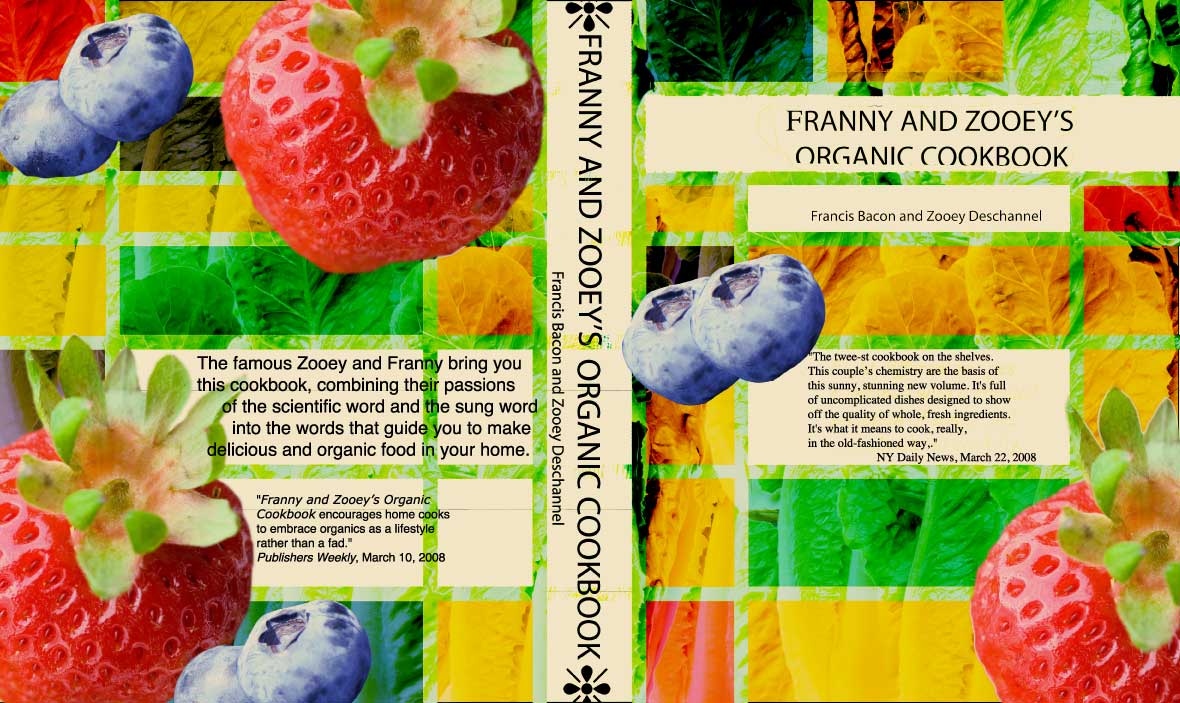
    As a design piece, I know that I perhaps should have found different fonts and maybe refrained from the dingbat route, but as a concept (Francis Bacon meets Zooey Deschannel and they make a cookbook together)… Aww right!

    sharing options:

    • Share
    • Share on Tumblr (Opens in new window) Tumblr
    • Print (Opens in new window) Print
    • Share on LinkedIn (Opens in new window) LinkedIn
    • Share on X (Opens in new window) X
    • Share on Reddit (Opens in new window) Reddit
    • Share on Pinterest (Opens in new window) Pinterest
    • Share on Facebook (Opens in new window) Facebook
    • Email a link to a friend (Opens in new window) Email
    Like Loading…
  • Photo Essay — Olivier Wevers

    February 5, 2012

    This slideshow requires JavaScript.

    Olivier

    View more PowerPoint from basementcat
    The photo essay module finished up this week. I learned something from it, I think. It was fun writing parts of the copy for this. The accordion book turned out better than I thought it would. The format for the presentation of this thing changed a few times, so it was gratifying to finish it, even with its imperfections and informality. Some glue that was used warped the photographs slightly. The black text on grey cardstock looked really crisp to me. A way to add edge without sacrificing readability. My teammates Meryl and Michelle were great to work with. I really liked their energy and great ideas. Coming up with solutions for problems that rose along the way was exciting.

    sharing options:

    • Share
    • Share on Tumblr (Opens in new window) Tumblr
    • Print (Opens in new window) Print
    • Share on LinkedIn (Opens in new window) LinkedIn
    • Share on X (Opens in new window) X
    • Share on Reddit (Opens in new window) Reddit
    • Share on Pinterest (Opens in new window) Pinterest
    • Share on Facebook (Opens in new window) Facebook
    • Email a link to a friend (Opens in new window) Email
    Like Loading…
  • House

    February 1, 2012

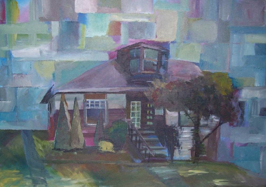
    painting of a house cubism blue

    I painted a picture of my house. Yup.

    sharing options:

    • Share
    • Share on Tumblr (Opens in new window) Tumblr
    • Print (Opens in new window) Print
    • Share on LinkedIn (Opens in new window) LinkedIn
    • Share on X (Opens in new window) X
    • Share on Reddit (Opens in new window) Reddit
    • Share on Pinterest (Opens in new window) Pinterest
    • Share on Facebook (Opens in new window) Facebook
    • Email a link to a friend (Opens in new window) Email
    Like Loading…
  • sc

    February 1, 2012

    update after critique:

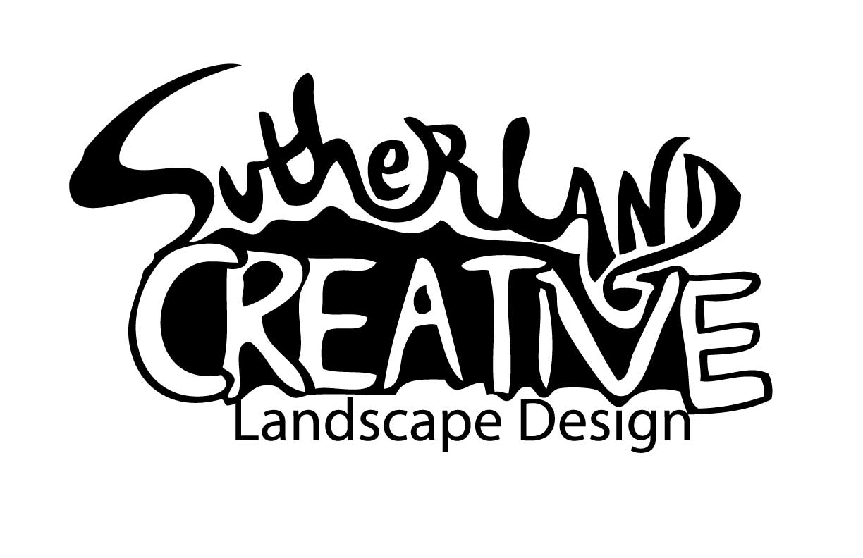
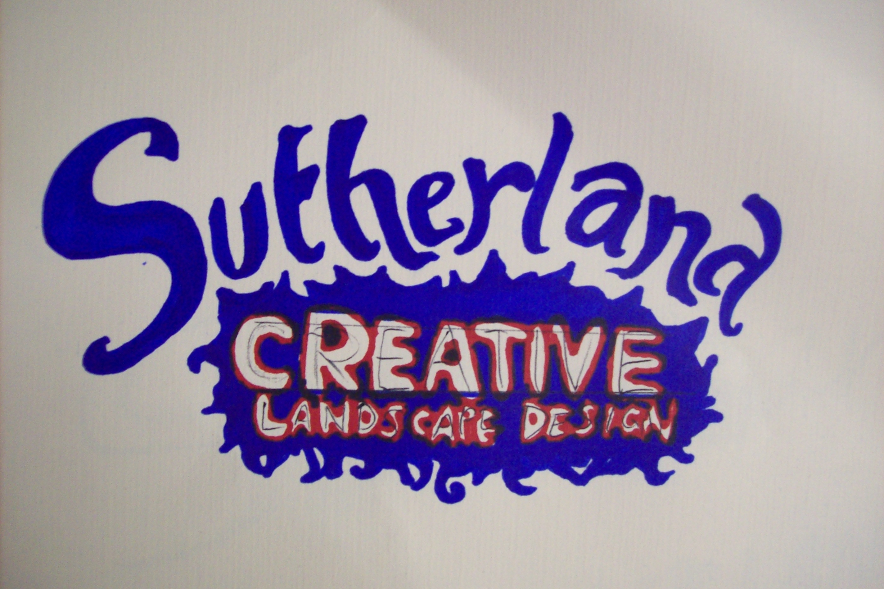
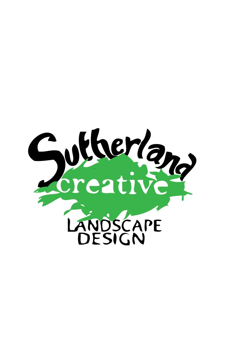
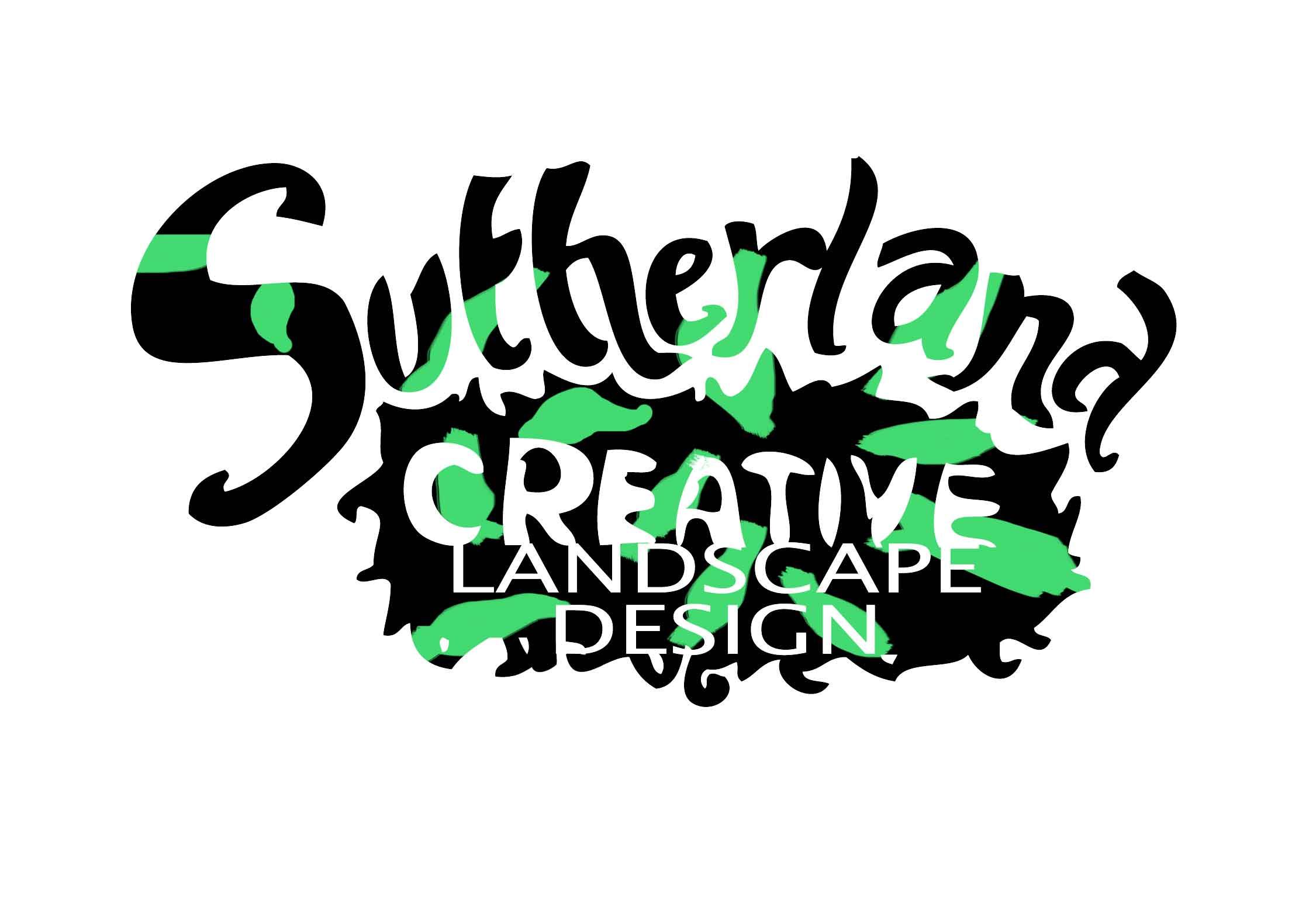
    Jill said it looked too “street.” She didn’t like how the upper and lower case were together for “Sutherland” and the leaf was dumb. How to make something “informal” but “professional” at the same time?

    I worked on it a little bit in illustrator… will smooth it out with sharpies later.

    Before critique and after… (still working on it.)


    sharing options:

    • Share
    • Share on Tumblr (Opens in new window) Tumblr
    • Print (Opens in new window) Print
    • Share on LinkedIn (Opens in new window) LinkedIn
    • Share on X (Opens in new window) X
    • Share on Reddit (Opens in new window) Reddit
    • Share on Pinterest (Opens in new window) Pinterest
    • Share on Facebook (Opens in new window) Facebook
    • Email a link to a friend (Opens in new window) Email
    Like Loading…
  • Photoshop Brushes Self Portrait

    January 31, 2012

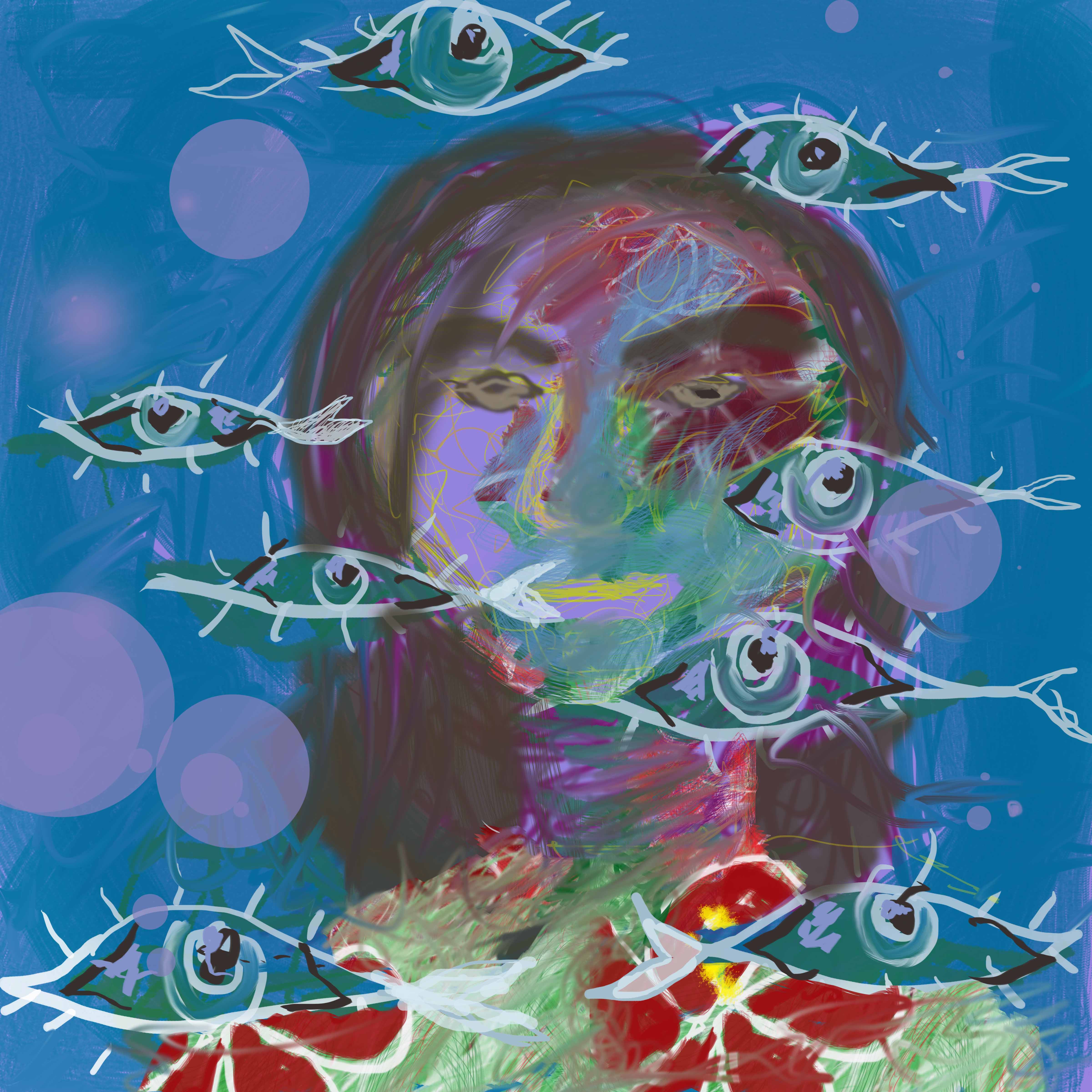
    Mr. Hoppe had everyone in the class make a self-portrait. It made me feel like I was in the first grade, in a good way. (Used wacom tablet)

    sharing options:

    • Share
    • Share on Tumblr (Opens in new window) Tumblr
    • Print (Opens in new window) Print
    • Share on LinkedIn (Opens in new window) LinkedIn
    • Share on X (Opens in new window) X
    • Share on Reddit (Opens in new window) Reddit
    • Share on Pinterest (Opens in new window) Pinterest
    • Share on Facebook (Opens in new window) Facebook
    • Email a link to a friend (Opens in new window) Email
    Like Loading…
  • Book Cover Project

    January 29, 2012

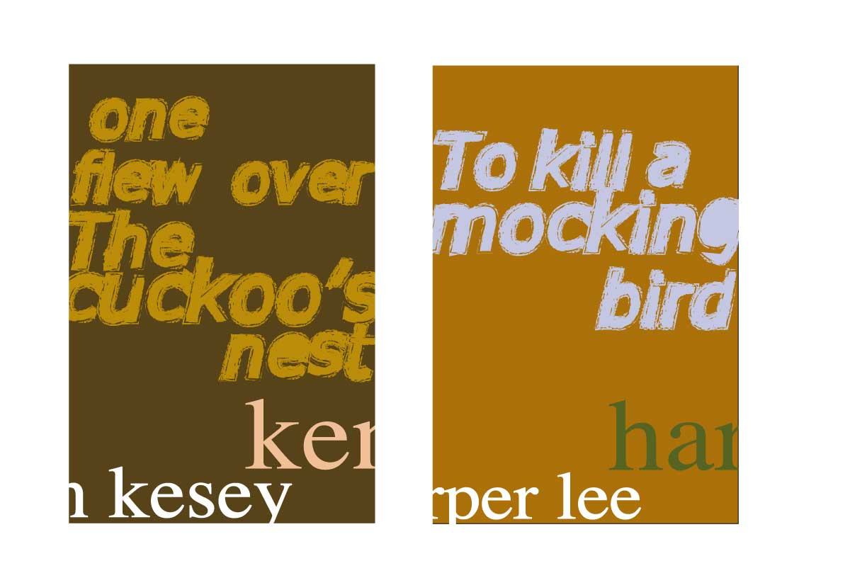
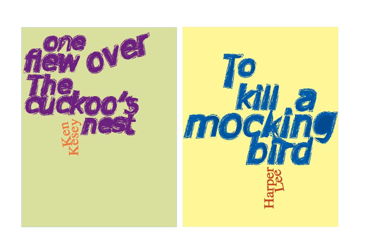
    How I did this book cover project:

    step1) Pick three titles from the list that have a tie.

    To Kill a Mockingbird by Harper Lee
    One Flew Over the Cuckoo’s Nestby Ken Kesey
    The Painted Bird by Jerzy Kosinski

    Ever wonder what to get that bird-loving relative of yours…

    step2) Follow restrictions from Tom and heed suggestions: no handmade type, no illustration, no shapes, just type, use pantone colors, three colors following some color relationships, no black, white doesn’t count as a color.

    step3)
    Update 2-6: Post-critique, the first of Tom’s critiques
    step4) Revise: color, tertiaries are always harmonious, therefore in this assignment, not a good way to learn how color plays well with other colors. The font is too similar in size. Not dramatic enough, I guess. The breaking up of the author’s name is a sad attempt at what people in the biz call “design.” Yup. First year work.

    step4b)
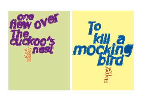
    step5) Re-present: mount trimmed designs on black board with 2inch border and inch spacing, black and 2 pantone color on once side and three pantone color on the other.

    sharing options:

    • Share
    • Share on Tumblr (Opens in new window) Tumblr
    • Print (Opens in new window) Print
    • Share on LinkedIn (Opens in new window) LinkedIn
    • Share on X (Opens in new window) X
    • Share on Reddit (Opens in new window) Reddit
    • Share on Pinterest (Opens in new window) Pinterest
    • Share on Facebook (Opens in new window) Facebook
    • Email a link to a friend (Opens in new window) Email
    Like Loading…
  • Organic Cookbook

    January 24, 2012

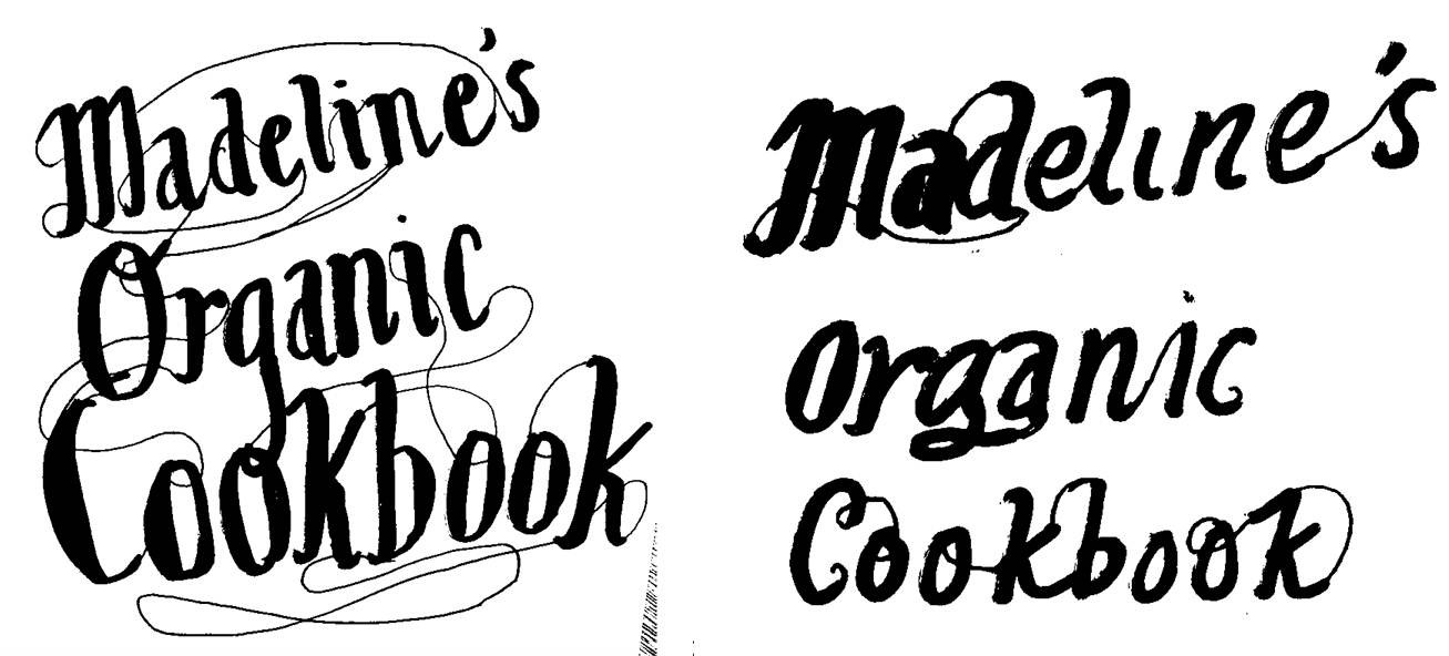
    Started fonting for upcoming Photoshop project for an organic cookbook…

    sharing options:

    • Share
    • Share on Tumblr (Opens in new window) Tumblr
    • Print (Opens in new window) Print
    • Share on LinkedIn (Opens in new window) LinkedIn
    • Share on X (Opens in new window) X
    • Share on Reddit (Opens in new window) Reddit
    • Share on Pinterest (Opens in new window) Pinterest
    • Share on Facebook (Opens in new window) Facebook
    • Email a link to a friend (Opens in new window) Email
    Like Loading…
Previous Page Next Page

Blog at WordPress.com.

Loading Comments...
  • Subscribe Subscribed
    Kismet Arts Tangent
    Join 102 other subscribers

    Have a WordPress.com account? Log in now.

  • Kismet Arts Tangent
    View site in Reader
    Manage subscriptionsSign upLog in
    Report this content
    Collapse this bar
%d