Skip to content

Kismet Arts Tangent

Art Collective

    • Fall Program
    • About
    • Blog
    • Contact

recent posts

  • Project Planning
  • Peppermint Products
  • Writing Prep List
  • Automatism
  • Latha’s Prattles

  • Instagram
  • Selection

    January 24, 2012

    flowers with pink background

    Today Mr. Hoppe explained how to go through the proper channels to get the best selection for an image. (Blue works best. If CMYK, convert to RGB.) I learned that the silhouette (the black and white image in the duplicate channel has to be super sharp (and blurry where you want it!) before actually making any selection. It’s a good lesson: patience for perfection.

    sharing options:

    • Share
    • Share on Tumblr (Opens in new window) Tumblr
    • Print (Opens in new window) Print
    • Share on LinkedIn (Opens in new window) LinkedIn
    • Share on X (Opens in new window) X
    • Share on Reddit (Opens in new window) Reddit
    • Share on Pinterest (Opens in new window) Pinterest
    • Share on Facebook (Opens in new window) Facebook
    • Email a link to a friend (Opens in new window) Email
    Like Loading…
  • Alpha Yoks

    January 22, 2012


    I’m working on an alphabet poster with Mr. Yoks. He’s terrible at counting. According to my chart, there are three 20th letters in the alphabet. Pen and ink.

    sharing options:

    • Share
    • Share on Tumblr (Opens in new window) Tumblr
    • Print (Opens in new window) Print
    • Share on LinkedIn (Opens in new window) LinkedIn
    • Share on X (Opens in new window) X
    • Share on Reddit (Opens in new window) Reddit
    • Share on Pinterest (Opens in new window) Pinterest
    • Share on Facebook (Opens in new window) Facebook
    • Email a link to a friend (Opens in new window) Email
    Like Loading…
  • Layers

    January 17, 2012

    Mr. Hoppe had the class make sandwiches using Adobe Photoshop’s layer feature and a series of stock photos that were oversized and from the wrong perspective. I made the bread 50% transparent so you could see that my sandwich contained some excellent looking onions that I distorted to match the perspective of the bread.

    sharing options:

    • Share
    • Share on Tumblr (Opens in new window) Tumblr
    • Print (Opens in new window) Print
    • Share on LinkedIn (Opens in new window) LinkedIn
    • Share on X (Opens in new window) X
    • Share on Reddit (Opens in new window) Reddit
    • Share on Pinterest (Opens in new window) Pinterest
    • Share on Facebook (Opens in new window) Facebook
    • Email a link to a friend (Opens in new window) Email
    Like Loading…
  • Snow Ballet

    January 16, 2012

    \Today, my teammates, Michelle, Meryl and I braved the slightly snowy city and went to the Pacific Northwest Ballet studios to see Olivier Wever at work. For the photo essay class (the assignment’s theme, the Creative Life), we decided to tell the story of Olivier, a Belgian art director of his dance company Whim W’him.

    Watching him work, we all got the impression that he was a fair, accessible artistic sort and the interview coming up in a week should go well. His musical choices are inspirational and his dance style unique and very passionate. Today’s session was somewhat technical, Olivier telling his dancers how they should melt from one position to another and how connected they should be as they chased each other around the studio. I liked all the nicknames for the dance gestures. There’s one called “ugly hands” where Olivier instructed a dancer to motion like she was picking up rocks. Meryl lent me one of her extra cameras to take photographs and it felt very different than my normal artistic pursuits. I had to anticipate before pressing the trigger because often, by the time you see something marvelous, it’s already too late.


    sharing options:

    • Share
    • Share on Tumblr (Opens in new window) Tumblr
    • Print (Opens in new window) Print
    • Share on LinkedIn (Opens in new window) LinkedIn
    • Share on X (Opens in new window) X
    • Share on Reddit (Opens in new window) Reddit
    • Share on Pinterest (Opens in new window) Pinterest
    • Share on Facebook (Opens in new window) Facebook
    • Email a link to a friend (Opens in new window) Email
    Like Loading…
  • Sutherland Creative

    January 15, 2012

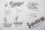
    “We discussed how this quarter will go down. I have chosen/been assigned a creative brief for Sutherland Creative, which will determine the designs for the next 12 weeks.” -from last week’s blog post

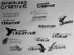
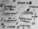
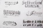
    Here are my sketches for the Sutherland Creative logo. Despite my best attempts at brainstorming, I couldn’t find a hook. But, they were very helpful. I combined the ideas of leaf, seeds and punk to come to the idea that a stencil-esque font might be the way to go.

    Update 1-28-12:
    Due to the snow that ensued last week, I didn’t get any feedback on these sketches until last Wednesday.

    Last wednesday was the closest I’ve come to crying during a critique. As Jill asked me more about my ideas for the logo, I realized as I was talking, (I think I said something like “a cross between art nouveau and punk’s stencil style to convey a love for nature and a do-it-yourself attitude), I had no concept. She gave me a stare, that kind of Jill-stare, are you serious? kind of stare. Noting my sketches, they were somewhat lacking in style, concept, etc. She said this isn’t art school. You can’t talk your way through it. She commented that she’d get back to me and I slumped in my chair. (I had to leave before she got back to me, but I could see that there was a disconnect from all the brainstorming I did, all the word lists and thought maps, I was unbelieving that I had gone into that critique with an iota of confidence, that I had in fact looked forward to going to school and hearing the phrase “that’s nice.”

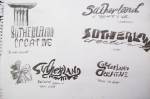
    So, I took out my pencil bag and made a series of new logo sketches and subtitled them with one or two words that denoted the concept for which I could better explain my creative choices with the letter shapes.

    I told Jill that I wanted to move forward with a design I titled “Hang Loose.” She told me it was risky because it was so graphic and not professional enough, but I thought I could modify it enough, and it fit with the creative brief really well. The document mentions “botanical,” “relaxed,” “friendly” and “script” as traits that the requested logo should have. I thought what better represents that than the “hang loose” Hawaiian mentality. Jill poo-pooed the idea of “Hang Loose” saying that the client didn’t identify with tropical or any Asian aesthetic for that matter. Jill had commented on how cool the trigram integrated with a tree would be, but not for this particular client. This stuff should really be in the creative brief, but I guess that’s the negotiation between Designer and Client that would occur in the real world.  So, we/she modified the pitch of the design to “relaxed botanicals.” After showing it to some of my friends, the phrase “pussy wagon” came up. See link for details. So, I have been struggling to de-psychedelify my logo. I’ve some progress, but I’ll get some tracing paper and computer work done over the weekend.


    sharing options:

    • Share
    • Share on Tumblr (Opens in new window) Tumblr
    • Print (Opens in new window) Print
    • Share on LinkedIn (Opens in new window) LinkedIn
    • Share on X (Opens in new window) X
    • Share on Reddit (Opens in new window) Reddit
    • Share on Pinterest (Opens in new window) Pinterest
    • Share on Facebook (Opens in new window) Facebook
    • Email a link to a friend (Opens in new window) Email
    Like Loading…
  • Dielines

    January 13, 2012

    First day of Production Design. Among other things, team assignment, expectation layout, role types, we discussed box design. Dielines are very important to design with accuracy and consistency, though the vendor will give you a design layout that is more structurally sound than the one that you will come up with in the designing process.

    In class we worked on copying one that was made up by the instructor. I think it was important that you make the template and scoring lines “global” colors in Illustrator so you can change them at will based on the color of the design so that they contrast appropriately.

    sharing options:

    • Share
    • Share on Tumblr (Opens in new window) Tumblr
    • Print (Opens in new window) Print
    • Share on LinkedIn (Opens in new window) LinkedIn
    • Share on X (Opens in new window) X
    • Share on Reddit (Opens in new window) Reddit
    • Share on Pinterest (Opens in new window) Pinterest
    • Share on Facebook (Opens in new window) Facebook
    • Email a link to a friend (Opens in new window) Email
    Like Loading…
  • Mr. Hoppe

    January 12, 2012

    The first day of photoshop with Mr. Hoppe was very interesting to say the least. It reminded me of the scene from Full Metal Jacket where a few select people acquire new nicknames and are drilled with questions to the point where the only acceptable answer is “I don’t know. Sir!”

    Mr. Hoppe knows his stuff. He briefly went over all the tools and noted how to make custom shortcuts and what the symbol that has a ramp with a “booger” is. (Apparently, the option key.) He discussed resolution, one of his mottos: Garbage In, Garbage Out. The worst thing you can have in photoshop is the jpeg. As he says, “It should be banned and outlawed.” I now know what is hi res vs. lo res, what pixels are and what increasing photo size vs. file size vs. pixel size.

    sharing options:

    • Share
    • Share on Tumblr (Opens in new window) Tumblr
    • Print (Opens in new window) Print
    • Share on LinkedIn (Opens in new window) LinkedIn
    • Share on X (Opens in new window) X
    • Share on Reddit (Opens in new window) Reddit
    • Share on Pinterest (Opens in new window) Pinterest
    • Share on Facebook (Opens in new window) Facebook
    • Email a link to a friend (Opens in new window) Email
    Like Loading…
  • Embarcadero

    January 11, 2012

    Painting of Embarcadero street shadows

    I felt like an empty shore when I started this painting. I felt comforted painting the cloudy day that matched my mood. I was looking through a classmates work and saw a painting entitled Embarcadeer-o. It looked nothing like Embarcadero. I should know. It was the first San Francisco neighborhood I wandered through. I think maybe I will layer another neighborhood on my Ocean Beach. This is what it is so far.

    sharing options:

    • Share
    • Share on Tumblr (Opens in new window) Tumblr
    • Print (Opens in new window) Print
    • Share on LinkedIn (Opens in new window) LinkedIn
    • Share on X (Opens in new window) X
    • Share on Reddit (Opens in new window) Reddit
    • Share on Pinterest (Opens in new window) Pinterest
    • Share on Facebook (Opens in new window) Facebook
    • Email a link to a friend (Opens in new window) Email
    Like Loading…
Previous Page Next Page

Blog at WordPress.com.

Loading Comments...
  • Subscribe Subscribed
    Kismet Arts Tangent
    Join 102 other subscribers

    Have a WordPress.com account? Log in now.

  • Kismet Arts Tangent
    View site in Reader
    Manage subscriptionsSign upLog in
    Report this content
    Collapse this bar
%d