![]()
It’s interesting for these effects that the clarinet image is on top of the stripes.
Art Collective
![]()
It’s interesting for these effects that the clarinet image is on top of the stripes.


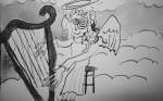
Here’s my Blob-Brush Dragon and his homeland, BlobBlending Volcano Island. (Done in Illustrator in class.)

I started working on the final for this class. I chose the Chicago Blues Festival option. I originally was intrigued by the Rodeo event and thought about how I could make that fun for me, and I realized that the audience and I have nothing in common. I am not sure about these assignments where there’s a choice of who my audience is. Will I have such a clear choice in the real world? Do I want to challenge myself? Or play to my strengths? (I like my “blues manatee” in the top left corner of this sketch session.)
Update 11-28:
Here’s my logo for this event. Font: Calligraphy Set by Wiescher.
![]()
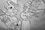
I think Jill was disappointed when she saw my sketches painted with ink and brush. I could hear it when she said “blah blah blah, just like the Mouse Book Cafe logo.” Arg. I couldn’t help myself. Perhaps that’s what drew me to this particular event. I could paint something nice for it. But, yeah, I feel more comfortable with a brush in my hand than a sharpie (god, for some reason, it smelled really strong today). My poster ideas were too cutesy. I proclaimed to want to use the message of “generational storytelling,” but each composition was too cutesy, too complicated, too overbaked. (I think the campbell’s tomato soup tribute was the final nail in the coffin of my poster thumbnail set.) She appreciated the artistic randomness in my use of the ink and brush, but I don’t want to be predictable, but I fear I don’t have a lot of skills to work with. (I’ll clean up this font in illustrator later.)
Update 12-4:
Rough Draft of my Poster. Keep it simple.

Update 12-6: Computer Power! Playing with transparency effects. Used this painting for texture in the background.

Critique: Bad design, bad font for logo, zero integration. She noted that I slapped it together, the word “festival” dangling unreasonably. She made the suggestion to find a little cubby for the word “chicago” to fit in as smaller text. The words I heard Jill say most today “Think Holistically.” She told me to consider some “historically relevant fonts. I made a huge improvement.
![]()
(Still a little unfinished. I don’t think I have the right software for designing at home.)
There.

Update 12-10:
(Reference photos from the internet) I thought to make a swirly line drawing for the poster, but after I finished it, the poster didn’t feel finished, so I am going to paint the thing after all.


Update 12-11:
Painted it. I’ve already had a comment saying it’s pretty dark for a poster, but I like it. On canvas board (12×18) with acrylic. I still need to crop it for tabloid size.

Update 12-14:
Since I am home sick, Jill said I could send in my poster as a pdf and so I edited it in powerpoint. Yeah, I tweaked the colors a bit. I was planning on cropping and pasting after xeroxing the painting and inverting the colors on the logo so I could place it in a dark corner, but I ended up framing the poster to allow for the white logo to be not so disjointed from the poster. I wasn’t satisfied how it was before. As a fully colored thing with no white, it was too dark for a poster and didn’t feel like something designed. I really like how it turned out.

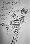

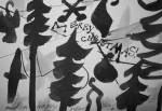
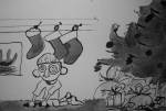
I worked on some more of these Christmas things. I am having a lot of fun playing with ink, making this world where every picture frame is slightly crooked and everyone’s eyes are buggin’ out.

I went to hand-drawing the poster for Graphic Design History Assignment based on Robert Crumb. It definitely reflects the topic, but I wonder if too much. Would it have been more clever to adopt a contrasting style like art deco or Russian constructivism?
Update 11-24:
I wanted to jazz up the poster with a little display text. I’ll clean it up in illustrator. (in ITC Christoph’s Quill™ Bold by ITC found at the font shop)


Here’s a mood board. What is a “mood board?” Well, it’s a collected effort to establish the tone of whatever campaign you are trying to put together. The one I am working with includes pictures of kitchens, a muted picture of Portland and our color palate. I chose the color palate as well as the Parisian Portland photo to show a life of leisure that can be achieved by buying the product (which in this case, as per the assignment, a fictional one–an app). My group is really competent and skilled in many facets. Being one of two graphic designers in the group, I took a more conceptual role and I was less involved in production for the print ad. I helped come up with the headline “Chaos controlled.” which will be better reflected in the edits next week. Other mandatory components: Interview question sampler (full documents not included), product name, 5 adjectives describing product, targeted audience. Hopefully, for the 30 sec ad, they will take my recommendation on the Amelie soundtrack. It’s just so lovely.
Update 12-8:
Last week, we presented our print ad to the class after receiving some critique from Jill and did some last minute (last hour) editing to make the story of the ad stronger. Jill had a good point about how the ad was really busy and the story wasn’t obvious, which is important for people flipping through magazines, each advertisement needing to catch the reader’s eye in a glance. We beamed as most of the class sat silent as the teacher implored them for corrections or additions we should make to the ad. (A couple of people wished our model was older and more clothed, but considering short notice, the thanksgiving holiday, and other stylistic considerations, our photographer did well.)
With the help of my team mates, I made this story board for the 30 sec commercial for this campaign. It really helped have other people to edit the story I devised to match the concepts we talked about when establishing the print ad. Sometimes, you’re too close to the storyboards to see the forest.
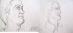
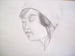
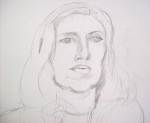
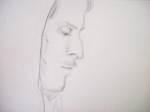
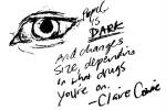
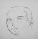
Today, the class learned how to do portraits. Claire had us make a face diagram for all the suggestions on how to make a face look more face-y, including the tips: shade the upper lip, suggest the lower lip with the chin shadow, the eye line has five eye-widths with the two real eyes separated by eyes on each side– if that makes any sense…– nostrils are dark, and so are pupils, so get those and you’re on your way. The advice came in handy when I was practicing on my podmates. It was really a treat to stare at them like this. We took turns modeling for 10 minutes each. Here’s Pete’s version of me:


Assignment: assigned topic– R. Crumb. Dimensions– 17×11 in. Other than taking a bad picture of the poster, I had trouble with this poster as it progressed. There might have been an optimal time to start, but after seeing all those movie posters in class, I felt that the collage-y chaos didn’t cut it, but I continued to cut it, hoping to give it more form, but instead, adding to the mess. I will try a different approach tomorrow.
update: 11-19

I did this today. I tried to incorporate the “b” in “Crumb” with the woman silhouette that was already very bad and it seemed like she had a peg leg which would have worked only for a poster on Jack Dawson from Titanic (he drew a one-legged prostitute).
