
I just made this banana in Adobe Illustrator (CS5.1) using the gradient mesh tool. I love technology.
Adobe-day

I learned how to make pattern swatches (amazing!). This is intellectual-yoks wall paper.
Art Collective
I just made this banana in Adobe Illustrator (CS5.1) using the gradient mesh tool. I love technology.
Adobe-day
I learned how to make pattern swatches (amazing!). This is intellectual-yoks wall paper.

 I redesigned the front cover because I reread the assignment guidelines and and some requirements were absent. Which was good, because I didn’t really like the front cover design. It wasn’t as slick as the back cover (which I kept). As per the assignment, I put it in a jewel case and boy, does it look sleek. Perhaps, too fitting with what is already out there? (Notice, I used photographs from my “Black is Ink” photography assignment.)
During last week’s illustrator class, we played with type. Here’s my CD cover assignment:
This is Laura Marling’s debut album, Alas, I Cannot Swim.


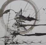
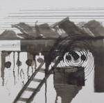
More mid-term relating drawings. I am not sure yet whether these will be the pieces that I use, but I really like how they relate to the theme in their formal elements.
Today was a work day for the mid-term in drawing class. The lovely Claire went around to everyone and pulled a gun, a Tim Gunn. She would try to understand your sketches then offer her takes on your direction and try to pull you to something that she thought youd be sucessful doing. When she gave advice, you’d be like “Well, oh… yeah, totally.”
Claire said that e1-3 were ready to go, but she didn’t like e4. Something about the turtle didn’t seem integrated enough, though she wanted to see where it was going and the falling lady was too obvious, she said. It didn’t have that “mark-making quality” like the others, but if I could swing it around, it would probably work for the 10×14 piece.
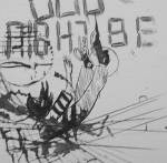
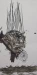
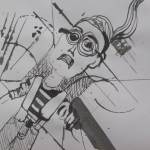
I made these in class today with waterproof india ink, pen and nib, and a brush. I am in love with ink, these days. Some of the other kids came over to look at my work and I think they were briefly enchanted, looking at a drawing so messy that I must have enjoyed doing what I was doing to have done that.


There’s a quote that reads something like “I used to like current events, but now, there’s so many of them.” I think he was talking about modern art.
Assignment: “Pick one of the four companies [Pineapple Patrol(Game Company),Mouse’s Book Cafe, Black Sheep Tattoo, Rainy Day Daycare] / sketch 10 different ideas for that one company / take one of your sketches (ideas) and continue to sketch it and push it as far as you can / have the sketch that you pushed as far as possible ready for critique (but it doesn’t have to be your finished design just make sure it is clear enough to hang on the board in the crit area). This homework with be expounded upon for our next assignment. Also, be sure to bring in the 3 different typefaces which could match the style of your symbol/idea.”
I will be updating this post with my sketches and final drawings and fonts as it comes up.
First: Brainstorm for Mouse’s Book Cafe
![]() Second: Sketching (I recently discovered how fluid sketching should be. Here, I used ink and brush to create most of these logo sketches.) I kept in mind what the target customer would be for this particular mouse’s cafe– hipsters!
Second: Sketching (I recently discovered how fluid sketching should be. Here, I used ink and brush to create most of these logo sketches.) I kept in mind what the target customer would be for this particular mouse’s cafe– hipsters!

Then, I zoomed in on one that I liked, playing with scale and juxtaposition and all that.

Then, during critique today, the teacher said that this one (with some modifications) in my sketches was rather lovely and the winner of who-wants-to-be-my-mouse-logo.

 I used ITC Bette Sta Regular font from font shop. I am not sure how font copyright works.
update 11-17:
I took input from Jill last monday and reworked the logo. It was a nightmare trying to move stuff around with the livetrace points in illustrator. Took the printed version, applied sharpie to the letters to connect them better, cut have of the ear line off (people commented on what a heavy ear for a mouse that was), smoothed out some lines, cut out the text from the image, spaced it better, photographed it, edited with PowerPoint and I’m planning on cleaning it up in Illustrator later.


My poster as it hangs in the fifth floor hallway. I really liked how it turned out. I think the 3-d aspect gave me a challenge and I feel like I rose to the occasion. Especially if you know Behrens much, this feels like his style on speed, which what it needed to be because we associate so much of his style with modernity as a whole that it would have seemed passe if I stuck to his sense of minimalism.
I gave a three-minute presentation on Peter Behrens. At least I think it was three minutes. Time really flowed while I spoke in front of the class. I covered most of my points and told a cohesive story about the context in which Peter Behrens rose to the height of his career as artistic consultant for AEG. The class laughed when I half-tried to pronounce it in full, which is supposed to sound like Allgemeine Elektrizitäts-Gesellschaft, but I think I ended up saying Allergen-aflergafler-gendlestaffu.
