
Today, I learned about movable type. It was super special because of the metal alloy that didn’t distort under pressure.
Today, I learned about movable type. It was super special because of the metal alloy that didn’t distort under pressure.
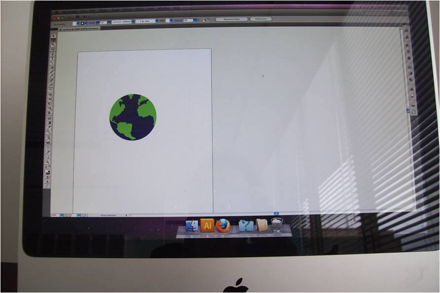
Today’s lesson in Adobe Illustrator first boggled me… Macs are tricky. I didn’t know how to load the application… I kept clicking and at first it didn’t have any of the plug-ins, which are crucial for manipulating objects in the program… that’s what it’s for… so after that technical glitch, I was on my way. Playing with the given shape, the earth was really fun. I abstracted it somewhat by making the subtle silhouette of the continents into jagged horizontal spires that looked like they were copied and pasted from an eighties’ sweater. And making Africa red because the teacher was teaching us about isolation and grouping. Subliminal message about Africa?
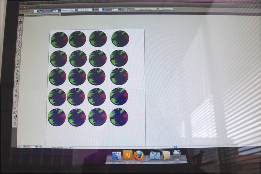
Here, (see the serial earths) I learned what the option button and shift button can do when they work together.
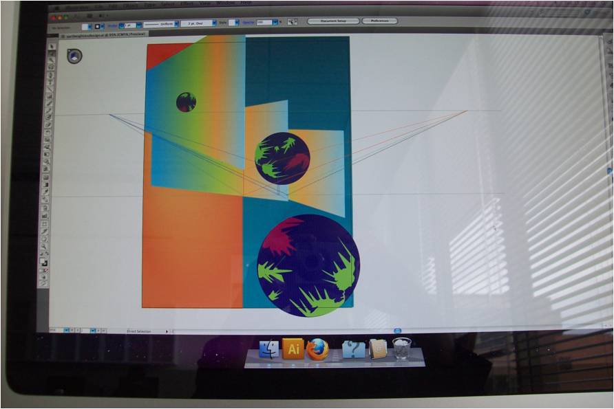
I really liked this. When I left the school, I realized that I should have saved these things as jpegs rather than photograph them, but I wanted to depict the mac interface. Photographs become my proof. I did use a Mac and I did use Illustrator and I am a winner. #winningthefuturebyusingamac
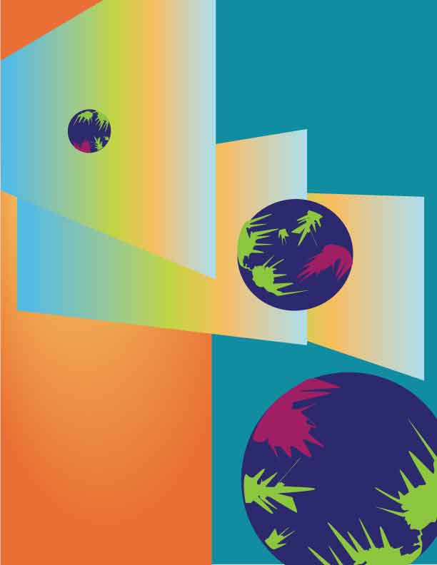
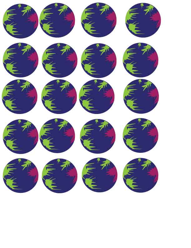
Update 10-17-11: I figured out how to save for web.
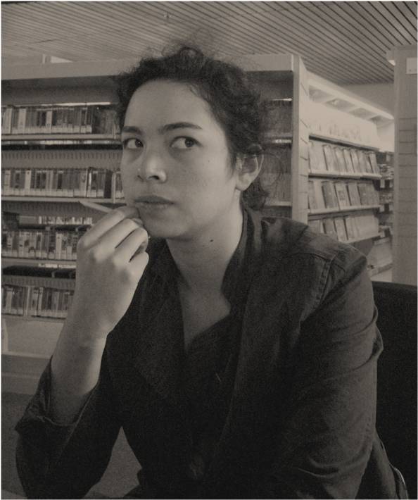
Ha. This is me at the Capitol Hill Library computer using a PC–and a pencil– to revise my school budget and make this blog post. I like being surrounded by books as I am connected to the world wide web.

This is my “dynamic” piece. I had my first critique for the class. The way the teacher anonymized the works was good. It felt more like they said “that design sucks,” instead of “your design sucks.” They didn’t actually say that. My classmates and I had shiny pebbles, a small handful each, that we would use to vote on stuff that was good and stuff that was bad based on some ideas about dynamic and stable designs and put up on the whiteboard. The teacher agreeed with one of the kids and said that there was only three different sizes in this design and it would be more dynamic if it was more drama in the scale-play, or something like that.

This is my “stable” piece. I thought using lines and orienting the shapes outward would be enough to consider the work balanced and somewhat predictable, but I think here again, I goofed up on the scale. I feel like I underworked the thought process about what these words mean and how I could visually express that. Lucky for me, the next assignment is to tweak these works and make posters. Today, there was a presentation about Gestalt (which I think is really interesting). Gestalt is the ellipses of the eyes; it’s about continuing something without having to put it there. Illusions like the necker cube and the vase/human profiles add a certain pizzaz to designs. Can I use that idea to make my (as one classmate referred to them) clams really wow the judges?

This is me walking along Broadway on my way to the library. I love the tiling on the local RiteAid building.

Photo of Charan
My first assignment in New Media class: introducing this guy using a mac and facebook. It was difficult. Couldn’t’ find wordcount on openoffice, couldn’t find the group on facebook I needed to post to; I felt like I was back in the fifth grade being introduced to the “file” tab. Here’s the introduction, the first document I’ve ever typed on a mac:
I’m Kat. Kat Countiss (Graphic Design 5140). When interviewing Charan Du François (Publishing Arts 5142), he painted a colorful picture of himself on the canvas of my memory, filled with rich foliage of emerald green. Mysterious, he is. Today, just a small jig of the puzzle is released into the atmosphere, coalescing into a cloud in my brain and then precipitating into these words which I now share. Words like “yin” and “yang” comes to mind, he speaks delicately describing his style– critical, innovative, resourceful and balance. “Does this look good?” his friends and knowing customers often ask. He believes in the value of a good presentation, his visual skills being an asset in retail-type jobs but his head is in another world, another time, a place where twilight-toned blues reign. I imagine triangles, lots of triangles, floating in space, some filled with pages of character stats for orcs and others drifting to a distant haunting piano melody of Rufus Wainwright. Another triangle depicts him, looking at a photo he can’t– by policy– print at the Fred Meyers’ photo machine. Capitol Hill patrons and their nudity, their intention to capture something as intimate as a human body in its tabooed fullness and their naivety, their expectation that they can print it at their local Fred Meyers. He tampers with the contrast, anyways. Charan explores concepts and solutions in his spare time in his fantasy fiction. It goes beyond the page into a world of interacting with characters. “People are difficult because they are so complex,” Charan said. Being critical, he often delves into the interactions and intentions of people, those around him and those constructed through rules and regulations found in the manual, third or fourth edition, I can’t remember. He claims to be somewhat of a perfectionist, but we all strive for excellence. He does it through framing graphs and adding art in the margin in his imagined book designs. Let’s reword this paragraph rather than spacing out the words to fit in this particular line on the page, he declares. Fast-forward to an afternoon. His short-haired tuxedo cat, named for the musical man Rufus, stars in Charan’s home life. “Meow,” I imagine Rufus, the cat, saying sometimes on especially rainy, misting afternoons while Charan is at work in the jungle of steel and concrete that is downtown Seattle. Bed, Bath and Beyond… sounds like a title of a philosophy book yet to be written. What is “beyond?” He keeps track of products; his meticulous nature has carved out a niche for him. He dreams of accents. A triangle floats in space with him surrounded by candles, inspired by the book, Generation X, where the main character buys hundreds of small candles and illuminates the living room, Christmas morning. I imagine Charan with his light colored hair and fair skin illuminated by the flickering of hundreds of candles with the barcode sticker still attached to its base. And, then a sigh. Rufus’ triangle shaped-meow floats on in a whisper until it hits Paris, where in another time Charan successfully purchased stamps for his mother in soft sweet French words. Le stampe, si vous plait.

Photo of me at my afterschool job
And here’s the intro he made for me. I really like it!
Kat Countiss called me out with a smile to do an interview and I immediately just thought “here’s a friendly, go-getter gal”. Since she had some interviewing experience we started off with her asking the questions however there was a lot she had to share at the same time. There seemed to be specifics that she wanted to cover to get the full picture of myself. In the process, specifics of her picture were revealed to me. I found she’s an intellectual in the sense of one who loves learning. Her methods weren’t an interrogation, but rather a fluid conversation that led to discoveries of each other’s nature. Getting to know her began with her own origins across the Pacific in Honolulu. She moved from Hawaii about 6 or 7 years ago following most of her family. This upbringing may have influenced her preference for painting landscapes, waterfalls, and nature in general. Graphic design appeals to her in that it provides a way to convey a myriad of emotions through technical terms and processes. She loves how art in any form can persuade people. Kat has an eye for organic design and enjoys the intellectual aspects of the creative process as well. You may have already read her blog called Science For Artists which has interesting facts accumulated from various sources that all artists ought to know! Finding the science behind the art either physically or conceptually intrigues her. Some of the literature she has delved into covers the connections between art, consciousness and language. The latter being one of the greatest barriers she’s experienced when it’s different from her own. Of the English language, one of her favorite words is synthesis. Perhaps, if it were possible, a blending of a cat and a dog would be a perfect companion for her. Taking the best of both worlds (a balance she often strives for) and integrating them into a unique companion. One which would enjoy going with her on hiking trips and other outdoorsy activities. While also being an independent animal that’s self-sufficient and able to clean itself. She would probably name it something with a strong name such as Sebastian or Spartacus. Kat may have to “settle” for a dog at some point, but hopefully one that’s independent enough not to miss her too much when she travels. Though so far Portland seems to be a reoccurring destination for her there are many far off places which interest her. While at her present job, she often hears from her crazy, self-important patrons that they’re either flying to or from either Europe or Japan. She seems to have somewhat eclectic tastes that lend herself a worldly air blending all these kinds of cultural inspirations together. I’m sure she’ll travel in a few years to see their source first hand. All the while drawing from every experience to paint her own picture. An image that must be warm as her spirit and the islands she used to call home.

Self-portrait on the veranda. The sunniest day of this quarter, I imagine. I got my coffee from Peet’s down the street. Starting off the day with… apparently some composer named Mantz. It sounded more like Vivadi to me, but hey, there was 200 years worth of decent classical, it’s hard to keep all the files straight in the filing cabinet of my memory. (By the way, any of you who store information like that are bound to be bad at remembering because you’re not utilizing your strength of spatial memory to the fullest extent… anyways…)

I went to the library today. The kids were quiet and learning. I was surprised and loved that. There was a bulletin board and a large white piece of paper with the question scrawled in turquoise marker: Are the arts DANGEROUS? And I thought, I hope so.

My first drawing class with Claire Cowie was inspirational and lofty-sounding. The syllabus presented things that I haven’t really explored. The kind of exploration that requires the headlamp and the nerves of steel. I am preparing myself for my clumsiness. I don’t think I am as good at drawing as the pictures I imagine I am going to create, but aim high. I purchased a sketchbook. My first one in years. The white pages, the fresh start, the encourangement of a teacher, all that is bound to give me the freedom to flourish. Claire emphasized how art and school are sometimes oppositional. Art is spontaneous and its origin is within. School is structured and compulsory and comes from without.


That night, I went to Amon Tobin’s ISAM audiovisual spectacular at the Paramount. I was amazed, bewildered and inspired by the bombastic beats that swung high and low across the stange and through the projections into my mind. Awestruck, my heart was racing, my mind was racing. I felt a constant churning as if the industrial beats were electrodes attached to different parts of my brain, stimulating mostly the project node. The imagery and sounds of plastic wrappers electronically amplified gave me a new lease on what I thought was possible in the alignment of art and sound.

This is me drinking coffee at the Panera Bread across the street from the school before class. I needed it. It turns out my Graphic Design History class is none other than a teacher lecturing in front of a class, putting together words like “shaman” and “cuneiform” into a narrative we can all relate to… sort of. It’s going to be a long quarter, hopefully broken up by some fire drills or classmates’ seizures. But, considering the subject matter, I can definitely stay awake and perhaps get inspired by the past.

My idea is to put my webby notes together into a massive poster at the end of the quarter and hang it up somewhere in my house to remind me what I learned for a mere $350. (I did some guessy-math on that number.)

Project Penway Challenge 2 (Due Week 5): an 11”x17” informational poster of Peter Behrens. I have been toying with the idea of making it out of pipe cleaners (a medium I successfully executed on a mask in the ninth grade). I should research this guy before getting stoked about creating a colorful and furry collage of nostagia.

This is me in the concrete stairwell at the school. The program’s facilities are on the top (fifth) floor of the building and the elevators are awkward to use because I have to cram into a small room with a bunch of people who are in school because that means some income from Financial Aid that they can use on drugs. (Not everyone, but I heard a conversation at a nearby bus stop that impressed me.) The stairs wind upwards and they seem to take forever and they seem painful if one was to lose balance. I took this picture right after being briefed on the basic intricacies of Adobe Illustrator. I want my first project on illustrator to be a trippy close up of my eyes widened, as if they are bugging out of my skull and the caption in reverberated lettering saying “oh. my. god. I’m using Adobe Illustrator to make this.” I’ve always seen the Adobe family as this cryptic complicated mess of a program with a zillion too many movable widgets. I can’t believe that I am going to start to understand what all those little icons mean and what they can do for me. (Not yet, though. Today, I learned out to make a “bleed guide” and how to open up programs in MAC computery things.) My teacher said “love the mac, know the mac.” And I thought, in that order?

This is me on my way out the door at 8:41 in the morning for my first class this decade. Does my face express the simultaneous uncertainty and optimism that I was feeling? I have a school schedule containing the following classes: Drawing 1, graphic production 1, History of Graphic Design 1 and New Media.

As per some strange school ritual, first-years were grouped off and led by second-years for a tour around the facility. The lovely Jaime Patneaude showed me around the school and told me of the epic Mama’s pizza, the place to get pizza, and Stumptown, one of her main haunts, which is down the street.

Drawing inspiration from Armin Hoffman, a class exercise involved black sharpie-made shapes against a 2x2inch square piece of paper. Going around the classroom, admiring other people’s shapes, their crisp lines and cohesive collection of interesting zigs and jags and blobs that seemed to swim off the paper, I felt like a fish in a small pond of potentially amazing designers. Hard to say from the well-executed squiggles, but I was intimidated.
Project Penway is afoot. My first challenge is to take one of the shapes I made this morning and using “the ideas of balance, tension, rhythm, pattern and overall shape” (see syllabus) I must create a 10x10in. composition. I am intrigued and inspired.

