“Rainbow Ribbon Creating Mountains, River and Tree”
“Color Armor”
Today, I spent the evening in markerland. Listened to some Marina Abramovic talks and experimented with some new markers: Crayola Ultra Bright Colors, including tropical violet and neon yellow. My magic pens are running out of ink, especially the reactor pen, so I made some abstract colorful pieces instead of trying to contribute to the cosmic bunny series. My hand, especially my thumb, ached from the pressure of holding the pen to the paper. As the night went on, I opted for thicker strokes.
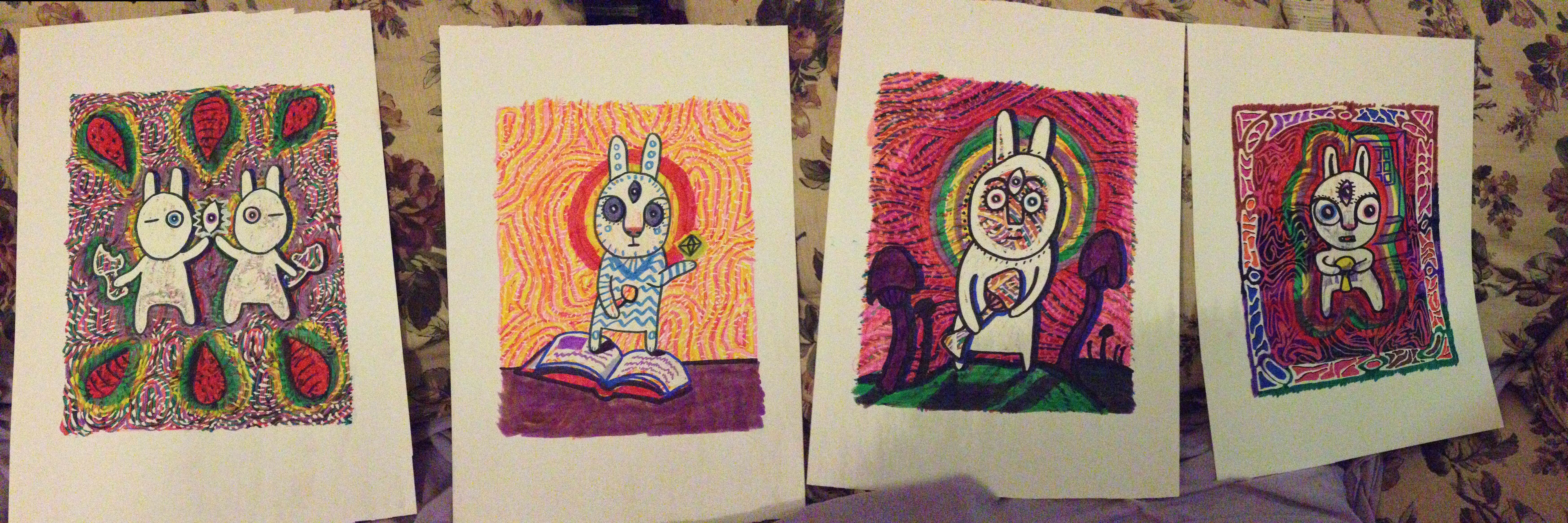
1. “Strawberry and Carrot” 2. “Spellbun” 3. “Boomface” 4. “Boomfang”
I was scoping Pinterest for inspiration to finish these backgrounds made with my magic pens and I saw this cosmic bunny: художник Нита Кравец – Освежиться. Fusing that character with Tuzki, I came up with this. As you can tell with these four iterations, that I’m still working out the specific details, but I really like the androgynous look of these bunnies and I like the low crotch, hiving the bun a bit of a dress/tunic feel on the torso. It’s fun putting the bunny into different environments and have different props (mushrooms). I like the idea of a world with just bunnies and the kinds of roles they can be endowed with. More architecture, too. It’s fun seeing the role of the mushroom change from scene to scene: a snack that brings connection, a wand to cast a spell, a find among rotten stems, an offering from a housemate?
I’m working on a bunch of these to sell at a fundraiser at the end of the week. The drawings are 8×10 on 11×15(inch) smooth textured watercolor paper.
In January, I visited with a new friend and drew on his couch while listening to Aphex Twin. Created Shelby-ception (14) and Quantum Entanglement (15). I decided to buy some watercolor paper and break out the Chameleon markers I received as a Christmas present and work on a birthday card for Nina (16). The drawings have been steadily coming out since.
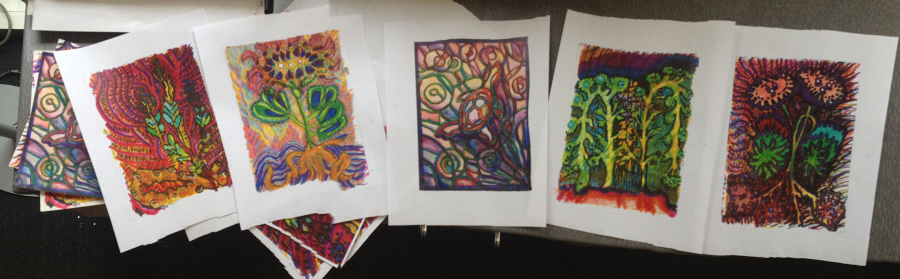
I was inspired by the surreal flora from the Voynich Manuscript and created some pieces based off of my favorite flowers. I particularly liked a flower that had the body of some four-footed creature. I’m planning on finding other places for him/her. I initially wanted to give it a centaur body, but it overpowered the geometric flowers. The creature is a soft, tinier thing that is shy, maybe passive, and solitary. In Thought Fountain, the creature is so lovely, I don’t know if I can make anything else as lovely.
I drew Catalyst and the Zodiac for a new love interest, Cassidy. I wanted to celebrate these parts of myself that fractured into nameable entities during a tumultuous time in my life. Ask me about it if you want to know more. I’m still metabolizing these mental happenings into stories to tell myself and others.
The J is for Jonathan. One of my first friends in California. A very loving guy, gentle and witty.
Cottonwood Sky (8), Sky Turtle(3) and Traveling Sprout(6) were created while Cassidy was out of town. Perhaps, I wanted to reach out across the distance in my own version of a whale song. Cottonwood Sky is based off of a visit I had to Colorado recently. We went to a hot springs at night and gazed up at the stars. Sky Turtle is a dreamy, stained-glass-esque piece, inspired by Terrence the Turtle, a character Cassidy made up during a therapy exercise to represent caution and slowness. Traveling Sprout: I’ve been chatting to Cassidy a bit through FB messenger. We talk about our new relationship being a sprout that needs tending and gentleness. We use that sprout emoji and lately, I’ve been drawn to using more stickers and emoji in my work, since it’s been a huge part of my visual language with him.
Dopamine (19) The week after we met was valentine’s day. I gave Cassidy this card. He joked saying “Thanks for the dopamine, etc.” It’s an honest and fun sentiment on this day so overwhelmed with heart iconography. I had to draw some dopamine (and seratonin).
Tuzki Flame (20) It was a birthday for one of my new friends who’s a spiritual person. I wanted to capture some of their personality while celebrating with a friendly face. Tuzki has a facebook sticker set, so it came to mind… do I spend too much time communicating through FB messenger that my visual language is clogged with others’ characters?
For Emma (21) Also a birthday present for one of my new friends who’s soon to be married. I met her fiance first, actually, though not by much. They identify with bears, so I thought a cute bear stack with some swirly night (with magic pens) would be a good birthday art.
Floating Cosmic Chocolate Mote (22) Sweet Cassidy constructed a haikube poem while he was away. I hold it as one of my most favorite poems– it’s about us. I’m a sucker for silly little love songs. “Some people want to fill the world with silly love songs/ And what’s wrong with that.” (Source) I really like cut-up poetry, words clumsily falling into place creating fresh and unstable imagery. I ended up not printing the words in this drawn piece. It’s so mysterious. What if I lose the words and all I have are these boxes…
Swimming Magic Otters (23) Also during Cassidy’s absence from California (am I fueled by distance?) I used the magic markers to create a drawing that reveals a second nature when markered on. I brought the 9” by 12” piece to his house and simultaneously, while on his bed, we magic-penned the surface, a white marker with special chemical, slowly and gratifyingly revealing the black parts to have two different colors, the Significant Otter facebook sticker — of course, our relationship is littered with these things, a sticker, something so casual and yet, friendly. It’ll do. This image is the pre-magic version. I’ll post the post-magic version, if I can get a picture. It’s at his house.
EEE Gamercat (24) Pink is a major theme my latest stuff. No doubt inspired by Cassidy and his pink persona. His curtains are pink. His hair is pink. The haze in my mind when I think of him is pink. Again here, a facebook sticker of something I only know as a FB sticker character. I hope to go back and trace these images to their original context and enjoy their original selves, instead of affectionate avatars, that I send over and over again to convey visually joy that might have come out more ambiguous if I had to type the feeling that they evoke.
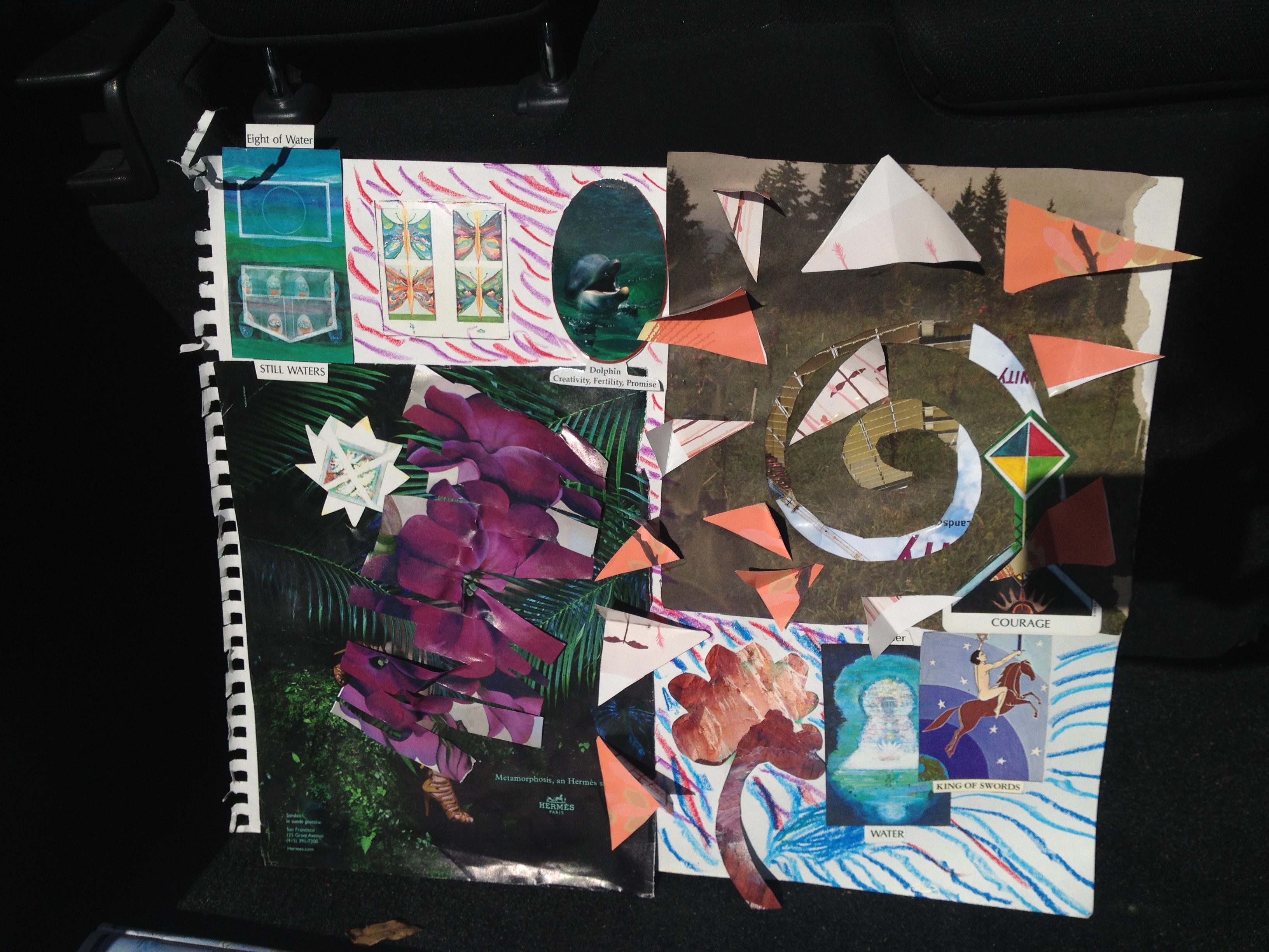
In an exercise in getting to know someone and sharing information about myself, we created collages that represented family. The one above is the one that I did. I’ve been a little distant with my family, thus, the still waters, house of faces in the top lefthand corner. The butterflies for my oldest sister, Jenny. When I stayed with her briefly in 2003(?), she was working on a butterfly piece, but also, she’s just a bit on the fringe. My sister Natalie is a smart social dolphin personality. I am represented as the figure covered in flowers hiding in a jungle with a reflective little star following me– my muse, I imagine. To right, a rocky pink craig cut into the sape of a four-leaf clover, representing my new love interest as well as two cards representing a pillar of my life and love, someone who has been supportive and driven, with courage as well, going into a spiral cut out of a skyscraper and meadow with pink abstract birds swirling around it, representing my energetic optimism.
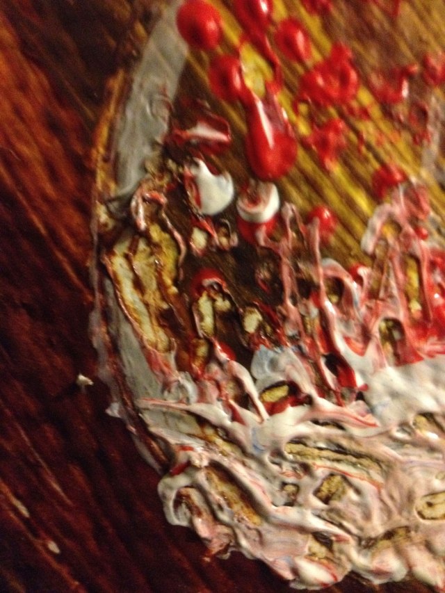
Process photo “The Secret of the Foxes”Process photo. I’m gonna mix paints differently next time.
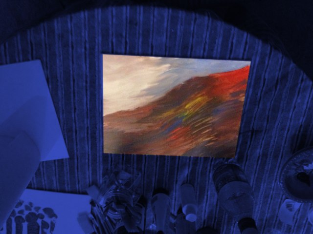
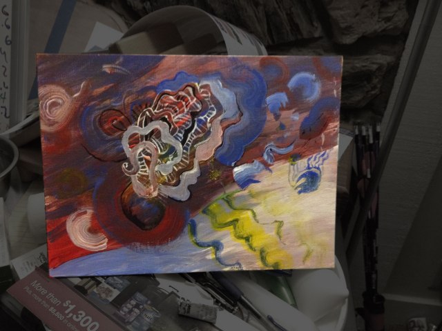
I was trying out a collection of brushes I recently purchased as a Christmas present to myself. I’ve done these noodly doodles before. Start out with one kind of petal-y shape and then add to it until comfortable. I don’t know how I feel about that striped paneling on some of the petals, but all good practice. I tried to add a little glittery flower on the white hill, but the nail polish I was using is not opaque enough. And it contaminated the vial with wet acrylic paint; a move that was creative, but not responsible.
The color scheme bothers me. I was painting with a friend of mine and he used green and a fleshy pink that he mixed carefully with a popsicle stick. I might go that route next time. It’s been a while since I had a palette that I didn’t improvise as I went along.
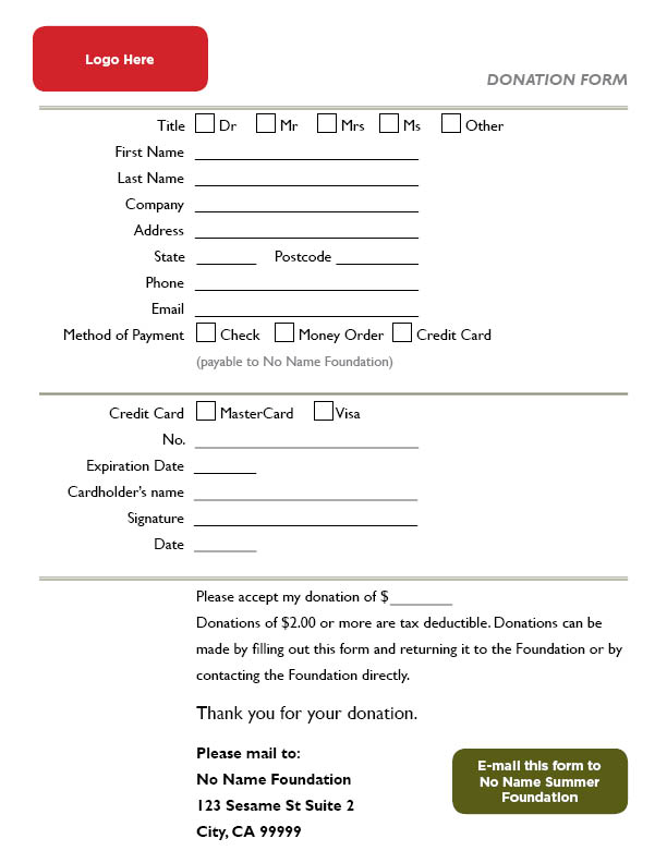
Today, I was looking for a form template that I could use to generate a donation form. I really dislike most forms because my handwriting isn’t 10pt font. This is a form optimized for accessibility: say hello to your over-50 (years old) potential donors!
There’s an “email this form” button. Go into the Windows>Interactive panel to change the email address from mine to the one you’ll use.
I wish InDesign would have a format type more specific than “text field”. I might have to go back and add more formatting to the text fields to echo formats such as date, credit card numbers, etc.
Since arriving to Silicon Valley, people have been telling me where to look for jobs. I’m a Graphic Designer with Marketing Experience and Front-End Development Skills.
Here’s where people have been saying I should look:
AngelList – Where the world meets startups– good interface, once you establish profile, there’s a great user experience of looking at each fit and stating interest and applying or skipping.
LinkedIn– Different ways to apply to a job breaks my flow a little bit. It’s either apply through LinkedIn or apply on the company’s website
Job Search Engine | Simply Hired– This website uses Ziprecruiter for a part of the screening process. It’s not bad. Not many companies use this, though… I don’t think.
Glassdoor – Get Hired. Love Your Job.– a few jobs looked promising. The first two postings I looked into, the position was filled. Not glassdoor’s fault.
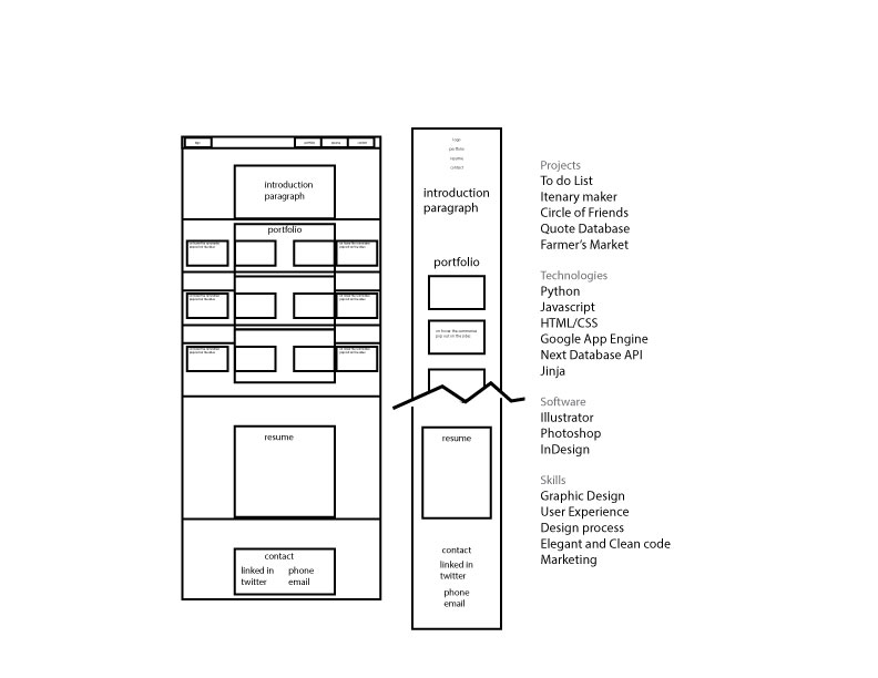
I started out thinking I would be adding more of my coding bootcamp work, but I didn’t feel quite as confident with some of my pieces as I thought I would. Great learning experiences, though.
responsive
has two Javascript features: a photo slider with left/right controls and a “read-more” pop-up window feature
standard jump behavior caused by bookmark anchors (the buttons lead to different parts of the page)
hand-coded
HTML, CSS, Javascript
“read more” feature disappears for mobile users (the bigger images don’t scale well). The mobile version becomes slightly simplified.
divided into two sections: work I did for Ada’s and other projects






 Kismet Arts Tangent