Skip to content

Kismet Arts Tangent

Art Collective

    • Kismet Arts Tangent- website under construction- stay tuned 🚧
    • Blog
    • Contact

recent posts

  • Make up looks
  • Images from re Patient’s Schedule
  • Self Intake
  • Inspiration Pool for zine
  • Photo shoot with Kayleigh Shawn

  • Instagram
  • Lustig Animation

    October 28, 2013


    layers
    Should I name my layers? Yes.

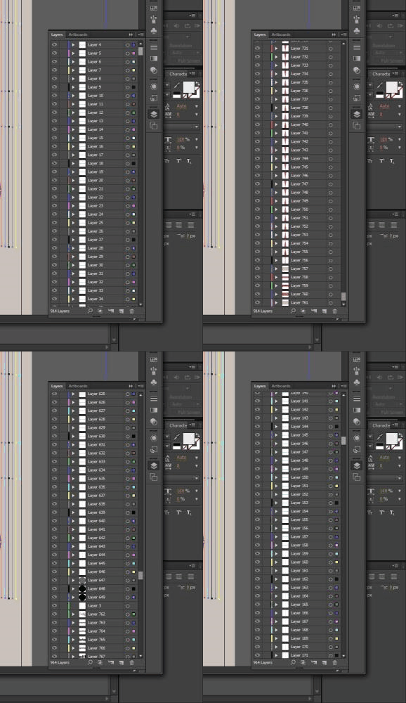
    I read Born Modern and I was deeply affected by it. I wanted to express my infatuation with Alvin Lustig with some geometric vomit, but after I assembled the illustrator file, I thought I was close enough to the point of making an AfterEffects video. It was more difficult than I thought. Layers wrestling was tough. I didn’t name my layers, but I was curious if I could handle it. It’s not so bad. I used the eye symbol to toggle on and off the layers to see if the layer I was affecting was the layer I wanted to affect.

    I wrote the script and made the outlines. It seemed inspiring at first, but afterwards, thinking on it, there was a bit of frustration in the rendering towards the end. I should make a habit of compressing the files now and again so it isn’t so bad on the thing– whatever the thing that crashes my computer when it’s overworked– thing. This is my second kinetic type video. The first one also being very similar in texture (lack thereof) and emphasis on flat basic geometric shapes. I’m looking forward to more reasons to branch out, but I also appreciated how much I can get without putting so much into it that I feel like I started a project that’s taking more time than it’s worth. I was a little impatient towards the end. I thought about correcting a typo, *repetition, but I kind of liked the way all those i’s looked, so I kept it, though I know some big shot is going to point it out and look down on me for it.

    Reaction To Alvin Lustig Video from Katarina Countiss on Vimeo.

    Here’s the illustrator image, which contains layers of triangles (I’m really into these dod-gammed triangles.) It was interesting seeing the changes that happened between this layout phase and the final product. I went through a few different songs, too.

    lustigeverything

    The script: 

    Today, I read one of those coffee table books. It was a big one. The topic: Alvin lustig.
    It made me think about typography
    and spacing
    and art, repitition, modernism
    I’ve been thinking about my stile as a designer.
    Or whether I am a designer at all.
    Lustig saw a combination of both worlds, art and design.
    And it was modern.
    And sublime.
    It seemed to express restfulness and energy.
    The artifice of something man made and yet
    an abstract quality that seemed fo the lenegance of the universes’s natural state.
    In my mind, I see this union transform what I think about both art and design.
    How can I take this and make it something my own?
    I have to think about it for a while.
    More importantly, create a lot.
    It will crystallize into something unexpected.

    The music
    Gurdonark / CC BY-NC 2.5

    sharing options:

    • Share
    • Share on Tumblr (Opens in new window) Tumblr
    • Print (Opens in new window) Print
    • Share on LinkedIn (Opens in new window) LinkedIn
    • Share on X (Opens in new window) X
    • Share on Reddit (Opens in new window) Reddit
    • Share on Pinterest (Opens in new window) Pinterest
    • Share on Facebook (Opens in new window) Facebook
    • Email a link to a friend (Opens in new window) Email
    Like Loading…
  • Home Depot: HTML prototype

    October 15, 2013

    Today, I made my first HTML prototype. Well, at least the start of it. The rest is just linking pages and adding content. I’m working with a project I did in school 3 months ago. I made an After Effects mockup. Perhaps it was the deadline, my lack of familiarity with the tool or some other factor, but I felt like it didn’t do my idea of how the app should work justice.

    Last weekend, I went to InfoCamp 2013 where Phannipha Arunyaangkul, UX Designer in Seattle talked about different ways to prototype. That’s when I found out about Ratchet, a tool specifically for html app prototypes for iPhones. So, no this hasn’t been updated for iOS7’s “chic” flat design (which I dislike a bit). But, you can dig into the CSS and make it look like whatever you want, so that’s cool. How can I summarize what rachet gives you: It’s a website template that is stalked with some styles that are conventional for iPhone apps. Buttons, entry fields, transitions, etc. It has some javascript you have to hook up and copy a lot of text from the website, but that’s easy enough. Here you see what the code looks like on desktop.

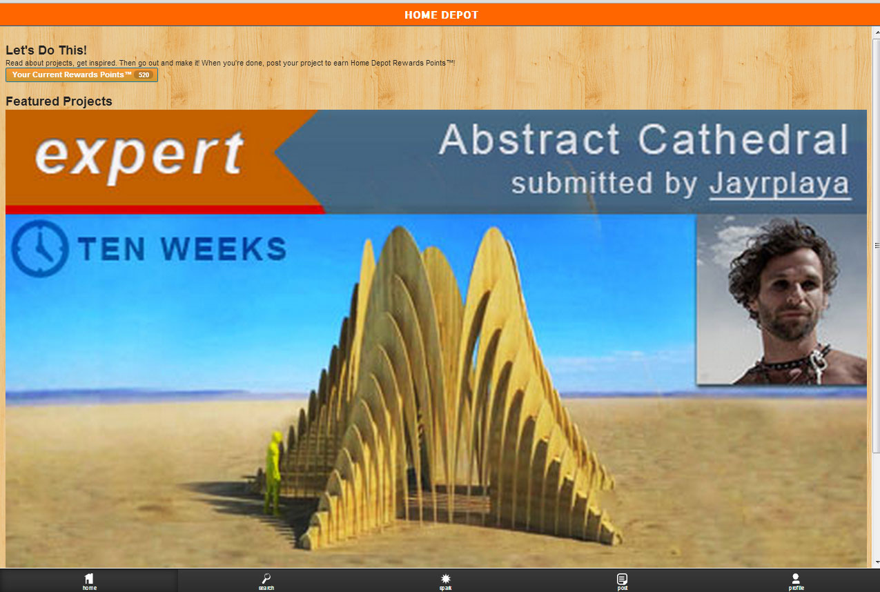
    printscreenhomedepot
    Desktop View: It looks hilarious, I know. I just had to include it!

    Changes to Rachet

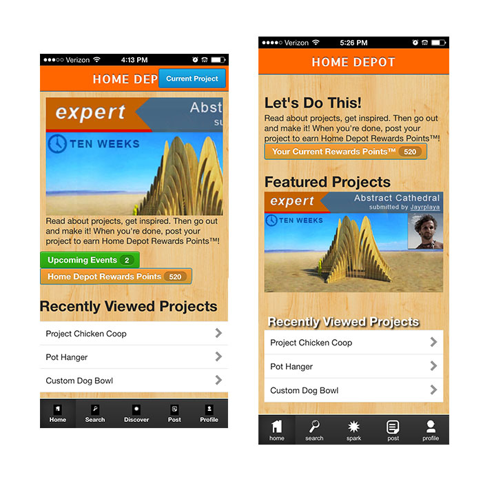
    homedepotprogress
    Left: first iteration Right: Second Iteration

    To get this view where it looks like an app, there are a few ways to do it. For this, I put it on my website, Home Depot App. With your iPhone, view the site, then click the  button and “Add to Home Screen”. I made some apple-icons (Free Online Favicon and Apple Icons Generator – iconifier.net.) so it looks really legit on my phone. Anyways, Rachet was recently updated two months ago, but during my first iteration, I noted that they have pngs for buttons. I think that’s good and all, but… SVG vs PNG. Scalable Vector Graphics are a lot easier to use and they look so crisp. So, for the bottom nav (see right image), you can see the image filling the space better. I made white .svg’s with no background and labeled them so I could control the spacing more effectively. I recommend that you outline your type, otherwise some fonts might get lost, but if you don’t… hmmm, something happens. I am not sure what.
    (Here’s results from that question “svg outline text”)

    “Text can also be styled with CSS properties such as font-weight, font-style, and text-decoration which can be implemented either through inline-style, internal-style or external-style like we have discussed in the previous post about Styling SVG with CSS”

    via Scalable Vector Graphics: Working with Text.

    I spent a good long while figuring out the slider. It’s not bad, but I was wondering how to make my images fit. It had a hard-coded height of 200px. Ended up using Amazium‘s max-img code. I know there’s a dozen ways to make images responsive, but maybe I just wanted to plug Amazium as being a really nice framework to use. I like their website. It’s got lots of readable code. Speaking of readable, my slider is not. It’s got pictures of text. I might spend a lot more time with the slideshow to make it text readable, but prototyping is all about maximizing your time.

    I started looking into Rachet without wireframing. I just wanted to see all of my options and dive in to see that I could navigate through the code and such. Now, I got to go back and polish up some wireframes and get this app prototyped. I’m excited to see how things progress.

    sharing options:

    • Share
    • Share on Tumblr (Opens in new window) Tumblr
    • Print (Opens in new window) Print
    • Share on LinkedIn (Opens in new window) LinkedIn
    • Share on X (Opens in new window) X
    • Share on Reddit (Opens in new window) Reddit
    • Share on Pinterest (Opens in new window) Pinterest
    • Share on Facebook (Opens in new window) Facebook
    • Email a link to a friend (Opens in new window) Email
    Like Loading…
  • Designing Beyond Photoshop: Eng speaks at Infocamp Seattle 2013

    October 14, 2013

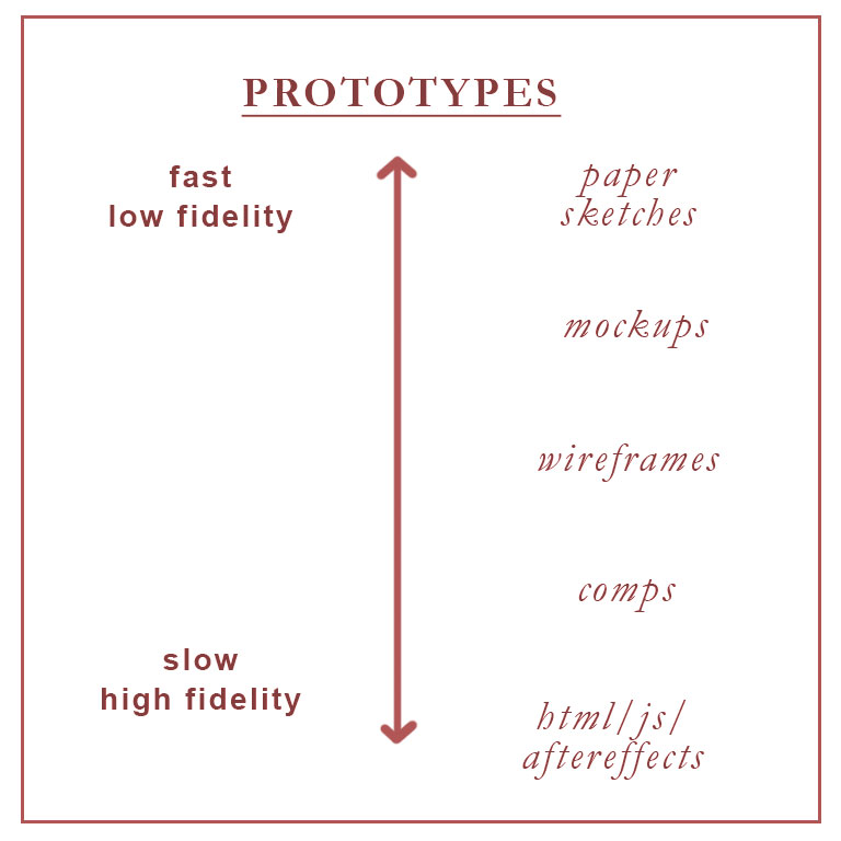
    prototypes

    Phannipha Arunyaangkul, UX Designer in Seattle talked at InfoCamp 2013 about how Photoshop is a pretty rudimentary tool when it comes to app prototyping.

    UX tools include Photoshop and wireframing. But, interactions aren’t static. Facebook Home features a chat bubble unlike anything previous.

    “…something like Facebook Home is completely beyond the abilities of Photoshop as a design tool. How can we talk about physics-based UIs and panels and bubbles that can be flung across the screen if we’re sitting around looking at static mocks? (Hint: we can’t.)”

    via Kevin Finlayson – Animation in UI Design.

    Prototyping Tools

    Apps like Axure and ProtoShare are quick and easy but have limited functionality. Apple officially uses Quartz Composer, but it has a steep learning curve.


    HTML, CSS and Javascript are relatively quick and easy. To execute this, you need to learn some. Here’s a few good resources: Code School, Codecademy and Tuts+.  And better too, front-end frameworks to get you started fast: Bootstrap, Foundation, and my new favorite (favorite because it is specifically for prototyping iPhone apps) Ratchet.  Google Web Designer is free. It cannot import styles, but it generates readable code. Framer uses PSD layers. Its top feature (in my opinion) is the animation. I didn’t know this, but apparently you can just tell what kind of rate you want your animation to go and there’s a library with the math and stuff so you don’t need to know the formula. Just the name. Find it at Easing Functions Cheat Sheet.

    After Effects. Um no?  After Effects is not really made for prototyping, or it would have some sweet presets. There’s probably a library of those floating around the internet somewhere. I wouldn’t recommend After Effects unless you’re really comfortable with a timeline scrubber. I always feel like the timing is too fast or too slow, but there’s no rhyme to it. It takes some getting used to. My prototypes look all janky and don’t align well. And states are too much trouble in comparison to the few lines of code it takes for a link to have multiple states, or what have you. But, on other merits, I would say it’s not helpful. With a coded prototype, you can pass it off to your developer and they will thank you for having websafe colors, and animation timing with code like this “webkit-transition: all 1s ease-in-out.”

    Stay curious. If you want to see what a website’s doing, check under the hood using your browser’s view source. If you’re really ambitious, use Save As and download the complete web page. Sometimes, what you save is a frozen version of the website, so check the states. And with code, sometimes it’s not that easy to decipher. Other resources include GitHub, CoffeeScript, Tumult Hype (doesn’t import styles), Webmonkey from WIRED, and Apple’s Keynote has a free limited library of protyping stuff at Keynotopia.

    sharing options:

    • Share
    • Share on Tumblr (Opens in new window) Tumblr
    • Print (Opens in new window) Print
    • Share on LinkedIn (Opens in new window) LinkedIn
    • Share on X (Opens in new window) X
    • Share on Reddit (Opens in new window) Reddit
    • Share on Pinterest (Opens in new window) Pinterest
    • Share on Facebook (Opens in new window) Facebook
    • Email a link to a friend (Opens in new window) Email
    Like Loading…
  • HTML5 Everywhere: Michael Booth speaks at Infocamp Seattle 2013

    October 14, 2013

    Michael Booth talked at InfoCamp 2013 about why you should use HTML5. Michael is a developer at Microsoft for over two years.

    He says that HTML5 is great for a lot of different projects. Because it’s easy to learn, it’s a widely known “language.” (See Why HTML is Not a Programming Language.)

    Its strengths: content creation, content consumption, “living” applications with frequent updates, heavy user interaction. It’s good for desktop. The benefits include the ability to make rapid changes (there’s a quick write-refresh cycle), shorter bug tails and less risk. When the application fails, the browser catches it, so it “gracefully fails” instead of crashing.  It’s good for web. It’s a text file, so the security risk is low. Users aren’t required to download anything. The browser handles everything. It’s good for mobile. Windows 8 supports apps in HTML5. Do that with PhoneGap.

    Its weaknesses: mathematical computations and intensive games.

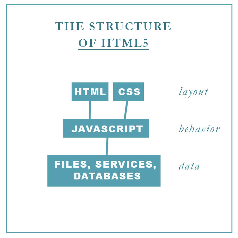
    The HTML5 stack is great for User Interface prototyping. Because of its popularity, there are many frameworks available. Prototyping in code allows for stateful prototyping. Active links, hovers, etc. are controlled by the CSS (Cascading Style Sheets) and developers will appreciate that you’ve communicated in a language they understand.


    layoutofhtml5

    Javascript

    Michael recommends downloading an editor. JetBrains WebStorm has a 30-day free trial period. JSFiddle allows you to create in the browswer in a usable WYSIWYG (What you see is what you get). Imagine sending a url to your dev and they get this! Wow.

    Q and A

    How much is enough? (Or what’s a recommended minimal amount of code knowledge for a non-programmer (read: designer)?
    Read code. Build a bare bones website with HTML and CSS. Basic javascript that calls and changes CSS. Be able to hide and display elements. Care about the explorer tools like Inspect Element. Get the “Inspect Element” Tool for Your Browser. With these tools, you can see what your favorite websites are made of.

    What projects are good for learning HTML5?
    Games. Personal Portfolio. Use Google. Look up what you want it to do. Then take the code that the result gives you and type it out. Think about why it works.

    What’s the difference between HTML4 and HTML5?
    HTML5 has new features including better scripting, media players, metadata and semantic tags such as <section> and <article>. Use HTML5 as intended and your page will be read by computers in a way that they are better understanding of the content because of this new markup code.

    sharing options:

    • Share
    • Share on Tumblr (Opens in new window) Tumblr
    • Print (Opens in new window) Print
    • Share on LinkedIn (Opens in new window) LinkedIn
    • Share on X (Opens in new window) X
    • Share on Reddit (Opens in new window) Reddit
    • Share on Pinterest (Opens in new window) Pinterest
    • Share on Facebook (Opens in new window) Facebook
    • Email a link to a friend (Opens in new window) Email
    Like Loading…
  • Open Source UX: Hoby Van Hoose leads a conversation at Infocamp Seattle 2013

    October 14, 2013

    Hoby Van Hoose (hobyvh) talked at InfoCamp 2013 about Open Source UX and the emergence of culture and community around user experience.

    User Experience is a budding discipline. How can we share information the way “view source” allows coders to learn from each other? The rate of innovation was faster because coders can see how a website is put together with little barriers. User Experience encounters obstacles that make learning from each other more difficult.

    Issues

    Often we can’t get specific about our project details because it’s proprietary. The stuff that we end up looking at is generalized and often too vague to be helpful. User Experience is a broad enough category that we don’t have an agreed upon vocabulary. Access is limited. Unlike the international HTML, user experience is not without language barriers.

    Potential Solutions

    UXRSS. A multimedia, open protocol forum feed similar to Stack Overflow, complete with wiki excerpts that help define terms, whiteboarding sessions, and video. It’s important to not just have solutions (See The Dribbblisation of Design) but lots of process work too. A formatting system where we can search by root problems, so if we’re having the same problem as someone else, we can learn from their solution as well. And often the solution is more than just some screens. It’s a system. And more, proof that the system works, some well-documented metrics.

    UX without Borders. A reference to Doctors Without Borders. It’s where nonprofit agencies can band together in “industry collaboration” and share real projects and insights. Think Data Scientists meets Mozilla. And they would document everything.

    UX Community. There are the monocultures of Amazon and Microsoft with their own way of doing things, their own vocabulary. In the future, after their employees leave those companies but take their frameworks with them, may we have an infusion of ideas into the population at large? A set of best practices an professional principals? There will be devoted researchers. There will be a separate set of ethics relating to the corporation and the individuals. Will there be a Hippocratic oath but for UX designers?

    UX Leadership. UX has and will have thought leaders. There will be a push in marketing the tasks of user experience as necessary as there was a push for “good design” a hundred years ago during the industrial revolution. The dialog of “good user experience” is beneficial in driving interest in user experience.  But, will user experience leadership be centralized like Wikipedia. Or will it be distributed, Amazon, Microsoft and others having their own lingo, standards, etc. like varied dialects?

    sharing options:

    • Share
    • Share on Tumblr (Opens in new window) Tumblr
    • Print (Opens in new window) Print
    • Share on LinkedIn (Opens in new window) LinkedIn
    • Share on X (Opens in new window) X
    • Share on Reddit (Opens in new window) Reddit
    • Share on Pinterest (Opens in new window) Pinterest
    • Share on Facebook (Opens in new window) Facebook
    • Email a link to a friend (Opens in new window) Email
    Like Loading…
  • Designers at Hackathons: Eric Bell speaks at Infocamp Seattle 2013

    October 14, 2013

    Eric Bell (ericthebell) talked at InfoCamp 2013 about Hackthons and why they are awesome! Eric Bell is a designer, formerly Seattle-based, currently lives in SF and attends hackathons. During his talk, he showed us some of his team projects at hackathons.

    A typical hackathon is a weekend of work, has an attendance of primarily developers. It’s sometimes sponsored by a company interested in promoting their platform or by a local makers chapter. Sometimes there’s a theme, rules and prizes. The work over the weekend sometimes leads to a real product, but other times it’s a great exercise in developing something in a short time.

    The reasons to attend one include working with new things, developing new skills, encountering new people and networking with potential employers, and exploring the challenges of a project with tight time restraints. For a user experience designer especially, it helps one evaluate and execute minimal necessary process. Tasks like personas, scoping the problem, sketching, prototyping, front end design (CSS), taskflows and story boards and mock ups are always needing to be done and often there’s a dearth of UXers to do those things. Often developers skip over a lot of these tasks in favor of doing what they do best: developing. It’s important for UXers to communicate their value to a team. Hackathons are great opportunities to get really good at explaining your trade– it seems everyone has a different concept as to what designers do and that’s because it’s a huge umbrella term for all of these roles.

    Get involved in a hackthon:

    Hackathon IO – Organize & Discover Hackathons – Hackathon.IO.
    Startup Weekend.
    search “hack” at Eventbrite.

    sharing options:

    • Share
    • Share on Tumblr (Opens in new window) Tumblr
    • Print (Opens in new window) Print
    • Share on LinkedIn (Opens in new window) LinkedIn
    • Share on X (Opens in new window) X
    • Share on Reddit (Opens in new window) Reddit
    • Share on Pinterest (Opens in new window) Pinterest
    • Share on Facebook (Opens in new window) Facebook
    • Email a link to a friend (Opens in new window) Email
    Like Loading…
  • M Theory Animation

    October 7, 2013

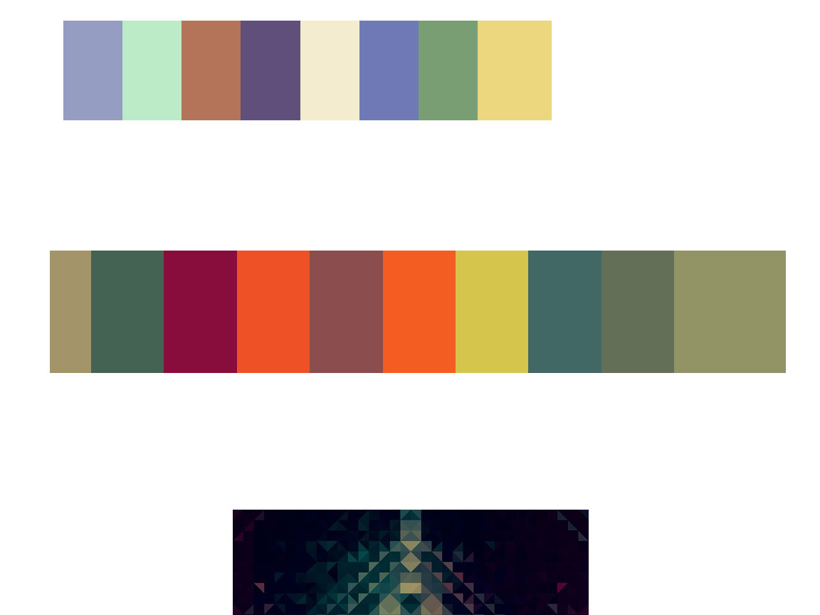
    M Theory Part 1 – YouTube. I saw this and I really liked the abstract content, but I thought the visuals could use a little update. Perhaps some kinetic typography. I’ve been dazzled by some well done typography videos recently, so I’m itching to be good at it. So, I tried it out. I started by picking out a color scheme by looking through my pinterest board of colors I’m interested in exploring together.

    colorpalettes

    I started at the beginning and tried to use shapes (with moving masks) to illustrate the spacey music. I think for the upcoming parts and second draft, I’m going to sketch out the typography and look for more appropriate fonts. I feel like my current font choices aren’t sophisticated enough (or coordinated enough) to handle something that requires a high level of understanding to explain with typography. Here’s the beginning of it. I could definitely align the timing a bit more, but I appreciate how the shapes help enliven the reception of the music. I have no deadline, and I’m thinking about putting this off. Letting the idea marinate and perhaps my return to the project will be a bit more inspired.

    M Theory Kinetic Type Video from Katarina Countiss on Vimeo.

    sharing options:

    • Share
    • Share on Tumblr (Opens in new window) Tumblr
    • Print (Opens in new window) Print
    • Share on LinkedIn (Opens in new window) LinkedIn
    • Share on X (Opens in new window) X
    • Share on Reddit (Opens in new window) Reddit
    • Share on Pinterest (Opens in new window) Pinterest
    • Share on Facebook (Opens in new window) Facebook
    • Email a link to a friend (Opens in new window) Email
    Like Loading…
  • IKF Kitsap: Web Design Phase 1

    October 5, 2013

    Assignment: Re-design International Karate Federation of Kitsap

    ikfscreengrap

    Phase 1 of Web Design

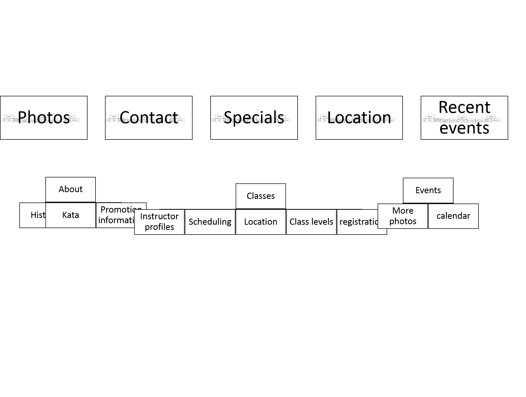
    1. structure information with user-centered considerations (Site Map) *Research the competitors (Links) and content (html)

    ikfsitemap

    International Karate Federation – Honolulu, Hawaii. The main organization is located in Hawaii.

    Karate for Women in Seattle – Feminist Karate Union  Seattle Branch


    2. communicate style and function Branding (style Tile) Version 1, very basic.

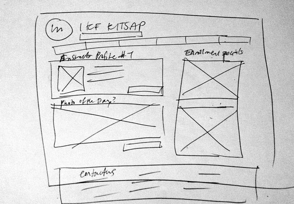
    3.wire-framing explore more efficient layouts (Don’t forget Advertisements if necessary!)

    wireframe

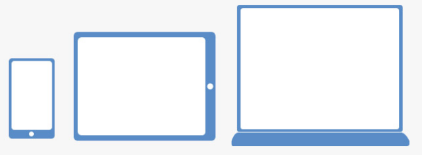
    4. understand mobile strategy and other media requirements. The client is very tech savvy and I want her to be able to show people her classes on her ipad, phone and desktop. As well as parents driving need easy to find information about the location.

    3 layouts responsive

    5. Users: audience, demographic. Who is this for? How should that influence the website? I want it to look clean and efficient (think discipline), but also fun. The main demographic of attendees are 5-10 years old.

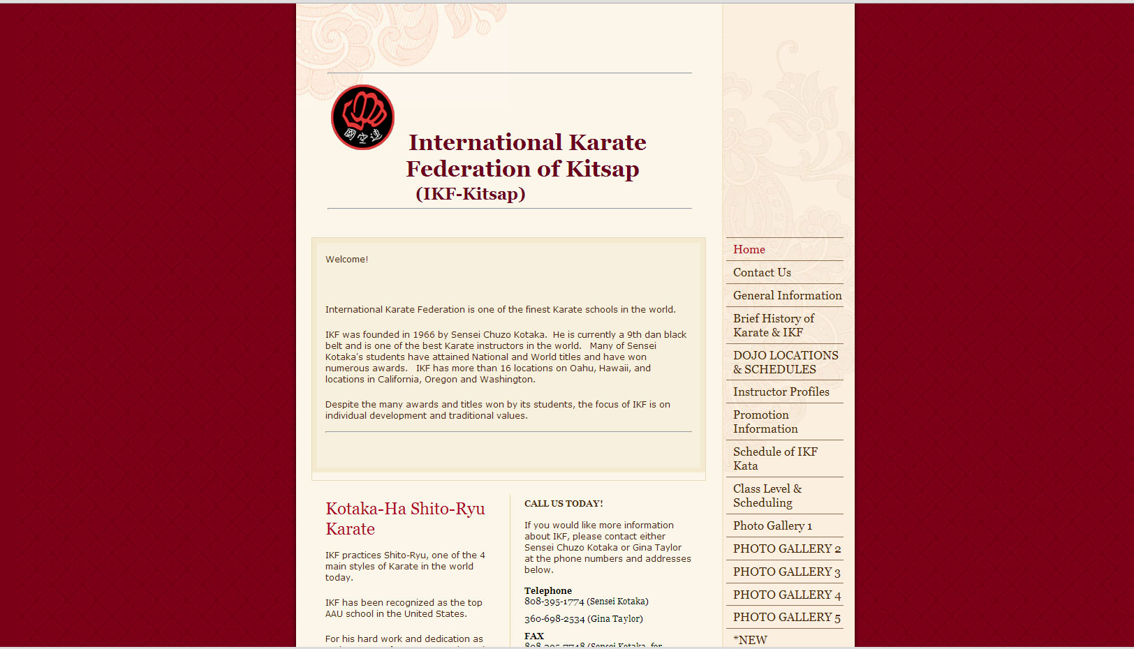
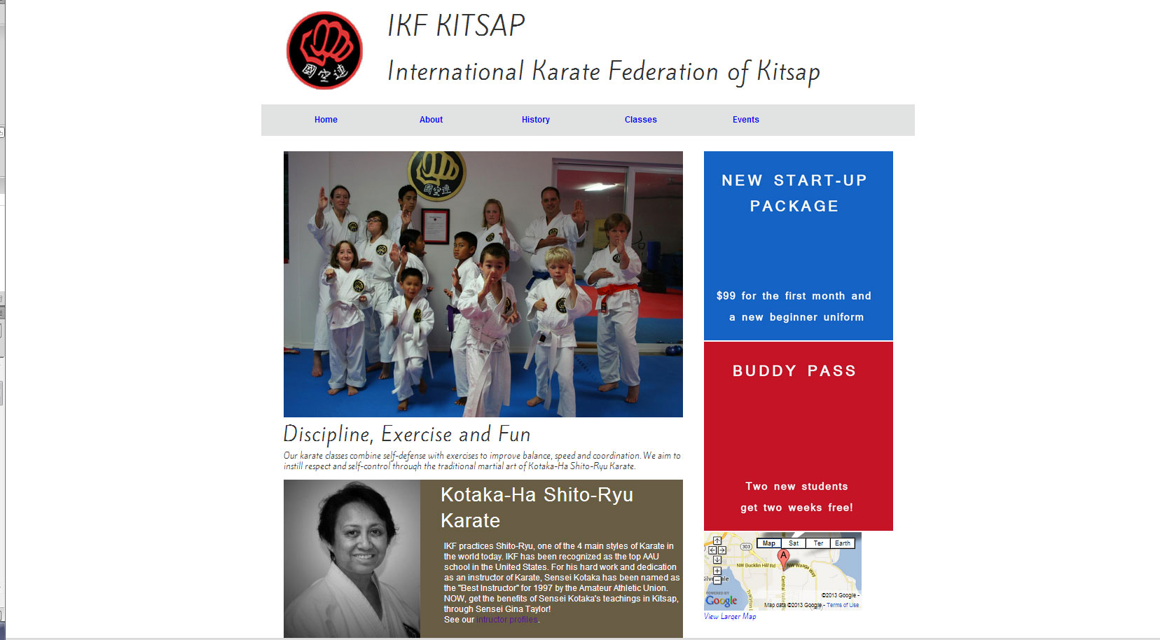
    After one day working on the project, the first iteration. I’m thinking this needs a lot of type and layout work yet. I also want to include the client’s social media icons and color correct some images. And then work on the enrollment special ads. I feel like I rely on this one framework too much and I’m not flexing its capabilities. I will think on this more tomorrow.

    screengrab

    sharing options:

    • Share
    • Share on Tumblr (Opens in new window) Tumblr
    • Print (Opens in new window) Print
    • Share on LinkedIn (Opens in new window) LinkedIn
    • Share on X (Opens in new window) X
    • Share on Reddit (Opens in new window) Reddit
    • Share on Pinterest (Opens in new window) Pinterest
    • Share on Facebook (Opens in new window) Facebook
    • Email a link to a friend (Opens in new window) Email
    Like Loading…
Previous Page Next Page

Blog at WordPress.com.

Loading Comments...
  • Subscribe Subscribed
    • Kismet Arts Tangent
    • Join 102 other subscribers
    • Already have a WordPress.com account? Log in now.
    • Kismet Arts Tangent
    • Subscribe Subscribed
    • Sign up
    • Log in
    • Report this content
    • View site in Reader
    • Manage subscriptions
    • Collapse this bar
%d