I’ve been thinking how it’s kind of been year of the triangle for a lot of us in graphic design school. I know I fell victim once or twice. I felt like the Promotional video that the video editing team did for the portfolio show was strong, but I wanted to play with it some more. As a video editor, I feel like this footage hasn’t been completely exhausted of possibilities.
https://vimeo.com/68863973 Here’s my progress at the end of day one of the project “Triangle Fever.” It’s a PSA parody of what to do when you have too many triangles on the brain and it’s affecting your design. I have an illustrator file of text of the outline above, ready for day 2 of the project when I put in the text and add a voiceover.
Update 6-24-13: I tried a voice over by using Text to Speech, free apps I found on the internet, but the downloads got garbled, so I didn’t use them and opted for musical soundtrack instead. I used AfterEffects to place the type and add some color. Thanks to Matt Nyce for giving me some leftovers from his music video he made. And a thank you to everyone on the promotional video team for making the original video. And thank you to Kthugha and their Attribution-NonCommercial 3.0 Unported song “the man said glitch.”
This painting became this painting which became the one above. It’s amazing to have taken something I painted over five years ago and make it something new. Today I spent some time painting words. I have a list of beautiful words that I think the world could use in the form of paintings. I used older canvases with other stuff already on them and I think it adds to the richness of association, memory and language. Subtle themes in these pieces.
Bucolic- in a lovely rural setting
This place was inspired by Edmonds in this painting that is now this painting.
Acquiesce- submit or comply silently or without protestAmeliorate- to make or become better, more bearable, or more satisfactoryBecoming- Attractive
Today is my first “workday” since graduating from graphic design school. I’m looking for jobs, drinking tea and trying to stay optimistic about my future. There were some things I wanted to do after graduation as a treat to myself. Thing 1: painting some words. I have a list of beautiful words. I’m starting at the top– it’s alphabetized.
a sketch featuring a logo pattern poster that I would later decide that it was too distracting.
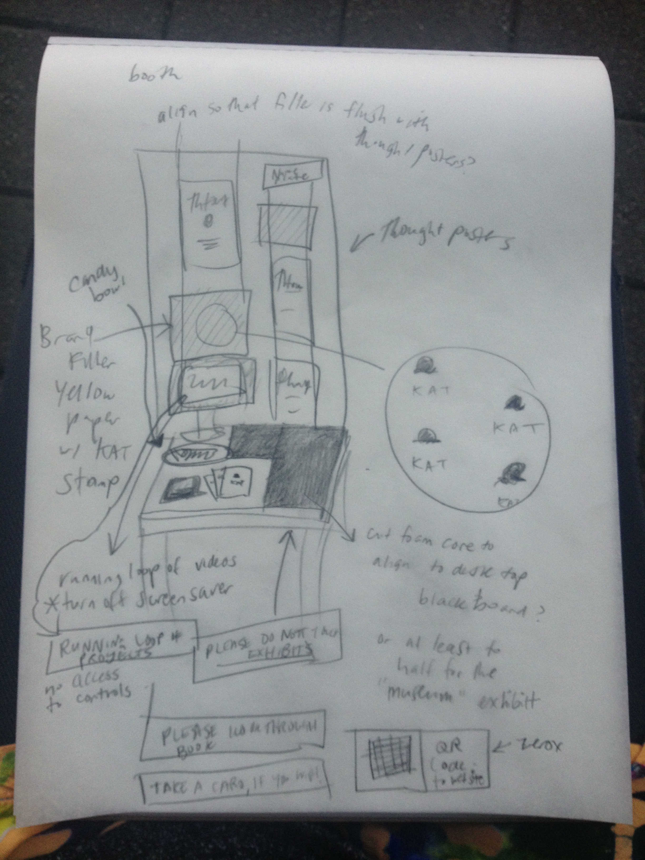
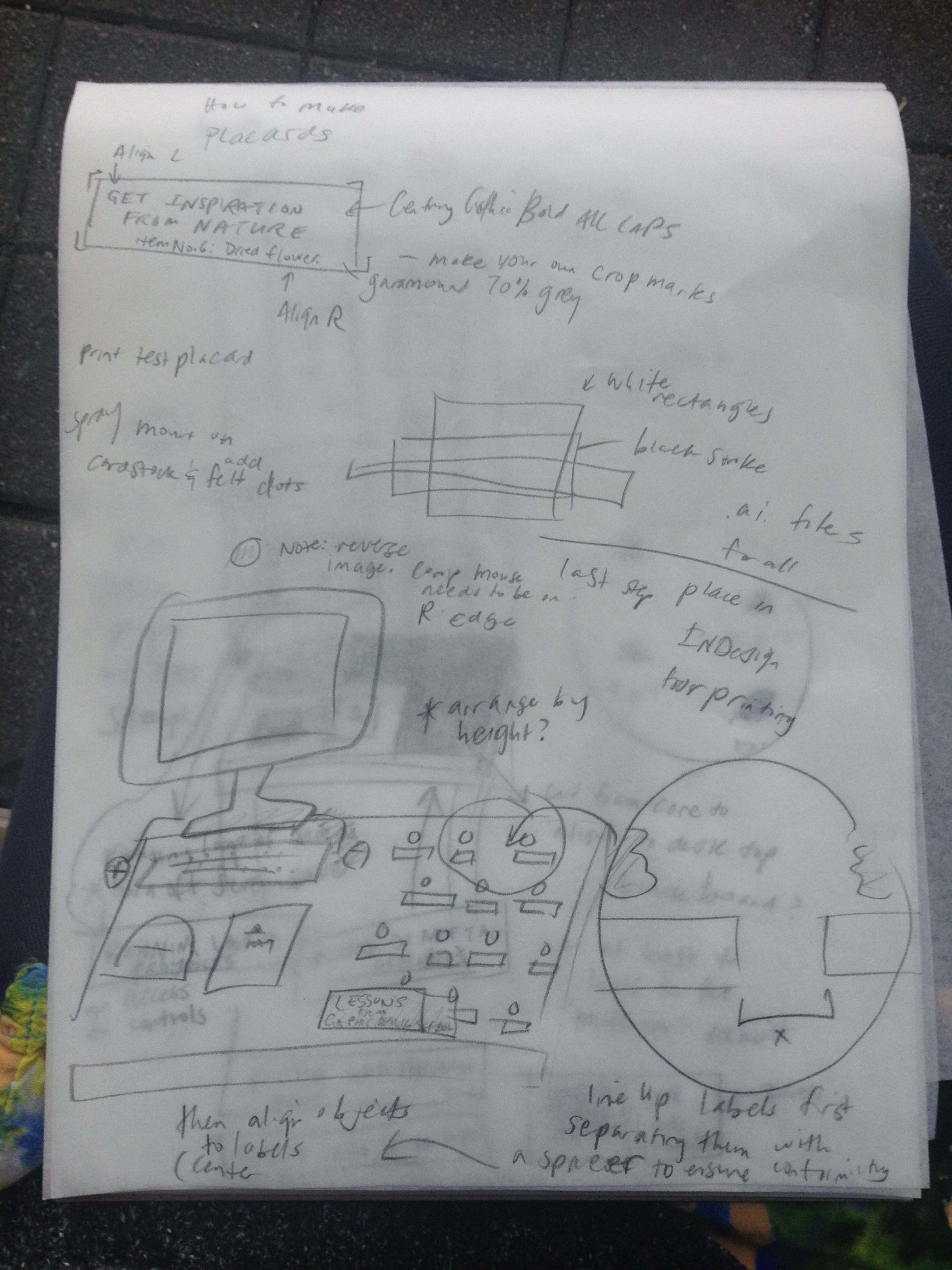
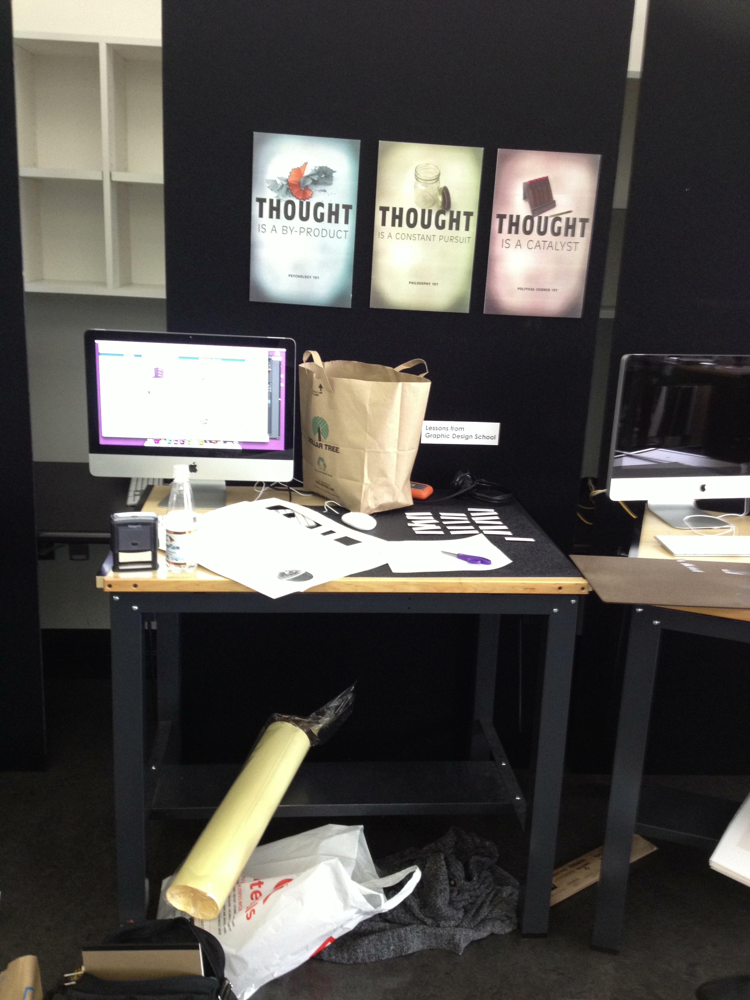
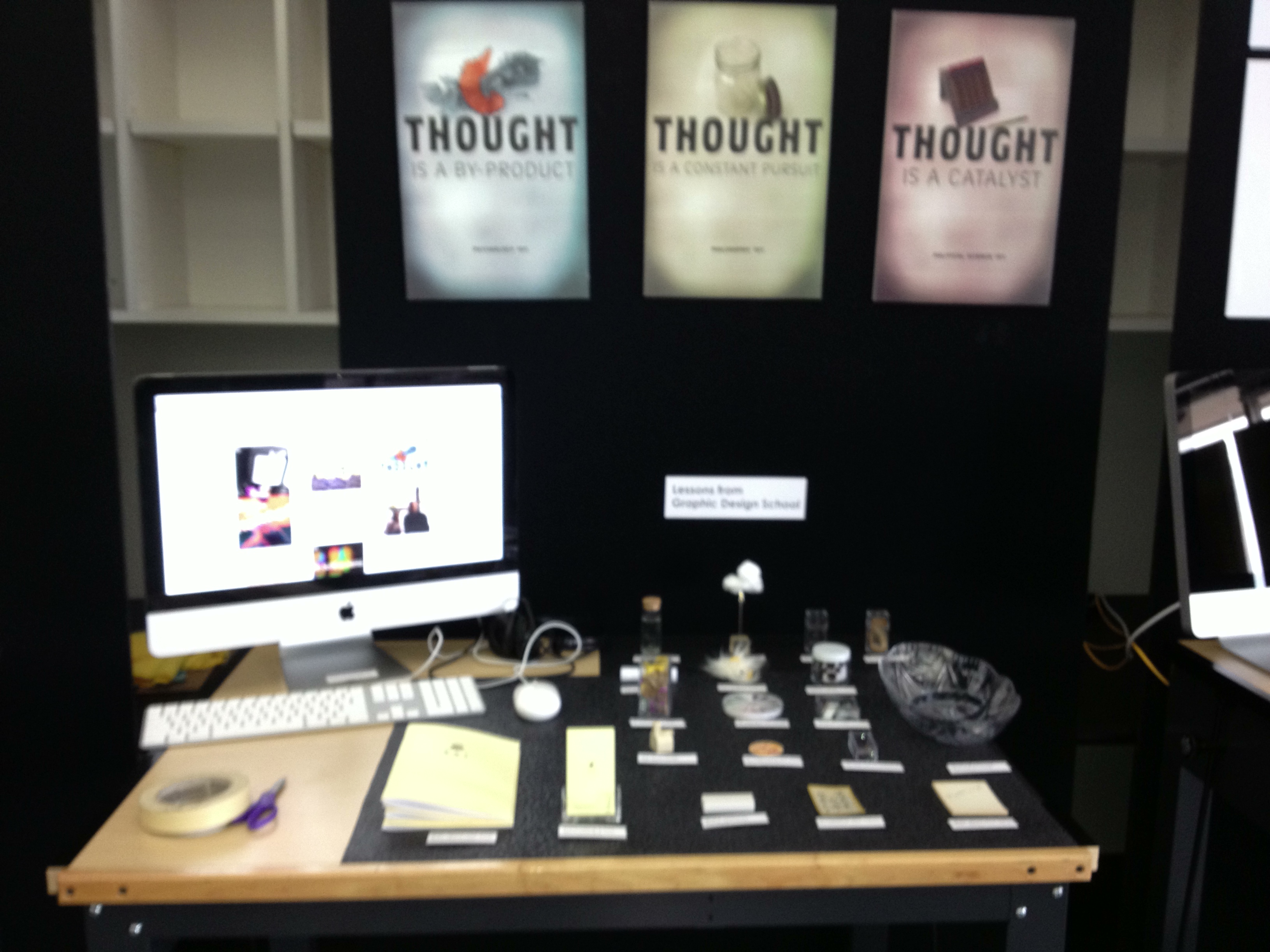
The teachers in the program have been encouraging “leave-behinds,” something that a designer leaves behind as a token after an interview to be remembered by. It’s a gift that seems to get the attention of employers. After making the “lessons from graphic design school” video, I was thinking about little things I could give out that carried that theme. I went to Portland began to hunt. Small items that meant something. I went to Storables, Cargo, the Dollar Tree and Porch Light for some small trinkets and came up with correlating bits of “wisdom.”
Some point between this pursuit and some Portland cold brew coffee where I thought it would be fun to display these items on my portfolio booth– every student gets a table, a mac and a tall piece of wall– and then I set out to designing an “exhibit.” It is turning out to be what I wanted it to be, but I am a little unsure of how it will be received. I think the candy bowl will help.
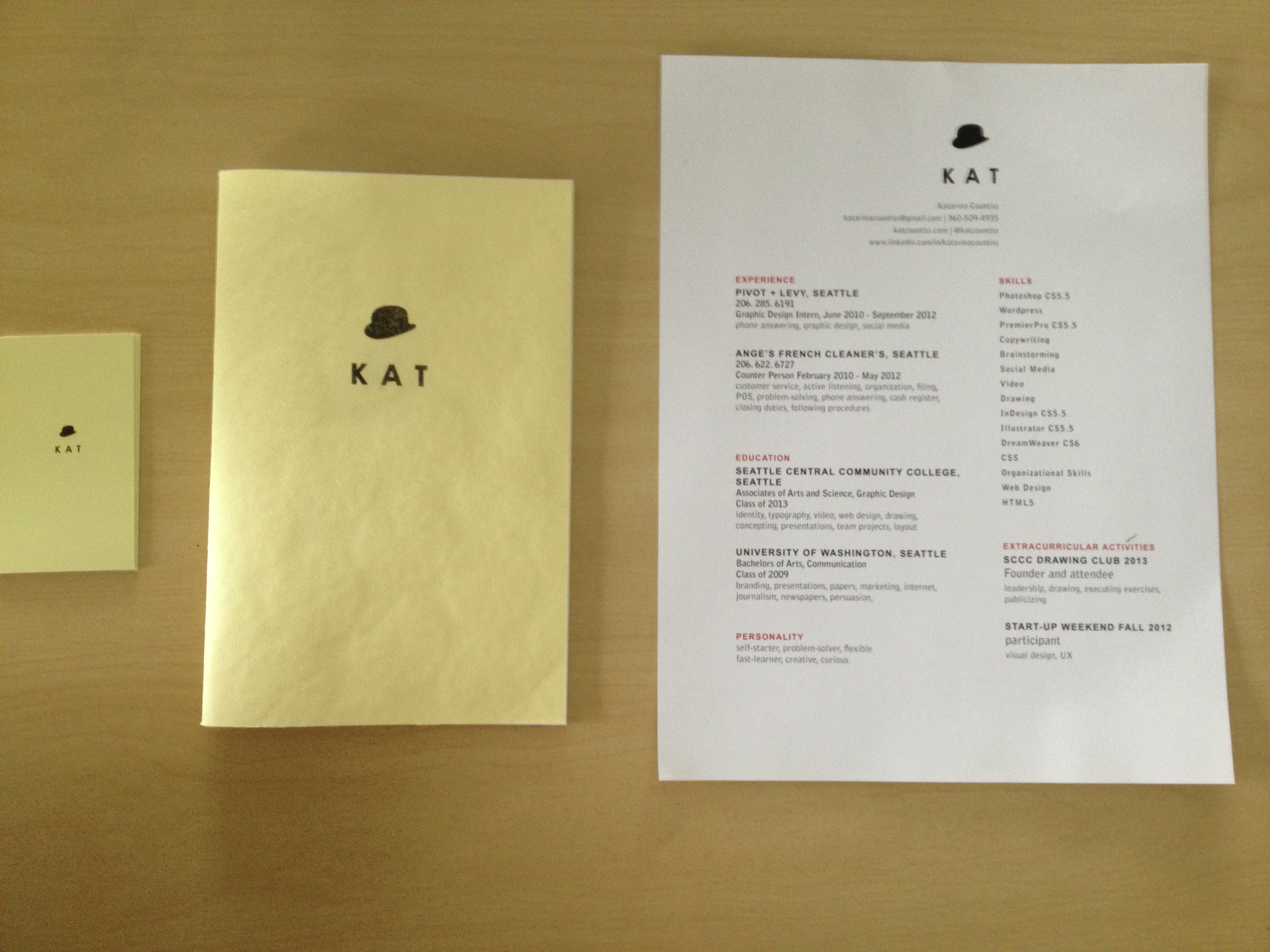
The printed “Kat suite”: Business cards, Portfolio Booklet, Resume
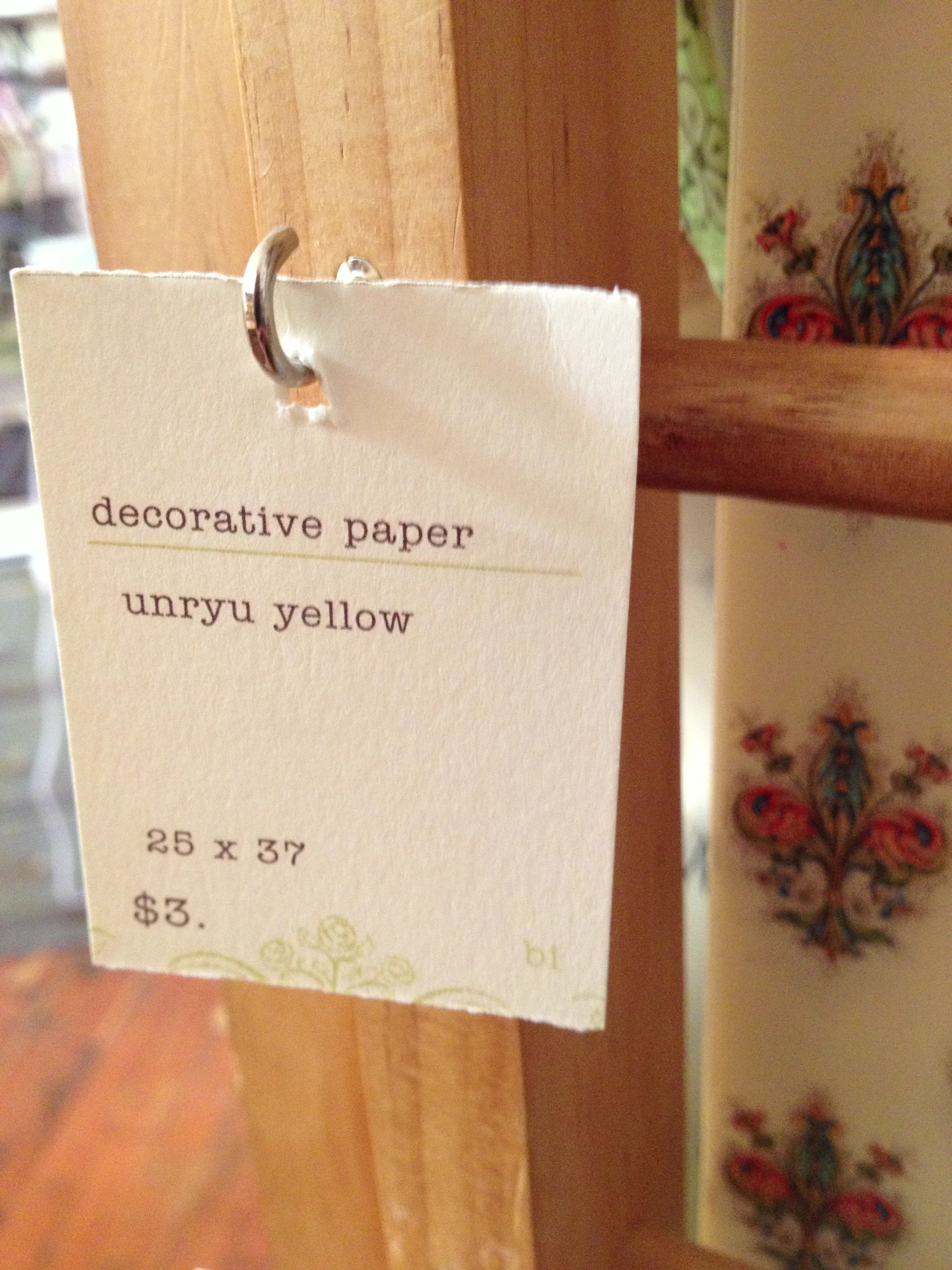
I went to Portland last weekend and found Oblation Papers. Apparently, I have been using “Unryu Yellow.” I knew I had found my yellow and I bought three sheets of it. I made portfolio booklets. I chose the “zine” book style because I wanted to make something I could give to my parents, my greatest supporters and this is a simple, efficient and cost-effective solution. I know that it’s traditional to have a printed portfolio book with a plastic cover, thick paper and plastic protector sheets for the inside papers, but over half of my portfolio is video/interactive and it didn’t feel appropriate to create a Portfolio Book by industry standards. Check out my website. It has videos, presentations and links to my blog. I find that far more useful.
I made this video to summarize my time at Seattle Central Creative Academy. Considering all the mayhem of corrupted files and exporting issues and a virus on my portable hard drive, I managed to save this from the rubble. The video reflects my state of mind at the moment– a little messy pastiche– with the Portfolio Show (SCCA Portfolio Show 2013) nearing ever so close, not close enough to be almost over but that feeling of suspense. Will I get a job? Will I be happy? Will I be involved in inspiring projects? I’ll find out… soon.
I wanted to summarize my two years at the Seattle Central Creative Academy’s graphic design program for my last project in special topics class.
Process: I wanted to capture something authentic about myself as a designer to show to employers. I interviewed my teachers hoping for some insight and asked them about myself and about design. I also had someone interview me on the same topic. I melded sound bites from those interviews into an audio file with a song as a backdrop.
I knew I wanted to make a “demo reel” but I had an idea for making a desk a device with my newly developed app walkthrough skills.
I prepared my “canvas reel,” video taping myself in an empty room in my house and roughly edited it to the pacing of the audio file. I made project reels which had clips from the video projects I did as well as process and images I’ve created over the past two years. I used After Effects to place this reels in the space of the room of the “canvas” reel with the 3D feature.
I wanted to make the audio a little more understandable, so I made captions. I wanted them to animate a little more than I did, but I decided on the expressive hand-written typography and that process led a different way than the scalable illustrator vector items that kinetic typography often uses.
The process with the lettering: I wrote down the script of the video. I screenshot the places in the canvas video where the audio clip ends the phrase for 16 of the phrases in the video. Made an Indesign file so I could print the screenshots scaled on letter paper. Used tracing paper and a 2b pencil to draw out the phrases. I scanned them in. Placed them into photoshop in different layers. Adjusted the levels (made the pencil marks more crisp) and inverted the colors so it was white text on black background. Numbered the layers so they corresponded. Imported that photoshop document into AfterEffects and moved the layers to match up with the phrases and set the layers to screen. There are some places in the video where the type didn’t quite jibe, so I just deleted those bits.
The layered collaged video looked a little jumbled, so I have some parts where a split-screen effect happens. I used clips from my favorite video projects.
Color correction. I wanted a good filter to make the pieces meld together a little bit and act as a highlighter for some of the pieces. Colorize in some places and a black and white tinted layer with a low opacity.
I couldn’t export my video very successfully from After Effects. I tried saving it as a copy, importing it, making new comps, using Premier Pro to add the audio ultimately failed to conform. I should have had better practices with the media cache feature which apparently you shouldn’t set up on a portable drive, but on the main computer. I ended up piece mealing the export process, saving most of the work I did, but there are some things that due to an “unknown error” will forever remain in this lonely corrupted .aep that will have to be remade at some point in the future.
I played this for my class as part of the final presentation. I had no audio, so I played Beatle’s “Yesterday” for accompaniment After considering Pink Floyd and Davy Jones and not finding good youtube videos fast enough.
I introduced it as a great learning piece about coordinating a lot of pieces of a project and trying to run with a bunch of corrupted files in tow. It seemed reflective of my mind and how I am processing the last two years. It’s kind of all in there and it will take a few more attempts at a video like this to make sense of it all.
Here I am at the 25% complete mark of the animations for the portfolio video. A lot of masks that are a bit over their time limit causing stains in the animation. I’m hoping that some color correction will make it look more seamless.
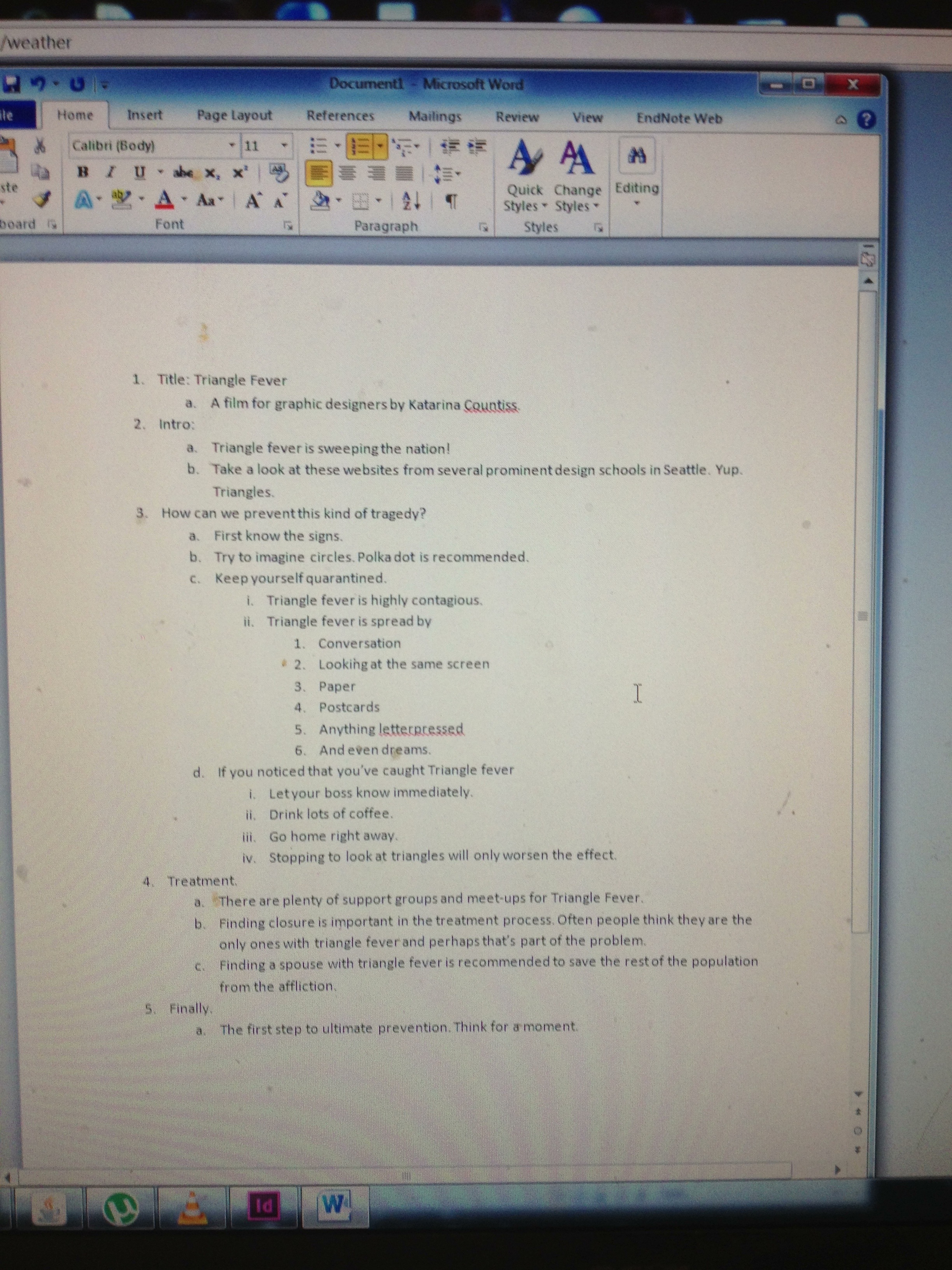 I’ve been thinking how it’s kind of been year of the triangle for a lot of us in graphic design school. I know I fell victim once or twice. I felt like the Promotional video that the video editing team did for the portfolio show was strong, but I wanted to play with it some more. As a video editor, I feel like this footage hasn’t been completely exhausted of possibilities.