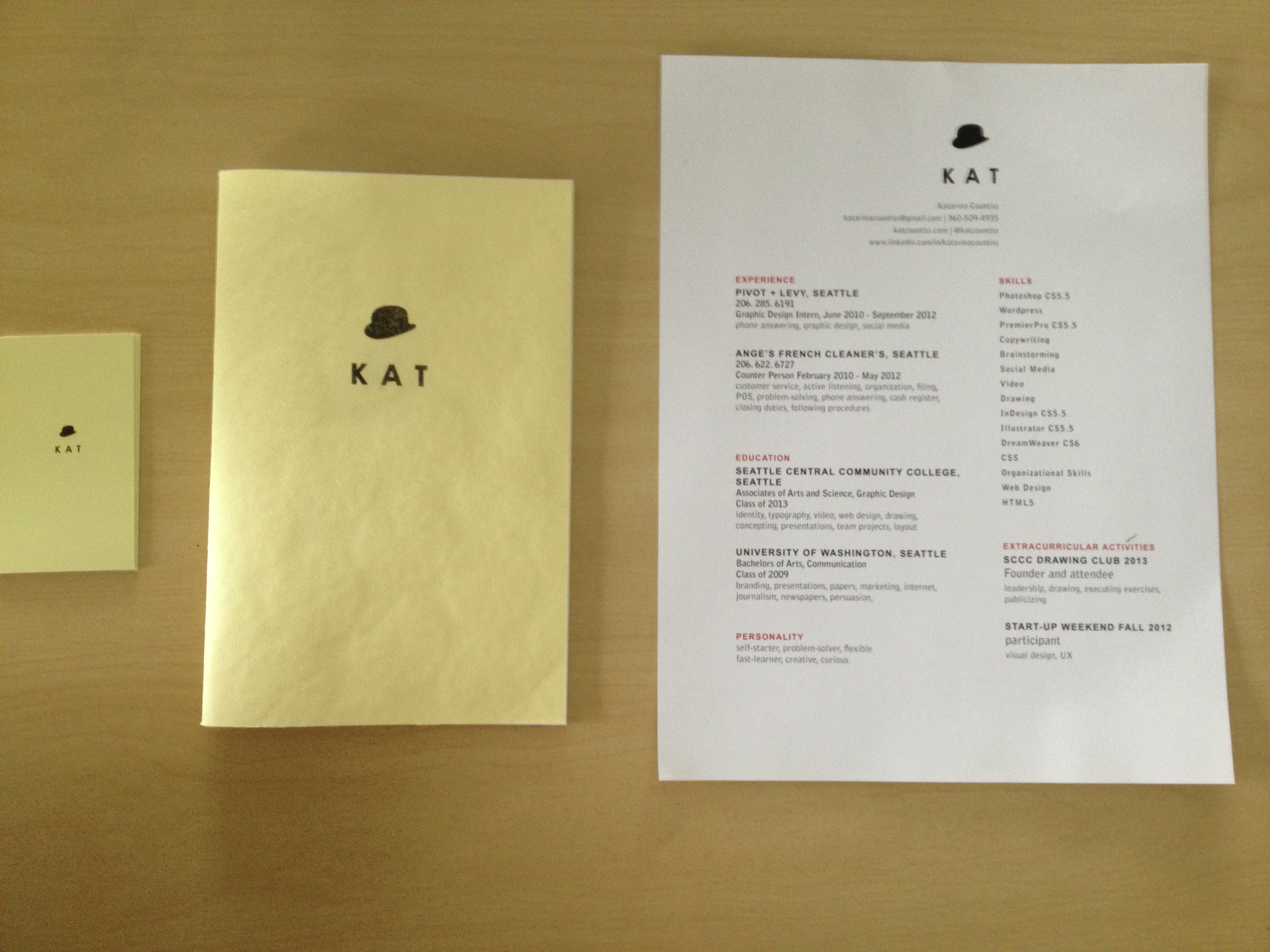
The printed “Kat suite”: Business cards, Portfolio Booklet, Resume
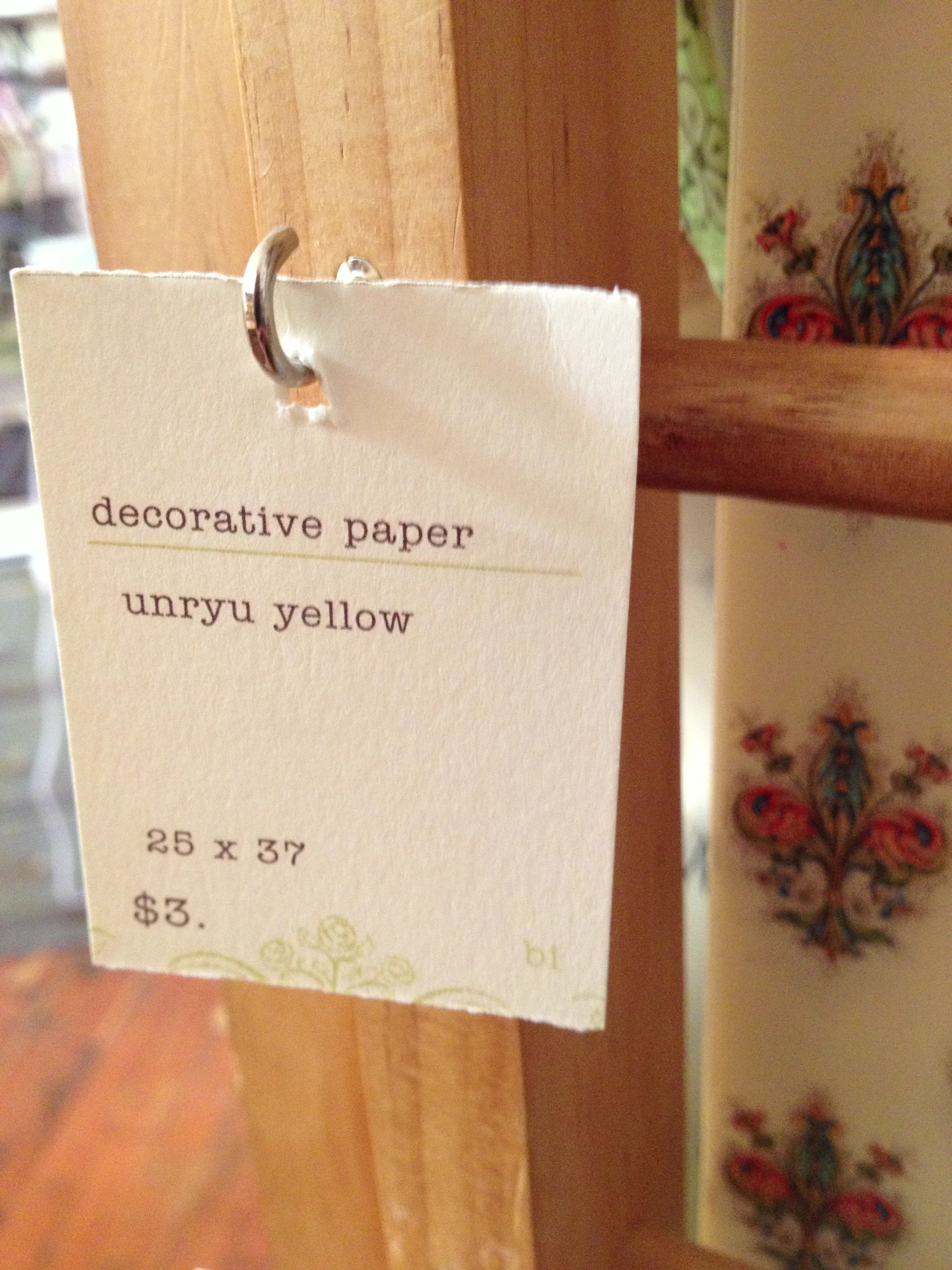
I went to Portland last weekend and found Oblation Papers. Apparently, I have been using “Unryu Yellow.” I knew I had found my yellow and I bought three sheets of it. I made portfolio booklets. I chose the “zine” book style because I wanted to make something I could give to my parents, my greatest supporters and this is a simple, efficient and cost-effective solution. I know that it’s traditional to have a printed portfolio book with a plastic cover, thick paper and plastic protector sheets for the inside papers, but over half of my portfolio is video/interactive and it didn’t feel appropriate to create a Portfolio Book by industry standards. Check out my website. It has videos, presentations and links to my blog. I find that far more useful.
I made this video to summarize my time at Seattle Central Creative Academy. Considering all the mayhem of corrupted files and exporting issues and a virus on my portable hard drive, I managed to save this from the rubble. The video reflects my state of mind at the moment– a little messy pastiche– with the Portfolio Show (SCCA Portfolio Show 2013) nearing ever so close, not close enough to be almost over but that feeling of suspense. Will I get a job? Will I be happy? Will I be involved in inspiring projects? I’ll find out… soon.
I wanted to summarize my two years at the Seattle Central Creative Academy’s graphic design program for my last project in special topics class.
Process: I wanted to capture something authentic about myself as a designer to show to employers. I interviewed my teachers hoping for some insight and asked them about myself and about design. I also had someone interview me on the same topic. I melded sound bites from those interviews into an audio file with a song as a backdrop.
I knew I wanted to make a “demo reel” but I had an idea for making a desk a device with my newly developed app walkthrough skills.
I prepared my “canvas reel,” video taping myself in an empty room in my house and roughly edited it to the pacing of the audio file. I made project reels which had clips from the video projects I did as well as process and images I’ve created over the past two years. I used After Effects to place this reels in the space of the room of the “canvas” reel with the 3D feature.
I wanted to make the audio a little more understandable, so I made captions. I wanted them to animate a little more than I did, but I decided on the expressive hand-written typography and that process led a different way than the scalable illustrator vector items that kinetic typography often uses.
The process with the lettering: I wrote down the script of the video. I screenshot the places in the canvas video where the audio clip ends the phrase for 16 of the phrases in the video. Made an Indesign file so I could print the screenshots scaled on letter paper. Used tracing paper and a 2b pencil to draw out the phrases. I scanned them in. Placed them into photoshop in different layers. Adjusted the levels (made the pencil marks more crisp) and inverted the colors so it was white text on black background. Numbered the layers so they corresponded. Imported that photoshop document into AfterEffects and moved the layers to match up with the phrases and set the layers to screen. There are some places in the video where the type didn’t quite jibe, so I just deleted those bits.
The layered collaged video looked a little jumbled, so I have some parts where a split-screen effect happens. I used clips from my favorite video projects.
Color correction. I wanted a good filter to make the pieces meld together a little bit and act as a highlighter for some of the pieces. Colorize in some places and a black and white tinted layer with a low opacity.
I couldn’t export my video very successfully from After Effects. I tried saving it as a copy, importing it, making new comps, using Premier Pro to add the audio ultimately failed to conform. I should have had better practices with the media cache feature which apparently you shouldn’t set up on a portable drive, but on the main computer. I ended up piece mealing the export process, saving most of the work I did, but there are some things that due to an “unknown error” will forever remain in this lonely corrupted .aep that will have to be remade at some point in the future.
I played this for my class as part of the final presentation. I had no audio, so I played Beatle’s “Yesterday” for accompaniment After considering Pink Floyd and Davy Jones and not finding good youtube videos fast enough.
I introduced it as a great learning piece about coordinating a lot of pieces of a project and trying to run with a bunch of corrupted files in tow. It seemed reflective of my mind and how I am processing the last two years. It’s kind of all in there and it will take a few more attempts at a video like this to make sense of it all.
Here I am at the 25% complete mark of the animations for the portfolio video. A lot of masks that are a bit over their time limit causing stains in the animation. I’m hoping that some color correction will make it look more seamless.
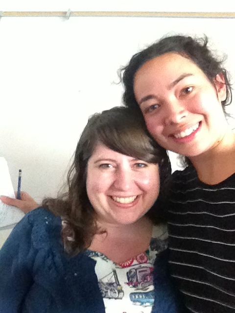
Rebecca Shapiro and I at our whiteboarding session
Yesterday, my Interactive Design teacher, Erik Fadiman, organized a whiteboarding learning session for a little extra practice before graduation and more importantly job interview time. Whiteboarding is when people gather around a whiteboard and do some group problem-solving. The whiteboarding interview is common for software engineers to show their interviewer how they would solve a problem. This exercise is also done by user experience interviewers.
Rebecca Shaprio, UX designer at Amazon and Seattle Central Creative Academy Alum, ran me through a Whiteboarding exercise to help me familiarize myself with the open-ended process of this specific type of interview. Each job and interviewer has special goals in mind, so each whiteboarding interview will be different. Rebecca told me that the primary goal is to witness how the interviewee thinks. This was my first whiteboarding session. She told me that for this task, just to write and talk out my thinking process.
She stated the prompt: Design Technology for the Goal, Buy Clothes Online that Will Fit. I had no time to prepare. Interviewers like to see how you think on the fly. I asked about restraints, budget, time, current technology and she said there are none. A free for all.
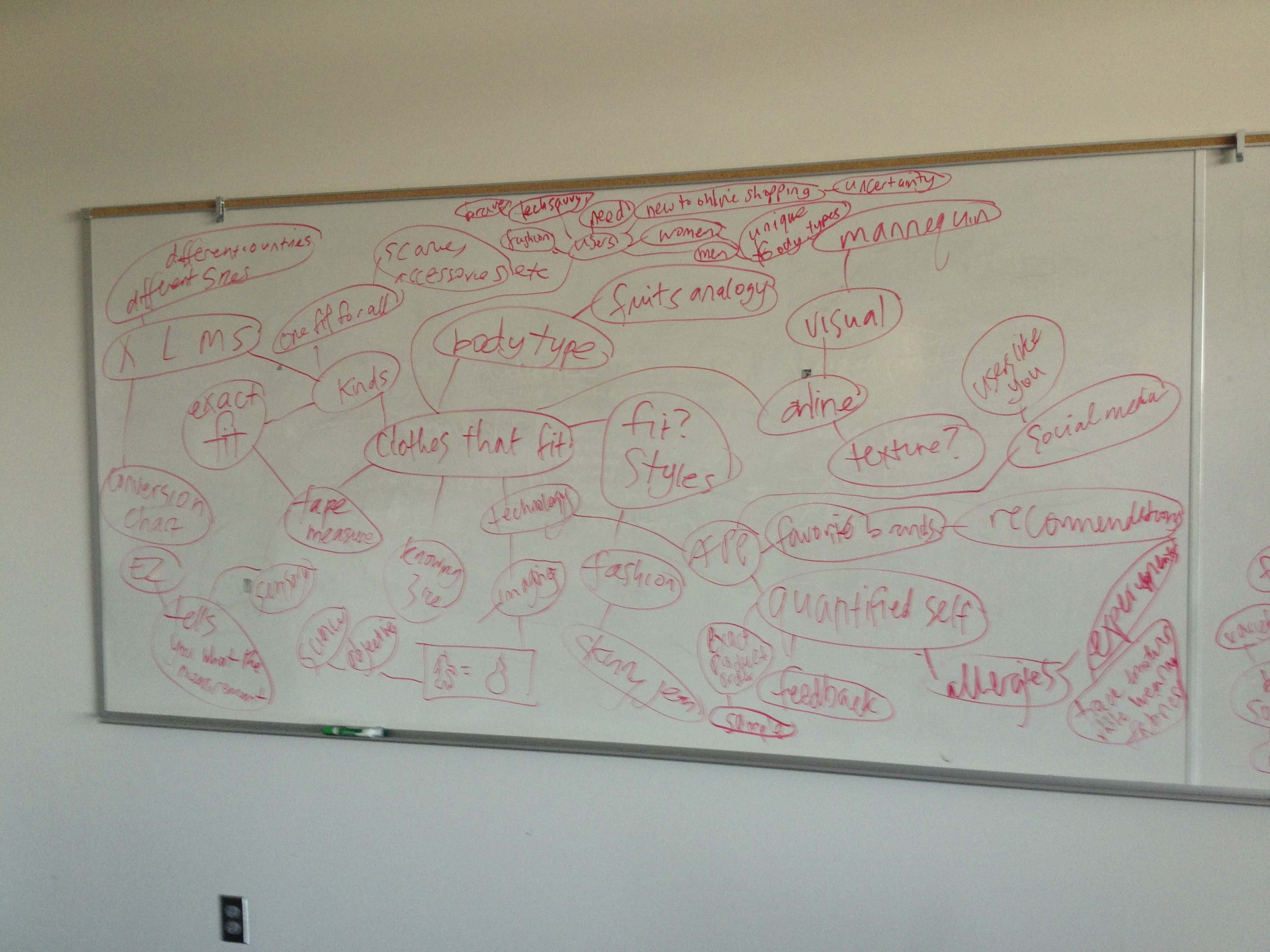
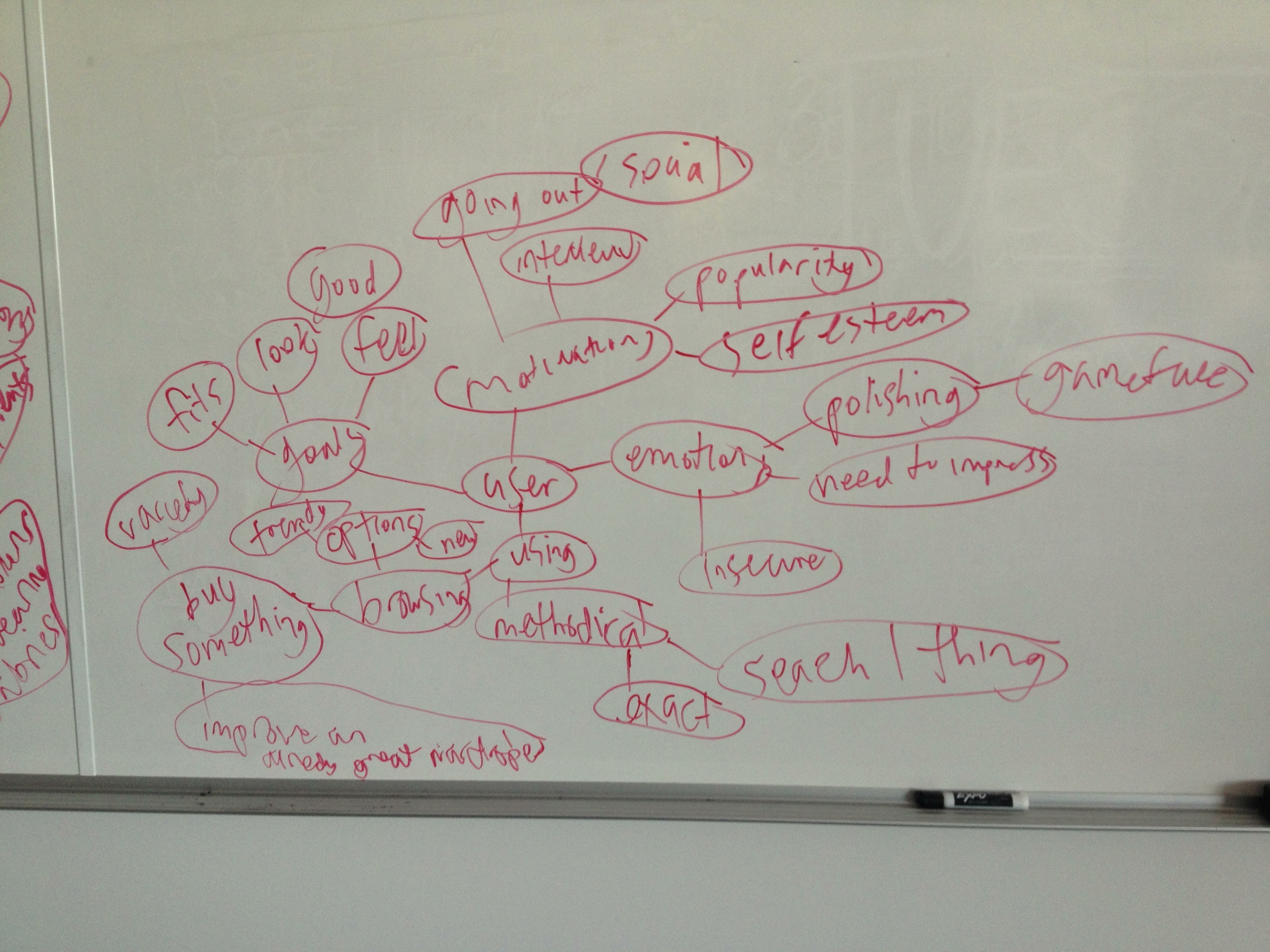
I started to brainstorm using the mind map method. I like this method because you can see hierarchy and context. It’s easy to add connecting ideas. The seed idea is “clothes that fit.” Rebecca prompted me to think of the users and to think of how to use technology.
Initial Brainstorm
Next, Rebecca asked “Who is the user?” and how are they feeling when using this technology. I thought about the different types of shoppers as well as the uncertainty.
mind map of the user
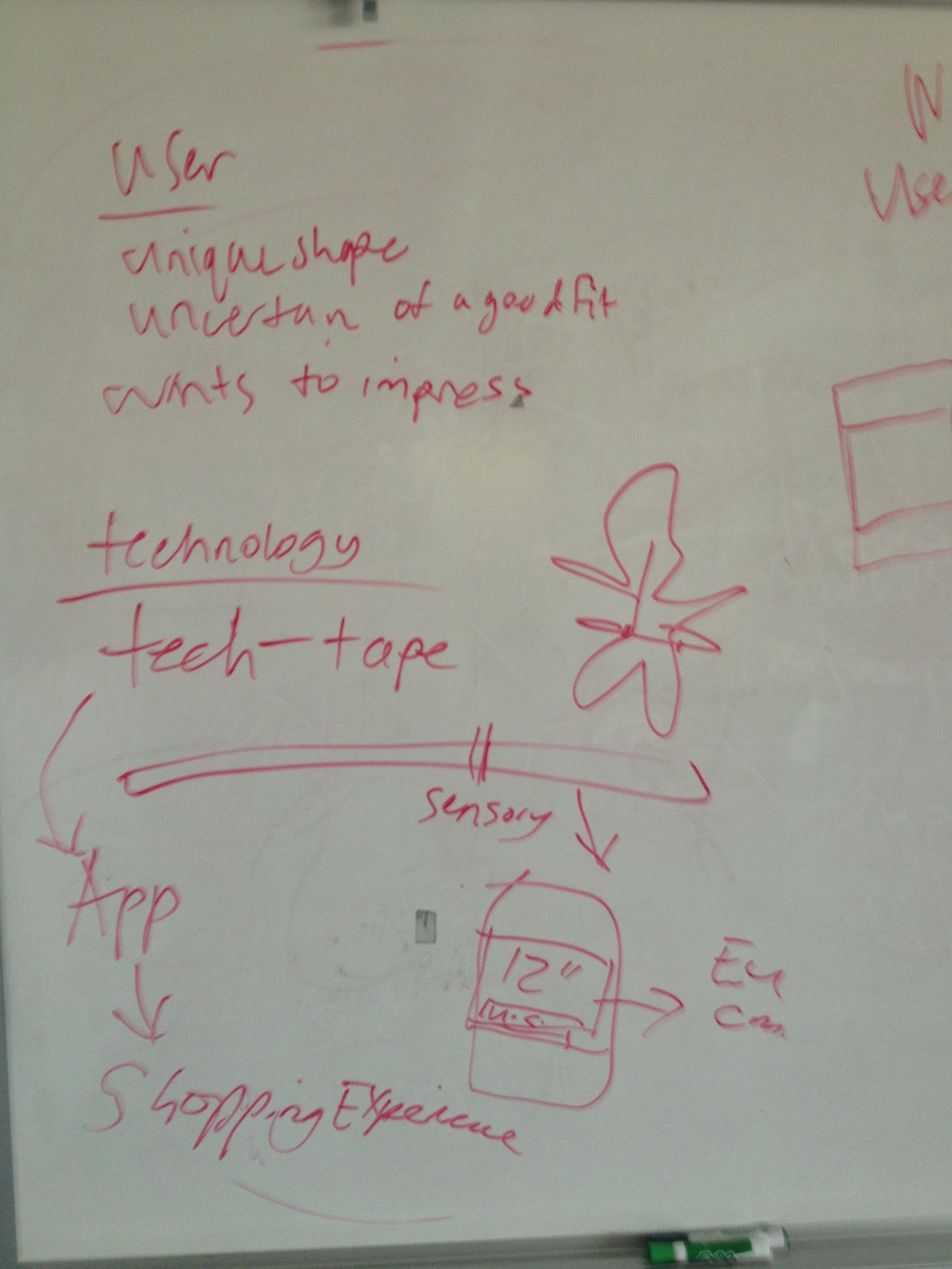
Rebecca asked me to write out a walk-through of the technology. First, I summed up what I established about my user, she’s a unique shape, uncertain of a good fit, but wants to impress. The technology: Tech-tape, a measuring tape that has no measurements on it. You pinch the places where the tape meets around you and that input is sent via bluetooth to the phone where the app keeps that information in your profile. I supported this by saying how I worked in a dry cleaning store and it’s kind of amazing that not many people can work a regular tape measure with ease and confidence. The device has a companion app that is a easy to use shopping experience.
the user and the technology
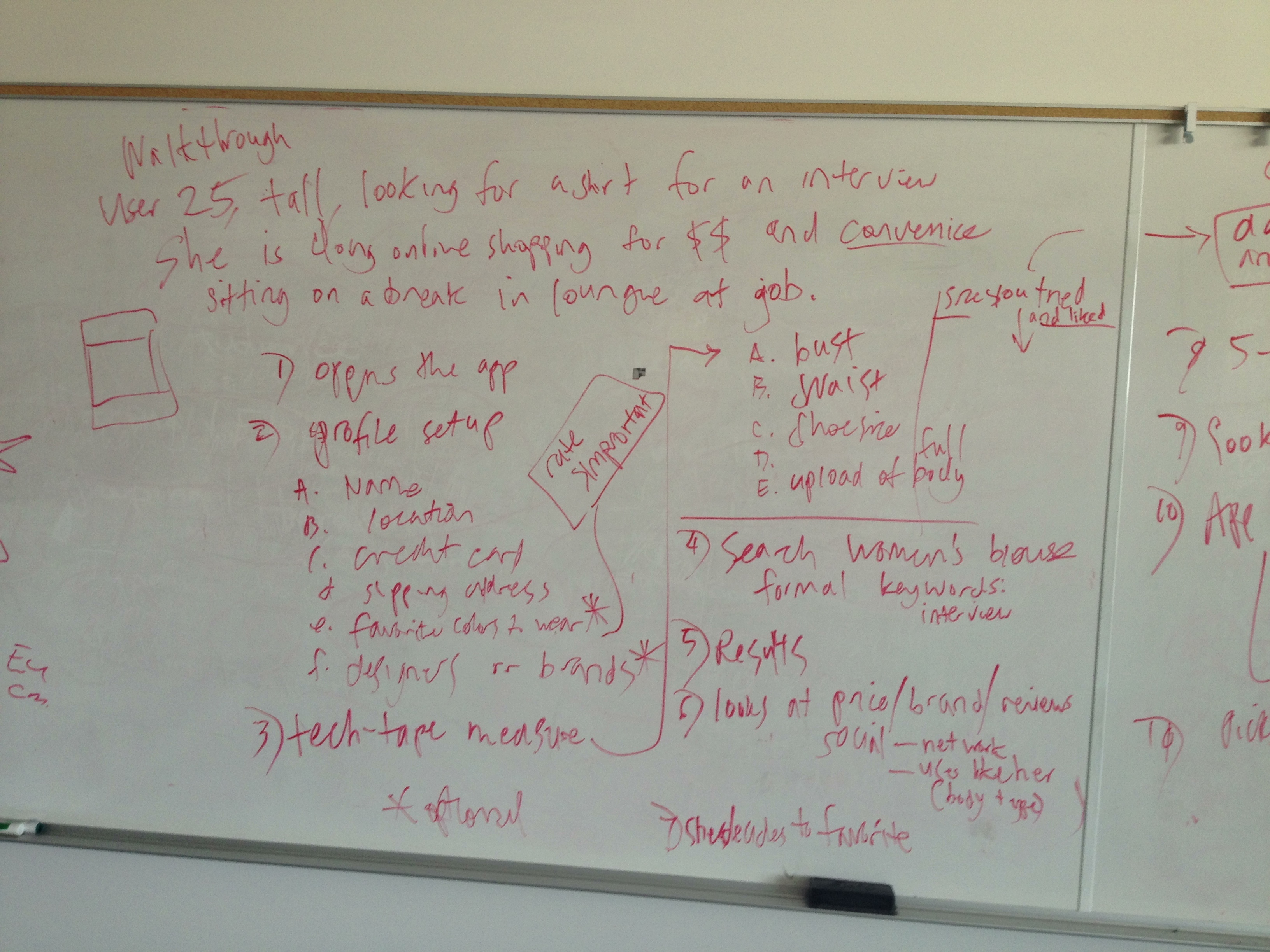
The Walkthrough
The user (based on myself mostly so I didn’t have to invent anyone, but also because this is a problem I occasionally think about) is 25, tall, looking for a shirt for a job interview. She is doing her shopping online to save money and convenience. She’s sitting, at a break, at a different job.
1. Opens App
2. Profile Setup (this step is key because the info entered determines a good deal of the top results in the search algorithms)
a. Name
b. location
c. credit card
d. shipping address
e. favorite colors to wear*
f. favorite brands/ designers to wear*
*optional
3. Tech-tape measure
a. bust, waist, etc.
b. upload a full body photo
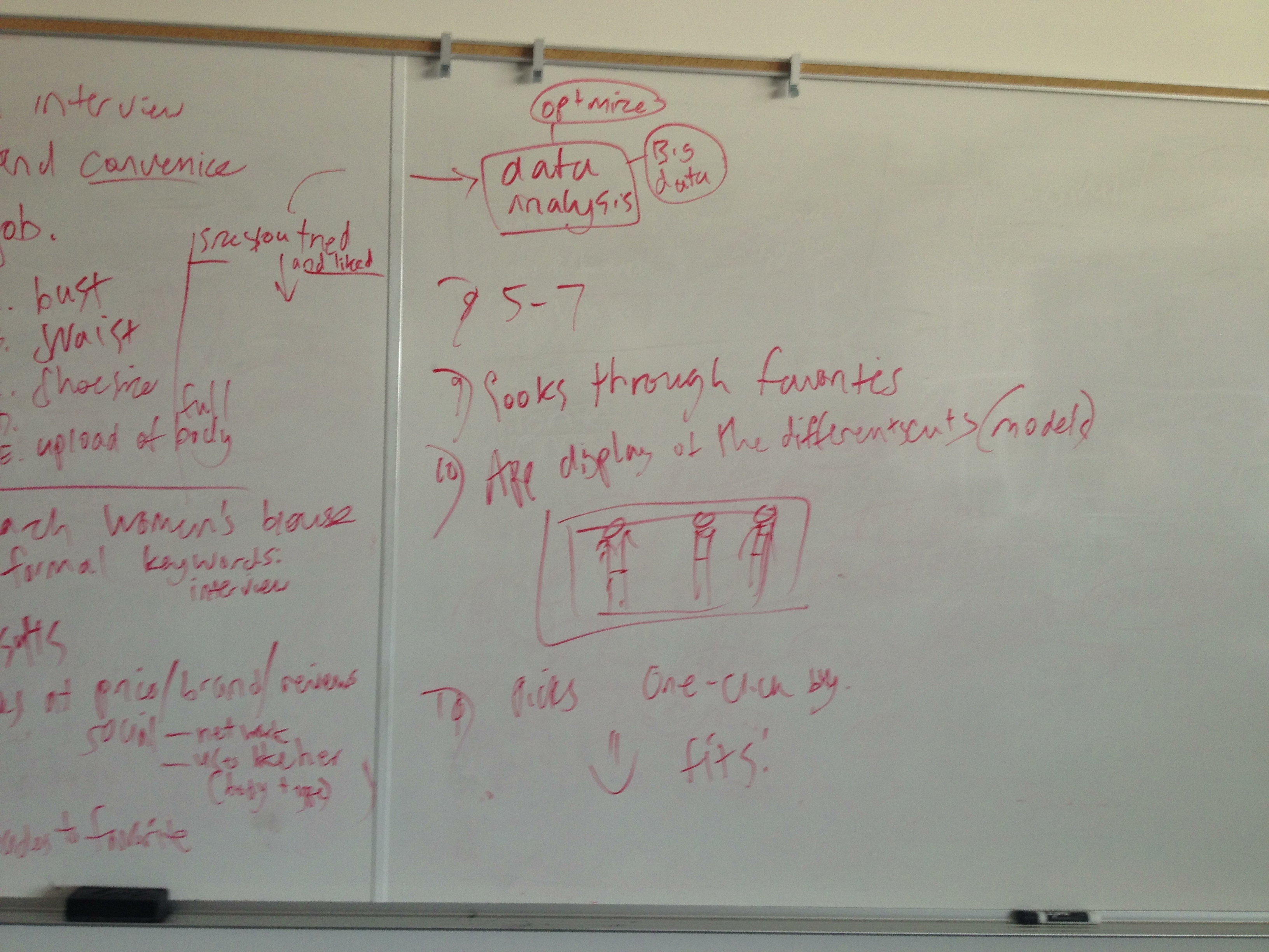
c.sizes you’ve tried and liked. This information goes into data analysis where studies are conducted to see how people use different sizes than recommended by the manufacturer and draw conclusions about why that is and how to improve the sizing process. #bigdata
4. Search: type in women’s blouse, formal, keywords: interview
5. Results
6. looks at price, brand, reviews, social– networks like facebook and also the “users like you” feature which finds users with similar body types.
7. Add item to favorite.
8. Repeat steps 5-7 until you have top 3 for comparison.
9. Look through favorites.
10. App displays the shirts on your uploaded full body photo. (This is where Rebecca stopped me saying that we ran out of time and I insisted I was almost done and added this last step.)
11. User decides on one and clicks it and the one-click purchase button (which I love about Amazon.com’s shopping experience) and the user receives it five days later and it fits. And she’s happy.
app walkthrough part 1app walkthrough part 2
After finishing the last step of my walkthrough, we sat down and talked more about the experience envisioned. She asked “How does this technology work in different contexts?” I told her that because it’s a smart phone app, it can go anywhere. I think that for clothes shopping, context is less of an issue than other shopping experiences like buying some expensive piece of equipment like a desktop computer. She asked about accessibility, which I addressed by saying that it will be easy to use because of the tech-tape’s simple interface. She asked more about disability where I explained how the tech-tape is all touch activated, so this is really a great app for blind people, no measurements to read. Also, the favorite color to wear option on the profile can be rated according to importance so the blind user can browse with confidence that she will never accidentally purchase an orange sweater when she only likes wearing blue ones.
Feedback After the exercise was completed, Rebecca said that I did pretty good. She liked that I created a device that helps users breeze through a task that might stop them because measuring can be mentally tasking. She liked the color matching feature. She emphasized the importance of thinking big and exploring new ways to meet users’ needs. Stretch your ideas because in User Experience, you’re designing for the future.
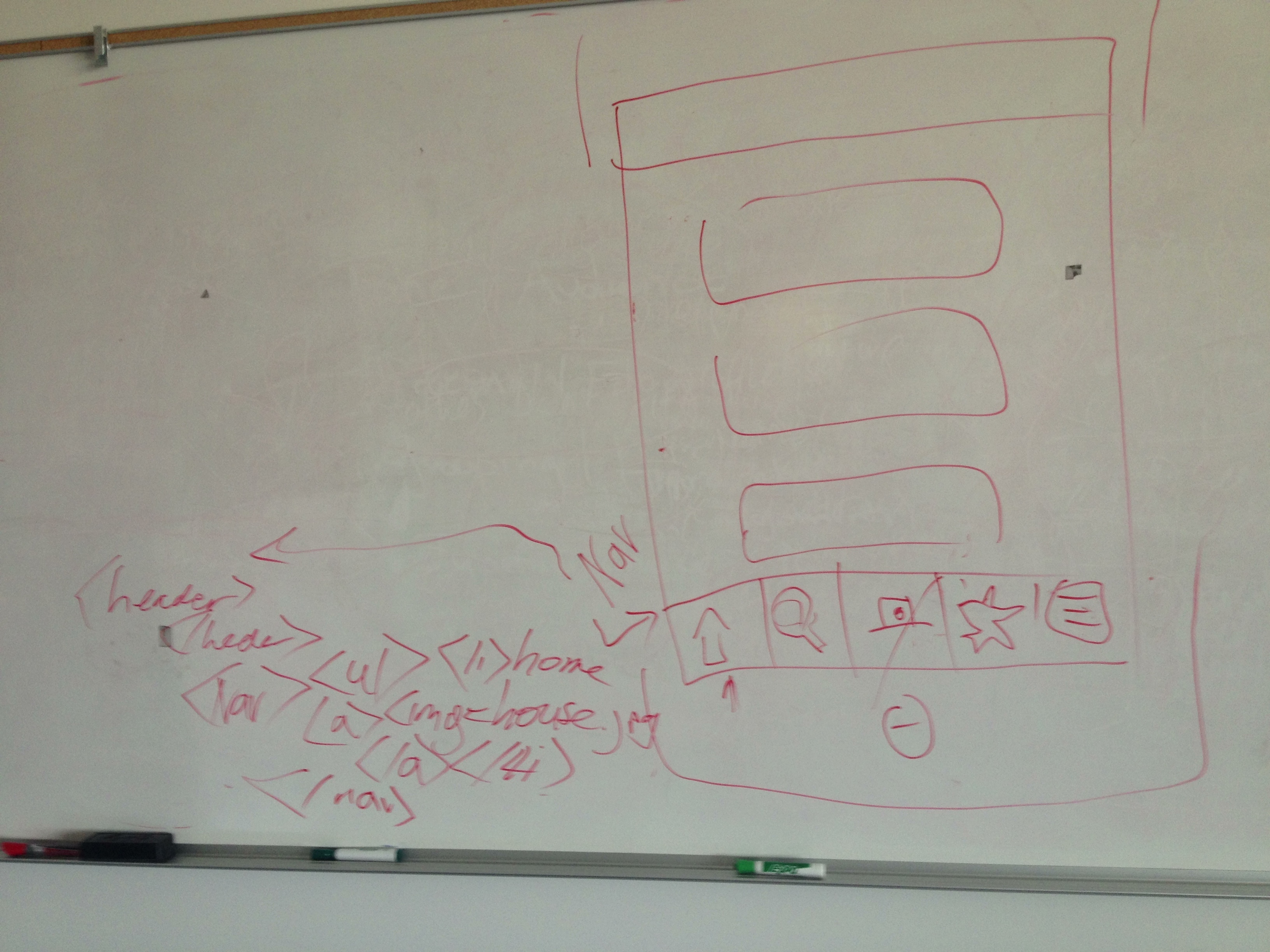
I told her that I expected the exercise to include some coding. And she said that in her interview at Amazon, there was a separate interviewer to test her on some basic html. I asked Rebecca to run me through a quick one where she told me to program the navigation for the app. So I drew a spare wireframe and next to the nav, I wrote out some tags, ul, li, img, and a. Good practice. It was weird to write that stuff out by hand on a whiteboard. It felt so unconnected and informal. I’d never have to run that code into a validator.
writing out some code
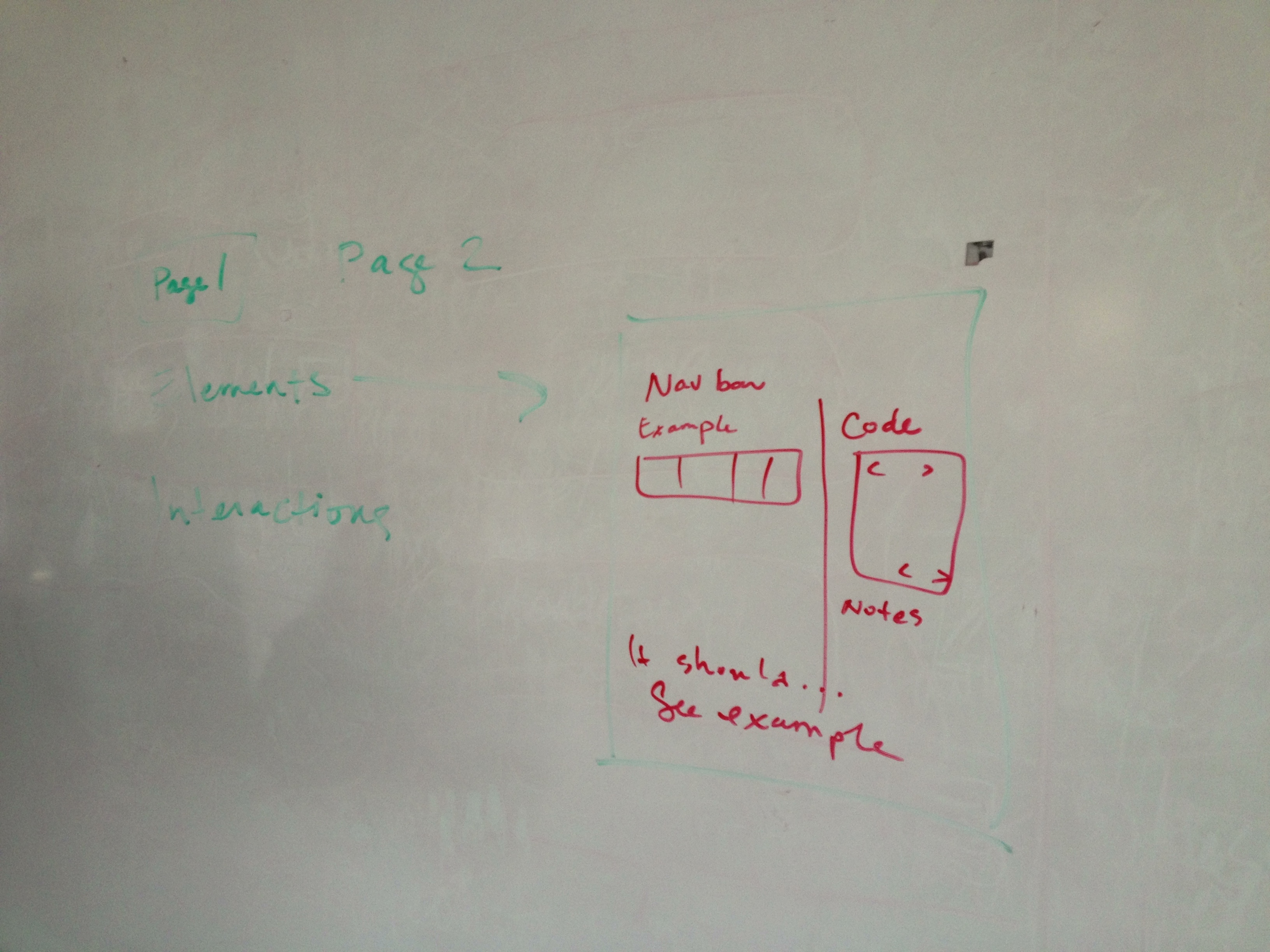
I asked Rebecca more about her job and what she does when she mentioned documentation. I am in love with the idea of documentation (obviously I like taking notes on things I do) and I wanted to hear about her process. She says it’s different for everyone and some projects require different methods. She was telling me about how she is working with some people in China so her favorite documentation method is to make simple html websites with her notes and screenshots of her Photoshop comp and actual code or links to examples of code that show the interaction. She told me that good documentation is about showing devs how easy it is to make an interaction you want to see happen. Sometimes developers code something a certain way because it’s easy for them or they think something is cool and it’s your job as a user experience designer to make it easy for developers to understand and use your ideas.
Rebecca few this diagram of her documentation setup. Notice the excellent penmanship.
In conclusion, this whole whiteboarding adventure took about an hour. It was educational and exciting, like witnessing the sprouting of a seed. It felt like a thing I should do as part of my professional career. I really enjoyed the process. Thank you to Rebecca Shapiro for taking time out of her Saturday morning and Erik Fadiman for arranging it all.
After going through the audio of the interviews I’ve conducted with my teachers and the interview I had a friend conduct of me for some valuable and authentic sound bites to guide the direction of the video, I have a first draft. This is a blank canvas for which to add animations with AfterEffects. I’m going to get a critique of this foundation from my instructor before animating over it.
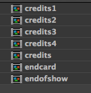
This is a screenshot of my file structure in AfterEffects. I put all of the credits into one mp4 for safe keeping. I named the title sequence the credits, but other than that it’s good. The numbered credits are for the different parts (part one, etc) and the end card goes on to each of them. Credits and end of show is for the four minute video.
EF: Your presentation today was excellent. Both your spoken assessment and your visuals. You did a great job of taking complex subject matter and making it tangible.
 Kismet Arts Tangent