Skip to content

Kismet Arts Tangent

Art Collective

    • Kismet Arts Tangent- website under construction- stay tuned 🚧
    • Blog
    • Contact

recent posts

  • Make up looks
  • Images from re Patient’s Schedule
  • Self Intake
  • Inspiration Pool for zine
  • Photo shoot with Kayleigh Shawn

  • Instagram
  • Haptic App Video Prep

    May 29, 2013


    Gesture Markup Language and Gesture Fonts | Gestureworks Core Gestures. A great place to get some free gesture icons.

    Outline for Video:
    1. Intro
    a. Logo screen: Perceptics. The Future is designed.
    2. State Problem
    a. Personalizing Workspace to meet the challenge of context in the world of changing technology.
    3. Related Technology
    a. Leapfrog
    b. Googleglass
    c. Kinect
    4. Required Technology
    a. Introducing Perceptics Tech
    b. Goggles
    i. Camera
    ii. Gesture detecting software
    c. Bracelets
    d. Envision interaction
    5. Describe the downfalls of the competition
    a. Limited vision and functionality with Google Glass
    b. Limited portability with Kinect
    6. Introduce the design of Haptic, A New Way to Draw
    a. Principles behind Haptic
    i. Describe ideal users
    ii. accessibility
    b. Features
    i. Designed primarily to interface with an iPhone 4.
    c. Interface
    d. Versatility
    7. Walkthrough
    8. Business Strategy
    a. Sponsorship from Art Supply Chains
    b. Freemium—valuable features that are designed for power users
    c. Sales in physical merchandise: different kinds of bracelets and goggles for the power users.
    d. Increasing Market Place. Open Source some of the software. This will create new features and ways to engage with the product.
    9. Marketing Strategy
    a. Slow Launch
    b. Initial Niche Market
    c. Internet Video Campaign

    After giving it some thought, I realized for pacing and for potential questions, the presentation should be PowerPoint and a video walkthrough.

    sharing options:

    • Share
    • Share on Tumblr (Opens in new window) Tumblr
    • Print (Opens in new window) Print
    • Share on LinkedIn (Opens in new window) LinkedIn
    • Share on X (Opens in new window) X
    • Share on Reddit (Opens in new window) Reddit
    • Share on Pinterest (Opens in new window) Pinterest
    • Share on Facebook (Opens in new window) Facebook
    • Email a link to a friend (Opens in new window) Email
    Like Loading…
  • Today

    May 28, 2013

    527 – YouTube.

    sharing options:

    • Share
    • Share on Tumblr (Opens in new window) Tumblr
    • Print (Opens in new window) Print
    • Share on LinkedIn (Opens in new window) LinkedIn
    • Share on X (Opens in new window) X
    • Share on Reddit (Opens in new window) Reddit
    • Share on Pinterest (Opens in new window) Pinterest
    • Share on Facebook (Opens in new window) Facebook
    • Email a link to a friend (Opens in new window) Email
    Like Loading…
  • Today’s Animation

    May 24, 2013

    unfold523 – YouTube.

    sharing options:

    • Share
    • Share on Tumblr (Opens in new window) Tumblr
    • Print (Opens in new window) Print
    • Share on LinkedIn (Opens in new window) LinkedIn
    • Share on X (Opens in new window) X
    • Share on Reddit (Opens in new window) Reddit
    • Share on Pinterest (Opens in new window) Pinterest
    • Share on Facebook (Opens in new window) Facebook
    • Email a link to a friend (Opens in new window) Email
    Like Loading…
  • Today’s Animation

    May 20, 2013

    sharing options:

    • Share
    • Share on Tumblr (Opens in new window) Tumblr
    • Print (Opens in new window) Print
    • Share on LinkedIn (Opens in new window) LinkedIn
    • Share on X (Opens in new window) X
    • Share on Reddit (Opens in new window) Reddit
    • Share on Pinterest (Opens in new window) Pinterest
    • Share on Facebook (Opens in new window) Facebook
    • Email a link to a friend (Opens in new window) Email
    Like Loading…
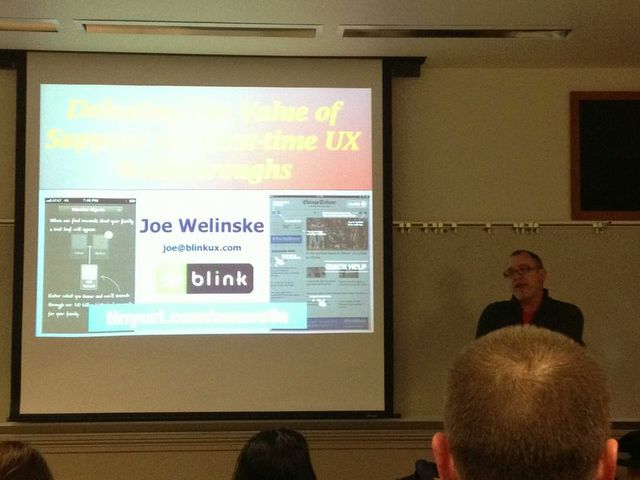
  • Debating the Value of Support for First-time UX Walkthroughs, a presentation by Joe Welinske

    May 18, 2013

    joe

    Today at Mobile UX Camp Seattle, Joe Welinske gave an illuminating presentation about first time UX Walkthroughs. Great ideas are worth sharing.

    There is a debate about interaction design. Some say, if you need help, you already blew it. Good user experience is so well-done that it’s seamless. Apps should be limited in features anyways. If you can’t figure it out, it’s the UX designer’s fault.

    Either your app is enterprise specific and it doesn’t need to act like mainstream consumer apps or it’s for the public and it uses common conventions, right? We looked at in-app tutorials, overlays vs. interactive, animation vs. live app interactions, and games vs digital journalism. The decisions made about walkthroughs depend on the 4 C’s: contextual, conforms, conditional and concise. The information should be information at the time you need it, optional, easy to click out of, efficient and consistent (looks and feels like the branding of the app).

    Approach 1: This app works like all apps of its genre. It uses standard visual cues like typrographical hierarchy, colored links and partial reveal. If your users are new to computers/touchscreen gestures/apps whatever, make sure there’s a help button to enlighten them about the conventions that they are might not be aware of.

    What can go wrong: It’s not obvious how to activate the help screen. When it happens, it happens when you just get the app. When the overlay takes over the screen, it’s in your face, a lot of information all at once. It’s overwhelming. Once is not enough. Retention of the information is minimal. You haven’t explored the app yet, you’re not sure you even need help navigating the app. (More on this: Jared Spool, reknown User Interface Engineer http://vimeo.com/41509755)

    Approach 2: New features that you must train the user to use. Firstly, any time you’re doing upgrades, you’re screwing your existing user base. The best thing you can do is to be the least annoying as possible. Or make sure that your feature is so useful that it outweighs the annoyance of a pop-up. In the future, we’ll have apps that will be smart enough to detect when the user isn’t getting the little tricks and gestures that you’ve designed into it and it will prod the user in a helpful way to interact with the app in the way it was designed.

    When to use certain app walkthrough types, it’s about the context.. Example 1, if you have a public restroom app, it’s a matter of urgency. At that point, the user is not receptive to walkthrough screens.Example 2, Google Earth has an optional walkthrough where the finger placement is indicated and you’re in the experience when you’re working with the tutorial. It’s not just an animated video. Example 3, Cut the Rope game. Each level teaches new interactions. The introductory level is simple and helps the user practice, giving a sense of achievement at the end. Good reinforcement. Example 4, Apple. Apple has traditional pdf manuals for all of their devices. It’s a cost vs benefit situation. If a certain amount of people want a pdf and it’s not too difficult, give it to them. Don’t underestimate the simplicity of a pdf. You can email it to people and it doesn’t need any navigation.

    Sometimes walkthroughs will be very literal. We’ll show the hands, the gestures, directions. Things like tap and hold and multifinger interaction is still new and strange and there aren’t any conventions for that.The future: As technology becomes more ubiquitous, the walkthrough experience will be tweaked with the changing times.
    sharing options:

    • Share
    • Share on Tumblr (Opens in new window) Tumblr
    • Print (Opens in new window) Print
    • Share on LinkedIn (Opens in new window) LinkedIn
    • Share on X (Opens in new window) X
    • Share on Reddit (Opens in new window) Reddit
    • Share on Pinterest (Opens in new window) Pinterest
    • Share on Facebook (Opens in new window) Facebook
    • Email a link to a friend (Opens in new window) Email
    Like Loading…
  • Today’s Animation

    May 17, 2013
     
    This is the latest draft of the animation for the promotional video for the portfolio show for Seattle Central Creative Academy, class of 2013. It has been a very difficult challenge for these these reasons. 1) I’ve never had any formal training in motion graphics or animation. 2) No one on my team has. 3) We haven’t established any procedure, mood board, style tile or concrete concept. 4) There’s no director. 5) I’m not even that good at animating, but since it’s been my special topic, people assume I must be good at it. 6) We agreed to approach it individualistically, but a lot of the critiques are about how it’s not consistent with the other animator’s more developed piece. 7) The concept, the animation is a visualization of an idea, is so abstract I thought I couldn’t be wrong in my interpretation, but I am. 8) We are a committee answering to another committee trying to steer everyone as we approach a looming deadline where we all hope to get jobs and be prosperous and find validation. 9) Every step of the way, I try to articulate how I see the process working more efficiently, but I often have to explain myself several times and they don’t agree with me. It’s like spitting into an ocean. 10) I want the project to be a success. I want to be a team player but I don’t want to be continually stepped upon. Everyone had to be a part of a committee and I chose mine, but there’s a point where it seems like I’m doing a lot of work for little to no benefit to myself and what’s the point in that?
     
    Reasons to be thankful for this hardship: 1) understanding how not to run an animation studio 2) dealing with different expectations and people who are trying to work with what they have 3) doing the same 57 seconds of animation five different times and getting better and better at it. 4) having the experience of doing work and having it been thrown away– that happens a lot in design firms, but they don’t talk about it. I don’t want to complain, but I want to document my experiences to make sure it never happens like this again.
     
    Friday, we had a showing/critique where people of the steering committee and the video editing committee were present and everyone looked at this piece and said that we weren’t going to make our Monday deadline. It wasn’t good enough. After the higher-ups left. I confessed to my team that this piece isn’t my best work and won’t be. It’s been a struggle being a cog in a video project led by committee. We put together this monster, something where no one visionary led the way, but a series of decisions made by the group. I think it is fine, but it’s not something I feel like I can really be proud of. It’s far away from what I would have done or wanted to do. But, I’m glad to be part of such a large production. I have such mixed feelings about it and I imagine I will work on a lot of projects where they are bittersweet.
     
    I’m getting more help on refining the animation and I’m presenting another draft on Monday. The group asks that it acts like a bug in the beginning and an “idea” towards the end of the section.

    sharing options:

    • Share
    • Share on Tumblr (Opens in new window) Tumblr
    • Print (Opens in new window) Print
    • Share on LinkedIn (Opens in new window) LinkedIn
    • Share on X (Opens in new window) X
    • Share on Reddit (Opens in new window) Reddit
    • Share on Pinterest (Opens in new window) Pinterest
    • Share on Facebook (Opens in new window) Facebook
    • Email a link to a friend (Opens in new window) Email
    Like Loading…
  • Haptic: App Design (new target users)

    May 17, 2013

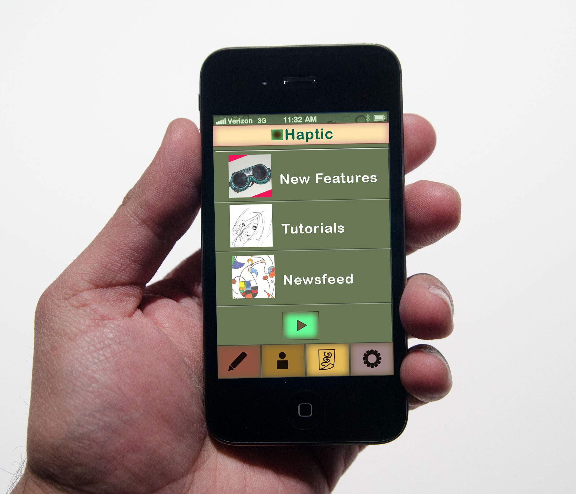
    Assignment: Make up an App, make 8-10 screens. Make a killer presentation and a landing page.

    Phase 1 of App Design

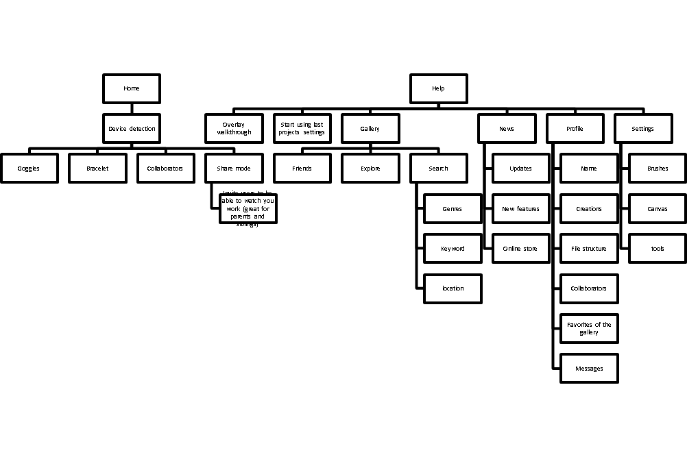
    1. structure information with user-centered considerations  *Research the competitors (Links)

    sitemapforhaptic

    http://www.autismspeaks.org/autism-apps
    http://www.avazapp.com/autism-app-screenshots-android/
    http://lescapadou.com/LEscapadou_-_Fun_and_Educational_applications_for_iPad_and_IPhone/Draw_with_Stars_!.html
    http://www.lullatone.com/games/dropophone-app/
    https://itunes.apple.com/us/app/kids-writing-pad/id583914609?mt=8
    http://4baam.com/applications.html
    http://www.polishedplay.blogspot.com/
    http://www.psoftmobile.net/en/

    Related Technology

    http://www.ted.com/talks/sergey_brin_why_google_glass.html?utm_source=direct-on.ted.com&awesm=on.ted.com_GoogleGlass&utm_campaign=&utm_medium=on.ted.com-static&utm_content=awesm-publisher

    NeoLucida – A Portable Camera Lucida for the 21st Century by Pablo Garcia & Golan Levin — Kickstarte

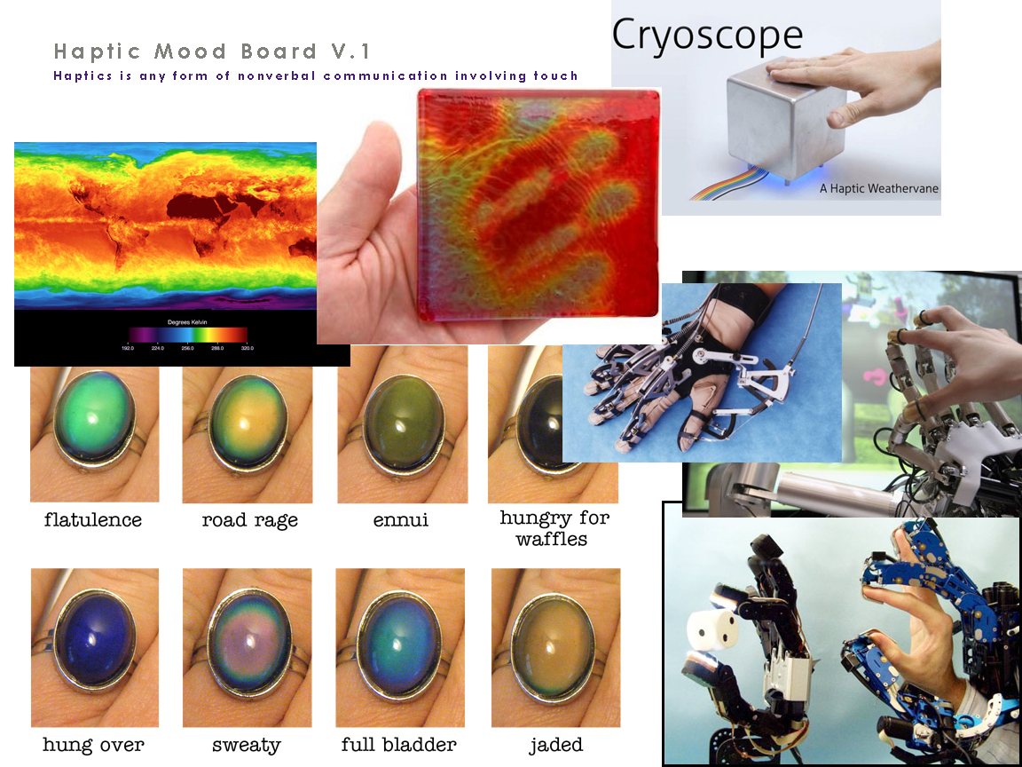
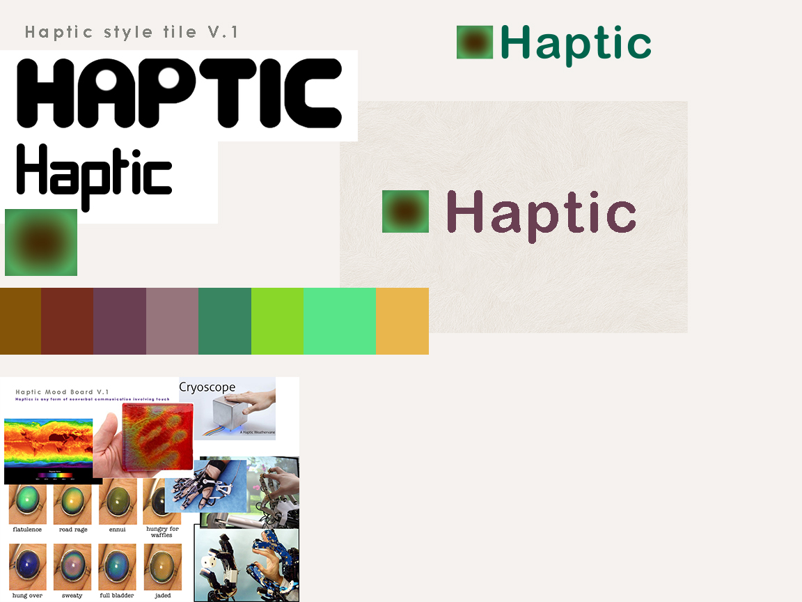
    2. communicate style and function Branding (style Tile) Version 1

    moodboard-haptic styletile-haptic

    Users: audience, demographic. Who is this for? How should that influence the website?  Autistic children who have special needs to develop creative and communicative skills.

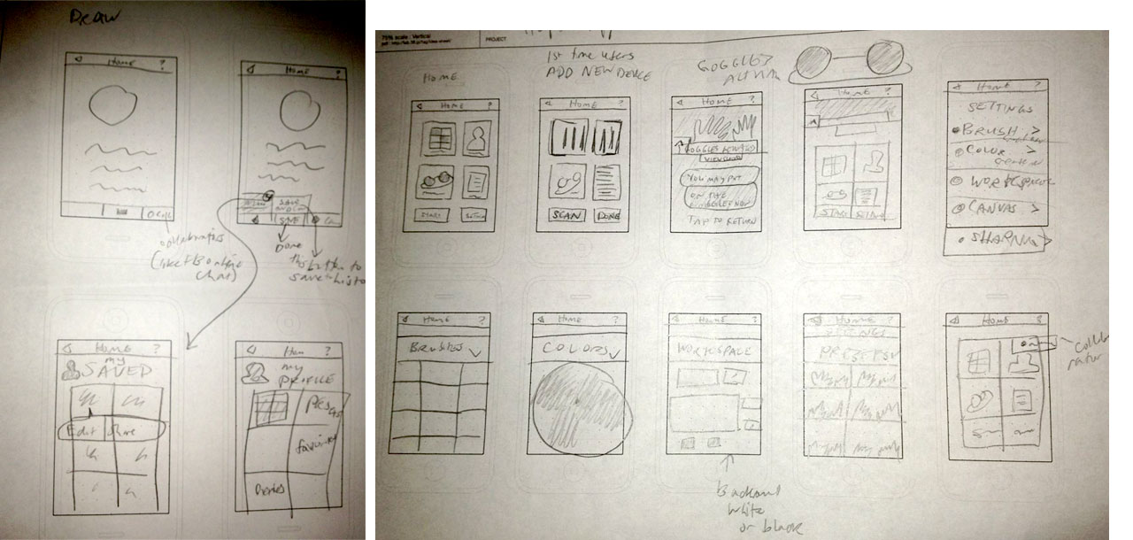
    Wireframes and Screens to come.

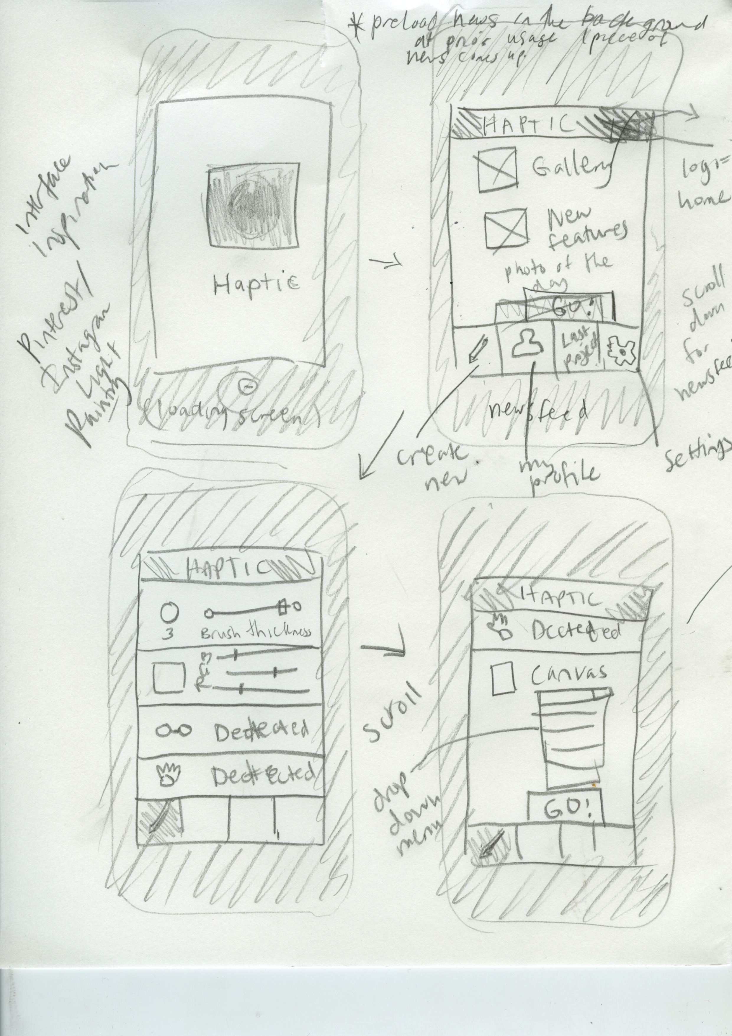
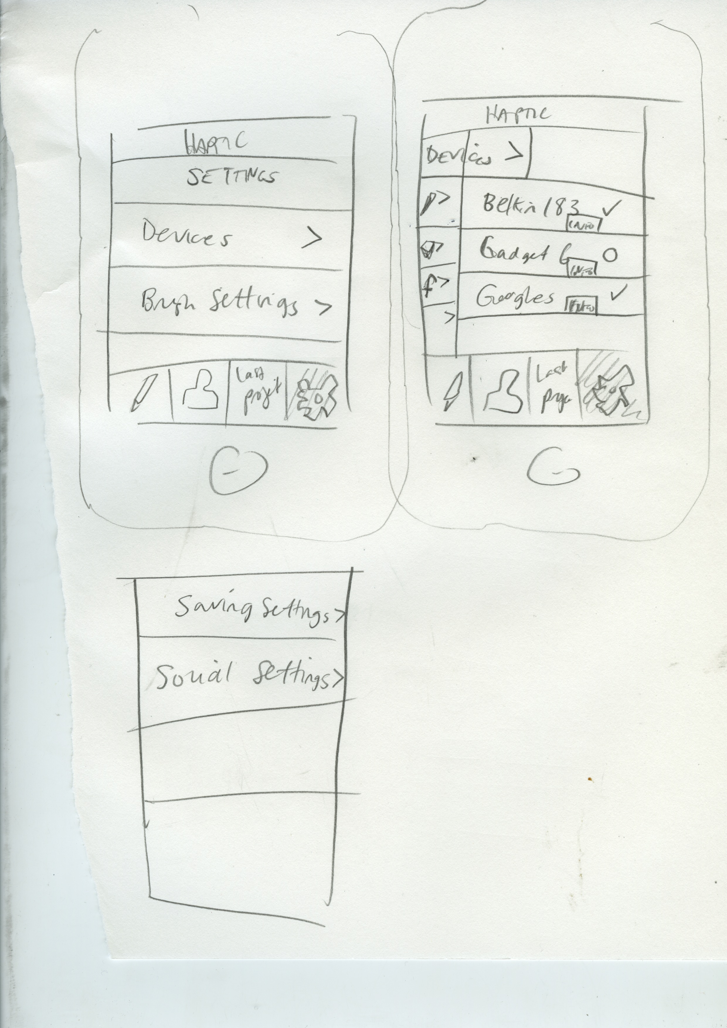
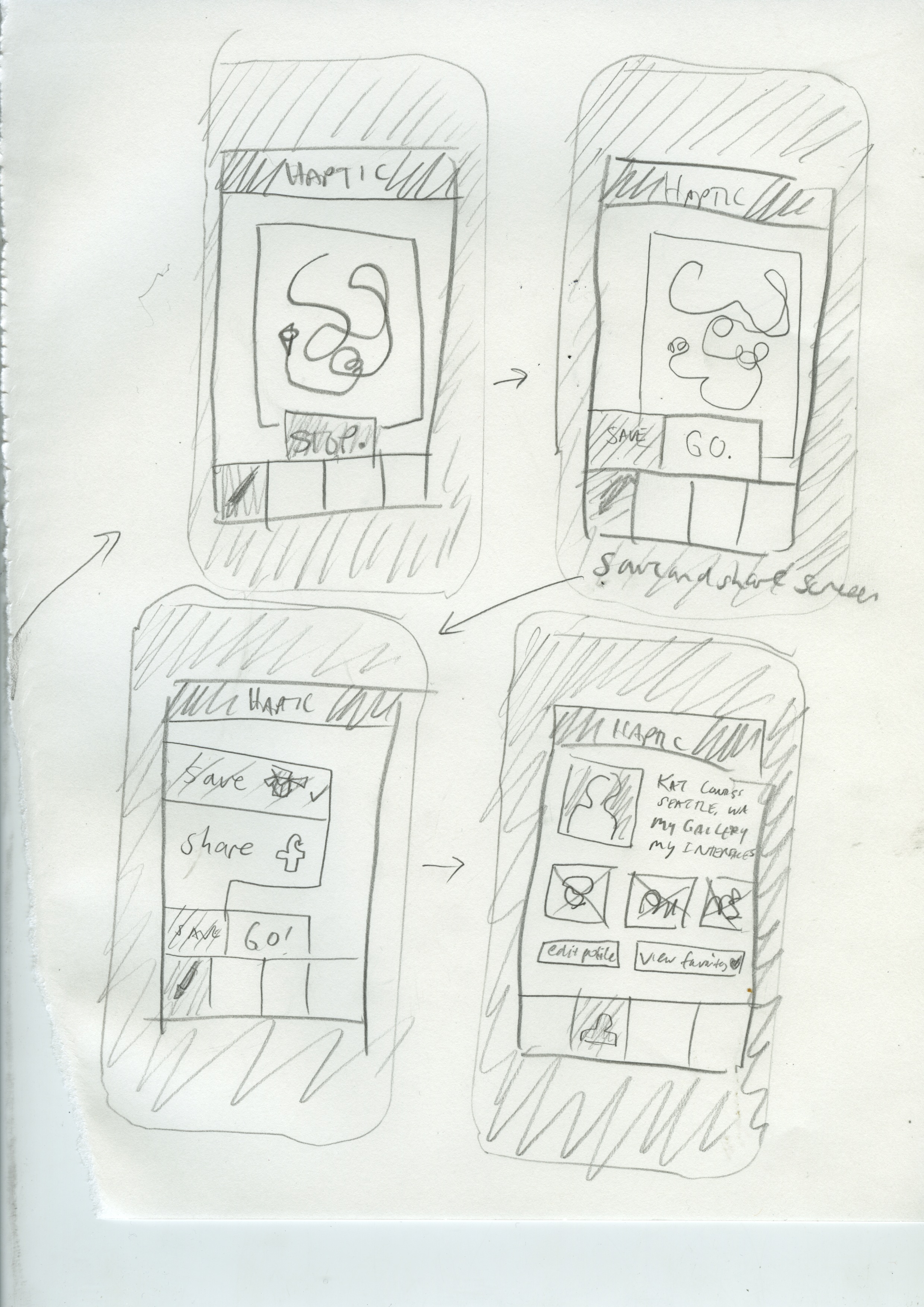
    Update 5-22-13: Wireframes!

    wireframes

    Hapticapppres2 from Katarina Countiss

    Links:
    Haptic, the App. (this is where my app’s landing page will live.)

    Update 5-29-13– I messaged my instructor a link to this blog post and got this response on 5-24-13:

    EF: So I’m impressed with your research and I can clearly see the potential for this particularly in the Autism market. In order to be successful next week you are going to need to simply your hardware/software combination and somehow demonstrate a Minimum Viable Product. SInce you cannot actually build it in our time frame, I suggest choosing between AfterEffects and Photoshop for mockups. You will need to put on your marketers hat and sell a difficult and abstract concept. Your branding feels very 90’s or retro sci fi; I would consider looking at the visual language of biotechnology for inspiration.
    KC: Ok. Thanks. Lots of work to do…
    EF:Do you have a way of saving work and perhaps recording the child’s progress as they use they app? Can it collect data and provide feedback?
    KC: There’s a “parent” feature which records that stuff and saves it for review later… It hasn’t been expressed thoroughly in the research and execution.
    EF:I think that is a good angle from both a marketing and UX perspective.
    KC:I’ll consider that. Thank you.


    sharing options:

    • Share
    • Share on Tumblr (Opens in new window) Tumblr
    • Print (Opens in new window) Print
    • Share on LinkedIn (Opens in new window) LinkedIn
    • Share on X (Opens in new window) X
    • Share on Reddit (Opens in new window) Reddit
    • Share on Pinterest (Opens in new window) Pinterest
    • Share on Facebook (Opens in new window) Facebook
    • Email a link to a friend (Opens in new window) Email
    Like Loading…
  • Haptic App: Midway Presentation

    May 14, 2013
    Hapticapppres1 from Katarina Countiss
    I’m presenting this to my instructor tomorrow to get some feedback on my latest project: Haptic, the App. Coming up with an app idea is difficult in the market that is so saturated with ideas. I think of it as a design assignment and I’m going to try my hardest to make this idea look good.
    I’m not sure how to find apps that are like this. This was what I found when I looked for drawing apps that was the closest. http://mac.appstorm.net/roundups/utilities-roundups/30-apps-that-use-your-mac-hardware-in-unique-ways/
    http://www.technewsworld.com/story/78008.html The future intersection of smartphones and 3D is upon us!
    appscreen1 Scan 2 Scan 1 Scan
    5-15-13 Post-critique: The group of “investors” (a few classmates and my instructor) said that the app is to generic in appeal as of now. We discussed the dropping price of technology like this. A big question was “why not a stylus?” I want to make this app for people with no small motor skills. I want to make drawing more accessible.
    Solution: With technology and concepts teetering on the edge of “too futuristic,” the answer is, slow launch. Start with a narrow niche market and go from there. Ashlee brought up the idea of autistic children and how they really take to technologies like the iPad because of the need for certain kinds of stimulus and communication techniques. This would also be a great audience to get some research money and parents love helping their autistic children express themselves.
    Slow launch: first special niche market, launch as a consumer product 24 months after that, future in open source.
    As for the wireframes and one screen I did: the audience will help define the look, so I’m going revise this stuff a little bit.

    sharing options:

    • Share
    • Share on Tumblr (Opens in new window) Tumblr
    • Print (Opens in new window) Print
    • Share on LinkedIn (Opens in new window) LinkedIn
    • Share on X (Opens in new window) X
    • Share on Reddit (Opens in new window) Reddit
    • Share on Pinterest (Opens in new window) Pinterest
    • Share on Facebook (Opens in new window) Facebook
    • Email a link to a friend (Opens in new window) Email
    Like Loading…
Previous Page Next Page

Blog at WordPress.com.

Loading Comments...
  • Subscribe Subscribed
    • Kismet Arts Tangent
    • Join 102 other subscribers
    • Already have a WordPress.com account? Log in now.
    • Kismet Arts Tangent
    • Subscribe Subscribed
    • Sign up
    • Log in
    • Report this content
    • View site in Reader
    • Manage subscriptions
    • Collapse this bar
%d