Assignment: Make up an App, make 8-10 screens. Make a killer presentation and a landing page.
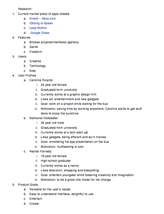
Phase 1: Research
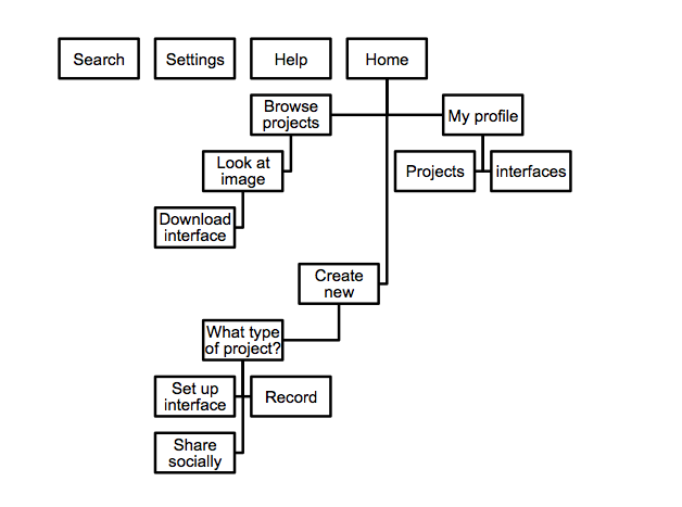
Phase 2 of App Design– Wireframes
I had a moment of clarity last night when I realized that this app is not incredibly realistic and I am happy about that. I wanted to make something forward looking. This app comes with bracelets and a set of goggles so the user can see a 3D interface and utilize space. This makes sense from a humanistic stand point. Our brains are better equipped to interact in a 3d space.
Update 5-14-13: This is what the instructor is asking for tomorrow as part of a midway check-in.
Define the user experience.
Show me that you have constructed a pathway that rewards, delights, or engages your users.
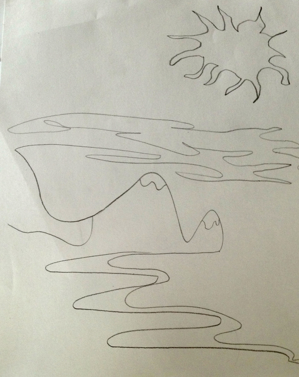
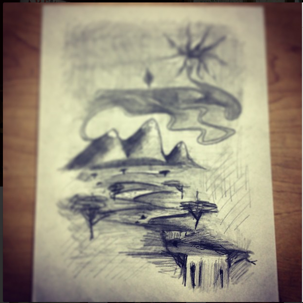
I had this urge to share my notebooks and journals with a new friend. It would have taken more than an evening to go through everything I wanted to share. I thought I would make a poem video so I could share things in small doses in a way I thought was meaningful. I’ve never done this and doing this, the process was new and I was working on a computer I was unfamiliar with in a lot of ways, so this is a rough draft of what I want to do. I tried to find an old poem about the similarities of spanish and french words, but I couldn’t. It annoyed me. I found this poem though. It’s from 2006 from a journal I named “Phoenix of Fidelity.” I was seventeen when I wrote it. It’s not my typical poem, but I like how simple it is. And it intrigued me when I read it. I’m interested in video like this. I’m interested in making video better than this. Something authentic and taking itself as seriously as it can. I wish I was better at editing sound.
Here’s the poem:
They are my mountains covered with velvet.
When I slide down them,
the world melts to syrup.
When I sit between their ridges,
the sky weeps soft tears.
When I reach up
to touch the falling rain,
I see you crying.
I see you laughing.
I see you smiling.
With me.
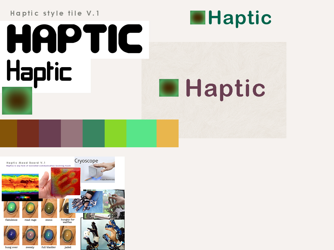
2. communicate style and function Branding (style Tile) Version 1
3. understand mobile strategy and other media requirements I need 3 layouts– mobile, tablet (landscape), and desktop. I have Amazium – The responsive web framework..!. working for me. So, I’m good for the scope and time of this project. It meets the needs.
4. Users: audience, demographic. Who is this for? How should that influence the website? Users. Must do some more research.
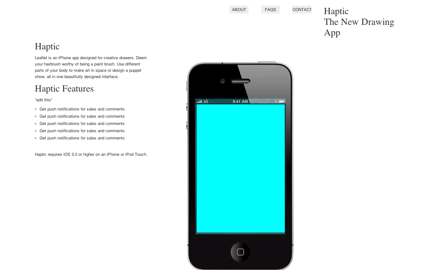
5. Iteration 1: Sans branding (copied the structure of the copy– will edit– of Leaflet‘s simple and elegant landing page), placeholder images
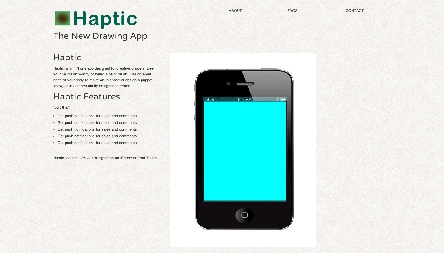
6. Iteration 2: Added the logo, some texture, rounded font
Links: Haptic, the App. (this is where my app’s landing page will live.
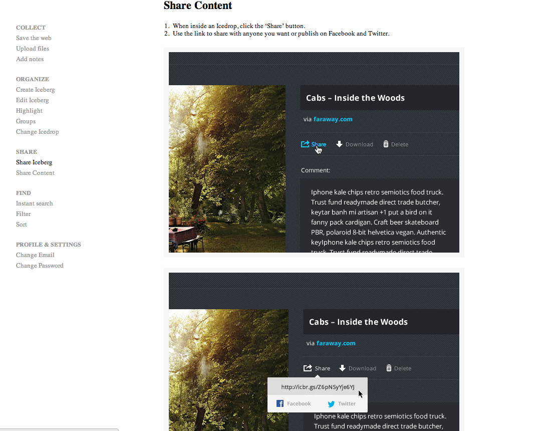
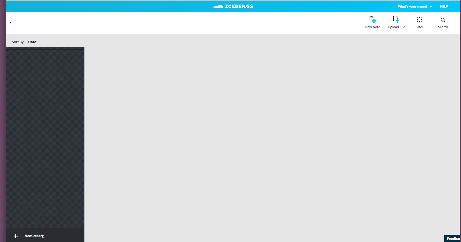
So, I go to this website. I can’t really set up my profile. Where are the buttons for submit?
The browser tool button they had me install also seems dudly and I have to stare at this thing. The email said that they want feedback but didn’t give an email for that feedback. I tried looking for a place for feedback, but Google doesn’t seem to understand my question. #namefail
I thought this would be a cross between Pinterest and Dropbox and Evernote, but it is so empty. I feel like it’s an extra step because I can organize my files on my drive or dropbox. So, there’s no network (you end up just sharing to twitter or facebook, great choices :P).
There’s no reason why I would go to a place for creatives if there’s no network of other industry or like minded people (or any people). Early adoption sucks.
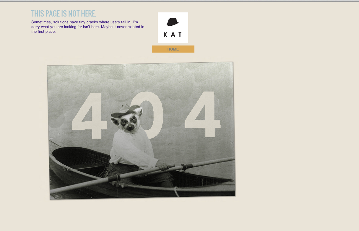
I really like adding error pages in the initial iterations because when I click on empty links, I get an affirmation that something I linked up works. In this case, it’s my error lemur.
update 5-17-13: I talked to Tom. I should have a neutral-colored background. His advice: Keep it simple. Especially with my brand, I agree that should be the road I take.
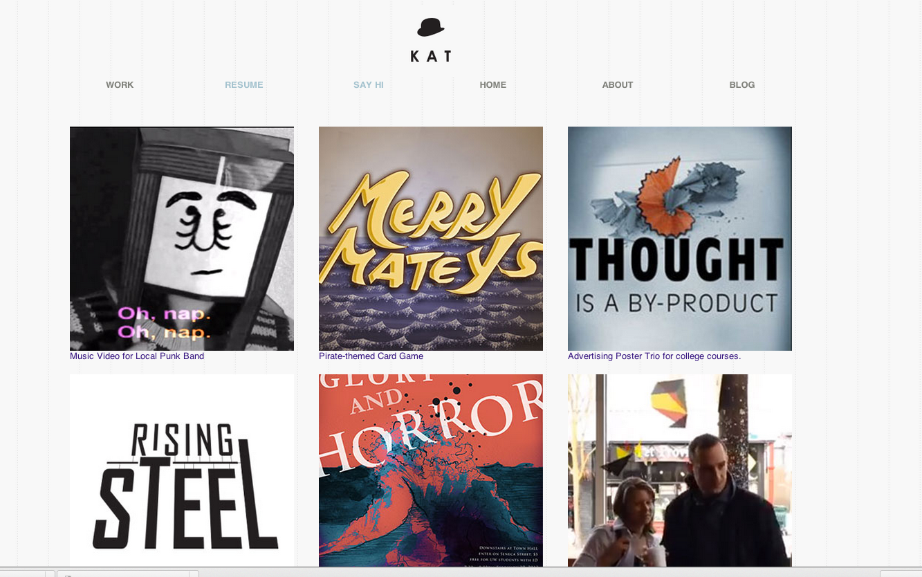
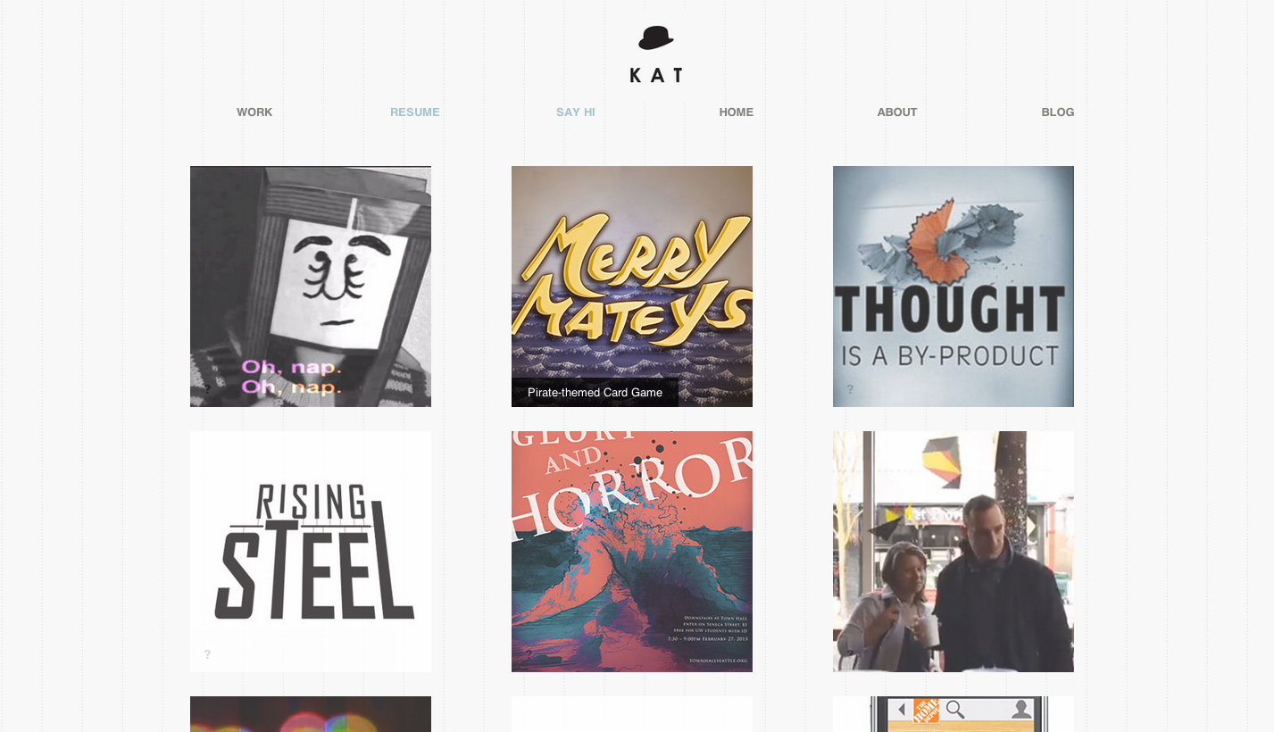
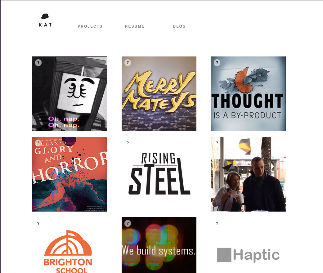
Update 5-20-13: Pinstripes! and a projects page
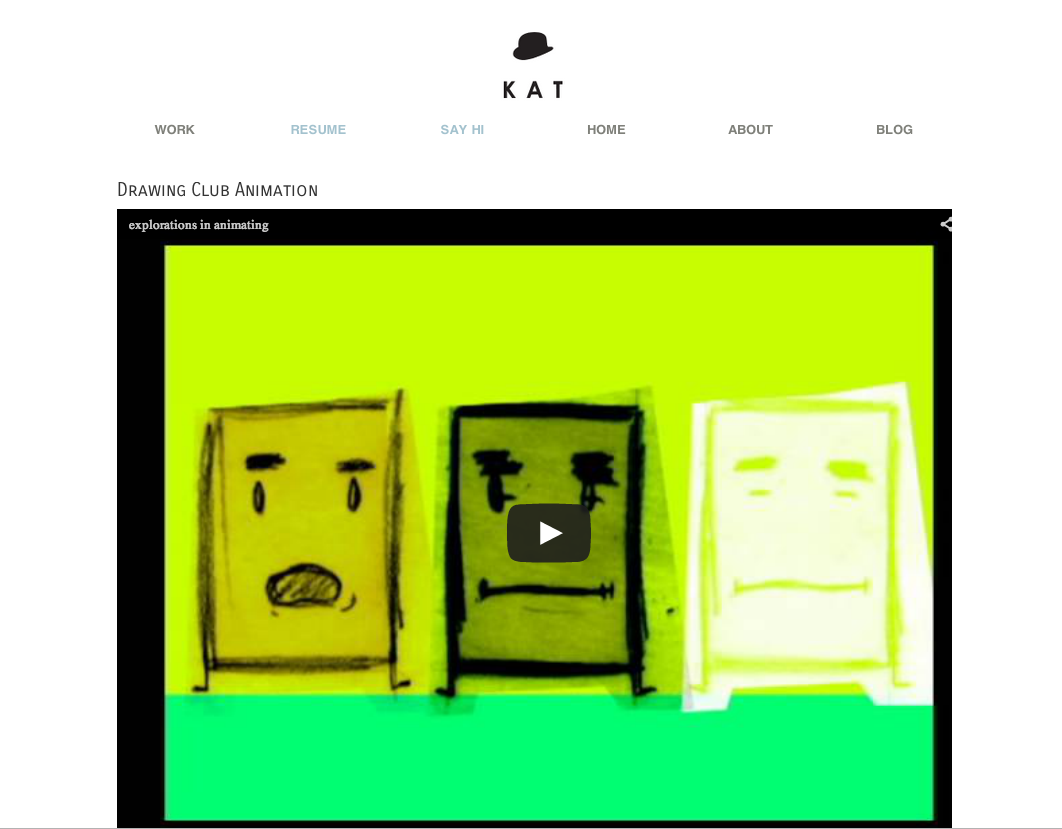
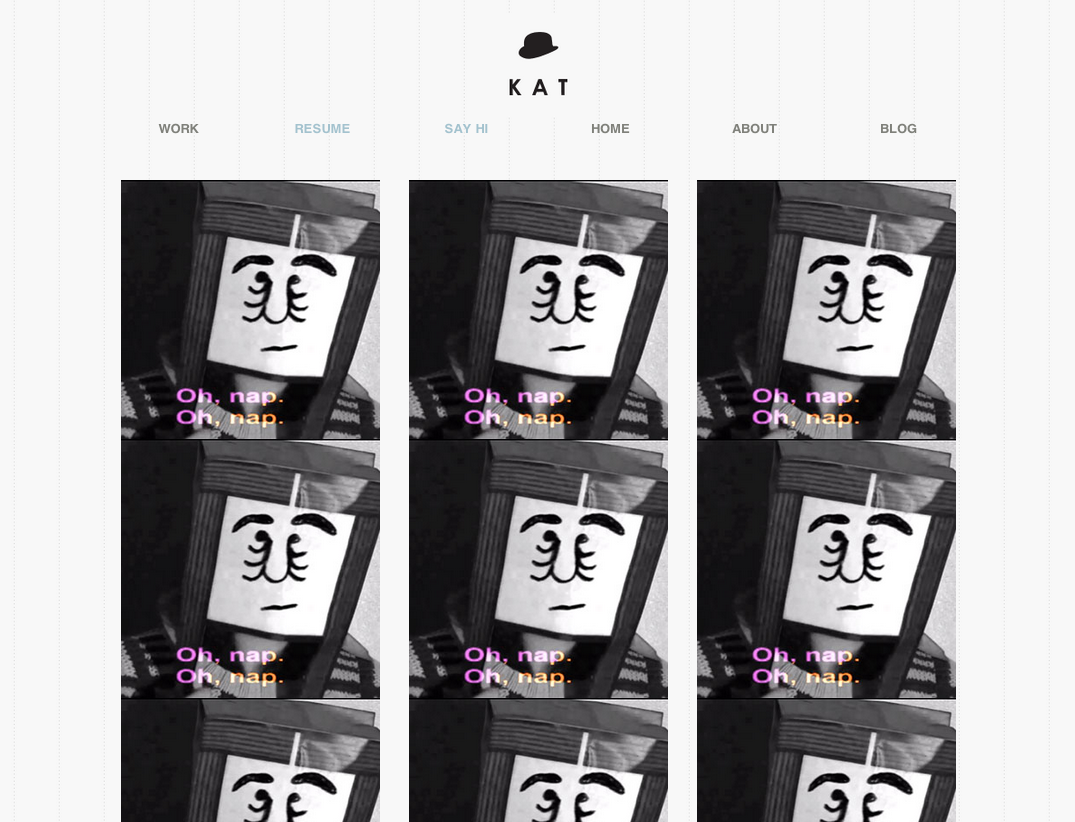
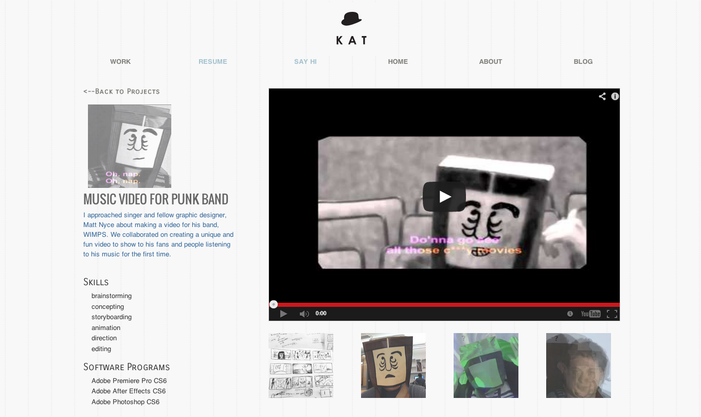
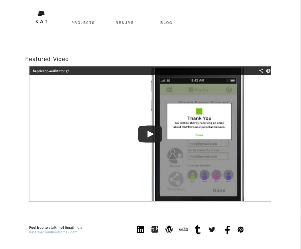
Slide-in captions!layout for videos on portfolio siteLayout with thumbnails of process linked to the blog.New header. I eliminated the contact page and put that information in the footer.Footer has contact infoFinally nailed the responsive nav.
Update 5-30-13: A checklist from my teacher, Barry Sevig. (Yeah, lifted right from the teaching website.)
Let’s go over a few things you might have forgotten to include in your portfolio site:
1. Google Meta Information
Two things you’ll want to pay attention to for basic search results.
<title>This will appear in Google</title>
-Title tags are important both for SEO purposes and also for wayfinding / bookmarking purposes.
Don’t forget your <title> tag’s.
<meta name=”description” content=”This is an example of a meta description. This will often show up in search results.”>
If you’re using WordPress you can make this dynamic in many different ways. Check the bloginfo function in the WordPress Codex for more on populating dynamic results for meta info http://codex.wordpress.org/Function_Reference/bloginfo
-Sign up for a Google Account
-Login at http://google.com/analyitics
-Setup a new site
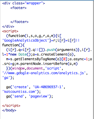
-You’ll be pasting <script> code snippet they give you into the footer of your site.
4. Optimizing Images No one wants to wait for your 4000×3000 images to load.
Images should be saved for web in Photoshop at 72 dpi and 70-80 quality. You best be saving optimized images YO!
5. Retina Logo / Trim
If you portfolio images are not retina… is your logo?
#logo {
background: url(mylogo.png);
background-size: 50px 50px;
}
#logo {
background: url(myretinalogo.png); /* !!!!! REMEMBER YOUR LOGO MUST BE 100×100 or twice the size as the original */
background-size: 50px 50px;
}
}
6. Favicons You need to use .ico files unless you don’t care about IE or older browsers. Then you can use PNG’s.
7. Apple Icons It’s safe to say that most people won’t be bookmarking your site on their homescreen, but maybe you will as a reference for when you pull up your responsive portfolio in an interview. Here’s how to include those shortcut icons for you Apple device.
So will Modernizer or the HTML5Shiv if you wrote markup in HTML5 and forget to include these for legacy browsers.
<!–[if IE]><script src=”http://html5shiv.googlecode.com/svn/trunk/html5.js”></script><![endif]–>
or
<!–[if IE]><script src=”http://cdnjs.cloudflare.com/ajax/libs/modernizr/2.6.2/modernizr.min.js”></script><![endif]–>
9. HTML Resumes
This is a bonus, but if you have time I would recommend a coded HTML resume and then a link to download / print PDF resume.
Examples: Clay & 10 resume templates for inspiration
9. Window Resizer
Have you checked your site to see how it looks on a 13″ Laptop? How much of your site is visible above the fold? Window Resizer Plugin for Chrome
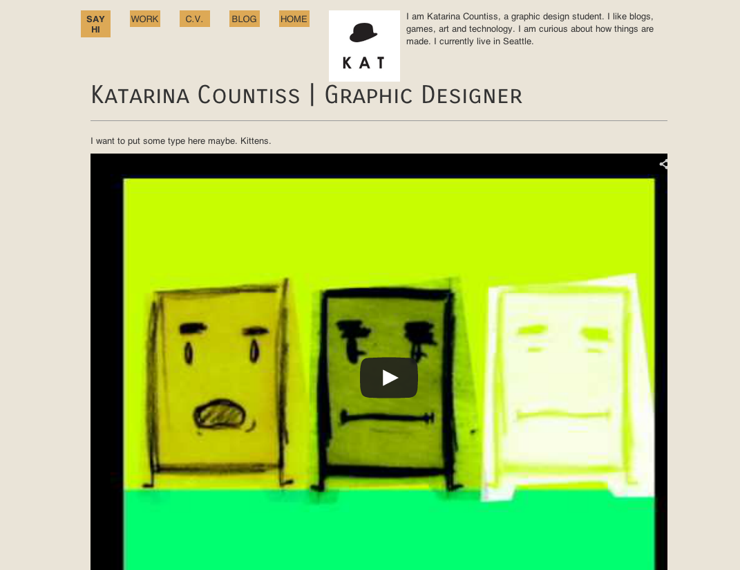
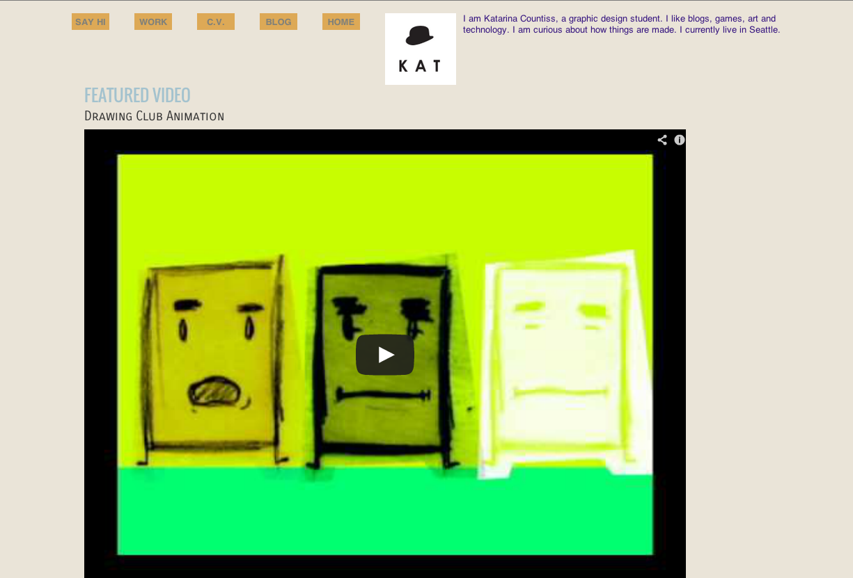
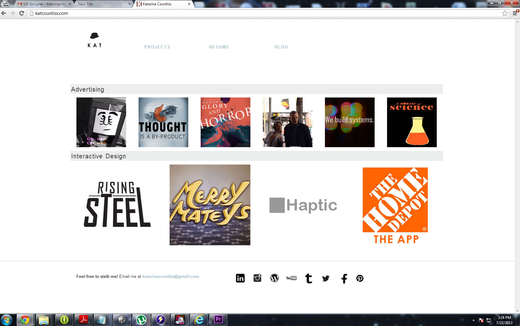
Update 6-7-13: I’ve gotten feedback from Barry the instructor and Paul Nissen, the unpaid superhelper of the program and I’m reworking a bit of the linking structure of the site and cleaning up some margins so that it’s all better aligned. More screenshots of the website as it nears perfection. Paul reminded me of other devices this morning and shows me my videos not loading on his mobile phone and the media queries failing me.
Update 7-23-13
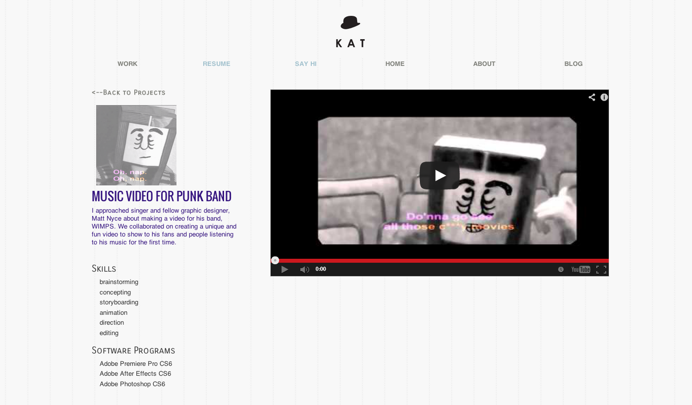
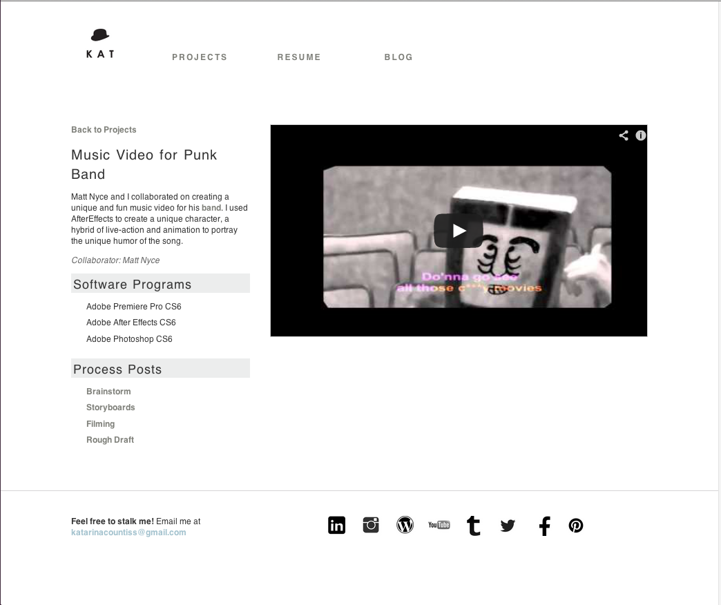
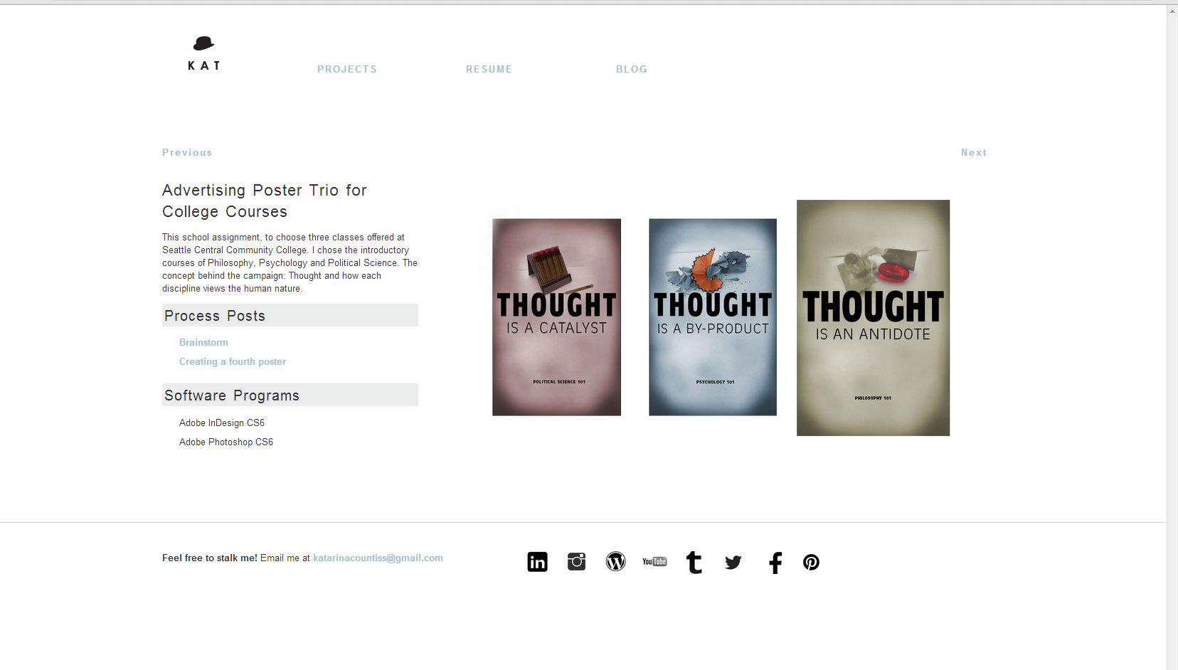
I talked to my design chum Paul N. who gave me a break down of what I needed to change. Including the project pages where there’s now a flow of projects you can click through to. Note the previous and next buttons.
I talked to my instructor, Erik who had this to say:
Your website is awkward. It is hard for me to understand what you want to do…Artist? Designer? Filmmaker? It’s all over the map, but lacking excellence….wait, the IT video is excellent, and the haptic work is strong, but many of the other pieces do not convey your strengths. I think of you as one of the smartest people in the class, but this collection of work does not display your sophistication.
I just got out of a meeting about understanding how the animation will proceed. I wanted direction and I was puzzled by the process, but I guess it comes down to “just do it.” Deciding on colors, textures and animations will be one of the most decision intensive thing I’ve done.
Today one of the team members made the outline of the first structure that the other animator and I will be converging on so the animation seems seamless.
update 5-8-13: Animation process
This is what happens when you try to link something into itself. #nestingfails
I added some pattern. This should really be in Proof of Concept post, but I am finally on slate for doing the animations for the video. I quoted two weeks, but I should have noted that was after we have the idea down and it’s just execution.
Update 5-24-13: The Process using Adobe After Effects
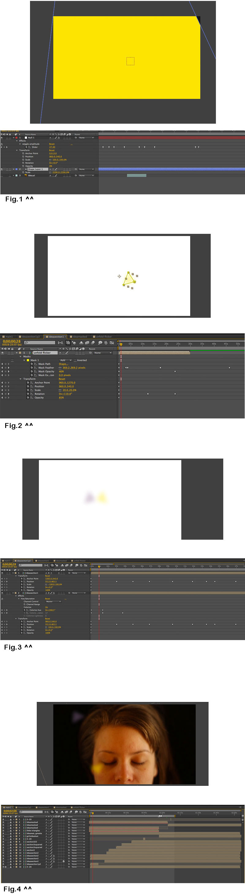
Fig 1: From my animation partner, Pete: “Here an attempt at the flicker animation. I used the wiggle expression on the opacity and position parameters. To turn on and off the opacity wiggle, I made a null object, added an effects slider, linked it to the wiggle amplitude and then animated using the slider. It’s pretty easy and I’m happy to show you how to do it. There’s also a video tutorial if that’s preferable. The file is attached so you can check out the parameters. http://www.youtube.com/watch?v=_pFM7TDYYZk” I use this flicker effect as the base file for all the triangles I use in the first part of the video, giving them a feeling of new and uncertainness. I put this file into “Ideasection1” comp.
Fig 2: Ideasection1 comp gives the the yellow triangle a mask and mask effects like opacity and feather. I also added some movement.
Fig 3: In the beginning of the video, I start with two triangles, but they are really the same moving triangle (Ideasection1) mirrored. The only difference between them is the color effect-Hue/Saturation on the grey triangle. This way, when I changed the feather mask and opacity on the “Ideasection1” comp, it effected them both equally. This makes up the “ideasectionp2.”
Fig 4: I put this file (ideasectionp2) over the main footage and gave it more movement within the context of the film’s composition. Each time I put file over the main footage in the timeline, I use that footage for a short sprint, turning the opacity to 100% when I want it and 0% when I don’t and then lock it immediately. Organizing the layers chronologically, in this case, the triangles that happen earlier are lower in the timeline stack. This is important for going back and editing individual parts and changing out the “reels” if the team doesn’t like what that bit is doing.
In this video, you can see the dramatic changes that the “idea” went through. The middle one is the semi-final one– it still needs some color correction on the footage.
 I had a moment of clarity last night when I realized that this app is not incredibly realistic and I am happy about that. I wanted to make something forward looking. This app comes with bracelets and a set of goggles so the user can see a 3D interface and utilize space. This makes sense from a humanistic stand point. Our brains are better equipped to interact in a 3d space.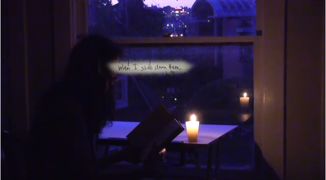

 Kismet Arts Tangent