Kismet Arts Tangent
Art Collective
-
Assignment: Get a job
Phase 1 of Web Design
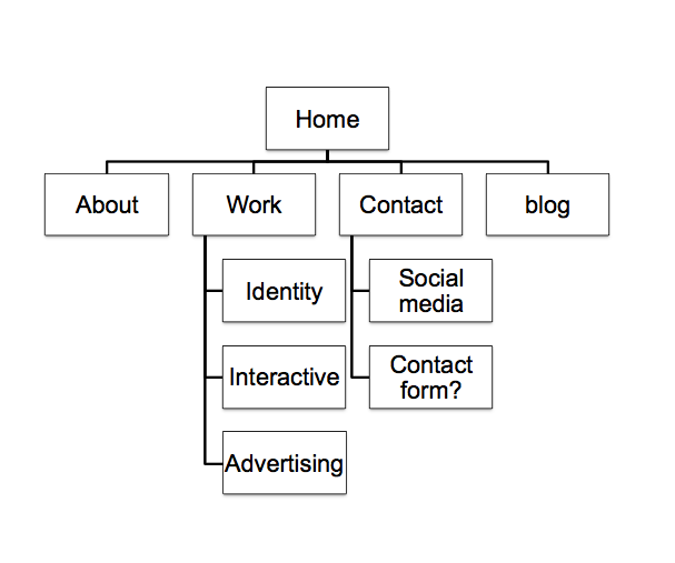
1. structure information with user-centered considerations (Site Map) *Research the competitors (Links) and content (html). I think the content/ captions will come in phases and iterations. I want to coordinate my print portfolio and web portfolio so they have similar copy.

dylanbetz.com.
Aaron Bloom | Graphic Designer.
magneticNorth – a digital design company, based in the UK.
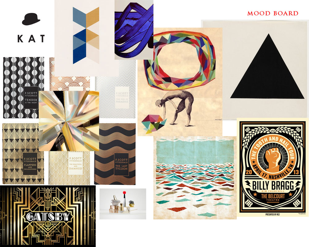
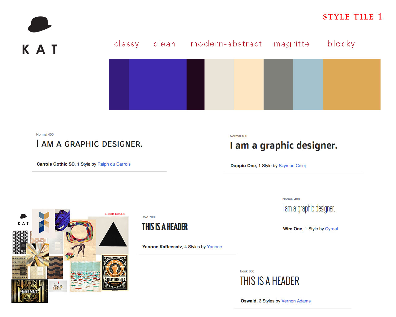
Art director / Graphic designer – Janis Godins.2. communicate style and function Branding (style Tile) Version 1


3.wire-framing explore more efficient layouts (Don’t forget Advertisements if necessary!)
4. understand mobile strategy and other media requirements I need 3 layouts– mobile, tablet (landscape), and desktop. Especially tablet, if I am to go into interviews with that kind of device (recommended).

5. Users: audience, demographic. Who is this for? How should that influence the website? Employers
6. Framework choice: I decided to go with Amazium – The responsive web framework..!. I was planning to go with 1140 grid, a framework I have used for many projects, but I found this: 1140px CSS Grid Retired — Andy Taylor. and so I decided to branch out. I think it’s for the best. Amazium’s defaults are decently close to what I am going for anyways.
Links:
Katarina Countiss. (this is where my portfolio site will live) -

 I presented this to Tom and he sad that I needed to give this stuff room to breathe. This project especially is the height of my graphic design glory so far and it deserves a few pages. I want to see more print portfolios before I make that decision. I’m still wondering how fancy they should be. I think that it’s a waste of money to make a fancy book when I think screens are where it’s at. I’m gonna get some advice from some people in the industry and get back to this in a week. Think about it, do a little research before designing a book.
 -
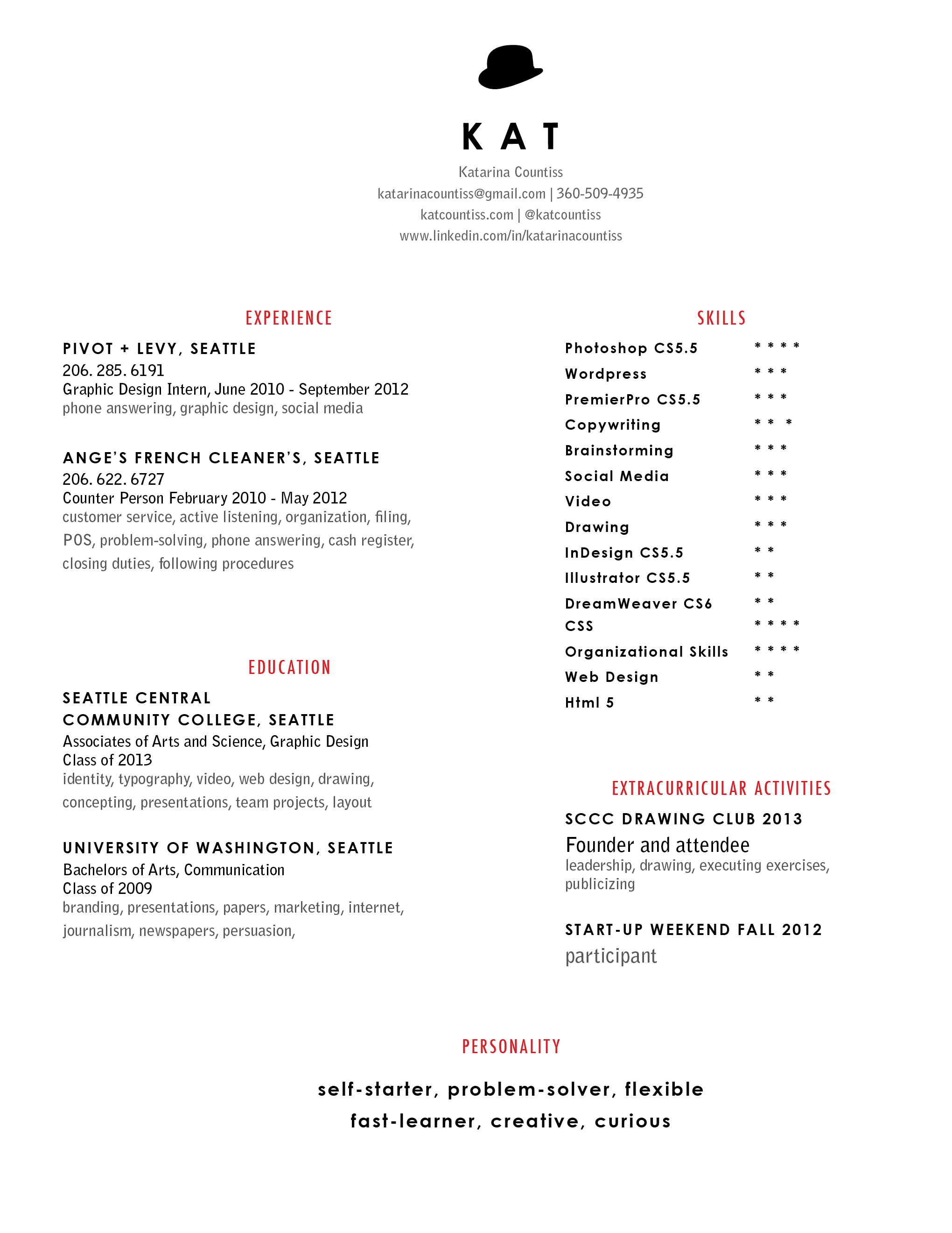
 My first go at typesetting my resume, this year. Every year it seems to improve in typography and qualifications (that’s a good sign!). But, it’s not perfect. I am going to sit with this for a while. Analyze why it’s not clicking for me. Maybe I thought it would be more impressive and when I look at it, I get a feeling of disappointment because I’m too ambitious for my current skill set. I wish I had something that made me truly stand out, like “Dolphin Trainer Extraordinaire” or “one of the last speakers of a dying language.”
Update 4-29-13:

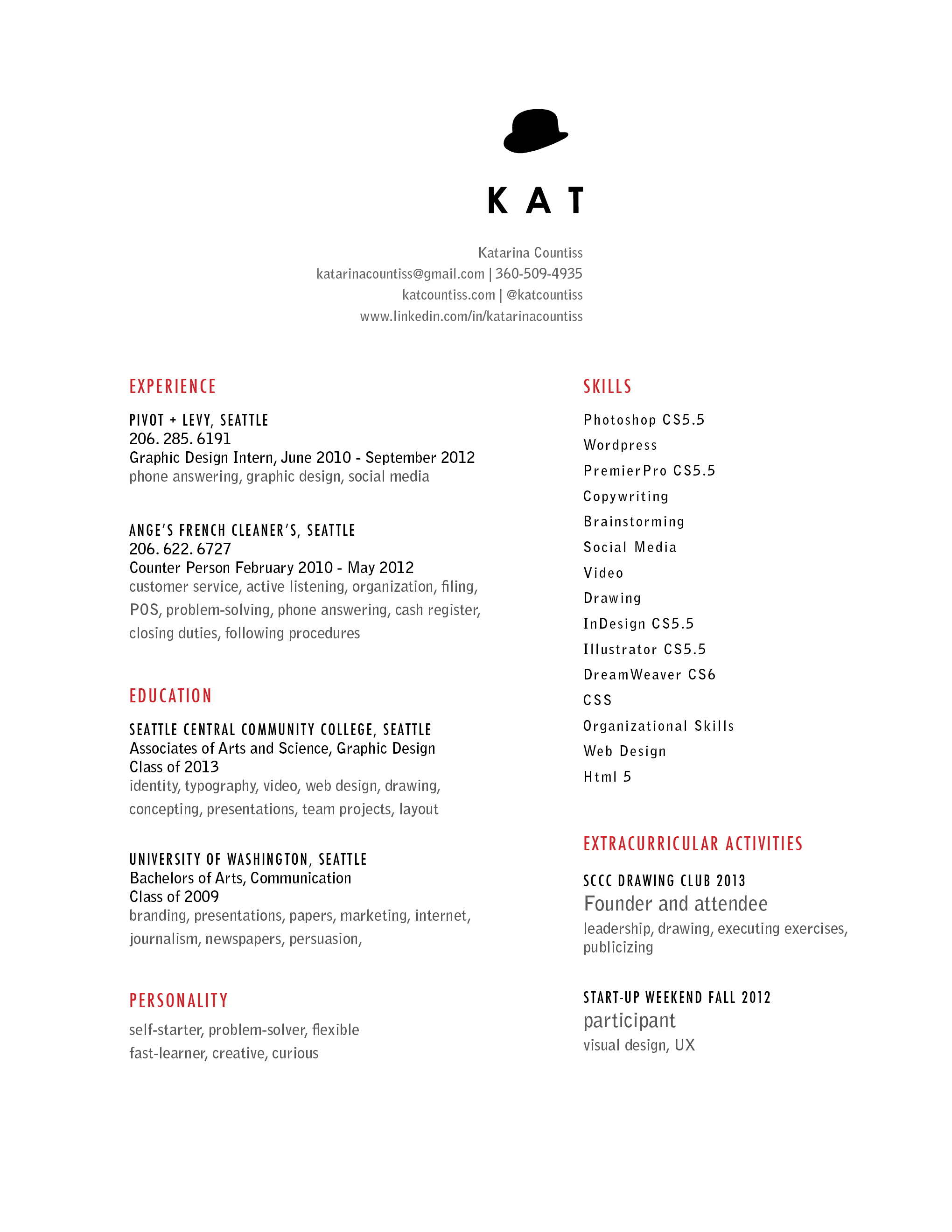
I presented this to Tom today. He said that I shouldn’t rate myself. Let them figure out what my strengths and weaknesses are. Perhaps wishful thinking will be in my favor. I adjusted the type and tried out some alignments and now I have this.
 I‘ll keep looking at it. I see new things to adjust every time.
 -
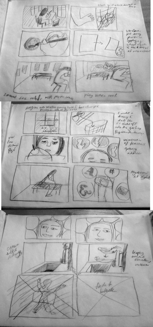
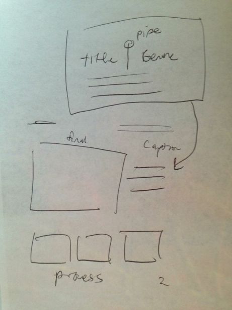
 I want to use my bedroom as a metaphor for my mind. I’ve decided my video featured prominently on my website should speak to my goals and my imagination. I’m going to use AfterEffects to create overlays of information on blank walls (like this video Sight on Vimeo on Vimeo). A lot of it will hinge on the voiceover where I will interview myself with the main question “What have the past two years been like?” I will answer candidly about my discovery and development of my own design style and ambitions that have laid dormant until now. I want to also express the feeling of design, when it’s all on you and there’s a fear present when you’re experimenting and you’re not sure if other people are going to “get” it. That’s where the camera is viewing the room at a sideways orientation and I intend on figuring out how to give the illusion that I am on a precipice, which is the edge of my bed like this image:
(attribution needed) -


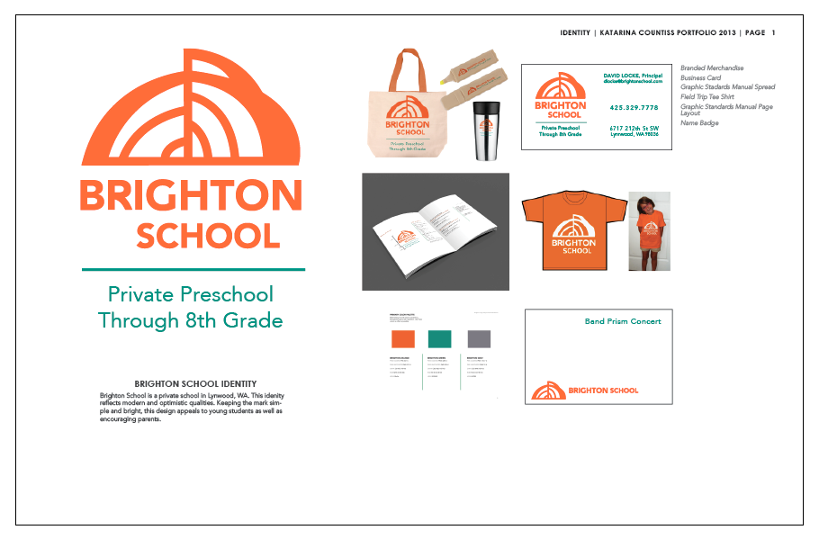
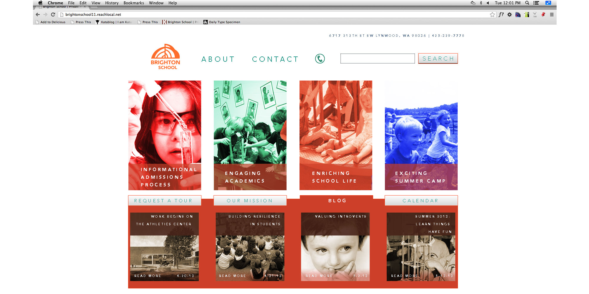
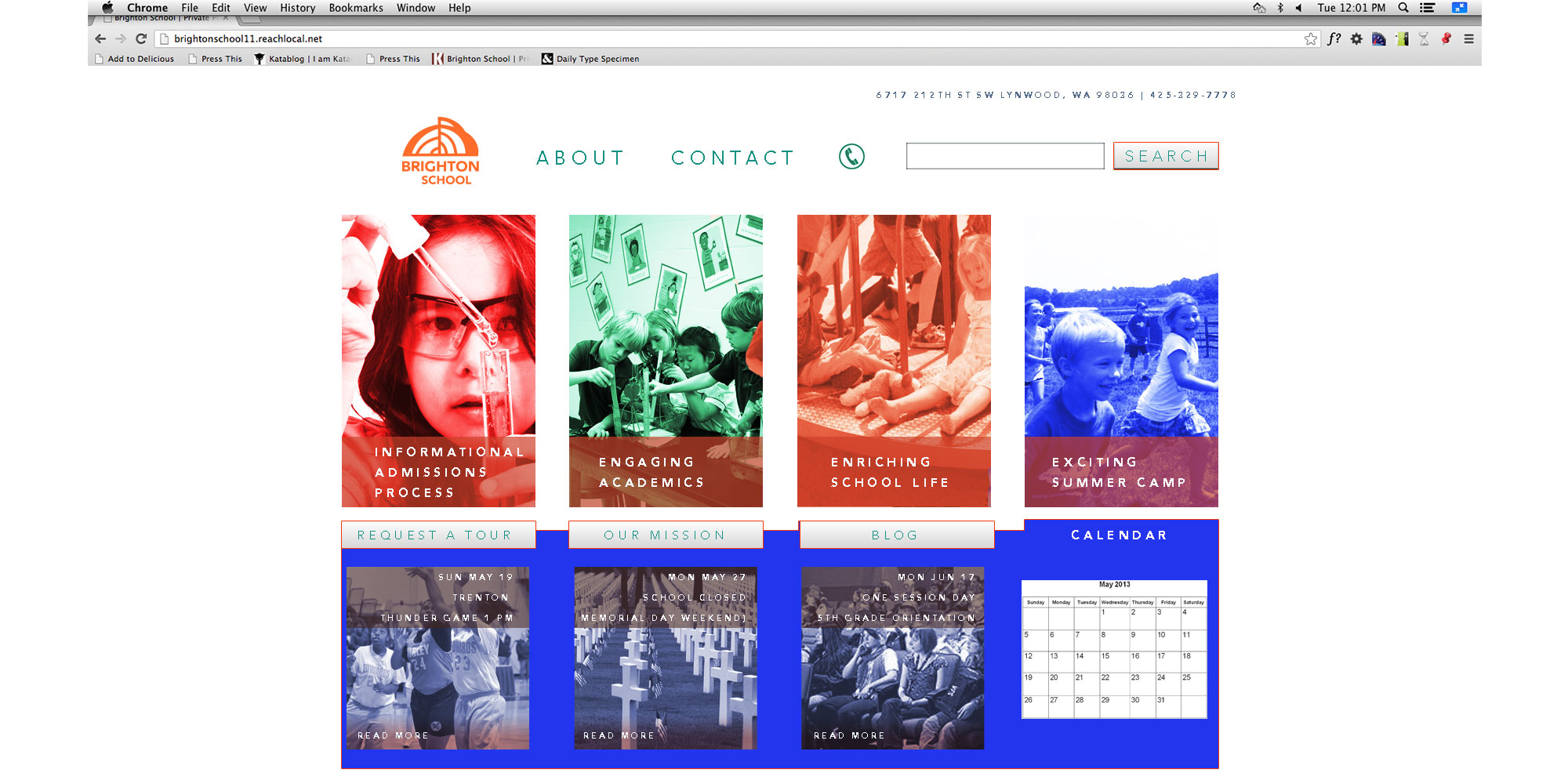
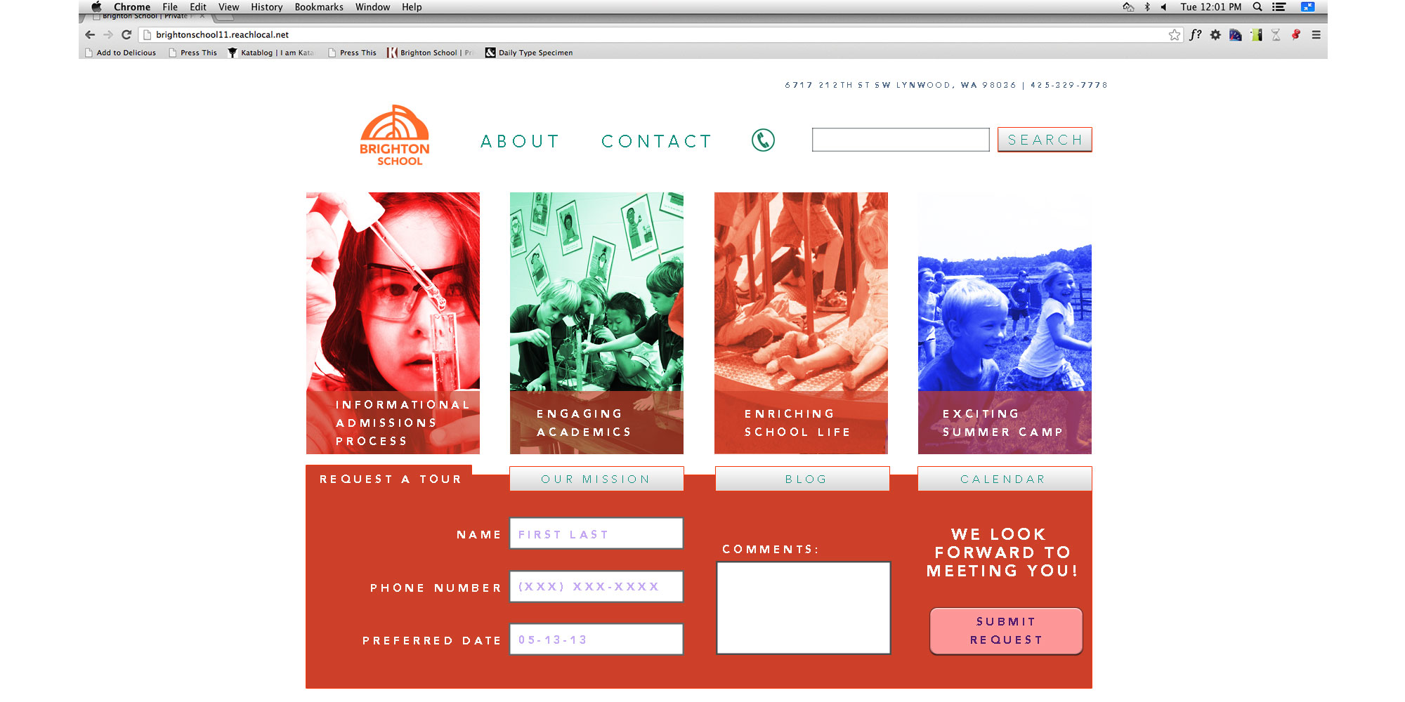
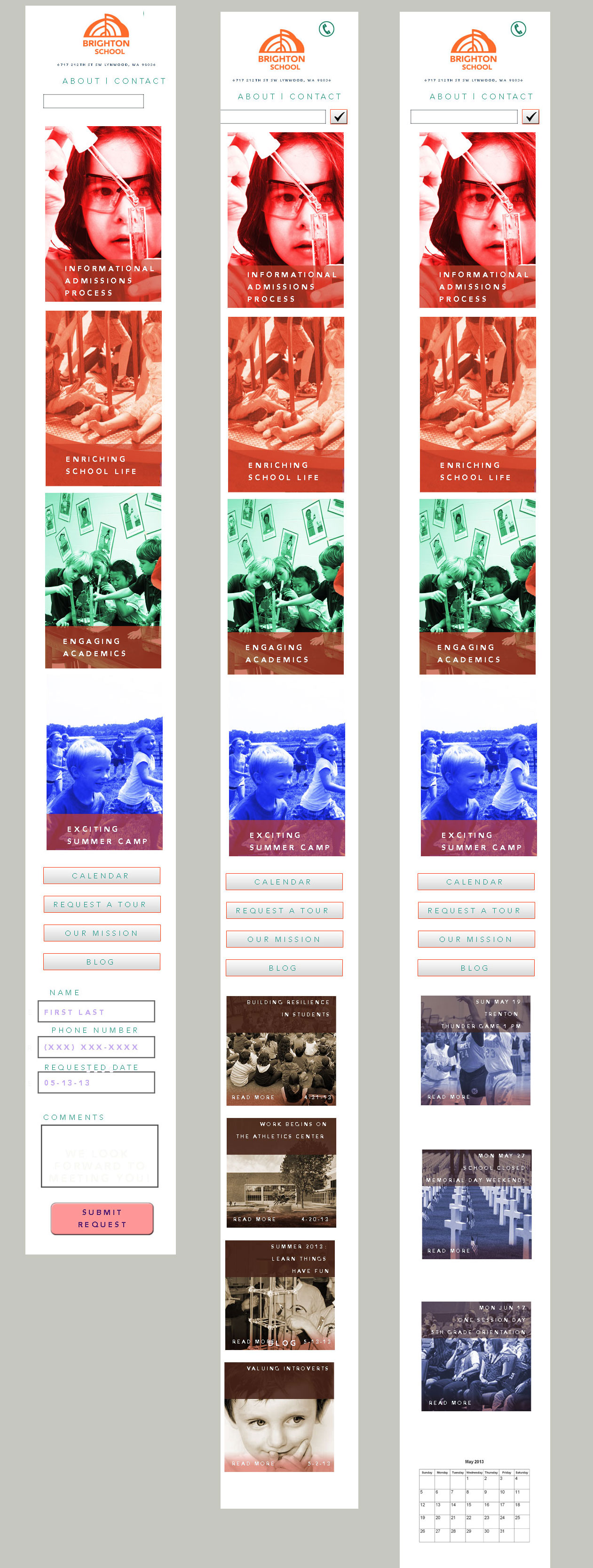
 Here are some photoshop comps for Brighton School as part of this massive identity project. It was easier than I thought to organize the file and resize it for mobile. I think a part of that ease was having a four column layout. They slid into one column smoothly.
In this comp, I imagined for Brighton’s website, big bright pictures and navigation in the middle of the page where the sought information is organized in a tab like structure so it doesn’t seem like you’re going out of the page to get information. I used color to differentiate the different kinds of information.
-

 On Friday, my Facebook status: “I designed an app that helps people familiarize themselves with the boarding process of an educational non-profit spacecraft that gives its riders two minutes of zero-gravity and a view of the moon… in my dream last night. This morning I felt productive, but I wasn’t.”
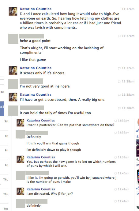
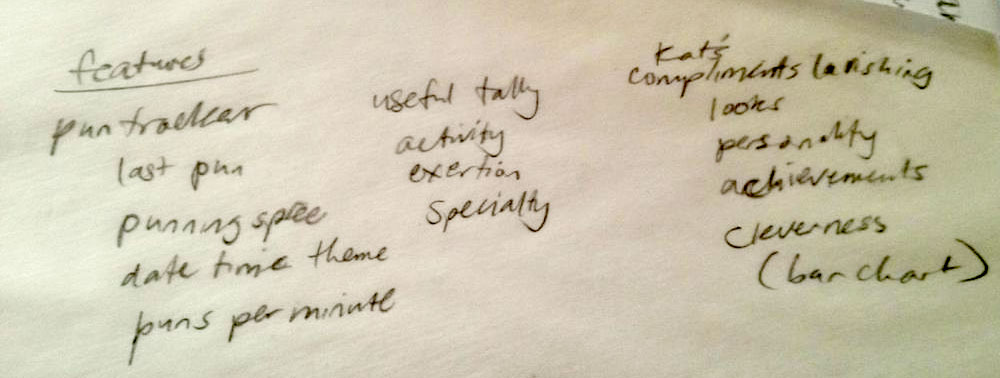
I had an urge to design some kind of app or something. Just for fun. Based on a facebook chat I was having, I made a sketch of a handheld electronic device with a program on it designed to keep track of different kinds of “scores.” This sketch represents three scores being tracked: puns, usefulness and compliments. The interface is a combination of a touch screen, voice, and a companion device, a bluetooth brainwave monitor that is worn by the participating users. It has been discovered that right before a creative moment, there’s a readable spike in your brainwave patterns (I read about it in Imagine, by Jonah Leher- Why Jonah Lehrer’s ‘Imagine’ is worth reading, despite the problems | Poynter..). It was noted by some people I explained the device to that this mechanism was unnecessary as the device could simply record everything and delete the unwanted later. In all practical uses, that would be the approach, but I love the idea of a smart device that is efficient, a device that activates right as the device becomes needed. The best joke of the weekend made by a friend, to whom I was explaining the invention paraphrased here:
<person 1>Did you have brain surgery? (pointing to the shaved spot where the bluetooth brainwave monitor device is adhered to the scalp)
<person 2> No, that’s my pun-tracker!
-
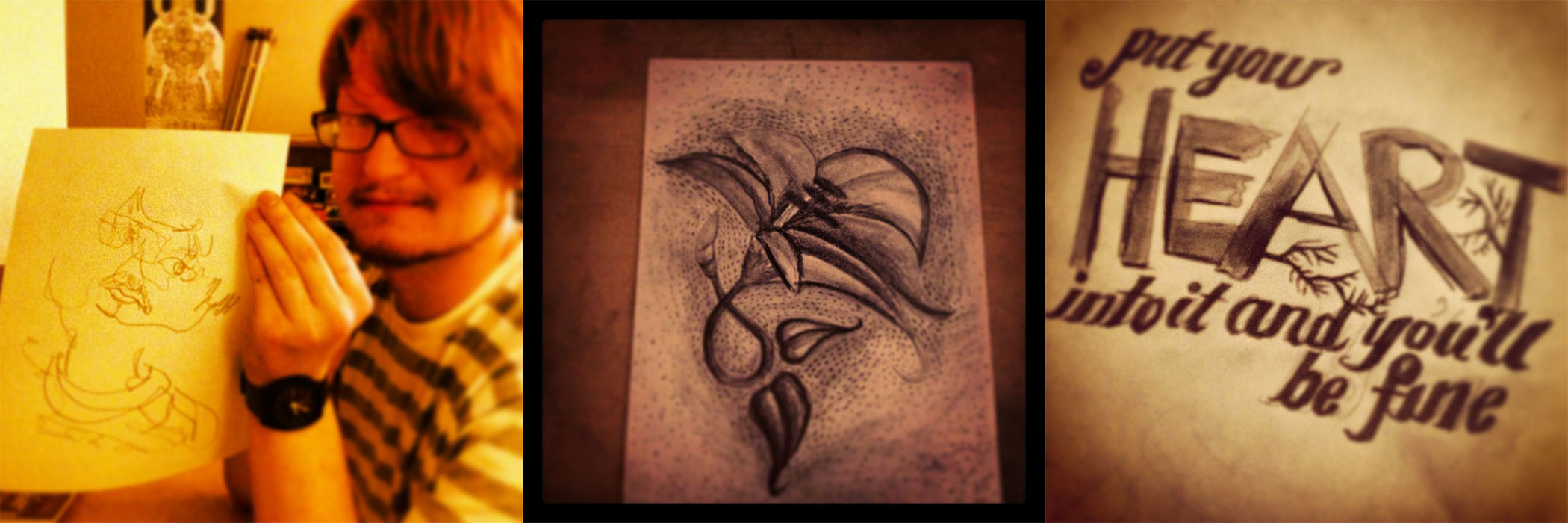
 Last week, I went over to a friend’s house to eat dinner and draw. Here are the results of that encounter. I instagram-ed them. I recently started instagram-ing and at first I didn’t understand the purpose of giving away your rights to your images to instagram, but I feel like it’s not about intellectual property, but publishing in a social forum. I find it interesting that I am in a culture that is sentimental about moments that just happened. I think I like that.