



Art Collective
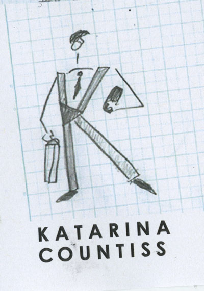
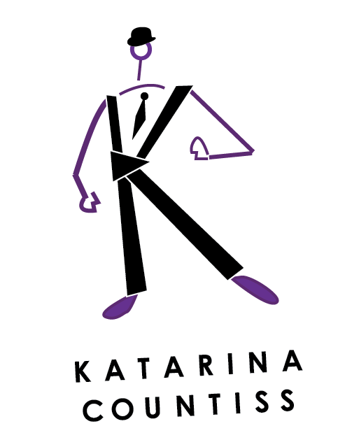
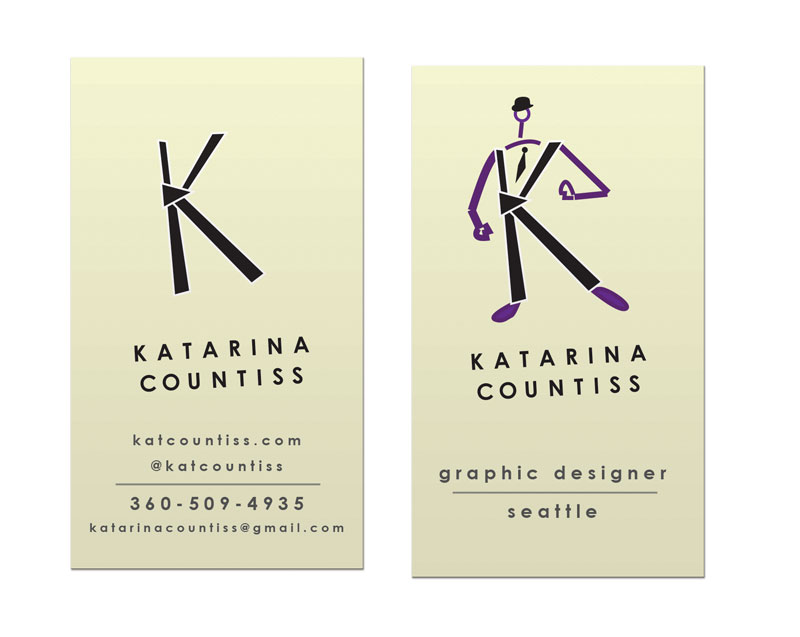
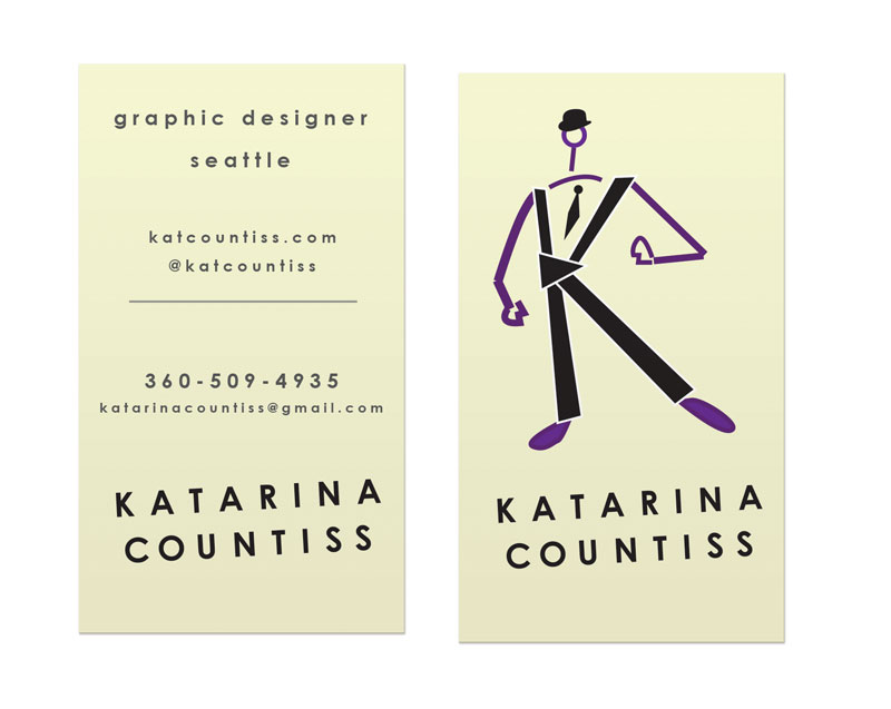
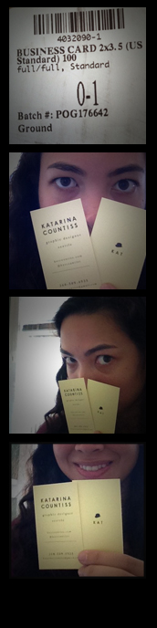
I talked to one of my classmates about the business card design and he said that it’s important to give the eye a break. I like to think of that approach as the reverse “mullet.” Party in the front, business in back.
Update 4-15-13:
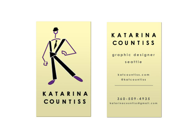
I had great feedback in critique today. Tom said that he “got” the idea of what I was going for with the type, a kind of 1920’s book title page look (centered, stacked, hierarchical type and playing with tracking). He said that perhaps a traditional typeface can bring that look out a little more. He liked the hat and lollipop head. He thought it was very “NewYorker” but the character needs work. I try to get Tom to like characters I make (he dug the pirate) but this one lacked charm from the shoulders down. He said if possible, try to just integrate the “swizzle stick.” I don’t think a lollipop sticking out of the wordmark would do, but I decided to take his advice and simplify. Here’s my new idea. I love it because it’s a nod to Magritte (The Treachery of Images – Wikipedia, the free encyclopedia.) and a mnemonic (Hat=Kat). I am beginning to embrace the idea that my name is made up of existing words (Kat Countiss= Cat Countess).
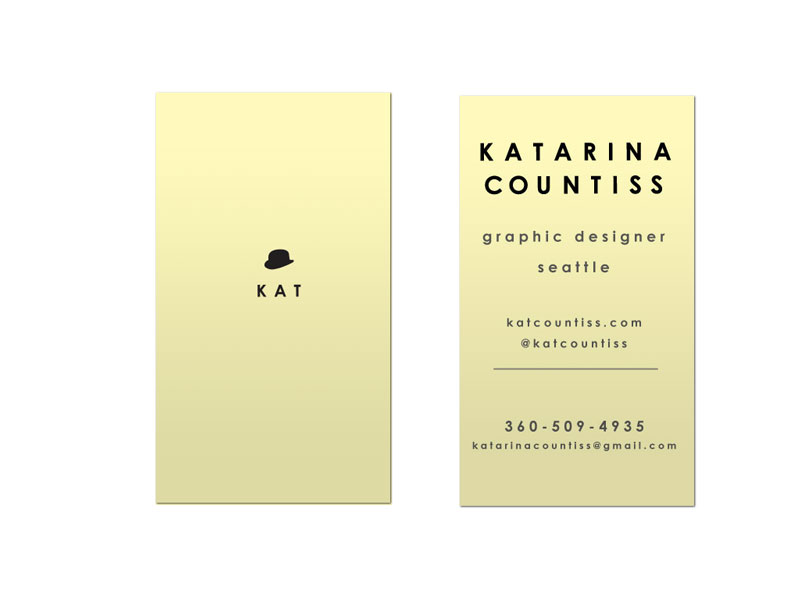
Update 4-22-13: Business cards with kerning:
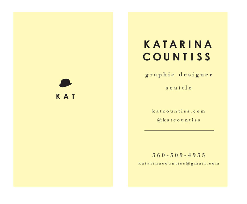
Update 5-13-13: I am in love with how they turned out!
Earlier Blog Post Related to this Project
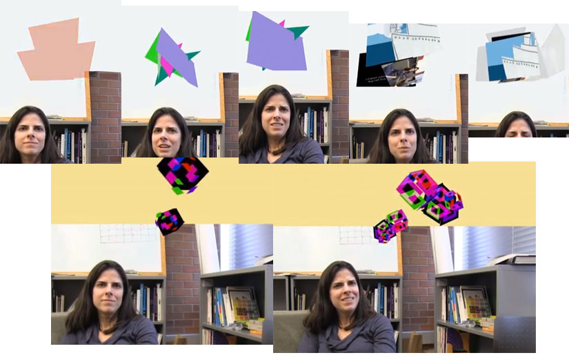
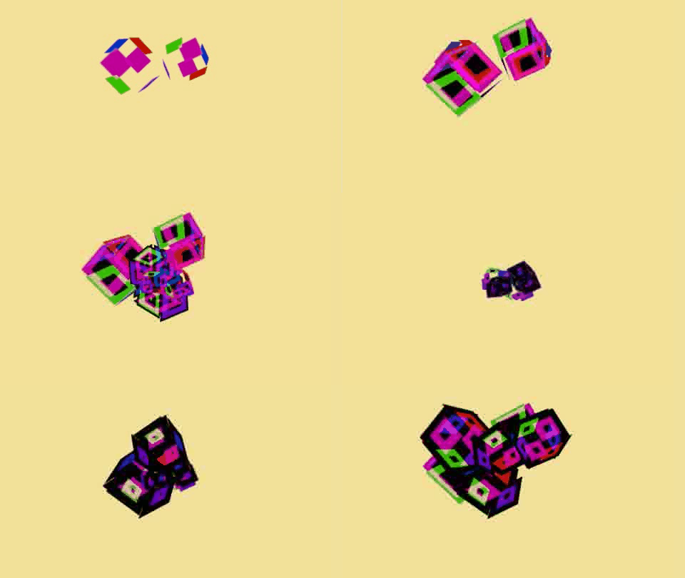
I’m in the portfolio video editing committee for my school. We’ve come up with a video that highlights our photography and motion graphics skills. I’m in the group that is figuring out how to animate what an “idea” might look like.
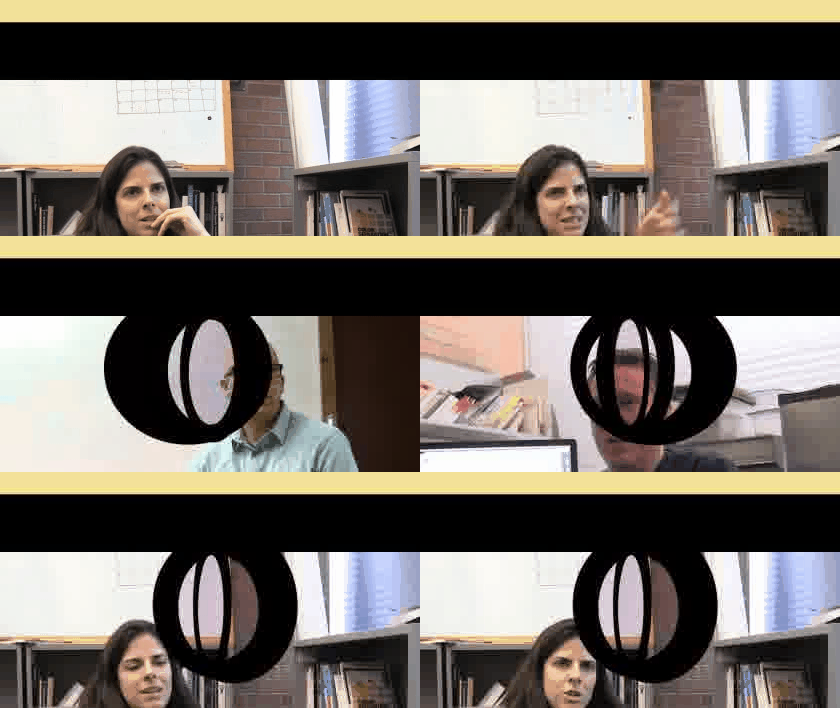
http://www.youtube.com/watch?v=xh2TZuHmN-U&feature=youtu.be
http://www.youtube.com/watch?feature=player_embedded&v=j4M28FEJFF8
Update 5-3-12: I’m assigned 1 and 3 of the Portfolio Show Animation. Here’s the birth of an idea.
Project: Liveshow Chaser App
Collaborators: Val and Gemma
Duration: 90 minutes
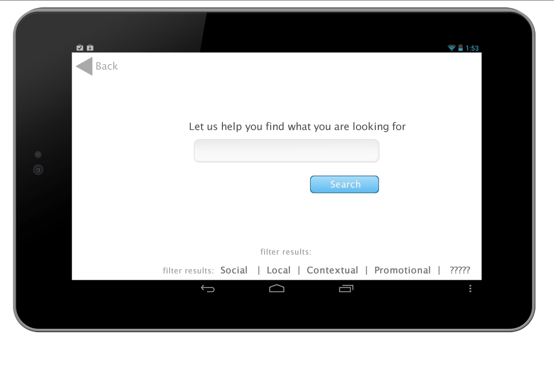

index. We made this using an unstyled information-less document set-up from the instructor in 90 minutes, from idea of what kind of topic to search to navigating Fireworks, a program we’ve never used before, then uploading a working prototype of the site using images linked together with html.
This is the first iteration. There are elements, icons that are generic place holders (from the google search for icons) and typography fairly basic. This Fireworks document has interactivity through the creation of “hot spots” (Adobe Fireworks * Hotspots, image maps, and rollovers.). Fireworks is a bit-map editing tool, but also a web building tool and a prototyping tool. Its common library has icons for arrows, dialog boxes, etc. that make prototyping a breeze.
naomikirabradly Naomi, Kira and Bradly acheived their “A” for the day by doing solid prep work, defining what they wanted their app to do and created this efficient prototype that’s worth looking at.
This app assignment is based on the principles for good apps: location, social, big data, special offers and meaningful interactivity and inspired by Sosh App. Sosh App Launches In New York City – Business Insider.
Below, I have some screenshots from the instructor’s presentation on the usefulness of Fireworks and exporting settings to have on.


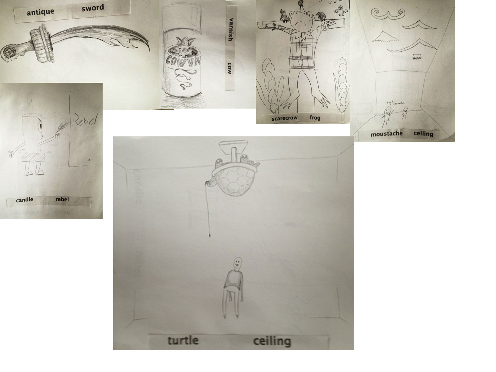
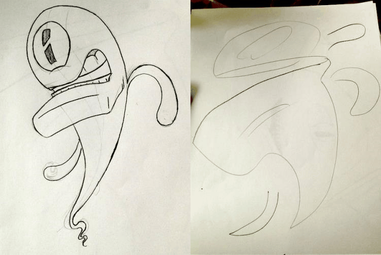
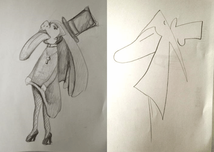
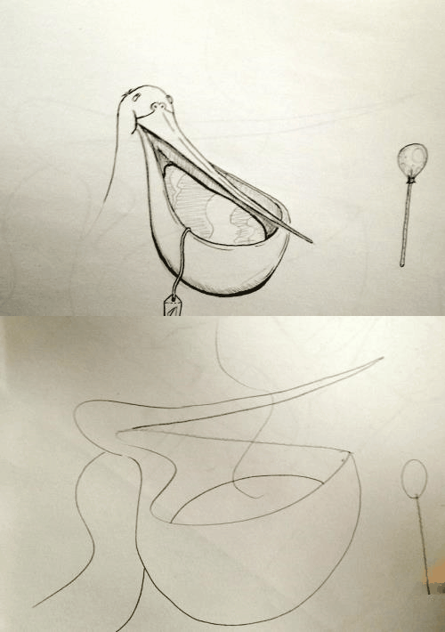
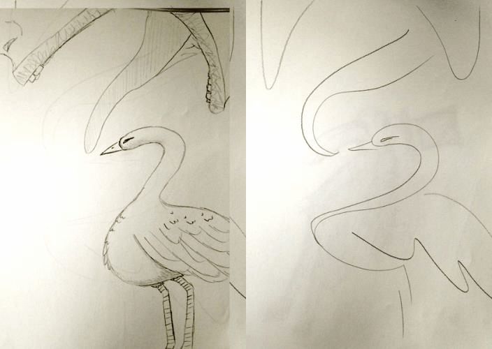 We did some drawing exercises at the drawing club meeting. One where you draw something inspired by two random words. And telepictionary.
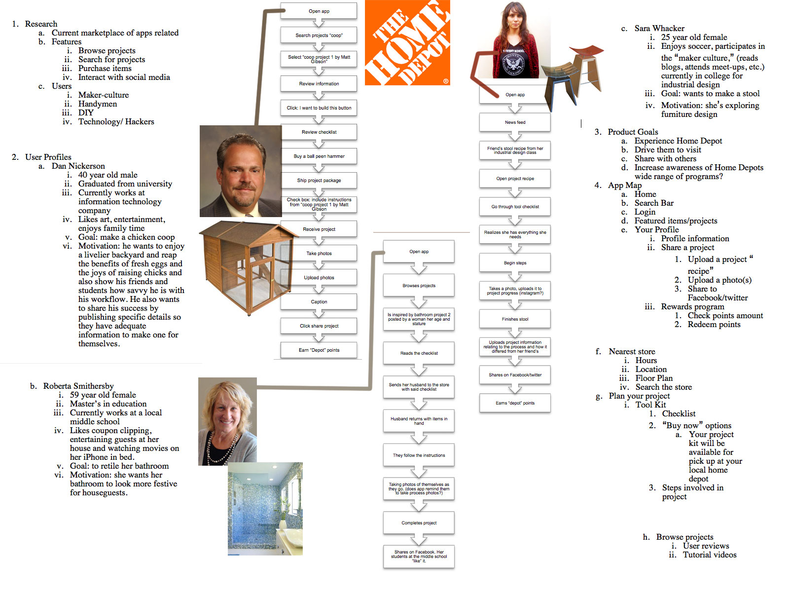
Update 4-10-13:
After seeing some of the other groups present, features to make sure to consider: smartphone checkout in-store? intelligent group ing of checklist based on floor plan of local store and for the final presentation, I think it’s really convincing if the user persona’s photos are of them engaging in a smart phone.
The instructor’s feedback included this=> How to Make Bakery-Style Cupcakes – Snapguide.
Update 4-15-12: Sitemap
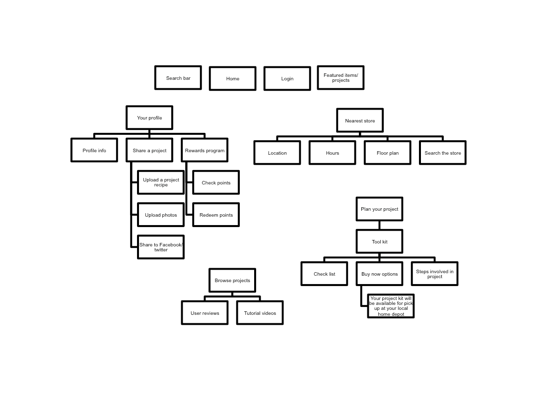 Update 4-17-13: Wireframes
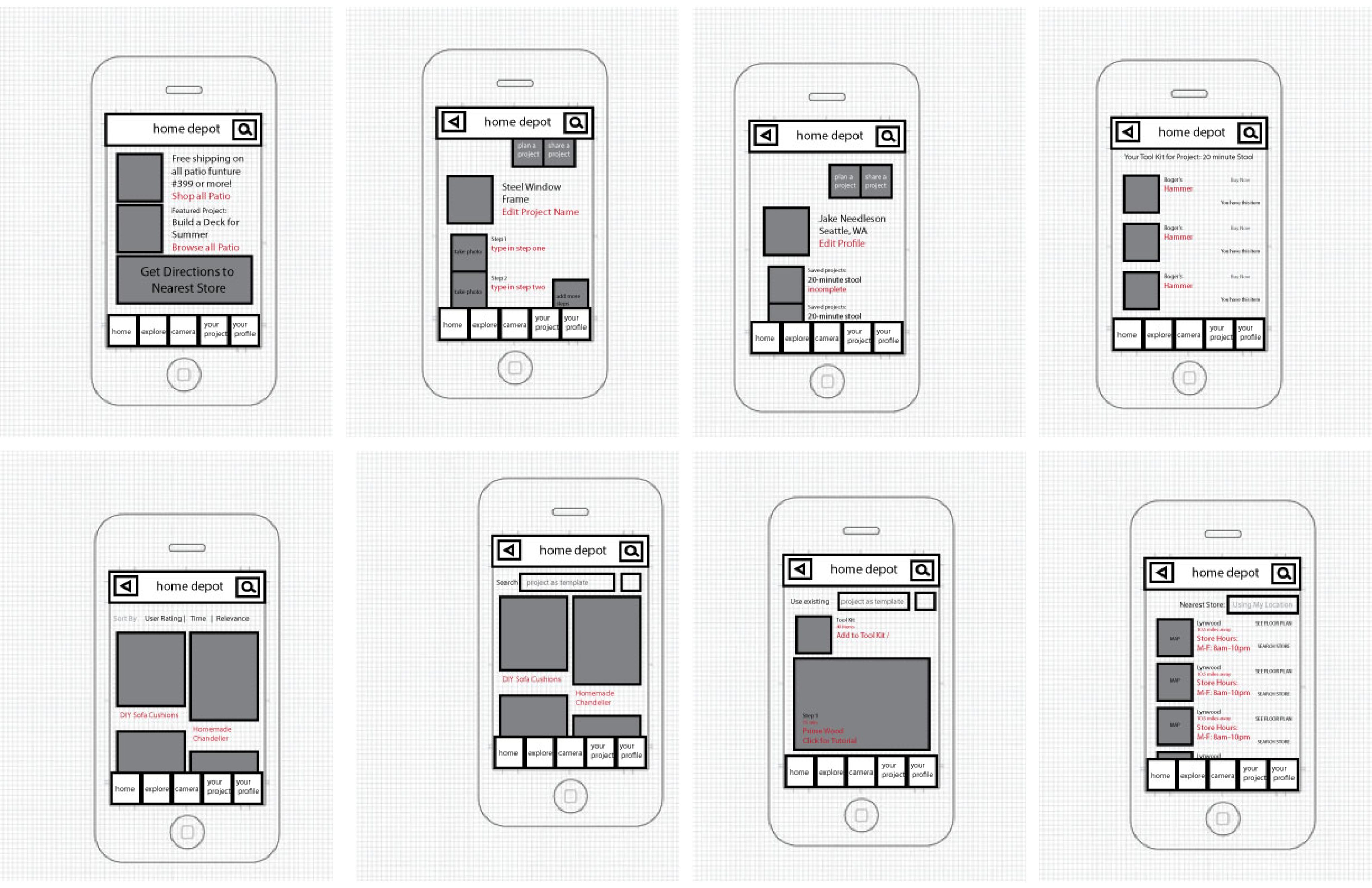 Use the TAP framework (TAP – Fireworks touch prototype tool for iPhone, iPad – UNITiD.)
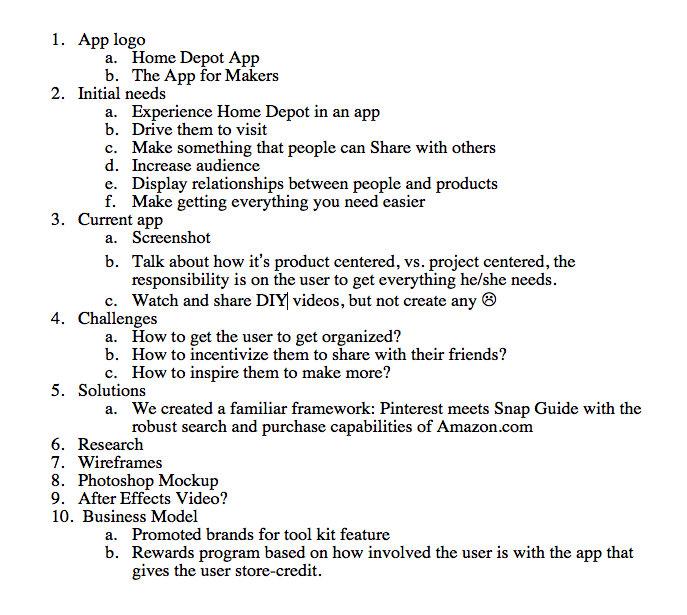
Update 4-26-13: I’ve passed off the wireframes to Liz, my visual designer and I am working on the presentation in InDesign for next week. Here’s the outline.
 Update 4-29-30: Today, I worked on the App Video Walk-through Draft 1 and The Presentation (also Draft 1). Ready for some skins and adjusting the timing.


Barry said to make the canvas bigger than the website. Plenty of margin. Same with mobile, and shooting for 320px wide isn’t a bad thing. For hover states in photoshop comp land, find an arrow from Google search and size it to actual size in relation to the photoshop document.
He talked about the layer comps feature in some detail. A good thing about that is the toggle. You can switch different states of the page (different pages within the site, hover states, etc.) with a use of a toggle vs. having to turn on and off each layer group.
For photoshop comps, design the desktop first then take those layers and put it into a new mobile sized document (see above) and resize/restructure the elements. Barry says that you don’t have to put everything on the mobile document (lest it be 5000px long) but if there’s a thing that needs to be expressed, like a login page, that’s a good strategy.
And, don’t forget to zoom out. PSDs save the way you’re looking at it, so when sending off files to clients, make sure that you are looking at the webpage mock-up in a normal way before saving and closing it.
(Export: File=> Scripts => Export Layer Comps)
Links:
Adobe Photoshop * Layer comps.
GuideGuide.
Ode to the Option Key: 30+ Cool Option Key Shortcuts in Photoshop | Design Shack. (The class oohed and ahh-ed a little when Barry resized an image using the shift and option key!)
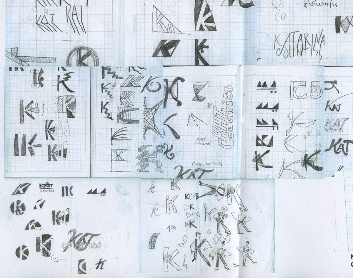
This is what I presented in critique today. We went over thumbnails. Tom didn’t say much about mine except that with a name like “Kat” why would I need more than three letters? I should consider myself lucky. I am not sure if I want to take his advice and go that route. I’ve done some thumbnailing and “KAT” just seems like an acronym without a cause. I don’t aspire to be Cher or Eminem. I strongly believe that a person earns their two names like Albert Einstein or Leonardo DaVinci. I like this mark. I think it is whimsical and it feels real to me. I am inspired by it and I want to see how far it goes.
 Kismet Arts Tangent