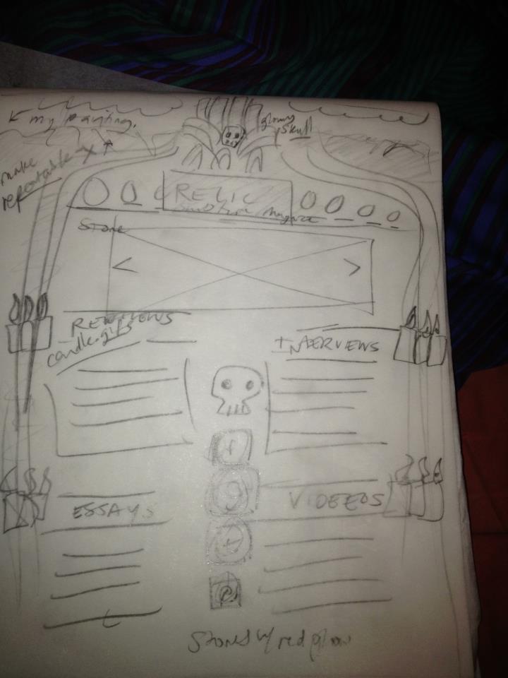
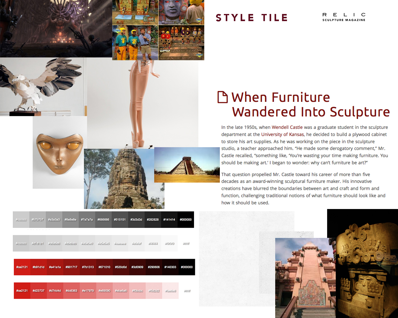
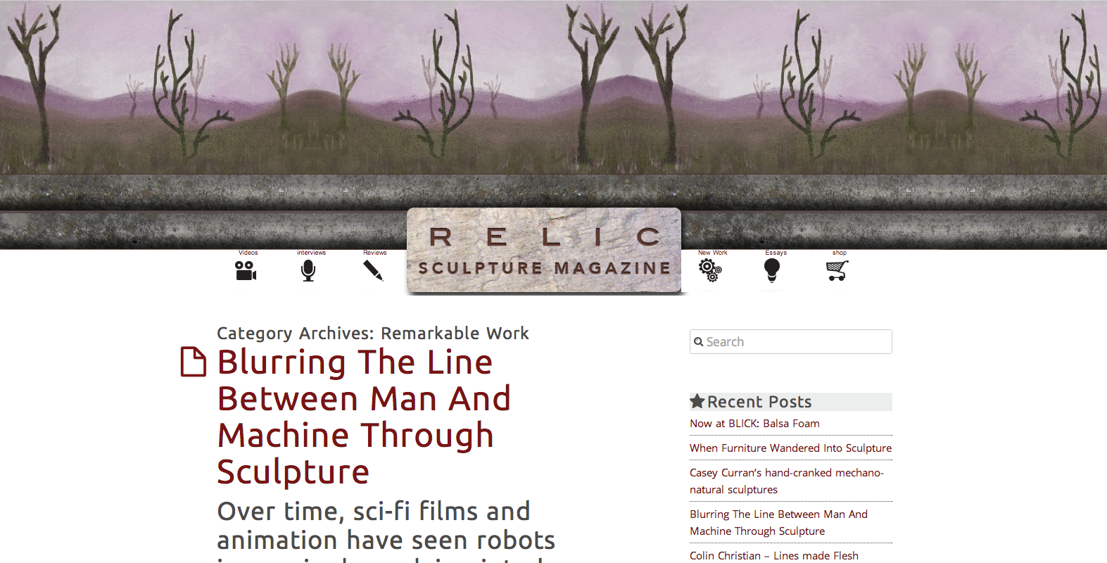
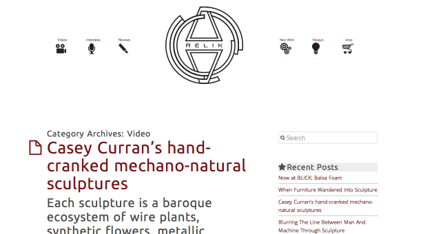
I had a revelation about what “RELIC” sculpture magazine is as a brand while watching my housemate play Brutal Legend : Brütal Legend – EA Games. I am excited to see where it goes. Here’s my new style tile and wireframe.
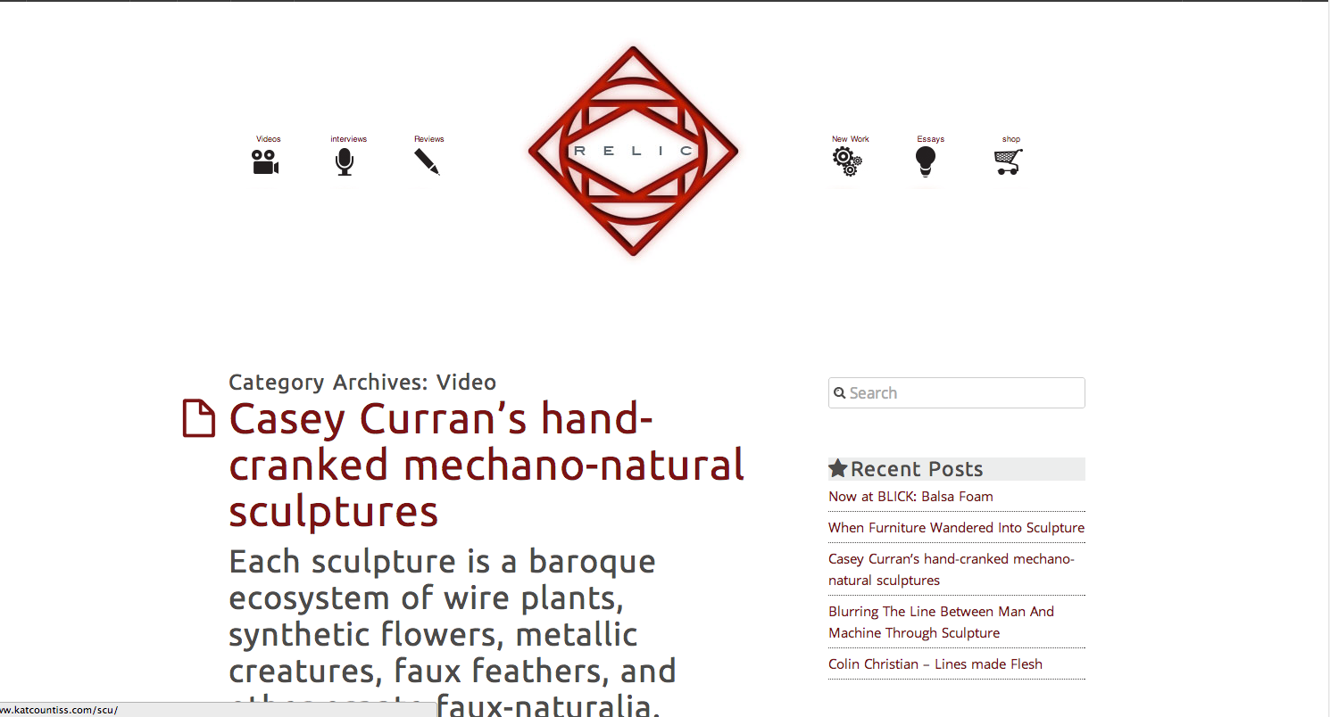
Update 3-13-13: My visual designer did not appreciate how over-the-margin-top this idea of Relic’s brand. So, we are backing off and going for a more modern approach. The logo is a stand-in stolen from http://sobekcis.tumblr.com/, but we’re inspired by that kind of geometric modern look.
Hover-state of logo shown.
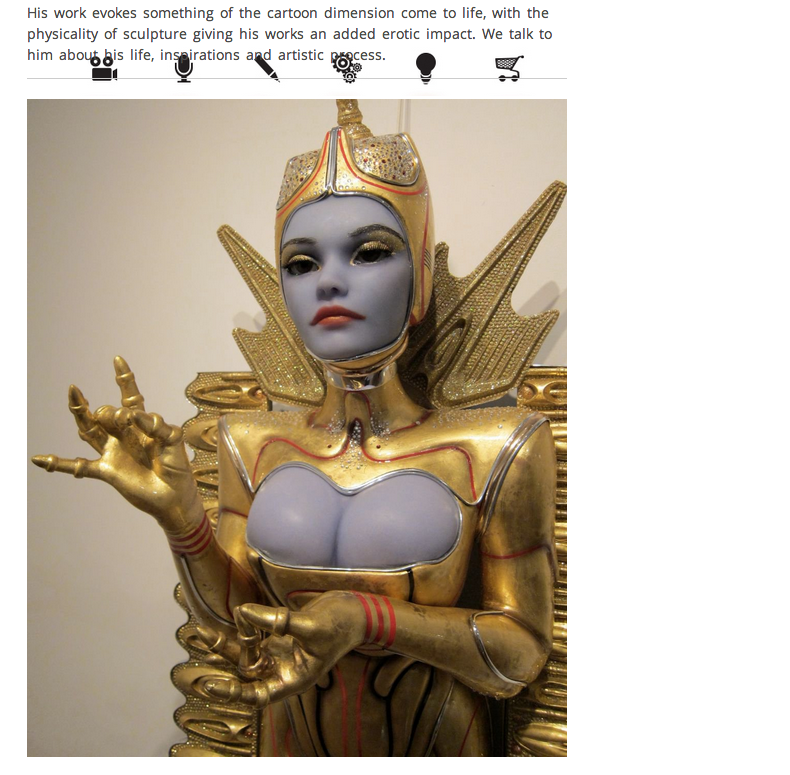
Nothing makes your heart jump quite like seeing your site broken, your nav all up in the text. I reinstalled the theme and saved all my code and reinserted it, but still… I hope I’m more careful when I am fusing themes in the future. (I tried to meld 1140 grid system with this theme with poor results.)
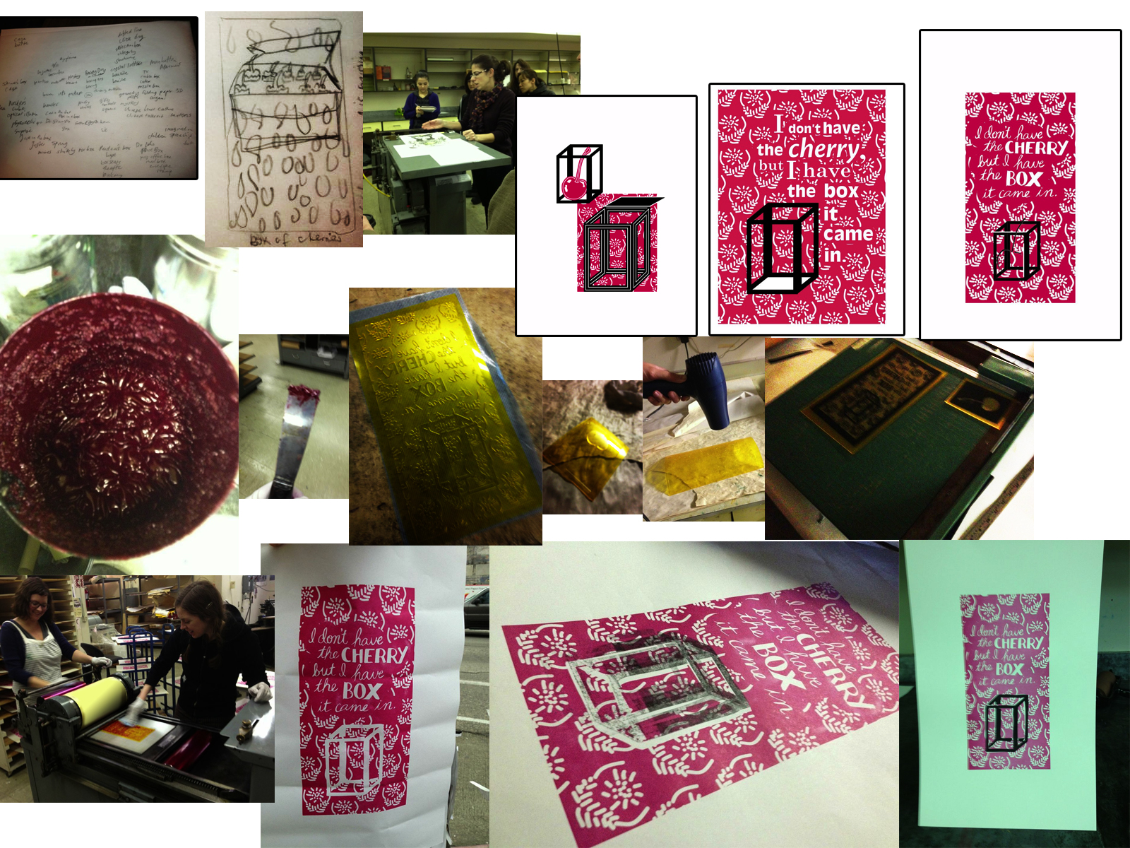
The theme was “box.” The poster challenge: Letterpress.
From the initial word association, to the time I first saw a letterpress machine in action, to today, when the last layer of ink went on: The Cherry Poster. It was incredible. Like baking a cake, making a plate, following the instructions, prepping… only a poster came out. We bonded over sharing inks and solvent and the lovely click of the Vandercook press as it hit the end of another run. Jill shared the mystery and science of registration.