Skip to content

Kismet Arts Tangent

Art Collective

    • Fall Program
    • About
    • Blog
    • Contact

recent posts

  • Project Planning
  • Peppermint Products
  • Writing Prep List
  • Automatism
  • Latha’s Prattles

  • Instagram
  • Object Poster 13

    March 8, 2013

    pp345

    This is a part of the Object Poster Series.

    sharing options:

    • Share
    • Share on Tumblr (Opens in new window) Tumblr
    • Print (Opens in new window) Print
    • Share on LinkedIn (Opens in new window) LinkedIn
    • Share on X (Opens in new window) X
    • Share on Reddit (Opens in new window) Reddit
    • Share on Pinterest (Opens in new window) Pinterest
    • Share on Facebook (Opens in new window) Facebook
    • Email a link to a friend (Opens in new window) Email
    Like Loading…
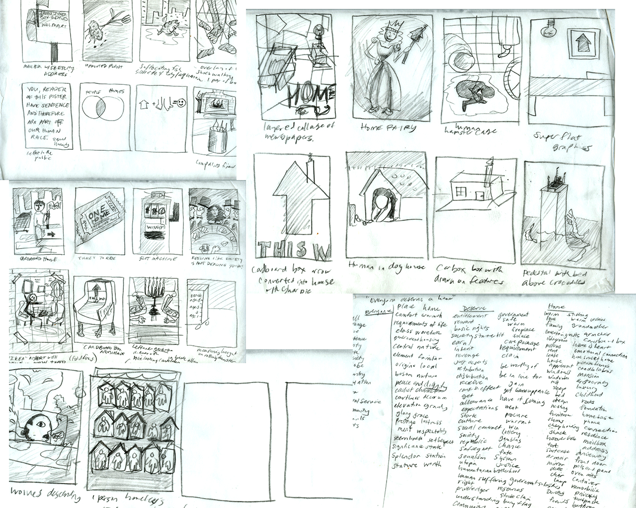
  • Poster for Tomorrow: Thumbnails

    March 7, 2013

    Here’s the creative brief:Posterfortomorrow.org.

    “A HOME FOR EVERYONE – A PLACE TO LIVE, NOT TO SLEEP.
    ‘Home’ means something different to all of us. The place where we grew up, the place where we live at the moment, the place we come to relax or entertain our friends after work. But for far too many people home remains a distant dream, a place to aspire to, as they try to eke out an existence in sub-standard accommodation or sleep rough on the streets because they have nowhere else to go.

    It doesn’t have to be this way.

    The United Nations has enshrined the right of every man, woman and child to a place to live. Not somewhere to shelter from the elements, but a place to live in safety, security and ‘in peace and dignity’.

    This is what poster for tomorrow is campaigning for in 2013: the universal right to housing. It’s a huge issue, which is why we’re going to be approaching it slightly differently this year.

    There’ll be one central brief as usual, but every month from February until June we’ll release a new brief addressing a different aspect of the issue: causes, facts, consequences and solutions. But for now we’d like to invite you to concentrate on one thing: the right to housing.

    MESSAGE

    We all deserve a home.

    INSIGHT

    A home is the start of a better future

    We’d like you to think about what a home represents – how it’s more than just four walls and a roof. What it represents to the millions of people living in slums, temporary accommodation or on the street is a future. A chance to break the cycle of homelessness, escape poverty, become a full member of society and live a ‘normal’ life free from the worries of where you’re going to sleep or what dangers you’ll face while sleeping rough.

    The reasons why someone is homeless or living in sub-standard accommodation are endless – poverty, bad luck, addiction, mental illness, eviction, a lack of affordable housing, relationship problems, domestic violence – but be they personal or societal, there’s one solution. A home.

    In 2013, with more people living in cities than ever before and the current economic crisis showing no signs of abating, it’s an issue that needs addressing more than ever. It remains an issue hard to define, harder to tackle and hard to address.

    It doesn’t matter why people are homeless, what matters is that they have the right to a home and the chance it represents to build a new life.”

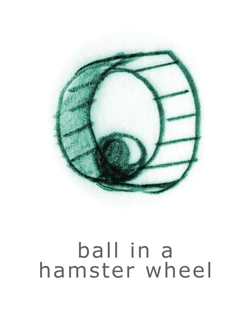
    thumbnails

    sharing options:

    • Share
    • Share on Tumblr (Opens in new window) Tumblr
    • Print (Opens in new window) Print
    • Share on LinkedIn (Opens in new window) LinkedIn
    • Share on X (Opens in new window) X
    • Share on Reddit (Opens in new window) Reddit
    • Share on Pinterest (Opens in new window) Pinterest
    • Share on Facebook (Opens in new window) Facebook
    • Email a link to a friend (Opens in new window) Email
    Like Loading…
  • Relic Week Four

    March 7, 2013

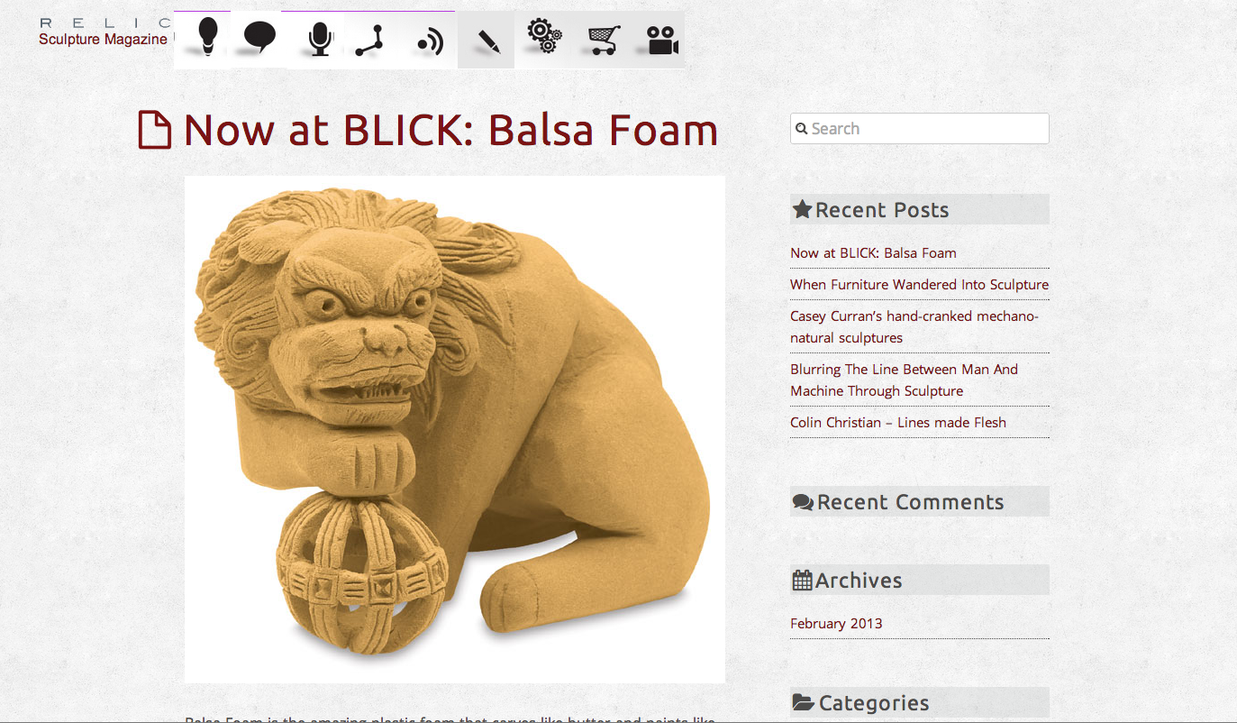
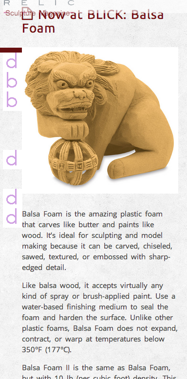
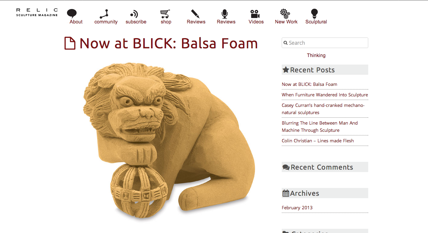
    Screen Shot 2013-03-07 at 9.48.01 AMScreen Shot 2013-03-07 at 9.49.14 AMThe User Testing Session was terrible for a number of reasons. Mostly the lack of navigation. This is the site right before the storm. The storm meaning I will destroy everything that I have built and start over. I think I do this every other web project, but there is something fundamentally wrong with my web design process. A revealing critique has led me to believe that every choice I have made with this project is completely wrong and I was under some false confidence that it was “okay” that it looked like a blog. I am frustrated and annoyed that all my friday status updates sent to the teacher had words like “fine” and “good” where it should have said “lazy” and “misguided.” I am interested in rewinding everything that I have done on this project and visit a few more sites before I feel like I know the first thing about what I am doing. It’s an online magazine. Magazine meaning style, sophistication and consumerism. Not a cheap wordpress blog. I’m going to focus over the weekend and hopefully get a good style tile to go off on.

    Update: I don’t think I’m going to throw away everything, but the site is going to be a lot more minimalistic than I wanted it to be, though we’ll see (I just noticed I have two review categories.)

    Screen Shot 2013-03-07 at 3.21.58 PM

    sharing options:

    • Share
    • Share on Tumblr (Opens in new window) Tumblr
    • Print (Opens in new window) Print
    • Share on LinkedIn (Opens in new window) LinkedIn
    • Share on X (Opens in new window) X
    • Share on Reddit (Opens in new window) Reddit
    • Share on Pinterest (Opens in new window) Pinterest
    • Share on Facebook (Opens in new window) Facebook
    • Email a link to a friend (Opens in new window) Email
    Like Loading…
  • Object Poster 12

    March 7, 2013

    p60

    This is a part of the Object Poster Series.

    sharing options:

    • Share
    • Share on Tumblr (Opens in new window) Tumblr
    • Print (Opens in new window) Print
    • Share on LinkedIn (Opens in new window) LinkedIn
    • Share on X (Opens in new window) X
    • Share on Reddit (Opens in new window) Reddit
    • Share on Pinterest (Opens in new window) Pinterest
    • Share on Facebook (Opens in new window) Facebook
    • Email a link to a friend (Opens in new window) Email
    Like Loading…
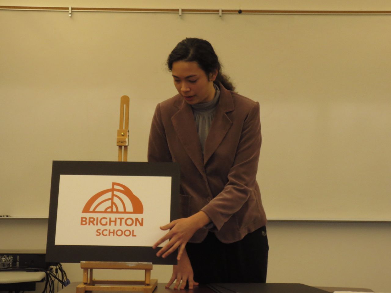
  • Brighton School Identity Presentation

    March 7, 2013
    My "client" took a photo of me during the presentation.
    My “client” took a photo of me during the presentation.
    Brighton school-brand-manual from Katarina Countiss
    I just completed the quarter-long project of creating Brighton School’s identity, compete with Brand Manual and client presentation (my teacher and classmates were excellent stand-ins for the Brighton School Staff). Here is planned structure of the presentation.

    Introduction

    Greet client by name.
    Introduce your name.
    Briefly describe the problem of the old logo
    Present Logo (foam core board) tagline on one side, without on the other
    Strengths
    Color
    Contrast
    Style
    Timelessness
    Ideals
    Respectful of institution
    Stationery (foam core board) Pull out samples on back
    Describe stock choice
    Graphic standards Manual (foam core board) 1 sample spread
    Ways to use and not use the logo
    Applications: Uniforms, truck decals, etc. (foam core) one side
    Ephemera: Brand Merchandise (same foam core) other side
    Conclusion: Describe the context of the logo
    How it will strive in the marketplace
    Thank you.

    It’s always an adventure presenting, blood pumping, all eyes on you. I think there’s often a few points missed. I didn’t mention the stock of paper that I so lovingly picked out. And after hearing everyone else’s pitches, I think would also have wanted to say the words “audience” “meeting needs” and “cost-friendly.” I’m looking forward to future opportunities to really nail it.
    This is my first Brand Manual. It was a matter of finding a good one on the internet and copying its structure. I think a lot of things are learned like that nowadays. Creating this brand manual was an excellent opportunity to practice my InDesign workflow, creating paragraph styles and master pages to create a consistent look throughout the whole book. Always do the table of contents at the end. I kept adding things and changed the page number references a few times. I greatly enjoyed making photoshop comps of the branded merchandise and field trip uniforms. It always feels gratifying to see a logo I’ve created in a realistic setting. I haven’t considered my skills to have extended to identity until this quarter, but I am excited to get involved in identity projects in the future.
    (Earlier Post Relating to This Project)

    sharing options:

    • Share
    • Share on Tumblr (Opens in new window) Tumblr
    • Print (Opens in new window) Print
    • Share on LinkedIn (Opens in new window) LinkedIn
    • Share on X (Opens in new window) X
    • Share on Reddit (Opens in new window) Reddit
    • Share on Pinterest (Opens in new window) Pinterest
    • Share on Facebook (Opens in new window) Facebook
    • Email a link to a friend (Opens in new window) Email
    Like Loading…
  • The History of Drawing

    March 6, 2013
    Drawing from Katarina Countiss

    sharing options:

    • Share
    • Share on Tumblr (Opens in new window) Tumblr
    • Print (Opens in new window) Print
    • Share on LinkedIn (Opens in new window) LinkedIn
    • Share on X (Opens in new window) X
    • Share on Reddit (Opens in new window) Reddit
    • Share on Pinterest (Opens in new window) Pinterest
    • Share on Facebook (Opens in new window) Facebook
    • Email a link to a friend (Opens in new window) Email
    Like Loading…
  • Object Poster 10

    March 6, 2013

    pp19

    This is a part of the Object Poster Series.

    sharing options:

    • Share
    • Share on Tumblr (Opens in new window) Tumblr
    • Print (Opens in new window) Print
    • Share on LinkedIn (Opens in new window) LinkedIn
    • Share on X (Opens in new window) X
    • Share on Reddit (Opens in new window) Reddit
    • Share on Pinterest (Opens in new window) Pinterest
    • Share on Facebook (Opens in new window) Facebook
    • Email a link to a friend (Opens in new window) Email
    Like Loading…
  • Drawing Club Meeting

    March 5, 2013


    Today in Drawing Club, we illustrated Six Word Stories and Politics, Business, Technology, and the Arts – Slate Magazine. We also played telepictionary and picked our favorite panels from that to illustrate.
    Screen Shot 2013-03-05 at 4.15.01 PM

    sharing options:

    • Share
    • Share on Tumblr (Opens in new window) Tumblr
    • Print (Opens in new window) Print
    • Share on LinkedIn (Opens in new window) LinkedIn
    • Share on X (Opens in new window) X
    • Share on Reddit (Opens in new window) Reddit
    • Share on Pinterest (Opens in new window) Pinterest
    • Share on Facebook (Opens in new window) Facebook
    • Email a link to a friend (Opens in new window) Email
    Like Loading…
Previous Page Next Page

Blog at WordPress.com.

Loading Comments...
  • Subscribe Subscribed
    Kismet Arts Tangent
    Join 102 other subscribers

    Have a WordPress.com account? Log in now.

  • Kismet Arts Tangent
    View site in Reader
    Manage subscriptionsSign upLog in
    Report this content
    Collapse this bar
%d