Skip to content

Kismet Arts Tangent

Art Collective

    • Kismet Arts Tangent
    • About
    • Blog
    • Contact
    • Donate

recent posts

  • Photo shoot with Kayleigh Shawn
  • Testimonials
  • Fractures Poem
  • Poetry
  • Pixel art products

  • Instagram
  • Object Poster 2

    February 26, 2013

    p80

    This is a part of the Object Poster Series.

    sharing options:

    • Share
    • Share on Tumblr (Opens in new window) Tumblr
    • Print (Opens in new window) Print
    • Share on LinkedIn (Opens in new window) LinkedIn
    • Share on X (Opens in new window) X
    • Share on Reddit (Opens in new window) Reddit
    • Share on Pinterest (Opens in new window) Pinterest
    • Share on Facebook (Opens in new window) Facebook
    • Email a link to a friend (Opens in new window) Email
    Like Loading…
  • Window Display for the MAC: Initial Sketches

    February 26, 2013

    macThe assignment: Window Display for the Mitchell Activity Center (the MAC)

    » Charles H. Mitchell Activity Center » The Charles H. Mitchell Activity Center (MAC) provides an environment that offers diverse activities to the campus and the general community to promote healthy lifestyles, wellness and recreational programs.

    Team: Michael and I
    Due in 3 weeks

    Today, Michael and I had our first design meeting. We had a meeting with the Mitchell Activity Center manager where we had a tour of the facility and spoke about the project’s parameters and expectations. We want to emphasize the facility’s offerings as well as improve public awareness of the fact that the gym membership is open to the community.

    The aesthetic: We wanted to be inspired by the graphic and energy Swiss Ski Posters and tie it together with the sports/activities of the MAC. We drew out some thumbnails and general concept. After meeting together and trying to find a color palate we agreed on (just swatches) we found that we could not. So, we’re going to design first and separately, then consolidate the palette afterwards and integrate our designs. A limitation to keep things simple for when we come back together is to use only 5 colors and black and white. We’re going to start with the 13 windows that are lining Broadway avenue, then use those successful ideas to inform the main entrance’s windows.


    sharing options:

    • Share
    • Share on Tumblr (Opens in new window) Tumblr
    • Print (Opens in new window) Print
    • Share on LinkedIn (Opens in new window) LinkedIn
    • Share on X (Opens in new window) X
    • Share on Reddit (Opens in new window) Reddit
    • Share on Pinterest (Opens in new window) Pinterest
    • Share on Facebook (Opens in new window) Facebook
    • Email a link to a friend (Opens in new window) Email
    Like Loading…
  • The Portfolio Show Video Editing Committee

    February 26, 2013

    The Portfolio Show is June 12-13th at Seattle Central Creative Academy and I signed up for the Video Editing Committee. The Portfolio Show is like prom. We voted on a theme and us upperclassmen are working hard to make it the best Portfolio Show ever. There are plenty of committees to go around, social media, exhibition, identity, web… I am on the video editing committee because I thought it would be fun and interesting to work with other video loving people and try my skills with After Effects. We also have a steering committee which means that each committee has a leader that reports to/ takes part in a big overseer committee.

    The video committee has had four meetings now. The first meeting we established that we wanted to do a long video and a bunch of short ones. The second meeting we had a brainstorm as to what the series would be like with no clear results, but it got us thinking. The third meeting we came up with a great concept (more like a hook, really) and the fourth meeting we invited the Video Shooting Committee to further elaborate.

    Yeah, there’s a video shooting committee, which would lead me to think, What does that collaboration look like? How do we synchronize? We talked about our ideas, the photographers explaining their visuals for the head-shots and how we can tie that into the video series. We were at loss for the story at first, but through a series of spoken aloud thoughts, we put stuff on the board. I’ve never been in a committee before, but I don’t think I like it for ideation. With around thirteen people, the room felt crowded and I kept thinking to myself that in a lot of firms, there is just a copywriter and an Art Director sitting in a room for three hours.

    Lately, I’ve been thinking how nervous I am about how things will turn out and then they turn out great. I’m a fairly pragmatic person. This nervousness merely indicates that I am doing something I’ve never done and I don’t know how it will turn out. I hope that our collaboration improves the ideas on the table instead of diluting it to please everybody, but so far it seems harmonious and we’re off to a great start.

    sharing options:

    • Share
    • Share on Tumblr (Opens in new window) Tumblr
    • Print (Opens in new window) Print
    • Share on LinkedIn (Opens in new window) LinkedIn
    • Share on X (Opens in new window) X
    • Share on Reddit (Opens in new window) Reddit
    • Share on Pinterest (Opens in new window) Pinterest
    • Share on Facebook (Opens in new window) Facebook
    • Email a link to a friend (Opens in new window) Email
    Like Loading…
  • Object Poster 1

    February 25, 2013

    pp20


    This is a part of the Object Poster Series.

    sharing options:

    • Share
    • Share on Tumblr (Opens in new window) Tumblr
    • Print (Opens in new window) Print
    • Share on LinkedIn (Opens in new window) LinkedIn
    • Share on X (Opens in new window) X
    • Share on Reddit (Opens in new window) Reddit
    • Share on Pinterest (Opens in new window) Pinterest
    • Share on Facebook (Opens in new window) Facebook
    • Email a link to a friend (Opens in new window) Email
    Like Loading…
  • Object Poster Series

    February 25, 2013

    I’ve been thinking a lot about the loveliness of the thumbnail drawings I’ve been doing and wanted to create a series of posters made from tiny drawings. I like the idea of an object poster because it draws some kind of significance to an object that sometimes gets taken for granted or it’s always seen in the context of a landscape or other kind of setting. I made a series of thumbnails for a video project and thought it would be great that they stand on their own.

    These posters are 12” by 15” and if you want one (you can choose your colors, too) let me know.

    sharing options:

    • Share
    • Share on Tumblr (Opens in new window) Tumblr
    • Print (Opens in new window) Print
    • Share on LinkedIn (Opens in new window) LinkedIn
    • Share on X (Opens in new window) X
    • Share on Reddit (Opens in new window) Reddit
    • Share on Pinterest (Opens in new window) Pinterest
    • Share on Facebook (Opens in new window) Facebook
    • Email a link to a friend (Opens in new window) Email
    Like Loading…
  • Forces of Nature Poster: Thumbnails

    February 22, 2013


    “HOMEWORK: POSTER ASSIGNMENT #6 — ALTERNATIVE GRID/MATERIAL POSTER

    Create a 15″ x 20” poster for the following topic: Nature’s Elements: Fire, Earth, Air, Water. Chooseone of the following categories to explore the topic:

    1. The Force of Nature: A poster showcasing the force OR the impact of one of the four elements.(See Relief Posters, So-Cal Fire Posters, Haiti Posters)

    2. The Stats of Nature: An information graphics poster for one of the four elements.

    3. The Science of Nature: A poster for a potential scientific lecture which uses one or more of the four basic elements in its research. An example— Lecture title: Professor of Mathematics at the University of Arizona., Alan Newell, ”The Universal Nature of Fibonacci Patterns,” part of the symposium, ”The Growth of Form in Mathematics, Physics and Biology.” The visuals could be inspired by the textures/patterns created by each element to showcase the reoccurring patterns in nature. (fractals, spirals, waves, bubbles, stripes, etc)

    This week research nature’s elements. Gather information (text) & inspiration (visuals), brainstorm ideas to start the visual layout your poster.”


    I made up an event based on a TED talk:

    Brian Skerry reveals ocean’s glory — and horror

    Wednesday, February 27, 2013, 7:30 – 9:00pm

    Downstairs at Town Hall; enter on Seneca Street. $5; free for UW students with ID.

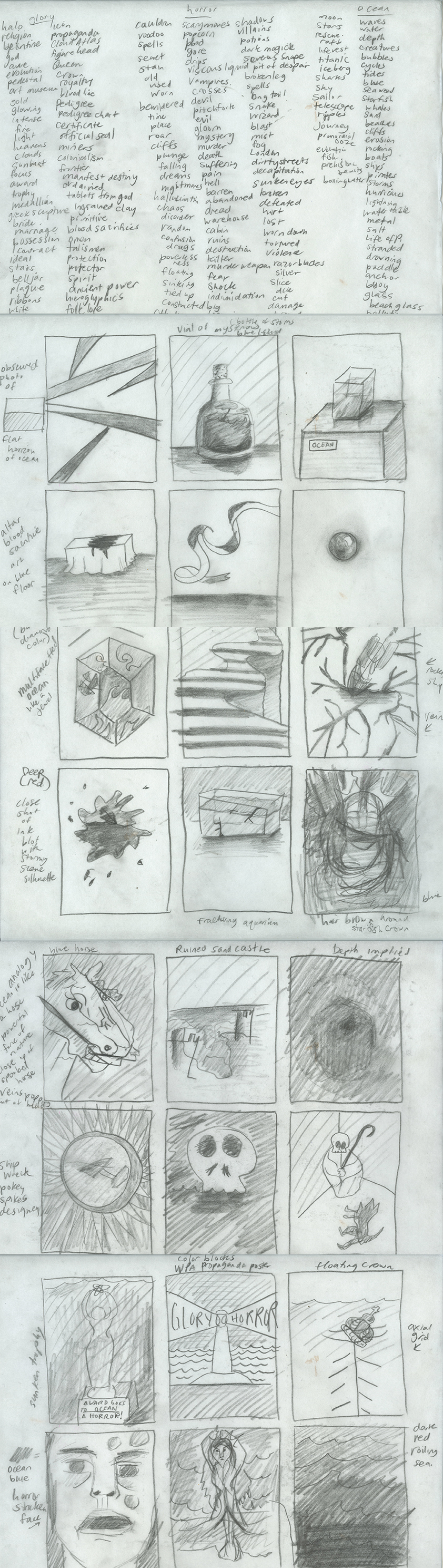
    I started with a word association with the words: glory, horror and ocean and generated some thumbnails.
    thumbnailingoceanposter

    sharing options:

    • Share
    • Share on Tumblr (Opens in new window) Tumblr
    • Print (Opens in new window) Print
    • Share on LinkedIn (Opens in new window) LinkedIn
    • Share on X (Opens in new window) X
    • Share on Reddit (Opens in new window) Reddit
    • Share on Pinterest (Opens in new window) Pinterest
    • Share on Facebook (Opens in new window) Facebook
    • Email a link to a friend (Opens in new window) Email
    Like Loading…
  • Relic Magazine Week 3

    February 21, 2013

    Screen Shot 2013-02-21 at 1.17.40 PM
    In the critique with Erik, he saw that one post had a subheading. He liked how that lead into the article. Now, the magazine has standardized subheadings for each post (h3). He also said that the big pictures full width of the blog create a smooth rhythm. So, I’ve adjusted the images so there are none jutting in. Also added a social-plug-in and a place for advertiser’s dumb banner ads using a text widget. (update 2-24-13: Blogger’s note, by “dumb banner ads,” I am referring to our current sponsor– AntiFloat Co., my fake advertiser and their in-house designer, a.k.a. me, their  banner ads– )

    Screen Shot 2013-02-21 at 1.51.10 PMUpdate 2-27-13: I wanted to create excerpts on the front page of the blog to allow the user to skim for content they want to read. How To Show Post Excerpts in WordPress | Pro Blog Design. This article shows two ways to do this. I chose the “more-tag” option because I like the control it gives the blog. Each post excerpt is cut off at a paragraph instead of mid-sentence. And now there are all of these buttons saying “Continue Reading.” A great way to encourage the reader.

    Screen Shot 2013-02-27 at 2.22.29 PM

    sharing options:

    • Share
    • Share on Tumblr (Opens in new window) Tumblr
    • Print (Opens in new window) Print
    • Share on LinkedIn (Opens in new window) LinkedIn
    • Share on X (Opens in new window) X
    • Share on Reddit (Opens in new window) Reddit
    • Share on Pinterest (Opens in new window) Pinterest
    • Share on Facebook (Opens in new window) Facebook
    • Email a link to a friend (Opens in new window) Email
    Like Loading…
  • Adoption Video: Storyboard

    February 21, 2013

    For my next project, I wanted to explore the interaction of animation and video using AfterEffects. My goal is to somewhat seamlessly marry a tracing-paper type animated character with a character shot with a DSLR in environments of varying light. I had this idea in such a hurry that I wrote the concept on a nearby envelope.

    Here is the storyboard. The story is of a girl who always wanted a pony and gets one. The beginning is her writing at a desk, broken (see the beginning of Moulin Rouge) and the flashback to the day she adopted a little animated horse. Que montage of frolicking and bonding. Then a scene at a veterenarian’s shop with a clipboard. The pronounciation of a short lifetime for the horse. Sitting on a bench contemplative. A scene where the horse sleeps at the edge of the bed. Then an impression and an unmade bed. Perhaps the sound of sobbing in the background. A montage of empty scenes where there was once an animated horse. The last scene: a boat sailing with the horse at the bow, looking eager. The last scene is completely animated.

    yoksanimationstoryboard'

    yoksboat
    The Last Scene

    sharing options:

    • Share
    • Share on Tumblr (Opens in new window) Tumblr
    • Print (Opens in new window) Print
    • Share on LinkedIn (Opens in new window) LinkedIn
    • Share on X (Opens in new window) X
    • Share on Reddit (Opens in new window) Reddit
    • Share on Pinterest (Opens in new window) Pinterest
    • Share on Facebook (Opens in new window) Facebook
    • Email a link to a friend (Opens in new window) Email
    Like Loading…
Previous Page Next Page

Blog at WordPress.com.


Loading Comments...
 

    • Subscribe Subscribed
      • Kismet Arts Tangent
      • Join 104 other subscribers
      • Already have a WordPress.com account? Log in now.
      • Kismet Arts Tangent
      • Subscribe Subscribed
      • Sign up
      • Log in
      • Report this content
      • View site in Reader
      • Manage subscriptions
      • Collapse this bar
    %d