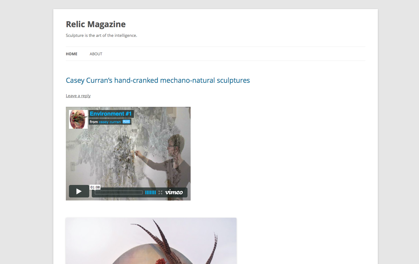
Relic Magazine now has a custom header 100% with placeholder buttons. (No hover states yet. Some issues.) Interestingly, there is a transition duration on them. I think I’ll keep it for now.
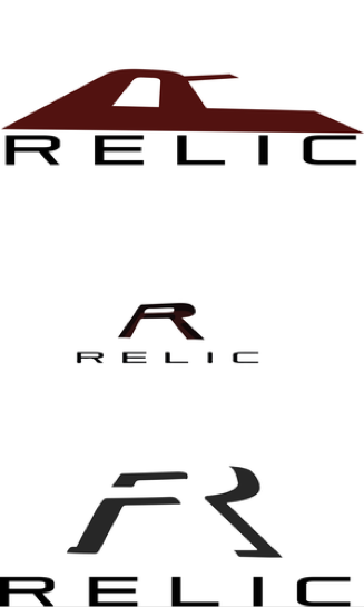
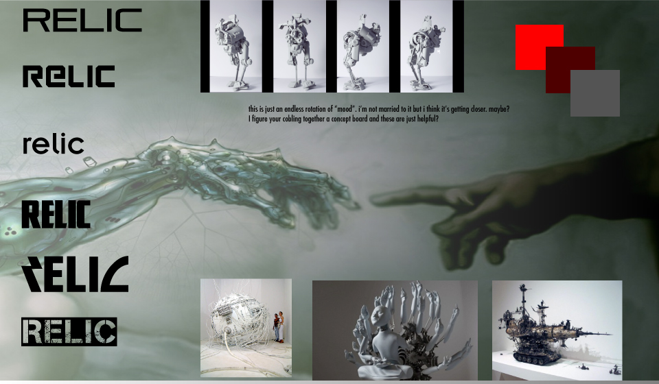
As for the design side, We are hashing out the logo.
Update 2-20-13: Our theme, Albino Mouse, is working for us. It’s organized well and it’s typography is impeccable. It comes with a few good fonts and symbols which lends itself to our brand. In the theme options, you can change type to a select few, add favicon and background color. Some things are better custom done. I handcoded the mobile nav on the side. I am experimenting with CSS sprite sheets.
We’re getting a symbol set together for the mobile nav buttons and I’ve adjusted the color and typography slightly.
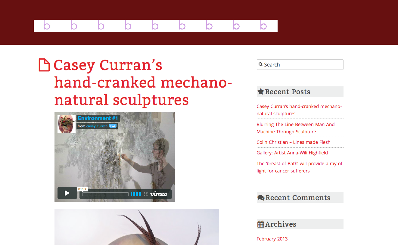
First week of the Blogazine project. Working with Aaron, over the past week, we’ve established that we are working on a sculpture magazine and after some brainstorming exercises have started to establish the identity: Relic. Relic is defined by its futuristic perspective looking backward on today’s current works as precious relics of a great time in sculptural advancement.
We have content (about 10 articles). We have moodboards (see above). Here’s the page (see below) as it is, the default theme: Twenty Twelve.
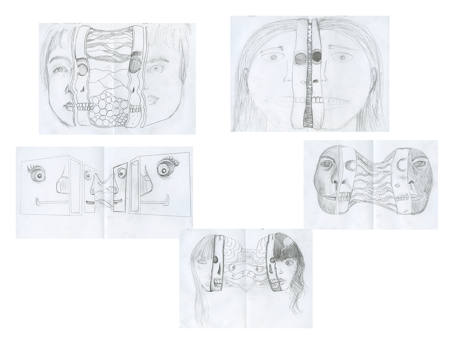
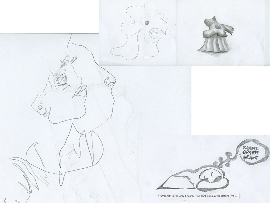
Inspired by something I saw on the internet, we did this drawing exercise. We each drew half of a face and then passed the paper and then someone drew the other half. Drew a skull sliver and then pass the paper (and copy) and then drawing connecting bits… eww. It was awesome.We did some imagination exercises and some blind contour drawings. And we did some rudimentary animation using tracing tracing paper. (I will put those into a little animation and post them later this week.)
Here’s my presentation slides I’m going to show to the class to help talk about my progress with this Music Video challenge.
This is the mid-point (60%, or less if Matt has something to say about it). You can get the look and feel I am aiming for with this video with this rough draft. I am planning on adding embellishments to give the video a little more spunk and to match the pace of the music, but first I want to run it by Matt, my ambassador from the band for whom this video is made. I don’t want to do too much before he says straight out that he hates it and it’s unsalvageable. I don’t know how blunt or discerning he is, seeing as this is the first time we’ve ever really worked together, but I am interested in seeing how it goes, a lesson either way.
Let me tell you how I put this together.
Fridaydraft
This is not the first rough draft. I finished filming on Sunday, trimmed down the footage to parts that I thought were interesting/usable on Monday and on Friday night, I started to dive in and make sense of the parts into a whole. This is when fridaydraft happened. See below.
I spent from 5pm to 12pm with this video in Adobe Premiere Pro (mind you a lot of that is waiting for it to render). I wanted to use all of the footage I had because I thought it was fun and it was going to be nice for the friends that helped with the video to see the fruits of their labor. I layered the clips over each other and sped up the timing to fit it all in. I used one project file, one comp sequence, everything was laid out on the timeline like a collage with edges sticking out as if about to rip it out and put a different image in. For fun and “edge” I decided to add some color correction (change to color, if you must know, but at the pace I was working, I was playing as if I were a child and chose green simply because my hand happened to be resting on its position at the time).This is what impatient people do when they are editing film. When I got to the end of that editing session, I looked over it and realized that adding in the faces to the paperbag heads was going to be impossible and I needed to strategize better. Also, it felt a little disjointed and the layers made everything kind of mid-toned (not very contrast-y).
Layers
The next day, I started back at the part where I had saved all of my favorite clips (Monday’s work, putting aside Friday’s edits). I had a video dedicated to the paperbag head. (I found it important and easier to work where I would export a video file at each step of the process to compress the information– thus saving space– and as a form of version control.) I used Photoshop to scan in the faces I created using tracing paper (I referenced the expressions you need to have a talking avatar) to animate the expression I originally thought I would draw on each paper bag. I am glad I abandoned that idea. I had crop marks on the image to line them up to the paper bag and then masked it out later. A good trick, actually. Keeping your work modularized (by that, I mean to save at various points, put things into comps or “folders of video assemblage”– it’s hard to explain if you haven’t used AfterEffects before) into separate comps make it easy to edit them at the right level of specificity.
Then, I exported that into a video. Then added it to my paperbag video in AfterEffects, moving the face to match the bag. I didn’t use a tracking preset, though I know they exist. I appreciated getting a feel for doing it by hand and it creates a lot of irregularities that I find amusing, like watching a ballet dancer trip on her pirouette and then invent a move to get back in the dance. Doing it the “naive” way is a style I try to embrace. I think there’s something charming about the way it emphasizes the method to which something was made, like an action painting. I exported this video and called it “talking.mov.” It was a glorious time. Up until then I was staring at a blank rectangle and hoped that it would turn out like I had hoped, like a face you could relate to. It had, now, whether what I hoped for is actually successful is a thing I will find out tomorrow.
I then added some color correction to that video using AfterEffects. It’s easy to add color correction to one long .mov — comprised of smaller clips– than to add the effect to each one in PremierPro (at least when I was doing it). I didn’t watch any tutorials on this and found it intuitive. First I added a black and white, and changed the intensities of each color to my liking; it created an interesting texture that I found helped the animation be more integrated with the video. I didn’t like the color of the “skin” on the paper bag or the fact that you can tell that it’s the same living room from my other video. There was some difficulty exporting as a .mov for some reason, so I exported as a tif sequence and then reimported that and then exported that. Perhaps, it was a shift in systems or a “corruption of a file” as one dialog box would have me believe. It was a good exercise in troubleshooting. I googled it and they said that when having trouble exporting, taking your footage and making a tif per frame is something that it can do a little easier for some reason. That was a lot of tifs.
Good/Bad
I’ve been working on this video, just finished with shooting and I took a great pleasure in thinking about making Matt watch a video that he thought I worked really hard on but it was actually a terrible video (a joke) and it would be great to see him try to tell me how awful it was and I would know the whole time that there was a second video that I thought was actually good, but interestingly enough the more my list of “bad” things I should do grew I wondered which category it should really be in. I didn’t end up making two (one bad as a joke) and the real one because I was worried he’d say that he liked the bad one better. But, I did want to embrace the idea of something that was so “other” it would be difficult to say outright if it was good or bad. I like that kind of thing. I made a poster that my housemate said was “delightfully tacky.” I hope to make a video with that kind of praise attached.
So, to go along with that, I’ve been watching music videos (the funnest research one can have) and I kept my eyes open. I was at a karaoke birthday party when I decided that I should have some of that in my video. A song with karaoke lyrics, is a song marked with cult fame, which I think that Matt’s band has the kind of irony to pull off without being quite as famous as say Dolly Parton’s “Jolene.” Maybe, it’s my hipster mentality getting the best of me, but I did it. And worse (or better?) I used a couple of rectangles on multiply-blending-mode in AfterEffects to highlight the lyrics. I was a bit sloppy. I didn’t want to spend too much time on it in case Matt shot it down, but not too little so he wouldn’t see the potential if there was any.
And that’s where I am at, today, night before mid-term presentations of the video that I had noted in my Timeline to be on the polishing stage right now. I didn’t anticipate shooting taking two weeks and it looks like editing will, too.
Update 2-11-13 Critique:
I presented these videos to the class and they liked the layered one better, but when I showed them to Matt, he liked the black and white version. He said it just seemed like the kind of thing a crazy person would make. He liked the intro and closing shot in the field and the movie theatre seizure from the second one. He liked the text but said to make it bigger.
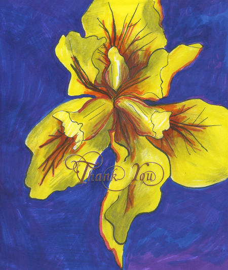
The class went down to the Letterpress Lab where we learned about letterpress and we all had a try at working the machine. A Vandercook 4. There was a plate lying around that said “thank you.” So, we all got a letter-pressed Thank you on a piece of paper. Just in time for a card I wanted to make for an upcoming birthday. I used some marker. pencil and a pen and ink to make it a little more colorful.
Looking back on my Phase 3 posts, they’ve never been all that positive. This is the interim where I am getting the idea of web design structurally, being able to handcode and use PSD assets, but the design is overall weak and typography isn’t figured out.
Today is the due date for this project and I think I could have spent more time with it. As Erik Fadiman says, “if you want to be a craftsman, hand-code it, but if you want to be smart use a theme –or code-snippets– that works for you.” I wanted to understand how to code in WordPress because I know how easy it is to change themes but I want to understand. The truth of it is simple. As much as 1140 benefitted from having so many divs (container, row, fourcol, etc.), wordpress benefits from class-itis. Each php element can be controlled with a class (just about).
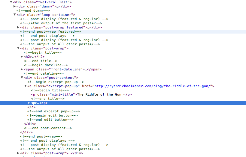
I looked at one of Erik’s favorite wordpress blogs from one of my classmates, Ryan. Ryan uses easy to understand naming conventions, (ex. post-wrap, post-content, front-dateline) and lots of code comments where things begin and end. I’m going to go into the next project with a strong but neutral theme and good habits of naming things for what they are and not what random thing I want to type hoping I’ll remember the abbreviations.
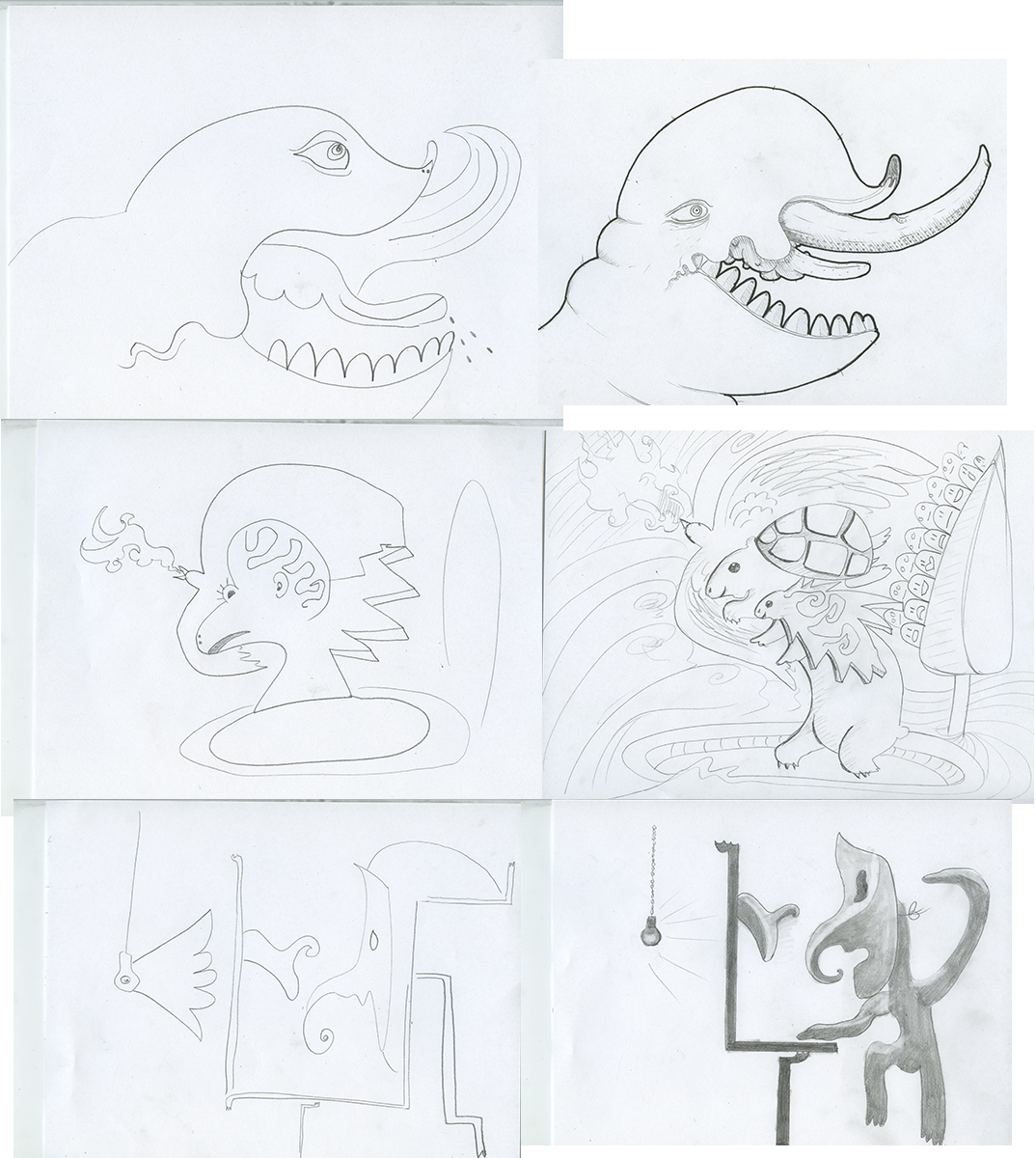
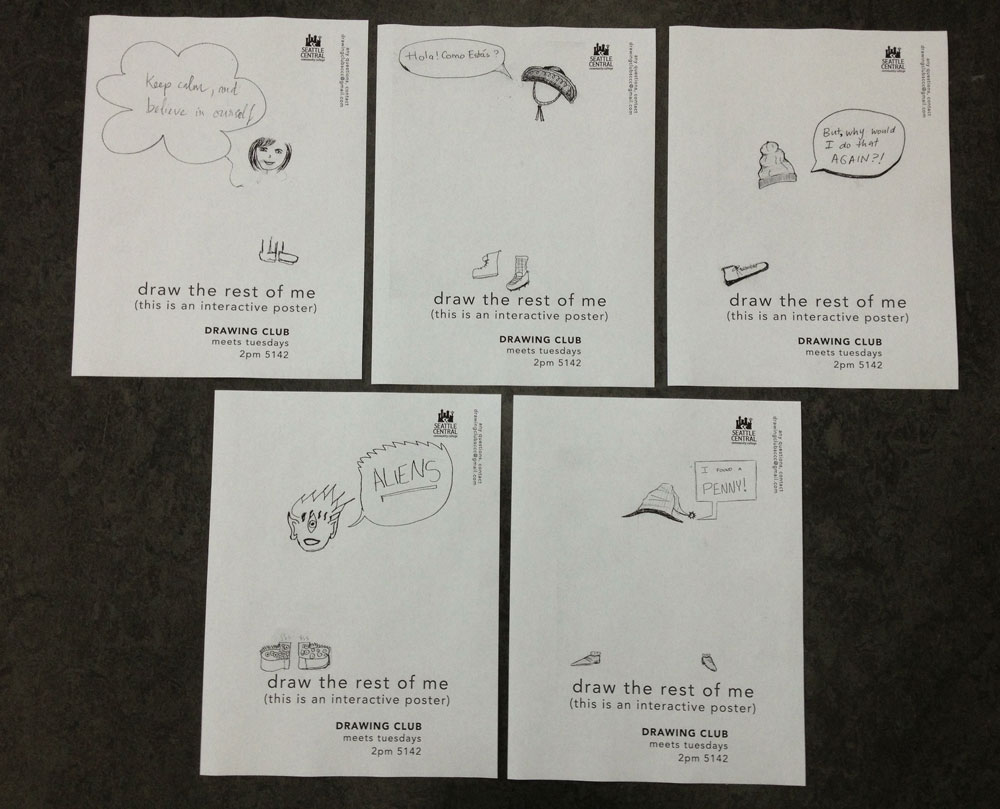
Today in Drawing Club, we did some imagination exercises, made drawings based on fun facts and some blind contour drawings. We also made more posters for advertising around school. (They are interactive!)
I’ve been assigned to design and execute a silkscreened (screenprinted, same thing) poster.
POSTER SPECIFICATIONS
Portrait format (vertical) poster. Design submitted must be original artwork that is previously
unpublished. The design must consist entirely of your own work and must not include any
copyrighted material. Designs are not required to have text but may have text added to support
your idea/expression of idea.
SILKSCREEN PAPER SIZE: 15”x 20”
LETTERPRESS PAPER SIZE: 11”x 17”
COLORS: 2-3 spot colors.
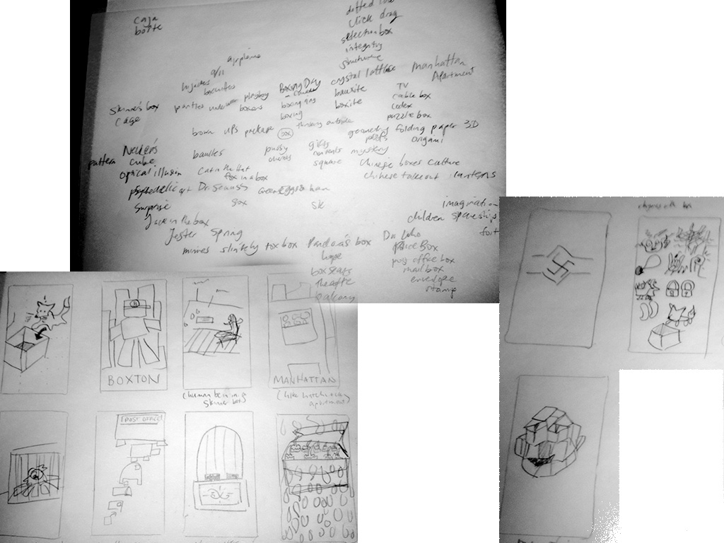
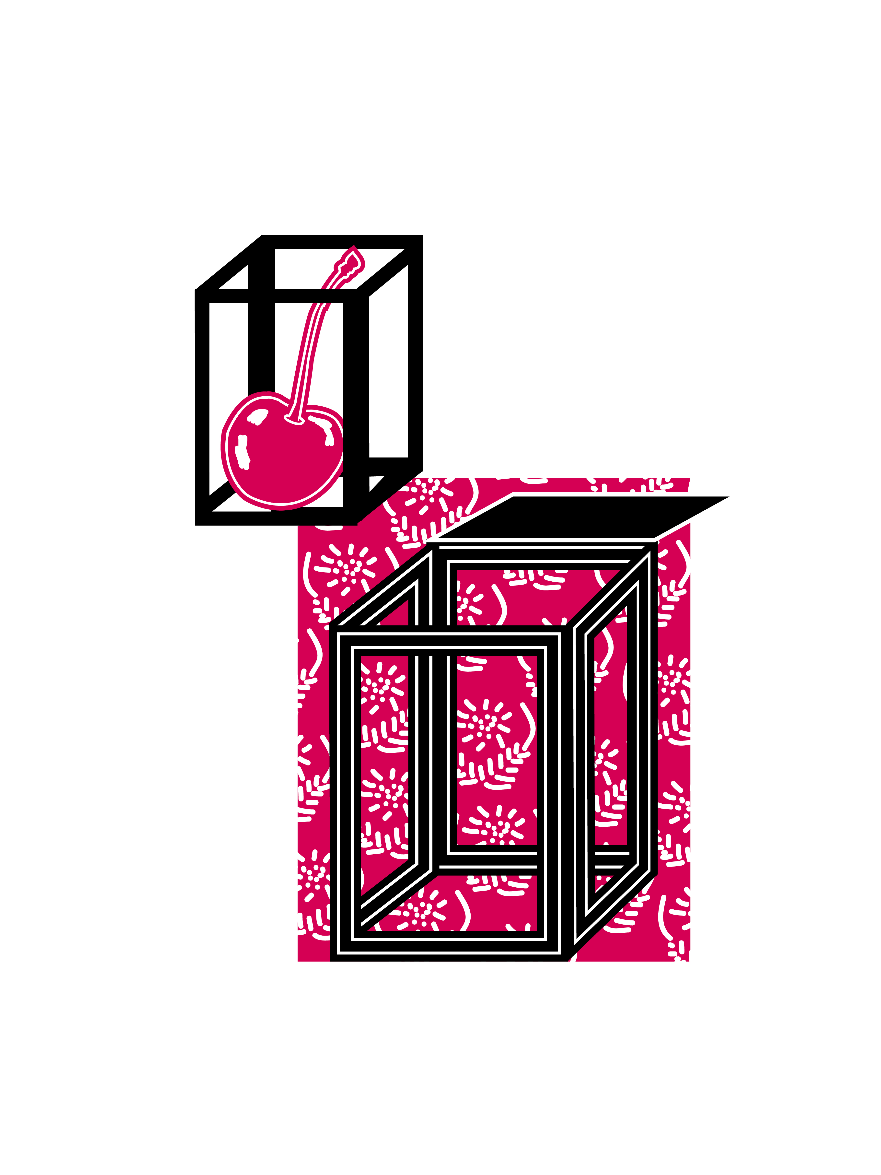
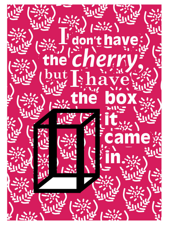
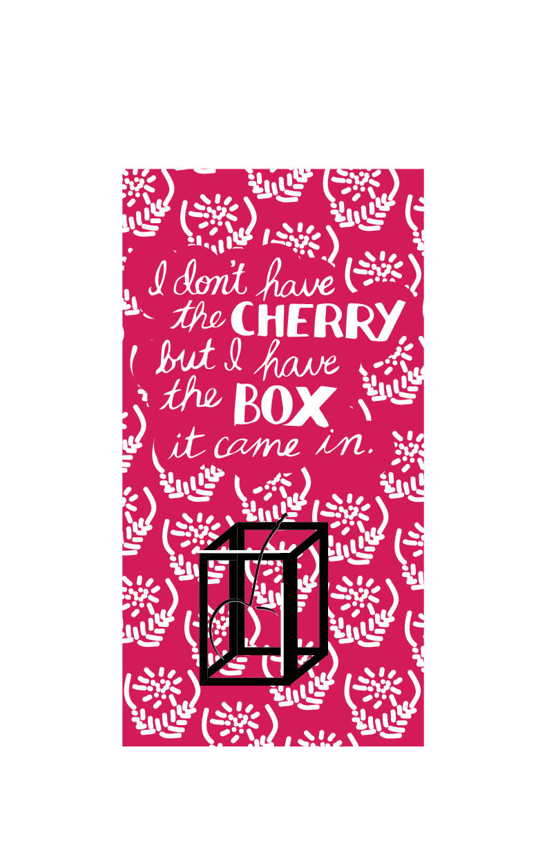
Inspired by the Hello Poster Show, Jill has assigned the theme of “box.” Here’s my interpretation of that theme. I thought at first about boxes, what they contain, anticipation, and then I thought about caja, and how it’s kind of like a cage. Then I thought about one of my favorite witticisms: I don’t have my cherry but I have the box it came in (or something to that effect, I couldn’t find the exact quote). It’s a play on words and symbols. Cherry being a symbol for virginity and box being a euphemism for vagina. The sentiment is that a woman’s value isn’t in her “virtue.”
This is was I am submitting for critique this week.
Update 2-8-12 Critique and Edits:
After watching Jill demonstrate the Letterpress stuff, I’ve decided to go a Letterpress route instead. In a group, we looked over this design and said that the image of the cherry conflicts with the quote “I don’t have my cherry but I have the box it came in” that I want to include in the poster. Val had the idea of creating an debosse of a cherry silhouette to be placed inside the box which will only be noticeable under raking light. Jill said that putting the type in white and extending the pattern would integrate the type with the image.
Update 2-15-13:
This is what I am presenting for critique. (I’m simulating the deboss with the inner shadow/silhouette on the cherry in the box. It will be a press without ink.)
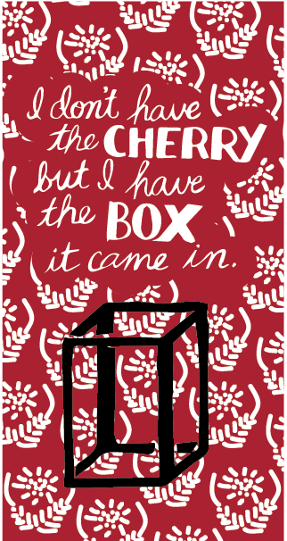
Update 2-19-13: The only thing I got from critique: hand-render the box to match the poster better. (The color is different. I picked a pantone color so it would properly separate in the pdf from which Ed — a cool guy, known as the program’s North Plaza guru (silkscreen-extraordinaire)– will make film from.)