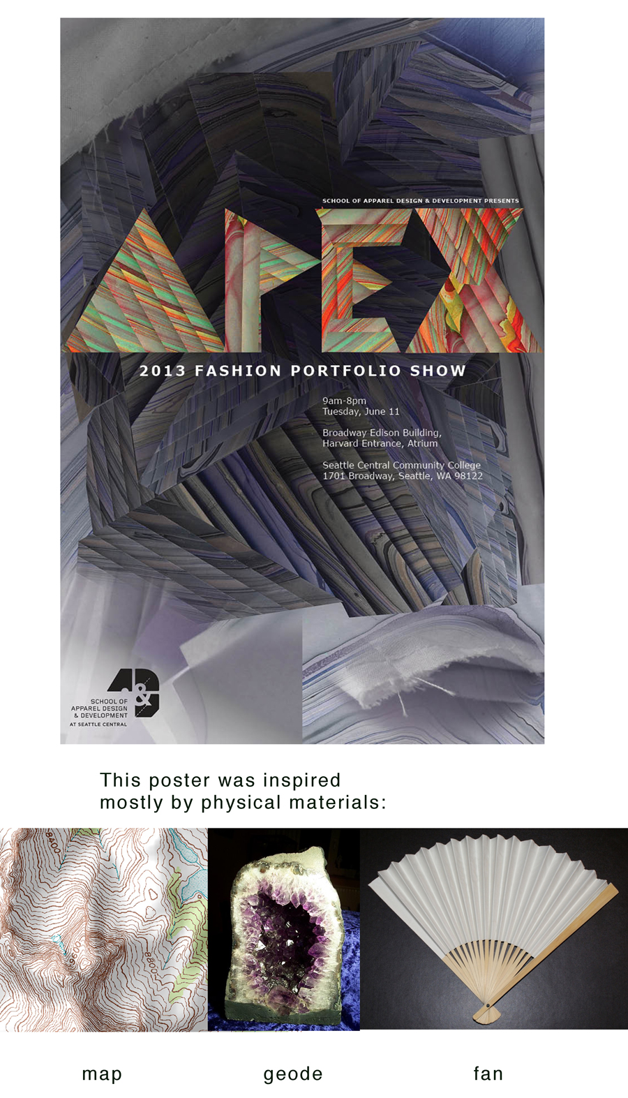
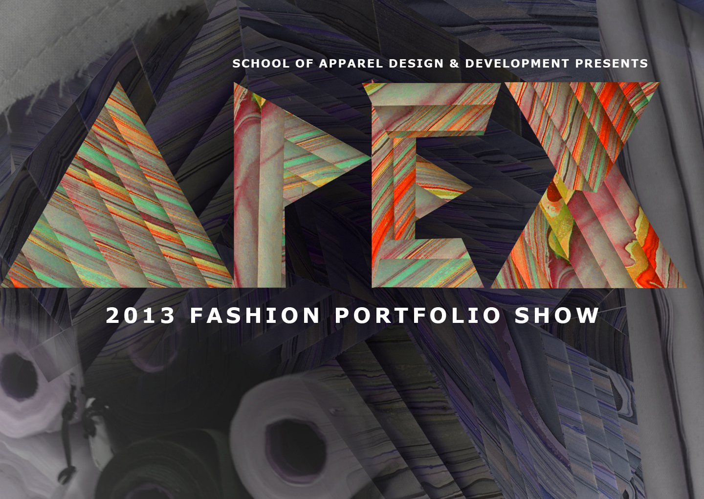
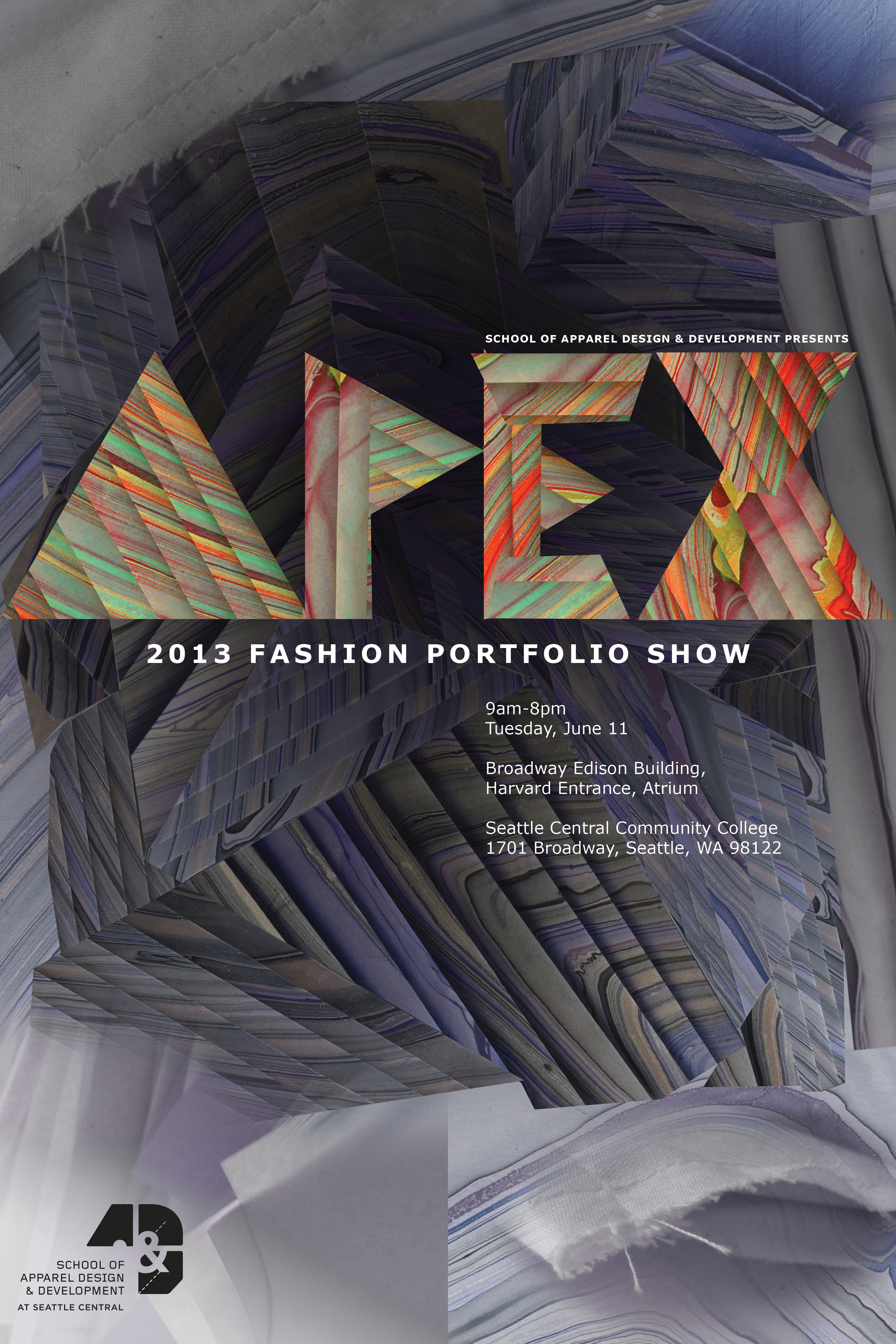
After some research, reviewing a detailed creative brief and logo guidelines, and a few visits to the Apparel Design Program’s workspace, I worked on this poster. I was inspired by the idea of what they wanted to convey “modern but touched by the hand.” I immediately thought of folded paper like I did for a poster last year in a tribute to Peter Behrens, a modernist architect. After doing some word association for brainstorming, I knew I wanted something organic yet structured, the word “layers” came up in different veins of thinking.
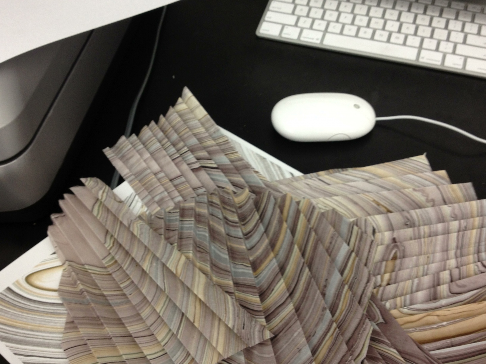
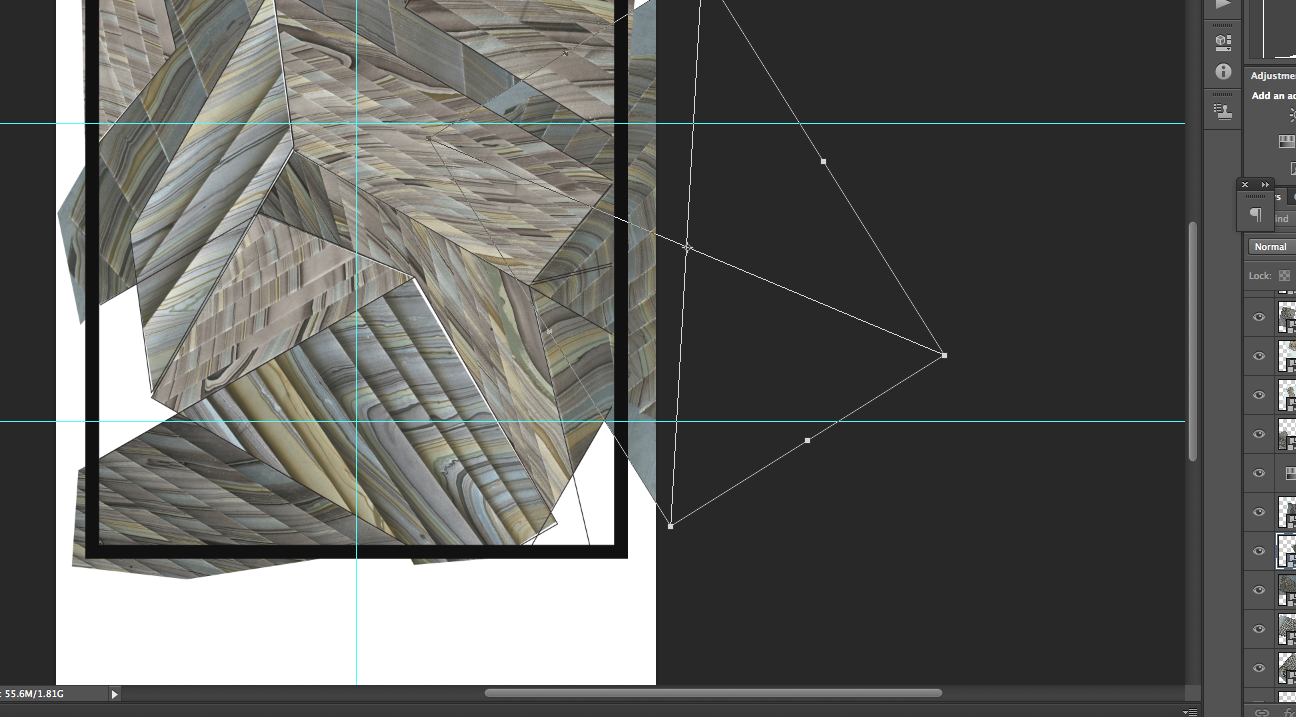
I was at the UW bookstore when this marbled paper struck me as the most beautiful thing and I wanted to use it for the poster. I folded it and scanned it in . For structure to organize the collage in Photoshop, I made a vector pattern that appears random but it’s constructed rotating a 2-d representation of a box, a technique I played with last year as a part of my adobe illustrator final.
I’ve been wanting to express the connection of folded paper to geodes for a while and I feel like this project gave me a great opportunity.
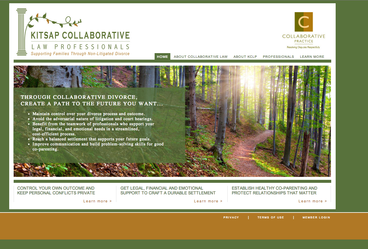
How I got to this point: I have been discovering a lot about WordPress over the past week. As an option, Fadiman has encouraged using MAMP and has outlined a process to help gain control over the beast that is wordpress themes. I don’t have the right set-up to make that possible.
I decided to work off of Fadiman’s “coffee” theme which is based off of 1140 Fluid Starkers WordPress Theme | thedotmack which is based off of Elliot Jay Stocks’ Starkers WordPress Theme, and the1140 CSS Grid. There’s probably other places to get a set of css for typography, but I encountered Toast | A simple CSS framework in my last web project and I really liked the default type hierarchy (H1 is big H2 is smaller and so forth.) so I took some of that code.
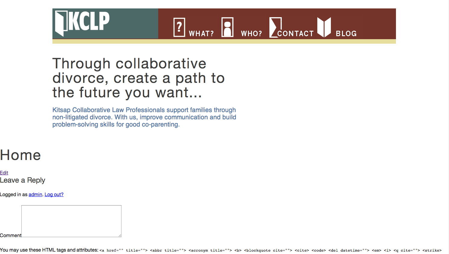
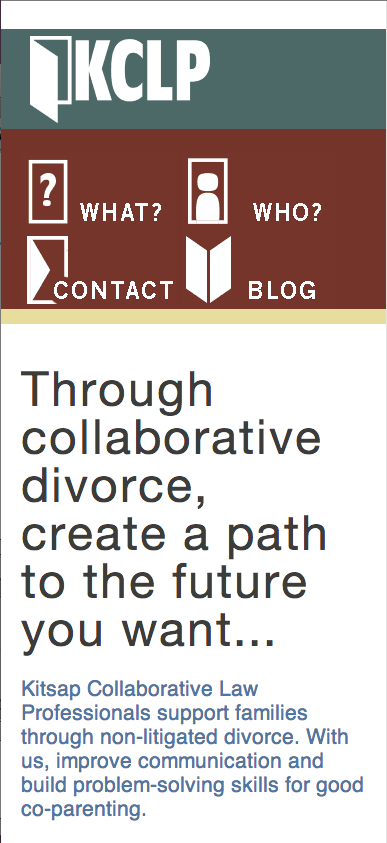
I made and uploaded a simple K for a favicon. I hand-coded the nav and made CSS sprites as well as creating vector icons. I deleted all of the header code that called up some fancy php to do this simple thing that css does (in a very static way). My client wouldn’t be able to customize their navigation. Connecting the pictures to the code requires them to live somewhere on the internet rather than pointing to the images file and saying “here they are” I used the url that is given in the media ->uploads-> edit window in the dashboard of Wordpress.
In branding updates: I changed Kitsap Collaborative Law Professionals to KCLP, created a san serif logotype and abstract stylized mark of an open door and corresponding icons.
Next Tasks: Styling posts, figuring out which class controls what element in a theme by looking at other themes, finding clean and classy code to copy, paste then comment out. Adding structure to the site (everything is in the container, in the row) Finding good imagery to help emphasize the empathy of the group. Find good fonts.
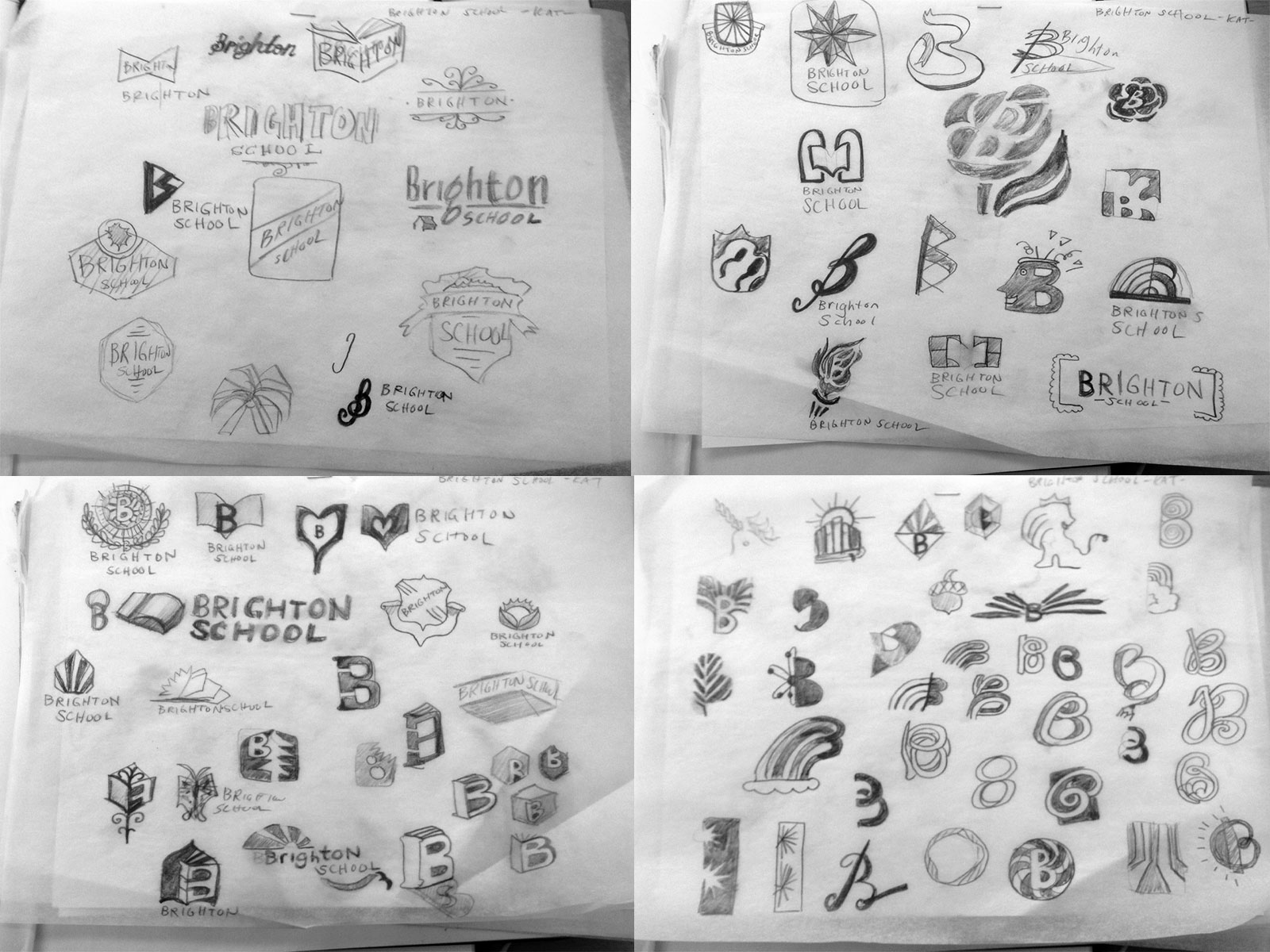
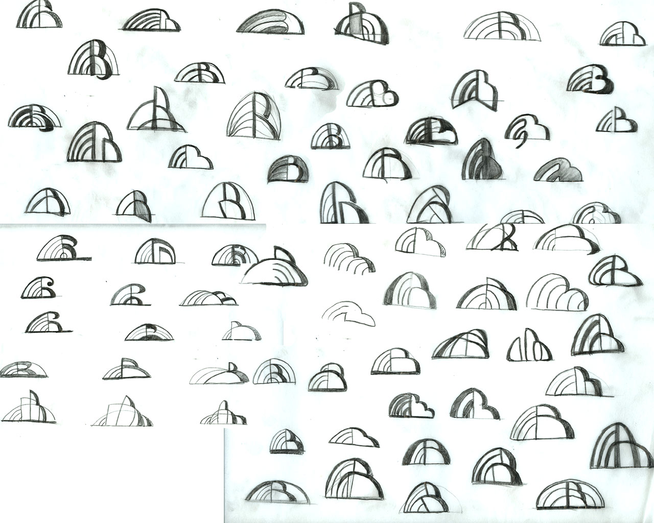
We looked over logos today. It was fun to hear Tom describing my logo, saying things like I don’t like the “sperm” in this one, or “I love this swirly straw, oh hey, that would be great merchandise.”
Tom said he liked this one. Abstract and a bit of optimism to it. Sydney Opera House. He said it would look nice on polos. A good rule of thumb for a logo if you ask me. I have a week to smooth this out into something typeset and vector. A lot of sketching between now and then.
Update 1-28-13 There’s still a lot of ways to explore this abstract concept. I showed these to Tom and I’m going to take the finalists into Adobe Illustrator and see what comes out.
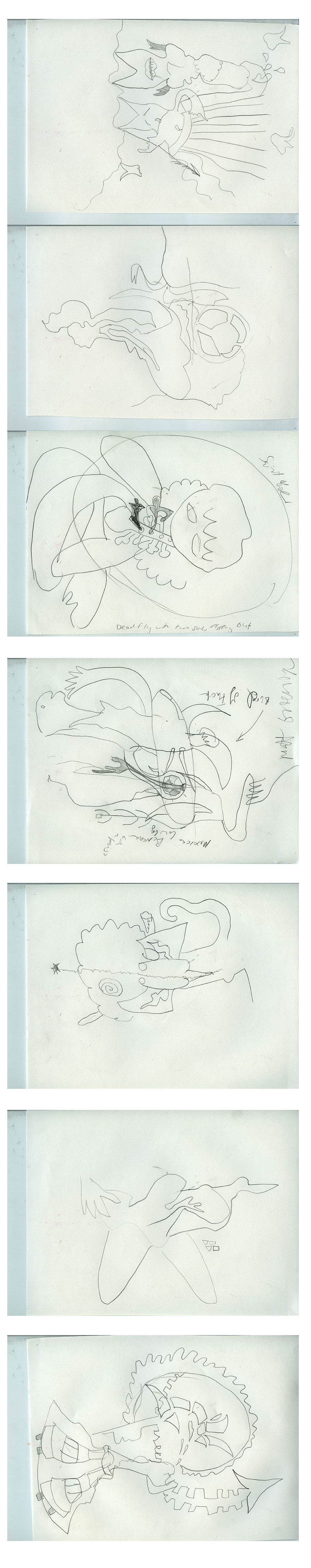
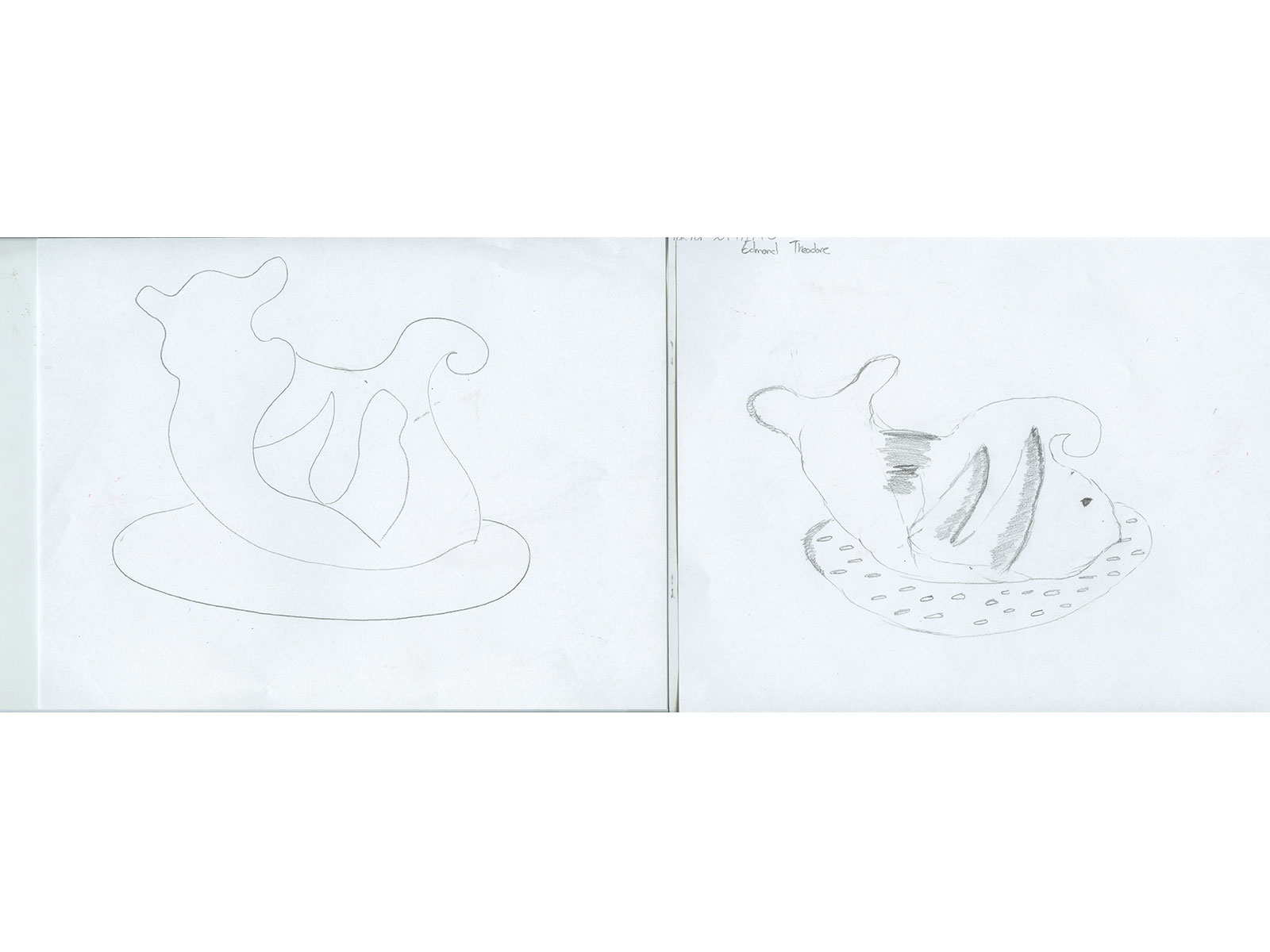
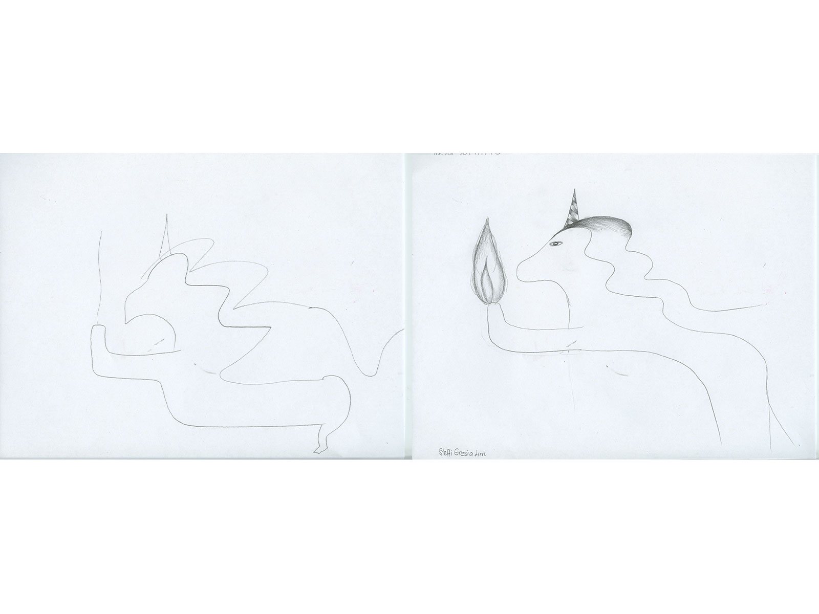
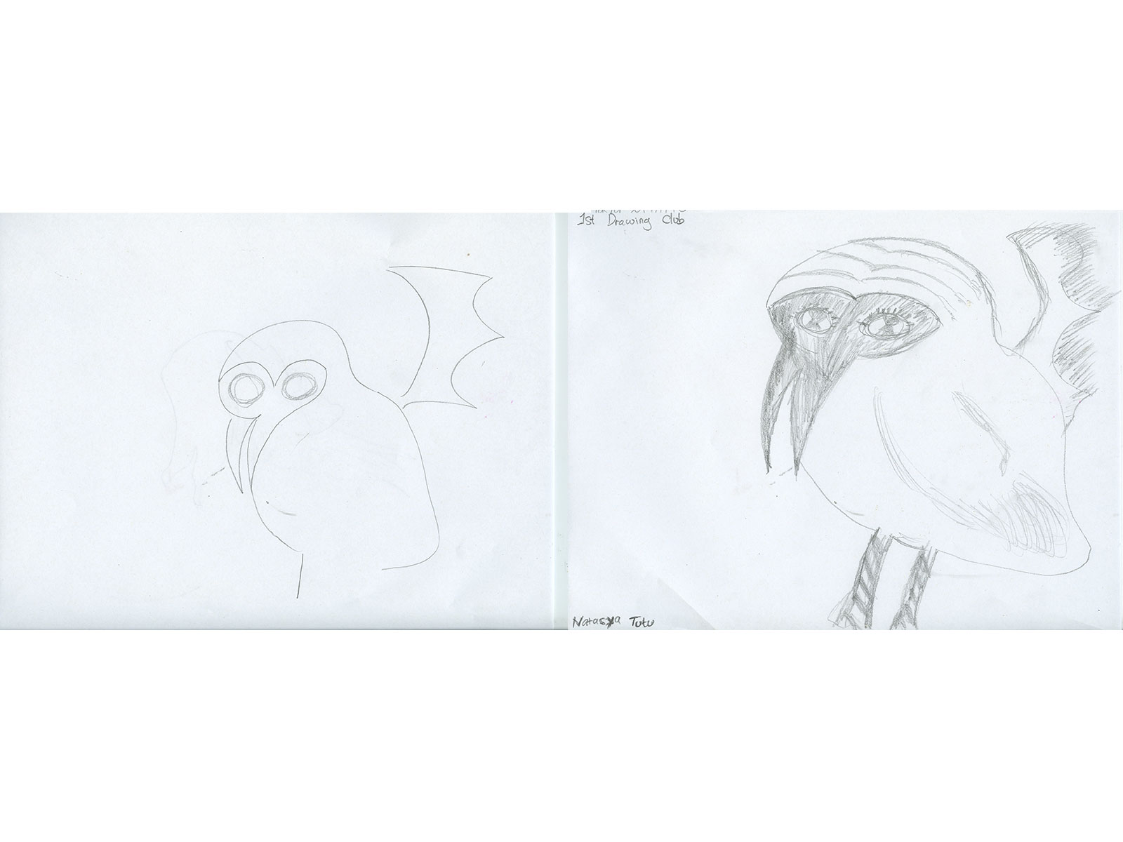
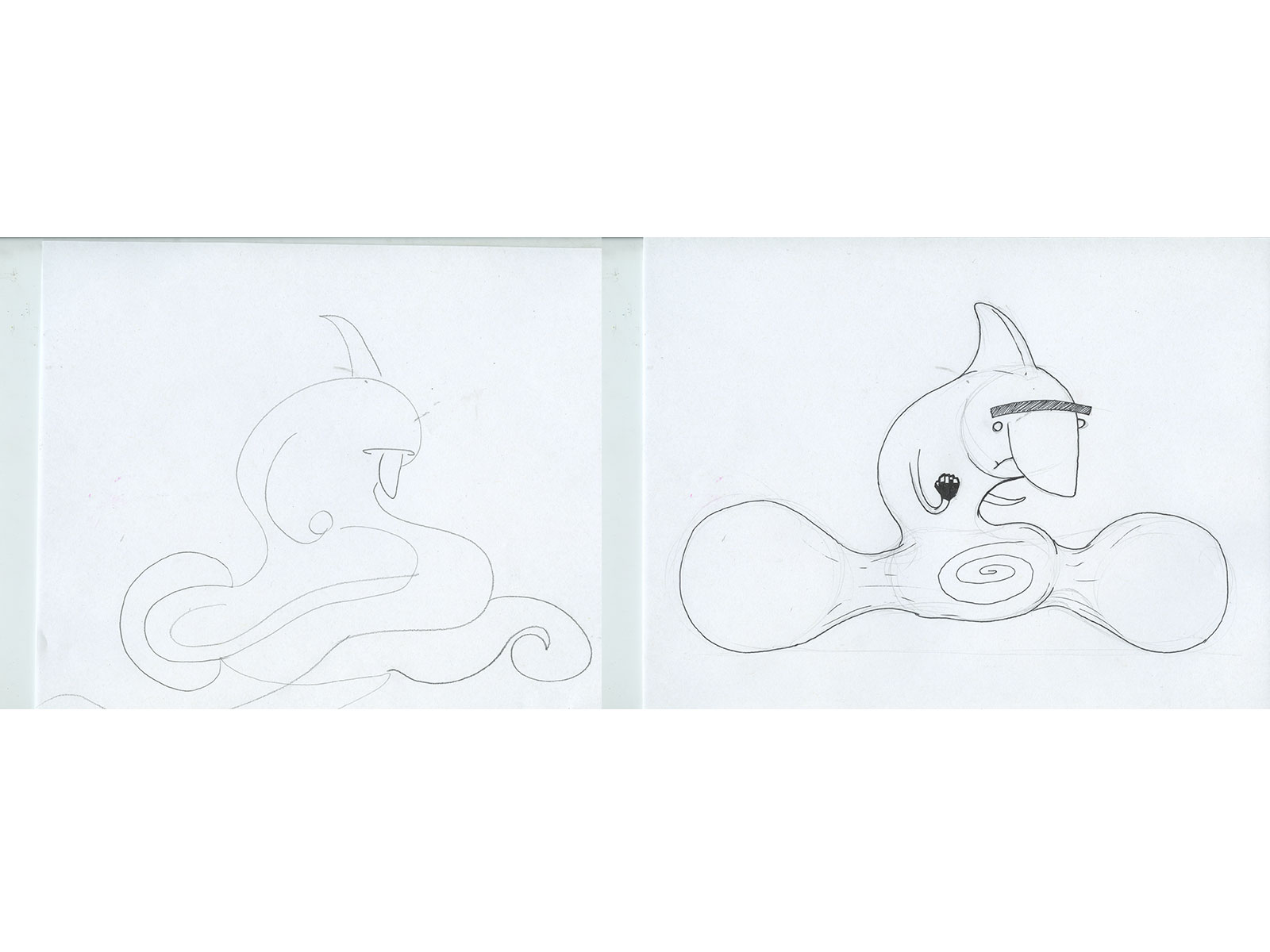
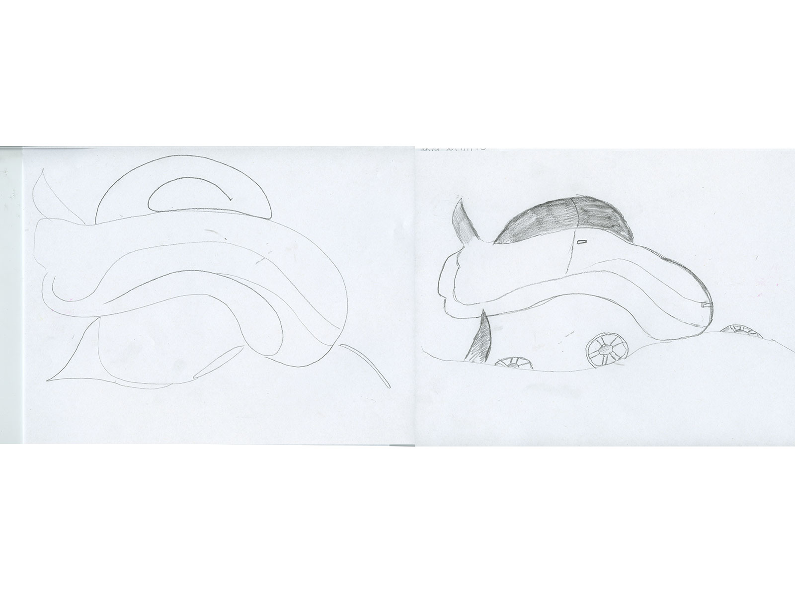
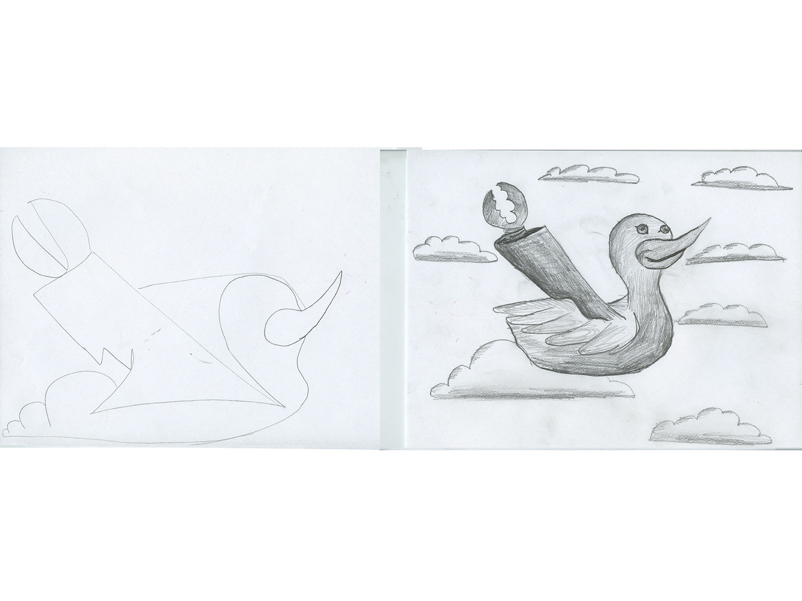
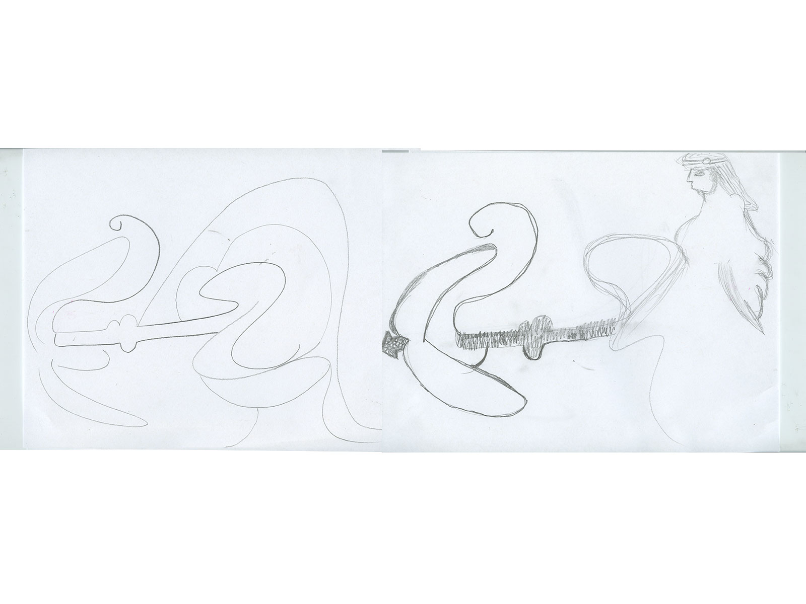
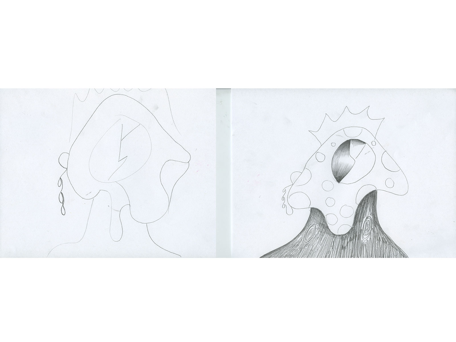
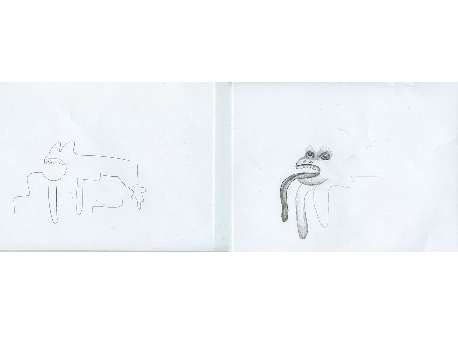
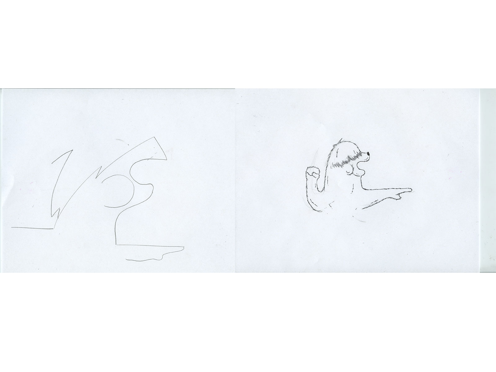
A friend and I made these drawings. We worked on them together one line at a time seeing different things in them. I really like the simple line quality on them.
Drawing club. We drew this together. We also did a couple of round table drawing sessions. It’s where each person contributes a line, any kind of line, straight, wavy, or curved until a vague picture formed then each of us picked on and reinterpreted the drawing. This is a great exercise when you don’t know what to draw.
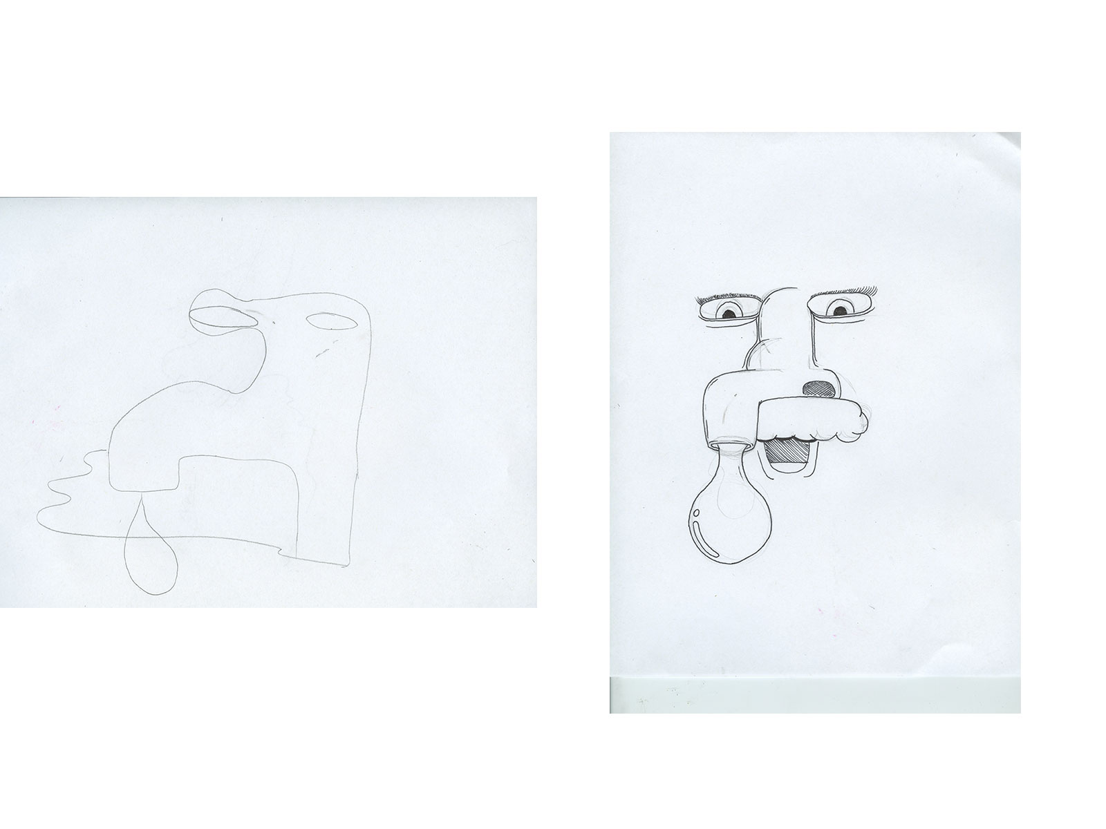
Telephone Pictionary is always popular. “I found a garbage can full of pudding” evolved into “Hot Morning Coffee.” Here’s ones we made today. telepictionary
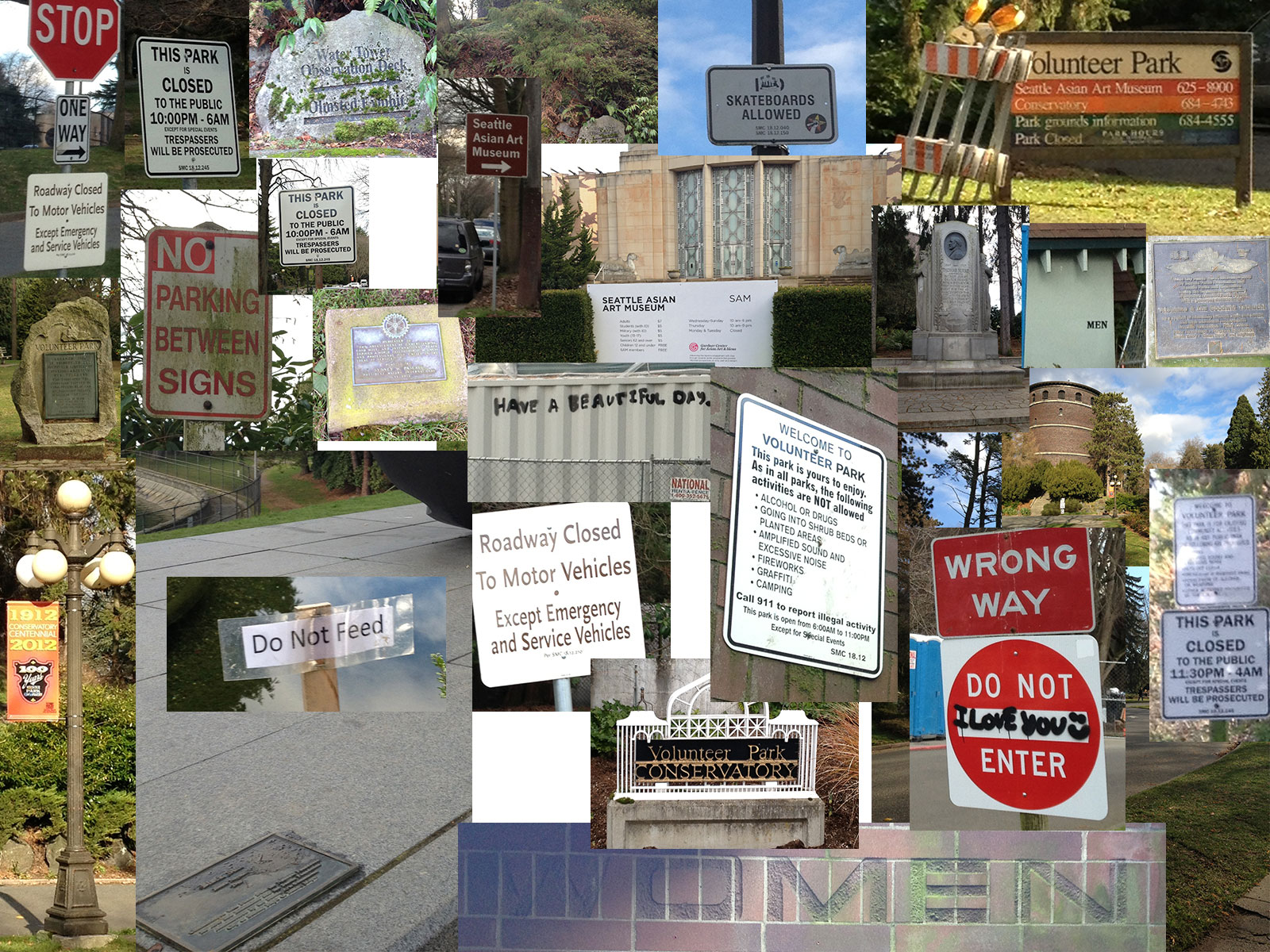
The Volunteer Park signage teeters between impersonal and unwelcoming and unplanned (read: graffiti) but heartwarming.
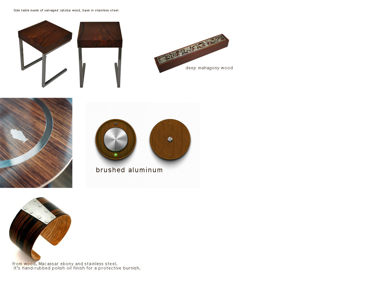
My team is inspired by the line between Art Deco and Art Nouveau, something modern, yet rustic. Here is a “swatch” page to help us see the range of the materials we are interested in working with.
Update: 1-28-13
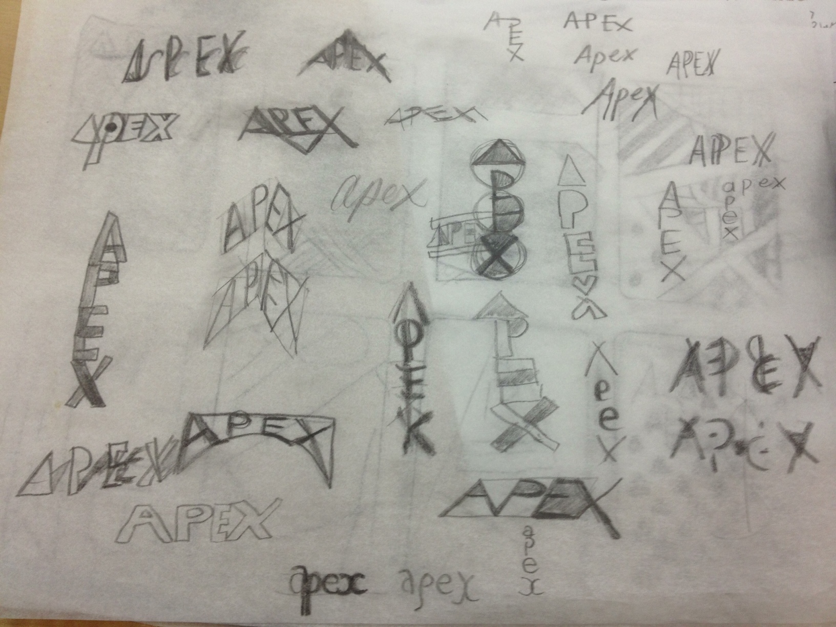
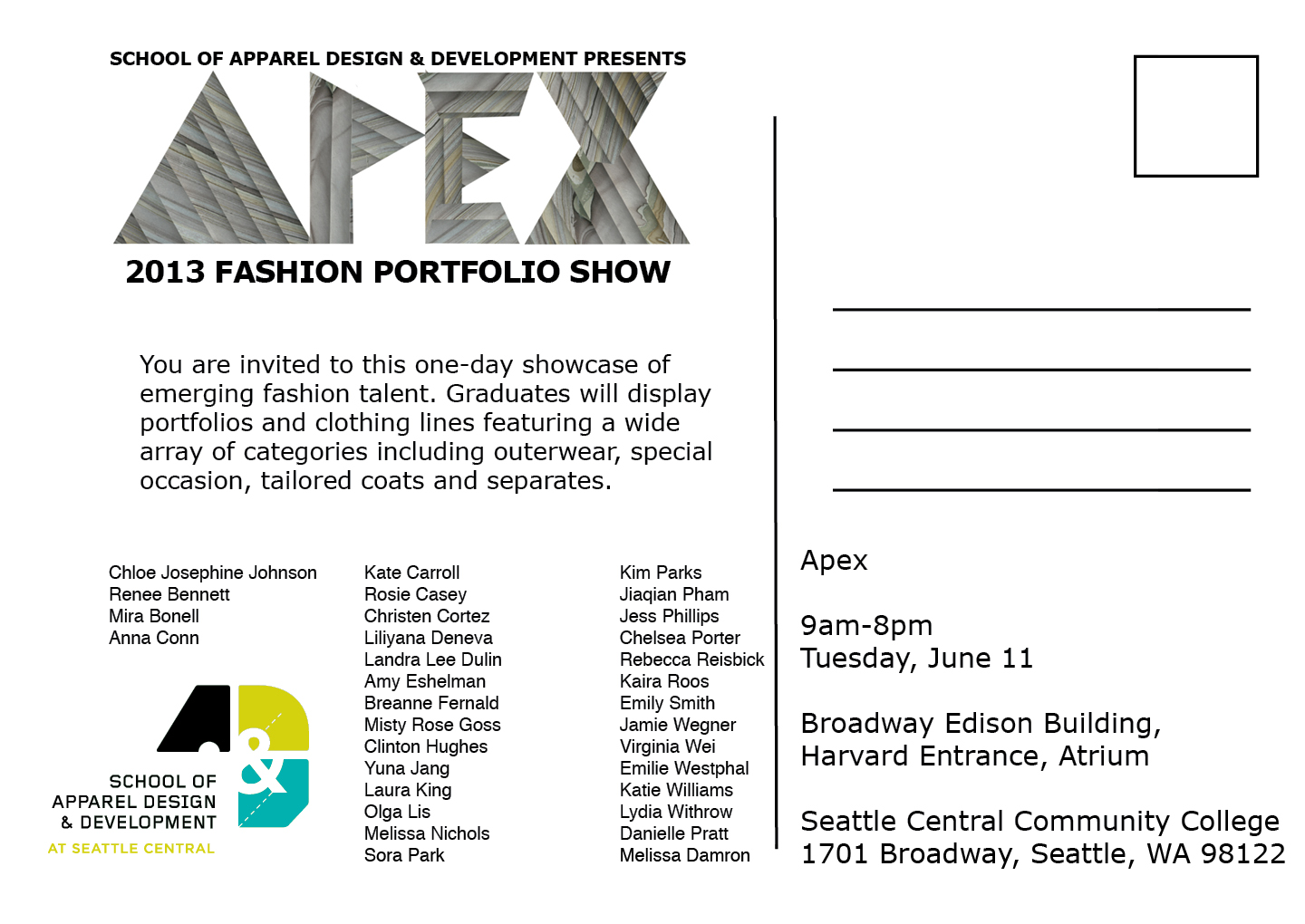
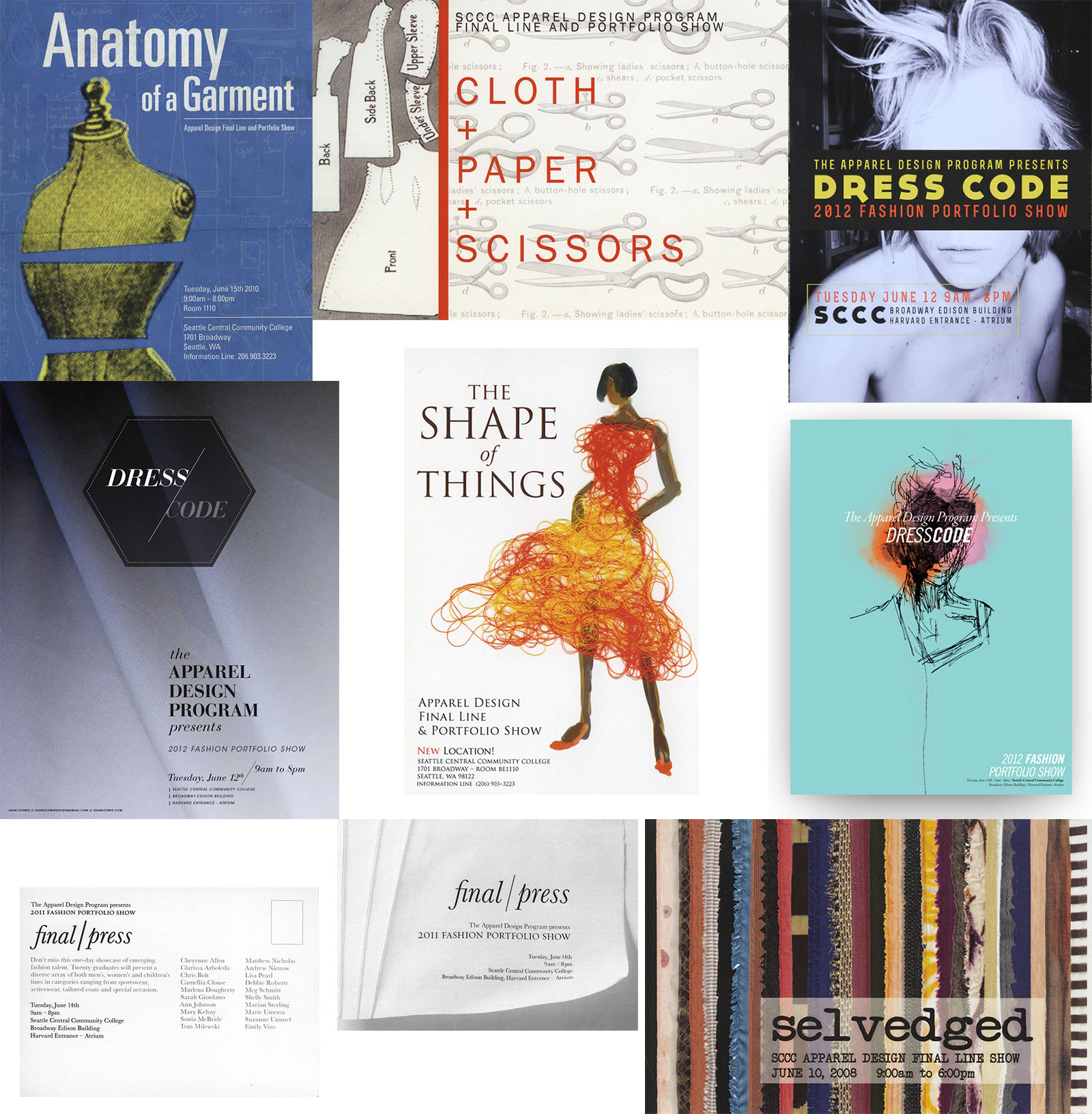
New Assignment: make poster and companion postcard for Apparel Design Show, themed “Apex.”
Today, some people from the program at Seattle Central Community Collage Apparel Design came to tell us about who they are and what they do. They brought material, specs, technical drawings, a couple of mounted presentations, tools of the trade and pattern swatches. Along with the creative brief, they talked about how the focus of the program is on technical excellence so the graduates are “employable right out of the gate.”
The focus is commercially viable clothing. They gave us insight into what they do, explaining the importance of the pattern and technical drawings and spec packages, which are spreadsheets with the specifics of the garment. One woman commented, “This is what you’d send to China.” The importance of this technical, standardized communication is paramount because time costs money and if one little thing goes wrong, managers have to be brought in and production halted– or worse, it goes unnoticed and you have 1,500 mistakes.
That’s why they must measure. They are precise. Their tools reflect this need. They have rulers for the hipcurve, the armhole. They are specific to 1/32 of an inch. Pattern grading is some kind of mathematical formula performed to create different sizes. Their tools: zigzag scissors, awls, pinkwheels, with beautiful wooden handles or shiny steel. They take care and pride in their tools. Apparently, the best tools of this type come from Japan.
The theme is Apex, the highest point on a pattern. One of the women showed us using paper how to make a dart. A dart is cinched fabric creating a point. A 2D object becoming 3D. All of us graphic designers oooh-ed at this obscure magic. (Considering that we stare at 2D creations all day, it’s quite refreshing.)
The women presenting told us not to take the theme too literally, because sometimes the apex on a pattern (the highest point on a bust pattern) is the nipple. I think every industry has their little inside jokes but I am curious if that theme was chosen especially for the little nudge nudge wink wink to all of the pattern makers.
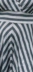
Though the focus is technical excellence, there is a design component to the program and it’s during this final line show that they can truly express their individuality. One of the women executed a bomber jacket, limited by the assignment parameters of it having to be a modern bomber jacket with zipper welt pockets and an inspiration from the 50s, she had created a beautiful design line with the plaid pattern. It is important to sew with consideration to the bias of the fabric. And it’s beautiful when a garment is constructed with conscious manipulation of the pattern.
An example of garment construction using the pattern to create an interesting composition.
“The bias direction of a piece of woven fabric, usually referred to simply as “the bias”, is at 45 degrees to its warp and weft threads. Every piece of woven fabric has two biases, perpendicular to each other. Non-woven fabrics such as felt or interfacing do not have a bias.”
via Bias (textile) – Wikipedia, the free encyclopedia.
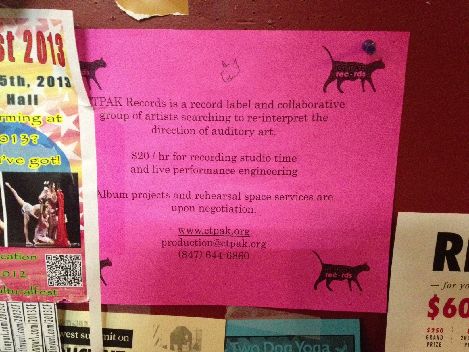
The poster: the client recommends that we emphasize modern, clean and technical, but implying creation, manipulation, “touched by the hand.”
I’m very excited to see how apparel design can be translated into graphic design.
I was inspired by Seymour Chwast who did a lot of drawings where he digitally colored them. I wanted to make a fun poster that echoed this idea of CT-PAK a group of artists redefining audio art.
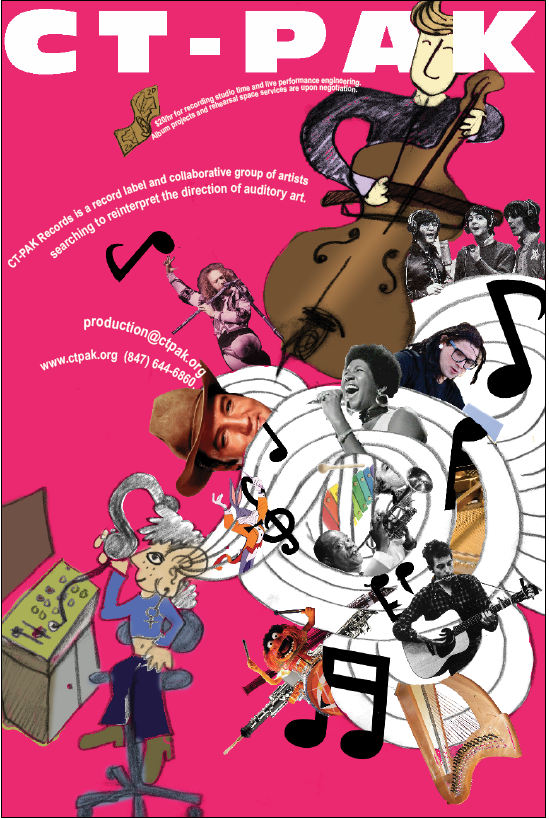
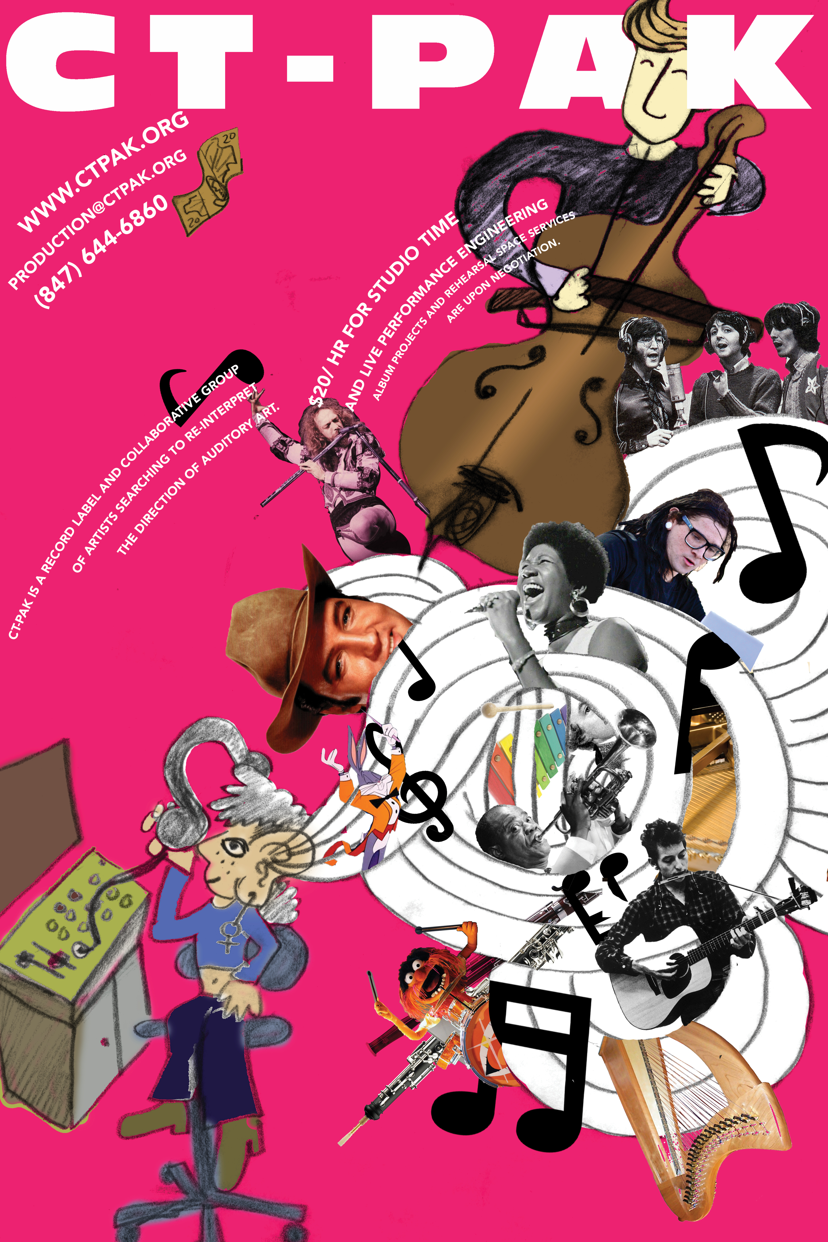
Poster after realigning text. Yay dilatational grids!


