Skip to content

Kismet Arts Tangent

Art Collective

    • Kismet Arts Tangent
    • About
    • Blog
    • Contact
    • Donate

recent posts

  • Photo shoot with Kayleigh Shawn
  • Testimonials
  • Fractures Poem
  • Poetry
  • Pixel art products

  • Instagram
  • Wayfinding Exercise #1: Seattle Central Audit

    January 8, 2013

    Today in groups of two or three, students from the Environmental Graphic Design class scoured Seattle Central Community College and took notes on how easy (ridiculous) it was to find random classrooms. My team (Joyce and I) were assigned to find “SAM 404, NP 304 and BE 4105” from the North Back entrance (entrance most north and on the west side of the campus). The way this is phrased is really crucial because that is how room numbers are listed in registration, the room numbers’ abbreviated building designations, but the building signage is sometimes abbreviated, sometimes not.
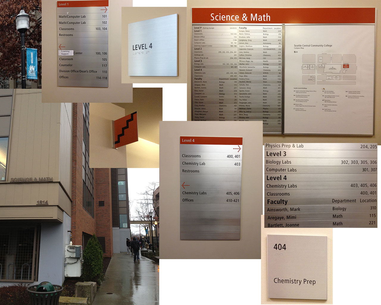
    Pursuit of SAM 404
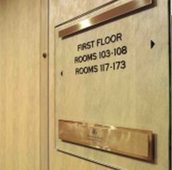
    Things that worked: Sign on side of the building facing, all caps bold permanent fixture. Banners that said “Welcome to Seattle Central” in blue. After entering building, the map and directory is on the right, official placard, clear map. We took the stairs (stairs had a sign in front of it, pretty clearly indicated stairs with a simple zig zag). Nice orange theme.

    Things that didn’t work: Building sign not at the entrance of Science and Math Building (also one must infer that SAM means Science and Math). SAM 404 not listed on directory (one must infer that it’s on the fourth floor due to standards). Once on the fourth floor, we had to go left to find further wayfinding signage (it’s right in front of the elevator, so if you go by elevator, it is a better experience). Signage in front of elevator not terribly helpful. Deciding to find the room number by looking at adjacent numbers then logically proceeding to the next one in sequence until we found it. We found “404A Chemical Storage” first then proceeded to “404 Chemical Prep.”
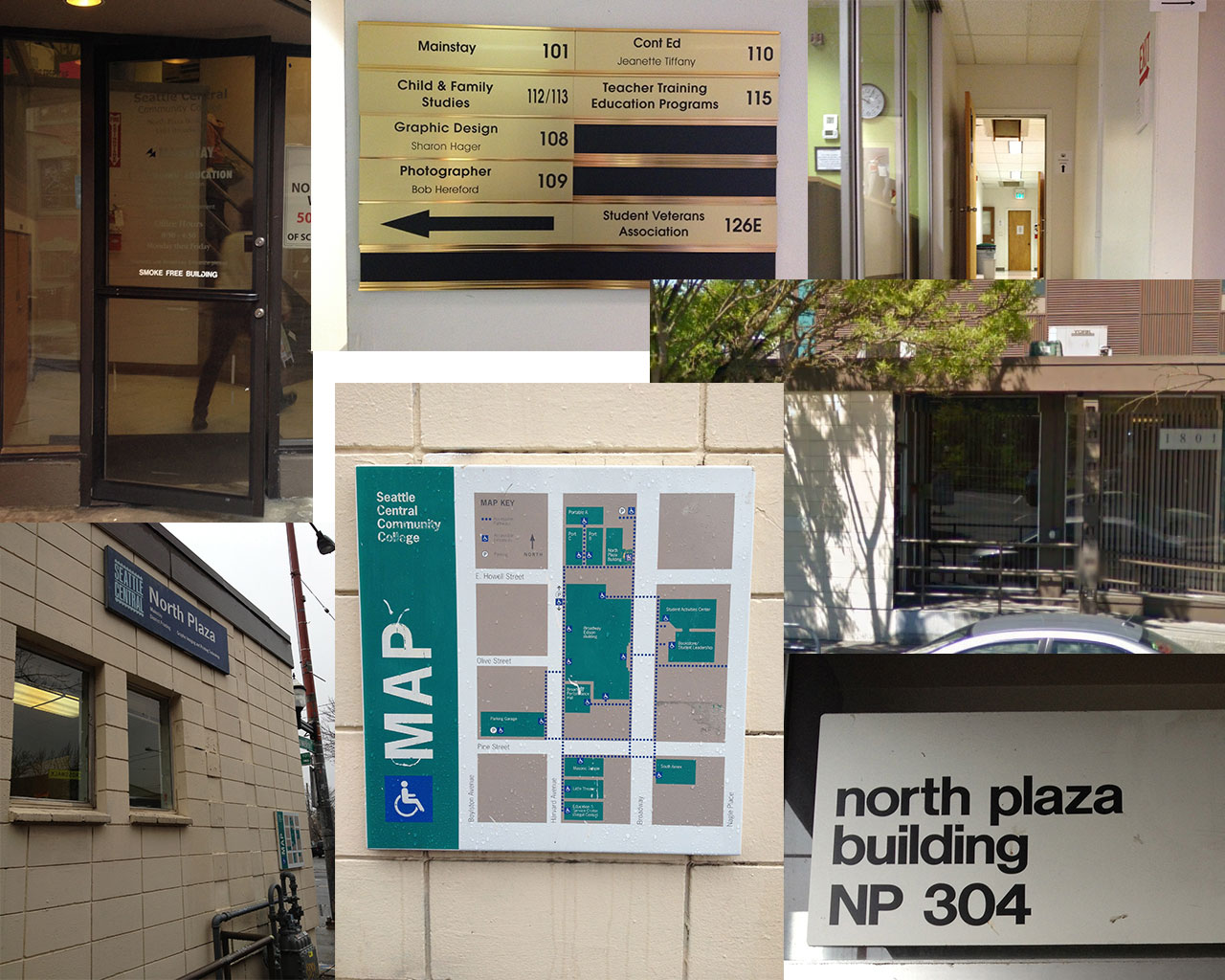
    Pursuit of SAM404
    Pursuit of SAM404

    Pursuit of NP 305
    Things that worked: There is signage on the North Plaza that says “NP” so we knew which building to circle for more information. Sign on side of the building facing east, all caps bold black permanent fixture says North Plaza. There’s a map affixed to the wall facing south on the building as well.

    Things that didn’t work: White lettering on glass on a door didn’t stand out too well. It turns out that the first floor isn’t connected to the third floor. There was signage indicating the various rooms on the first floor (gold placard), but no indications to stairs or no. Sign that says NP 305 in bold black san serif lettering only visible from handicap ramp which is the only way to get in.
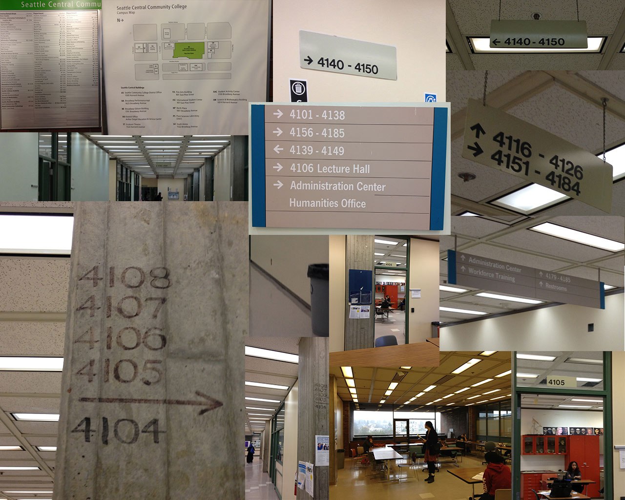
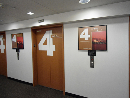
    Pursuit of 304
    Pursuit of 304

    Pursuit of BE 4105
    Things that worked: Upon entering the main building from the north (one must infer that BE stands for Broadway Edison building which I don’t think people would assume, but there is a big all caps bold black permanent fixture says Broadway Edison). There’s a map and directory on the right after you enter. On the fourth floor signs outside of the elevator also clearly designed and helpful.

    Things that didn’t work: There’s a map and directory on the right after you enter, but it didn’t list BE 4105. The directory was arranged by department, finding the room numbers were difficult (and impossible for this particular location). We inferred that it was on the fourth floor and took the elevator and followed signage placed on the right which pointed down the corridor. There was a fork in the road with mutually excluding signage but also excluding our room number. We followed 4106 around which turned out to be a block, numbers following (in this order): room 4106G, 4106K, etc. We followed them around a corner where the trail seemed to run cold until I spotted magic marker on a cement pillar two feet above eye-level, which we followed to a “sack in a cell” and found 4105 (its sign hiding behind another cement pillar) in a corner next to a collection of desks.

    Pursuit of BE 4105
    Pursuit of BE 4105

    The Team’s Suggestions: All encompassing portable paper map with index that’s arranged by room number. Maps on each floor. A detailed map at the bottom of each building with a directory accounting for every room. Consistent conventions. We noticed the Science and Math building had consistent orange theme and more consistent signage (probably because it was built rather recently).

    1)There needs to be a map of North Plaza building with room numbers located near entrances so visitors realize that it is most efficient to enter at the east entrance for room 304 instead of the south entrance which doesn’t give any hints as to through connecting to 304.

    O'hare Terminal Map. It's easy to indicate location of a room. It's another thing to indicate its entrance.
    O’hare Terminal Map. It’s easy to indicate location of a room. It’s another thing to indicate its entrance.

    2) Recommend bright color palate and mnemonic object for differentiating floor and building. (Hanging ceiling signs can’t be black and white; they blend into tiling and light fixtures. And white on grey does not stand out.)

    Pacific Place Parking Garage: Level 4 is Sydney and Orange
    Pacific Place Parking Garage: Level 4 is Sydney and Orange

    3) Signage that lists specific room numbers individually loses some numbers that are also there. Perhaps something like Mayfair Hotel’s room signage.

    mayfair hotel room signage wayfinding
    mayfair hotel room signage

    sharing options:

    • Share
    • Share on Tumblr (Opens in new window) Tumblr
    • Print (Opens in new window) Print
    • Share on LinkedIn (Opens in new window) LinkedIn
    • Share on X (Opens in new window) X
    • Share on Reddit (Opens in new window) Reddit
    • Share on Pinterest (Opens in new window) Pinterest
    • Share on Facebook (Opens in new window) Facebook
    • Email a link to a friend (Opens in new window) Email
    Like Loading…
  • Thoreau Poster

    January 7, 2013

    posterbrainstormAssignment: “Design a 12 X 18 poster with the following quote: It’s not what you look at that matters, it‘s what you see. – Henry David Thoreau

    The quote must appear on the poster. You may do anything you like for illustration, photography, media, etc. Print scale to fit on a 12” x 18” paper for critique next week. You will also need to place your file as a .jpg in my drop folder. It should be 240 dpi and named as follows: Poster1_YourLastName.jpg Bring in your digital files of this poster for next week’s class.”

    I am not quite sure where to go with this. I brainstormed and put out some thumbnails but didn’t feel like anything was truly original. Here’s an attempt. After finishing, I realized I want to think about it some more. I like the idea of doing something wild, but I don’t think this is it. I am going to let my ideas cook a little more.

    It's not what you look at, it's what you see.

    Update 1-10-13: I think that this is kind of a difficult assignment because the quote’s so generic. I decided to make it biographical and put a picture of Thoreau (and get the quote right).

    thoreau

    Update 1-11-13: After critique, after Jill saying that I needed to integrate the type and the image more (and that the type has the “emotional hook”), Jill added more copy to the poster. It’s now an event poster for a think tank. Here’s the extra copy: “What You See is a think tank from New York that does experimental research on new ways of thinking and the power of the imagination.  What You See has generated a critical mass of creative people in many different fields, for whom it‘s been a catalyst for experimentation and innovation. Seattle chapter forming, January 27, 2013, 7:00 pm, 1000 Fourth Ave., Seattle, WA 98104-1109. Member application required. Curious? whatyousee.com 206-733-9608.”

    She encouraged us to read an excerpt from Typographic Systems of Design: Kimberly Elam and then sketch out potential solutions for the new copy integrating with the poster.

    grids and thubnails

    thoreau3
    This poster uses an axial grid.


    sharing options:

    • Share
    • Share on Tumblr (Opens in new window) Tumblr
    • Print (Opens in new window) Print
    • Share on LinkedIn (Opens in new window) LinkedIn
    • Share on X (Opens in new window) X
    • Share on Reddit (Opens in new window) Reddit
    • Share on Pinterest (Opens in new window) Pinterest
    • Share on Facebook (Opens in new window) Facebook
    • Email a link to a friend (Opens in new window) Email
    Like Loading…
  • CDK: Web Design Phase 1

    January 7, 2013

    Assignment: Wordpress.org site

    I’m going to rebrand and restructure the information on this website: Kitsap Collaborative Law Professionals.

    Current look
    Current look

    Phase 1 of Web Design

    1. structure information with user-centered considerations (Site Map) *Research the competitors (Links) and content (html)

    cdk site map
    cdk site map

    Financial Advisor Training – The Legacy Companies.

    Lawson Lundell: Business Law Firm | Western Canada.

    SJ Berwin | The International Law Firm.

    Axiom Law.

    2. communicate style and function Branding

    ckstyletile

    Update 1-10-13: After presenting to the class, the feedback was negative regarding the imagery and overall look I chose. I introduced it saying I wanted to bring back those cute pamphlets but I forgot how ridden they are with judgement and vestiges of a puritanical culture that would be scolding divorce, especially for women and the practical solution is to stick with mostly typography. The lovely Emily directed me to Matter where they use photography of people-less spaces, typography and color blocking to inform their audience.

    Screengrab of Matter.vc
    Screengrab of Matter.vc

    Update 1-21-13: Here’s a new style tile to go with my new approach. (I’m still exploring typographic options.)

    style-tile

    3.wire-framing explore more efficient layouts (Don’t forget Advertisements!)

    wireframe cdk blog

    4. understand mobile strategy and other media requirements Client wants 3 layouts– mobile, tablet (landscape), and desktop

    3 layouts responsive

    sharing options:

    • Share
    • Share on Tumblr (Opens in new window) Tumblr
    • Print (Opens in new window) Print
    • Share on LinkedIn (Opens in new window) LinkedIn
    • Share on X (Opens in new window) X
    • Share on Reddit (Opens in new window) Reddit
    • Share on Pinterest (Opens in new window) Pinterest
    • Share on Facebook (Opens in new window) Facebook
    • Email a link to a friend (Opens in new window) Email
    Like Loading…
  • Team Poster: How to Use a Coffee Cup

    January 7, 2013
    Sketches for the poster
    Sketches for the poster

    Today as an icebreaker for our new critique teams for the quarter-long project, we were assigned to make a list of five common items from around the room, then pick one, then make a poster together due four hours later. Roxy and Aaron are on my team and we came up with this poster. We started by writing out the steps then making some thumbnails then I drafted this layout (on the left). I drew the coffee cup. The character was drawn up in parts like a puppet and then put together by Roxy and duplicated in different poses.

    A poster on how to use a coffee cup with no words.
    A poster on how to use a coffee cup with no words.

    sharing options:

    • Share
    • Share on Tumblr (Opens in new window) Tumblr
    • Print (Opens in new window) Print
    • Share on LinkedIn (Opens in new window) LinkedIn
    • Share on X (Opens in new window) X
    • Share on Reddit (Opens in new window) Reddit
    • Share on Pinterest (Opens in new window) Pinterest
    • Share on Facebook (Opens in new window) Facebook
    • Email a link to a friend (Opens in new window) Email
    Like Loading…
  • Books: Reading in Progress

    January 7, 2013

    The Best Books of 2012: Your 10 Overall Favorites | Brain Pickings.

    I’ve gathered some reading lists together and put some books on hold at the Seattle Public Library.

    I look forward to reading these.

    Seattle Public Library's available books from the reading lists I've recently discovered
    Seattle Public Library’s available books from the reading lists I’ve recently discovered

    sharing options:

    • Share
    • Share on Tumblr (Opens in new window) Tumblr
    • Print (Opens in new window) Print
    • Share on LinkedIn (Opens in new window) LinkedIn
    • Share on X (Opens in new window) X
    • Share on Reddit (Opens in new window) Reddit
    • Share on Pinterest (Opens in new window) Pinterest
    • Share on Facebook (Opens in new window) Facebook
    • Email a link to a friend (Opens in new window) Email
    Like Loading…
  • Winter After Effects Project Directory

    January 7, 2013

    self directed project phase 1

    timeline components brainstorm
    timeline components brainstorm

    This is the changing document to document what I am doing with my special project for Winter Quarter and what I think I am going to do. I won’t delete the timeline but rather reflect where I am veering and for what reasons.

    Week 1 (1-7):
    What I planned to do: Set-up Timeline Document. Think of ideas for special project and begin concepting.
    What I ended up doing: Team Poster: How to Use a Coffee Cup

    Week 2 (1-14):
    What I plan to do this week: Brainstorm Components, flush out timeline and Polish concepts, write up timeline and proposal with moodboards for project. Meet with Matt Nyce (the contact for the band for the music video). Winter After Effects Quarter Mission Statement
    What I ended up doing: See below post for brainstorm/storyboards. See above mind map for components. My goal is to expose myself to more music videos. Research on Music Videos 

    Week 3 (1-21):
    What I plan to do this week: Finish Storyboards, get approval from Matt Nyce, video prep and shoot.
    What I ended up doing: Brainstorm and Storyboards for Music Video.

    Week 4 (1-28):
    What I plan to do this week: make Ai file for after effects, Rough Draft
    What I ended up doing: More Research for Winter Quarter Project. I haven’t finished shooting, so I am thinking I have to push everything forward a little. Meanwhile, I’m getting a feel for the possibilities of what video can be.

    Week 5 (2-4):
    What I plan to do this week: Final Execution, you tube video, links, logo at the end of the video
    What I ended up doing: I’m a little bit behind. I finished shooting monday and I hope to get a rough for next week’s presentations. Nap Video: Editing Footage | Katablog. I also did more research: Ideas that Make a Music Video Special

    Week 6 (2-11): Presentation Day
    What I plan to do this week: Wrap-up project #1, presentation, brainstorm and research for Video Resume (project #2)
    What I ended up doing: Nap – Rough Draft, A story about editing | Katablog. I presented a couple of rough drafts and had another meeting with Matt. He liked it and gave me some edits to make.

    Week 7 (2-18):

    What I plan to do this week: moodboard and shoot for Video Resume
    What I ended up doing: After completing the edits, I decided to hold off on the idea of a Video resume and continue exploring animation. Adoption Video: A Storyboard

    Week 8 (2-25):
    What I plan to do this week: make Ai file for after effects, Rough Draft
    What I ended up doing: No blog post this week. animatin – YouTube. I made this as part of figuring out how to animate this project.

    Week 9 (3-4):
    What I plan to do this week: Final video, Polish presentation for final presentation
    What I ended up doing: yoks1 – YouTube. I have some footage for animating on.

    Week 12 (3-11):
    What I plan to do this week: Presentation
    What I ended up doing:Whoops. Presentation is next week. I’m finishing up a small section of the footage. I call it episode 1. Here’s the rough draft. layout_1 – YouTube.

    Week 13 (3-18):
    What I plan to do this week: Presentation
    What I ended up doing: After Effects, the Winter Quarter Project | Katablog.

    sharing options:

    • Share
    • Share on Tumblr (Opens in new window) Tumblr
    • Print (Opens in new window) Print
    • Share on LinkedIn (Opens in new window) LinkedIn
    • Share on X (Opens in new window) X
    • Share on Reddit (Opens in new window) Reddit
    • Share on Pinterest (Opens in new window) Pinterest
    • Share on Facebook (Opens in new window) Facebook
    • Email a link to a friend (Opens in new window) Email
    Like Loading…
  • Poster Process

    January 4, 2013
    true creativity often starts where language ends by arthur koestler poster design sketching brainstorming
    poster brainstorm and sketching

    Today is the first day of Poster class. I think I’m going to like this quarter very much. My class time was spent exploring brainstorming techniques and sketching out a poster featuring the quote “True creativity often starts where language ends” by Arthur Koestler (great writer, by the way, if you get a chance you should read Insight and Outlook).

    Jill went over some techniques of brainstorming. 1) Sketching symbols that capture the psychological state of subject (in this case, a quote) 2) Picture Associations– when drawing blanks, look to images (read: Google Image Search) and gather some inspiration and 3) Forced Connections– random words sometimes hold unique connections.

    What I thought was very valuable was the notion of 20-minute sprints. Jill said that we can’t concentrate very well after that, so it’s good to take a break, get some coffee, surf the internet, walk around a bit before getting back into it. I think it worked really well for me. I went for a walk to a local thrift store and took some pictures of things that I found inspirational. There was a framed photograph of an iris with a starship at its pupil I wanted to have.

    items I liked on a trip to a thrift store
    items I liked on a trip to a thrift store

    Jill also talked about using a matrix to combine styles and mediums to get unique posters. Like doing a poster Dada style with mud as your medium. Etc. Endless fun, but I didn’t have time in class to really see what ideas that process could generate.

    I sketched out the lion tamer, but I really like this one item that I saw at the thrift store that seemed perfectly beyond language in essence that I wanted to make this poster. (I spent some time doing selections in Photoshop but I know I could have spent a little more to get the mask perfect.) Yes. It’s a bejeweled teapot wind chime.

    teapot windchime with arthur koestler quote


    Links:

    Random Word Generator Plus. (good if you want to find obscure words, there are changeable settings)
    Creative Random Word Generator – 7 random words. (produces up to 8 random words at a time!)

    sharing options:

    • Share
    • Share on Tumblr (Opens in new window) Tumblr
    • Print (Opens in new window) Print
    • Share on LinkedIn (Opens in new window) LinkedIn
    • Share on X (Opens in new window) X
    • Share on Reddit (Opens in new window) Reddit
    • Share on Pinterest (Opens in new window) Pinterest
    • Share on Facebook (Opens in new window) Facebook
    • Email a link to a friend (Opens in new window) Email
    Like Loading…
  • First Day of WordPress Class

    January 3, 2013

    Today’s class is WordPress class. As usual for the first day of a new class, Erik Fadiman gave a lecture talking about wordpress, design and business. Firstly, he said that he’s no longer going to talk about responsive, quoting “if it’s not responsive– it’s not web design.”

    Wordpress.com vs. WordPress.org
    WordPress.com vs. WordPress.org

    The beast: Fadiman said if a client comes to you with a wordpress.com site, just stay away. It’s limited in many ways. Unlike wordpress.com, wordpress.org, the one we are going to be learning, can be customized, stylized and broken. You can change the file structure or style.css like any website. WordPress has a dashboard with widgets, themes and a thing called php. Essentially, it’s a birdcall to connect to SQL which is stored in some magic WordPress cave somewhere. The html is generated dynamically. Because it is an open source content management system, people are coding for it all the time, giving it new ways to interact with other applications like Twitter, Facebook, LinkedIn, etc as well as giving it better plug-ins.

    How to tame it: Purchased themes end up being more work to customize. Buy a theme only if you absolutely have to. Start with a good theme, like 1140 Fluid Starkers WordPress Theme | thedotmack. Download it and put it in your site in the themes folder. Remember that wordpress’ “html” structure is 4 buckets of delicious php: header, footer, index and sidebar.  Treat it like a big document. In the head, within the header php, you can add your fonts, google metrics (Google Analytics Official Website – Web Analytics & Reporting – Google Analytics.), etc. and the opening tag for the container is in the header.php and the closing one is in the footer.php. (Which is rad when you are adding pages, you don’t need to copy-paste those sections.)

    screenshot of wordpress files
    Today, I uploaded a new theme to my new project, a wordpress.org blog.

    “When in doubt, consult the codex.” The nice part about open-source is that all of these people are coding for this. If you have a problem, one of these geeks will have solved it for you. Fadiman recommends WP super cache and contact form 7.

    Your client: Before even starting a website for your client, ask them: How much you want to spend? Who is your audience? What are your goals with this website? Ask for analytics. Sometimes, their budget, audience or goals might indicate that they don’t really need/want one of these beasts you are about to tame. They just want a simple and limited wordpress.com blog that is free (not including domain costs) and you can send them on their way. Design is a job and you need to get paid for good work. A part of that job is to take on good clients.

    The goal after creating the site is to be able to hand off the site to your client and confident that they are ready to take over the site and empowered to say things to their audience. Training your client to use the wordpress controls may take a long time and they might have some questions days, weeks after. Make sure to account for this in your invoice. As a wordpress designer, you are shaping the experience not only for your client’s audience, but for your client. If your client has a good experience with wordpress initially, it’s more likely your site will be put to good use. In fact, get the client familiar with the dashboard interface before you start styling.

    Follow-up: Part of your job as a blog designer is maintenance. The best and worst thing about the Internet is that it changes so quickly. It will happen that your plug-ins are updated and new ones become more relevant. Put monthly maintainence meetings into your invoice as well. A good blog is a blog that’s updated regularly and often.

    Web Presence Blogging is a corner of the trifecta of web presence (the other two being social media and graphic design). For my internship last summer, the company I worked for wanted me to explore social media (previous blog post). Social media is about broadcasting your brand. Blogging is about supporting your brand, giving it authority in the industry and attracting an audience with relevant information. When using WordPress, explore its social media widgets and get connected.

    Links:

    WPMU DEVs premiere WordPress blog – WPMU.org.

    1140 Fluid Starkers WordPress Theme | thedotmack. (unstyled, but nicely commented-out)

    Respo Theme | Themnific | Most useful WordPress themes!. (needs a lot of overrides)

    sharing options:

    • Share
    • Share on Tumblr (Opens in new window) Tumblr
    • Print (Opens in new window) Print
    • Share on LinkedIn (Opens in new window) LinkedIn
    • Share on X (Opens in new window) X
    • Share on Reddit (Opens in new window) Reddit
    • Share on Pinterest (Opens in new window) Pinterest
    • Share on Facebook (Opens in new window) Facebook
    • Email a link to a friend (Opens in new window) Email
    Like Loading…
Previous Page Next Page

Blog at WordPress.com.


Loading Comments...
 

    • Subscribe Subscribed
      • Kismet Arts Tangent
      • Join 104 other subscribers
      • Already have a WordPress.com account? Log in now.
      • Kismet Arts Tangent
      • Subscribe Subscribed
      • Sign up
      • Log in
      • Report this content
      • View site in Reader
      • Manage subscriptions
      • Collapse this bar
    %d