Inspired by this image (as shared by Tom Lenon on Facebook), today’s drawing club meeting, after a warm up with a collaborative drawing exercise, was coming up with our own device. The device we came up with makes toast.
Here’s the plan. First, you must insult a bald guy (not pictured) to the point where he’s so angry he pounds his fist against the table and knocks over the glass of water (A). The water proceeds to drip on the cat (B) and the cat, annoyed, leaves his place on the see saw and causes the 8-ball (C) to roll off the see saw triggering the boot to fall from its place tied to the wall (D) and hits the stick (E) which hits the mallet ball (F) which slides into upside-down toy-parachute (G) attached to the chain for the ceiling fan (H) which turns on and knocks down the top few pieces of a stack of bread (I) and that slides down the fabric ramp into the toaster (J). Meanwhile, back to the 8-ball (C), it also triggers a series of dominoes (K) which taps a stick (L) which then taps the perched billiard ball (M) into a spiral slide, gaining momentum (and taking a while, going through all of those turns, then hitting the plastic lever on the toaster promptly after the toast falls in. With this kind of drawing, it took some thinking. Start with the task you want to complete and work backwards to come up with all of the elements. Roughly sketch it out then begin again with a clean sheet for the final result. In our experience, we ran out of space because we didn’t realize that the stack of toast would be so close to the ceiling to start with.
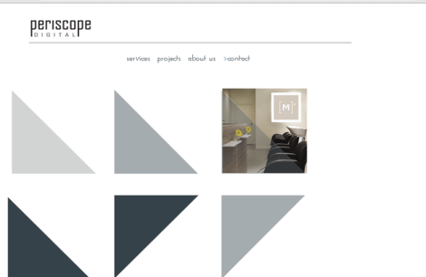
Today was the final day of working on Periscope Digital’s website with my teammates Blaine and Jose. Coding up to the very minute before presentations, my last touches to the website was the alt tags and some portfolio images put that were almost forgotten about. My team truly worked together to make this site something that I cherish and often visit for a little mood boost. Jose’s eye for photography with Blaine’s elegant triangle design, this site stands out as being something with a real vision. It wasn’t easy getting here.
I mentioned in the presentation that I used components of 3 frameworks to create this beast. It was a different world when designing for desktop. Something like this wouldn’t have been a dastardly task. The way the triangle code was conceived (using css transistions) they are absolutely positioned, which means as coder, I told each shape where to go three different times (desktop, tablet and phone). And, to add, the text is on a fluid grid which means that the boxes containing them are governed by percentage widths rather than fixed pixel-widths. Next time, if I am considering a static page layout like this, I would choose less all the way and then never pay mind to the spacing that occurs on devices in between the sets that I’ve created in code.
We spent a while making sure that everyone understood the brand, Periscope Digital and developing photoshop comps. I think this led to an easier implementation, feeling confident with our concept through the coding process.
Project management was adequate. I tend not to judge methods that worked. We had fluid deadlines and took the time we needed to make something solid and once. Not to say there wasn’t a few changes along the way.
Websites are not like paintings. They are finicky and sometimes seem to fall apart when you’re not looking. I had a few issues with media queries. For most of this last weekend either but not both tablet and phone styles would work. This was very frustrating. Erik Fadiman said that he tried figuring it out by changing the background colors to bold primary colors to see immediately which css styles were operating. In every project, it seems like there’s a point to switch to a clean framework or relink something by copy-pasting functioning code. I did that yesterday when I added LESS media queries.
As for other websites this final season, I’ve enjoyed the interesting play that comes with exploring a medium for the first time. This notion that we are the upcoming makers of the internet isn’t so crazy anymore. Check out this website by Emily Eagle and Scott Richardson: Field and this one by Pete Brand, Krispijn Larrison and Brandy Collins: SHFT.
The lastest assignment in Advertising: make a trio of posters for classes (my choice). So, I’ve chosen Philosophy Psychology and Political Science 101.
The lastest assignment in Advertising: make a trio of posters for classes (my choice). So, I’ve chosen Philosophy, Psychology, and Political Science 101. Here are my thumbnails and the comps. I took the photographs myself. When I tried to think of a symbol for “by-product” (the gear in the thumbnail wasn’t technically one) I realized that by-products are waste and really hard to render in an icon sort of way. I resorted to photography and I am glad I did. I took the photographs myself using white paper as a background then I used Photoshop to colorize the images. The font is Antique Olive Std.
Post-critique: No one got the jar. I meant it to be a symbol of pursuit, an empty jar, ah… well, no one got it. I spent a good few hours afterwards talking about it with peeps. I word-mapped and thumbnailed some alternatives, asked Tom about it when he told me to look in a philosophy term glossary. I was reading a poem, (with this pursuit on the front of my mind) and I saw the word “antidote” jump out at me. Here’s the new addition to the trio. I can move on with my life now.
Today is the presentation day of the quarter for my special topics project. This has been a turbulent quarter. I won’t say that I am happy about this class. It has caused me stress. There were days when I couldn’t seem to do anything right and I closed the program, stared at my desktop and then realized that I made a commitment to this topic in some way and that I had to break through the cloud of confusion.
I could have picked drawing, but instead I wanted to “ride the After Effects Train” and unfortunately it never left the station. I wanted some help with After Effects and I felt that the only way to do that was by doing it Fall Quarter when a handful of others also took on the project. We’ve all been figuring it out separately and perhaps for the best. Today will be illuminating as to what else can be done with this program. I’ve kept close to the Kinetic type route.
My work
After some small starts, trying to figure out masks and importing photoshop layers, I realized that my lack of imagination was stopping me from exploring After Effects in a way that could keep me going all quarter. It was then I devised the test. I created some music samples and then asked everyone to draw some sequences that represented what they saw in their mind’s eye when they heard the sounds. I got back a surprising amount of good and interesting lines and shapes that I then was inspired to make a music video of abstraction.
The workflow
I did not keep a log of how long this project took. Next time I will. I estimate that it took about fifteen hours from creating the .aep file to posting it on YouTube. First (after listening through the song a few times) I wrote down the text for the opening words. Sentence by sentence, I arranged the words in Illustrator.
(Also see previous kinetic type project) For this: Make an illustrator file the same res as your video (super important). type the sentence. Create outlines. Ungroup. Arrange the sentence, nest words, consider emphasis. Then, group the letters word by word. In the layers panel there’s a drop-down menu where it says “send groups to layers” or something like that, I just look for the word (Sequence). Then take the layers out of the original layer. Delete the original layers. Then save.
Then import your .ai into After Effects. Always use the Illustrator/eps checkbox option and the keep the layer size option. Then create a new composition, drag your ai folder into the comp panel (see here for a diagram of names for panels) then right click and enable time remapping. Then bring in the audio file and show the waveform and align the words to the blips on the waveform.
I repeated this about twelve times for this project, though I only found out about the waveform bit near the end. The next thing I did was create shapes using the shapes panel. Every shape in the video is done in After Effects. Inspired by this tutorial, GreyScaleGorilla. I made a series of sequences where I used the previous sequence as a starting point, creating more complexity.
Here’s what I ended up with.
Here’s my presentation. I’ll miss these presentation days. The little things that people say when they are scriptless and describing their process. “Pulling a Nathan” means withdrawing efforts from learning After Effects. “How do to aerobics in a corset” is how Liz described the book she found on in-house designers. And the apt description of her fish friendliness indicator app “Fissues” (rhymes with issues).
Today in drawing club, we drew portraits of our teachers. Here is Marc (top middle and lower left), Tom (the one with the glasses) and Jason (top right). Drawing people you know is known to reduce stress. Try it. Good luck with finals everyone!
Project 3 is a team project, building a responsive portfolio website for a design firm. My primary role is the coder. Yesterday, I received the files for the logo and the photoshop comps for the website. I am working to match the photoshop comp as best I can. I believe in its design (most of it anyways) and I want to make it work. I haven’t seen a lot of websites like this and I am pleased in its uniqueness, perhaps at the cost of ease of code-abilty. So far it has been smooth other than my switching out the guts of toast’s grid system for 1140 grid’s column styles. (The difference is minimal The css class rules read “onecol, one col last” now, instead of “grid-1, grid-2.”) I felt like I didn’t understand those. Perhaps it’s because I set up the framework 8 days ago and then didn’t really understand it and then after customizing the code a little, I might have lost what little guides that were put in there to help me understand it. Oh, well.
The website is a work in progress and seeing it on my laptop, the grey is very faint. I must bring that up with the designers.
So far, it’s 61 K. Projecting that it will be a about 150% more (adding more photographs and fonts), it’s the lightest website I’ve ever built.
The lastest assignment in Advertising: make a trio of posters for classes (my choice). So, I’ve chosen Philosophy Psychology and Political Science 101. Some have recommended that I choose a suite like 101, 102, 103 of the same subject, but I really enjoy drawing parallells between disparate things. Here’s my brainstorm and thumbnail phase. I think it’s imperative to have these word maps, or at least a list of words relating, because otherwise I forget what I am doing and there’s this big blank where there should be ideas.
Here’s my final version of the SCCC (Seattle Central Community College) ad for Advertising class. I was inspired by soviet Russian space race postage stamps from the sixties. This is my first time working with a photographer being on the set and all and co-directing the shoot. I think this is a significant improvement than my first idea. I’ve come a long way.

 Here’s the plan. First, you must insult a bald guy (not pictured) to the point where he’s so angry he pounds his fist against the table and knocks over the glass of water (A). The water proceeds to drip on the cat (B) and the cat, annoyed, leaves his place on the see saw and causes the 8-ball (C) to roll off the see saw triggering the boot to fall from its place tied to the wall (D) and hits the stick (E) which hits the mallet ball (F) which slides into upside-down toy-parachute (G) attached to the chain for the ceiling fan (H) which turns on and knocks down the top few pieces of a stack of bread (I) and that slides down the fabric ramp into the toaster (J). Meanwhile, back to the 8-ball (C), it also triggers a series of dominoes (K) which taps a stick (L) which then taps the perched billiard ball (M) into a spiral slide, gaining momentum (and taking a while, going through all of those turns, then hitting the plastic lever on the toaster promptly after the toast falls in. With this kind of drawing, it took some thinking. Start with the task you want to complete and work backwards to come up with all of the elements. Roughly sketch it out then begin again with a clean sheet for the final result. In our experience, we ran out of space because we didn’t realize that the stack of toast would be so close to the ceiling to start with.