Skip to content

Kismet Arts Tangent

Art Collective

    • Kismet Arts Tangent
    • About
    • Blog
    • Contact
    • Donate

recent posts

  • Photo shoot with Kayleigh Shawn
  • Testimonials
  • Fractures Poem
  • Poetry
  • Pixel art products

  • Instagram
  • NRD Phase 3: Polishing a nrd

    November 13, 2012
    work in progress website screenshot
    work in progress website screenshot- start of day

    Critique from the Fadiman (web teacher): “More white space, especially between elements vertically and in terms of line height. Elements in header are crowded and unharmonious. More padding in those boxes around your headlines. I think inclusion of a younger, edgier font. Advertising needs to be integrated, not marginalized to the right column. Content and structure are great, but needs more social.”

    yslow plugin screenshot
    This is what happens when you don’t pay attention to how big your photos are.
    screenshot of website version1
    screenshot of what I offered up for critique today


    I like the idea of a physical interface look, but this isn’t styled enough. I have a lot to do. I don’t think I understand the brand’s aesthetic. I am going to consult my style tiles again and figure out what I need to do to make this website what I want it to be.

    Katsite Project 2

    (Earlier Post Relating to This Project)

    sharing options:

    • Share
    • Share on Tumblr (Opens in new window) Tumblr
    • Print (Opens in new window) Print
    • Share on LinkedIn (Opens in new window) LinkedIn
    • Share on X (Opens in new window) X
    • Share on Reddit (Opens in new window) Reddit
    • Share on Pinterest (Opens in new window) Pinterest
    • Share on Facebook (Opens in new window) Facebook
    • Email a link to a friend (Opens in new window) Email
    Like Loading…
  • SOB: Thumbnailing the Campaign

    November 9, 2012

    thumbnailing for ads for square one bistro


    I had these today for class. Some critiques: tweak headlines -> Eat our good grades. and Take the Pop and Sizzle Quiz. Make the image complement the headline and perhaps play with type to match a graded paper. I have a week to carry these as far as I can go. It’s time for some food photography!


    (Earlier Post Relating to This Project)

    sharing options:

    • Share
    • Share on Tumblr (Opens in new window) Tumblr
    • Print (Opens in new window) Print
    • Share on LinkedIn (Opens in new window) LinkedIn
    • Share on X (Opens in new window) X
    • Share on Reddit (Opens in new window) Reddit
    • Share on Pinterest (Opens in new window) Pinterest
    • Share on Facebook (Opens in new window) Facebook
    • Email a link to a friend (Opens in new window) Email
    Like Loading…
  • NRD Phase 2: Implementing The 1140px Grid Layout

    November 7, 2012
    screenshot of website before reframeworking
    screenshot of website before reframeworking

    I felt like I had lost control. Things weren’t floating the way I expected them. I think that fluid grid layout in Dreamweaver has a lot to live up to. I much prefer using classes to control boxes. The 1140px Grid System is flexible and if you understand code, very straight forward. It suffers from what is referred to as “divitis” (lots of divs) but it makes up for it in even spacing and clear labeling.

    The 1140px CSS Grid System · Fluid down to mobile.

    Going from one to the other meant overhauling the site. Keeping the html someplace safe while I put in the framework. It is a good exercise because I closed off some tags that were left open and understood better where I put things. I am glad my slideshow is working like it should. Everything is feeling much more structured than my last website.

    To do list:

    add the logo in the header
    Styling buttons, posts and designing a banner ad
    Getting more feature articles (I need 10)
    Coding some drop-down menus
    polishing general design
    adjusting slideshow size to fit container
    cut down photos to the right size and quality for maximum performance
    add font squirrel fonts

    screenshot of website after restyling
    screenshot of website after restyling

    Katsite Project 2

    (Earlier Post Relating to This Project)

    sharing options:

    • Share
    • Share on Tumblr (Opens in new window) Tumblr
    • Print (Opens in new window) Print
    • Share on LinkedIn (Opens in new window) LinkedIn
    • Share on X (Opens in new window) X
    • Share on Reddit (Opens in new window) Reddit
    • Share on Pinterest (Opens in new window) Pinterest
    • Share on Facebook (Opens in new window) Facebook
    • Email a link to a friend (Opens in new window) Email
    Like Loading…
  • Kinetic Type Tutorial

    November 7, 2012

    vector type on layers ai

    I tried following along with this tutorial: Kinetic Typography Tutorial | The Crooked Gremlins.

    1. Import Audio. Drag it down into your layers. At first I couldn’t hear my audio clip in Preview. The Internet has asked this question already.

    “To hear the audio you must play a RAM Preview pressing the Zero on the NumPad…Previews only sound. Hope this helps” -Dalvenjia via Dalvenjia’s Activity – Yahoo! Answers.

    Some peeps on the internet said that AE doesn’t “like” mp3s and .wav’s work much better. Online Audio Converter (MP3, WAV, Ogg, WMA, M4A, AAC) – media.io.

    2. Prepare your content. What I did was take the lyrics and type them into Adobe Illustrator, create outlines, group the letters into words, put each word on its own layer and label the layer for the word it has. Then arrange them. This is fun. (look at the vid, he shows a slick method.) Then import the file  into your After Effects comp.


    3. Video. I converted files from YouTube to mp4 with Media Converter – the fastest free online audio and video converter.

    4. Importing. Don’t forget “Retain Layer Sizes”retan layer sizes

    4. Working the text layers. Remember to have your type rasterize otherwise when you scale up it gets blurry real fast (even though you know it’s vector!). It’s the sunshine button.

    5. Animate, Render and Done. I was a bit frustrated that I couldn’t get the audio to work. I think there was something wrong with the audio clip I got. But, here is an excerpt from the Decemberist’s Crane Wife.

    rasterize button in After Effects
    sunshine

    Checklist for Classwork:

    Review My Timeline
    Discover Tutorials
    Develop Materials for Executing a Project outline in a tutorial
    Work Alongside tutorial until completion
    Reflect and Document on newly learned technique

    sharing options:

    • Share
    • Share on Tumblr (Opens in new window) Tumblr
    • Print (Opens in new window) Print
    • Share on LinkedIn (Opens in new window) LinkedIn
    • Share on X (Opens in new window) X
    • Share on Reddit (Opens in new window) Reddit
    • Share on Pinterest (Opens in new window) Pinterest
    • Share on Facebook (Opens in new window) Facebook
    • Email a link to a friend (Opens in new window) Email
    Like Loading…
  • EPub Resource Material

    November 5, 2012

    as published by Jill Vartenegian on her class website.

    EPUB RESOURCE MATERIAL
    “How to” export your file as an ePub


    View these links:

    Controlling Order of Content Export
    Adding a navigational TOC to an eBook 
    How to export your file to ePub 
    New Export Options for ePub in InDesign CS5.5

    For a more in-depth view of Indesign & ePubs:
    Creating an eBook with InDesign (Part 1 & 2)
    How to tag your styles for ePub


    If you have a Lynda.com account you can view these links:
    Anne-Marie Concepcion Indesign to ePub (site)

    Chapter 3: Creating a navigation table of contents (TOC) with a TOC style
    Using a TOC style in combination with and Indesign book
    Chapter 4: Adding a custom TOC as the first page of the ePub file.
    Chapter 5. Exporting from Indesign to ePub

    ”How to” make formatting edits to your code
    Lynda.com: Anne-Marie Concepcion Indesign to ePub (site)
    Review the following videos:
    Chapter 8. Editing ePub files for formatting
    (editing CSS, setting space, creating drop caps, side bars and pull quotes, text wrap)

    Experimenting with typefaces in ePub
    Embedding Fonts in ePub (site)

    CSS Examples (site) 

    ePub Zen Garden (site) 
    System fonts available for the iPad, iPhone (site)

    ePub communities, wikis, forums
    ePub Secrets (site)

    Pigs, Gourds, and Wikis (site)

    Mobile Read Forums (site)

    ePub, Indesign Secrets (site) 

    Book: ePub 3 Best Practices (book)

    Electric Book Works: The EBW Knowledge Base (site) (last updated 2011: This site has good information on the overview of the process, the order of ebook parts. The overview of production tips and Creating an ePub from Indesign are good BUT – be forewarned – the technical details within the overview are becoming a little dated because they are working in CS4. If you disregard the techical detatils and focus on the overall process, the information is still valid.

    Recommended
    International Digital Publishing Forum (site)
    ePub validator (site)


    While we’re on exporting: Here’s a web version of my design of Jane Eyre (pdf not epub)  jane eyre booksample

    sharing options:

    • Share
    • Share on Tumblr (Opens in new window) Tumblr
    • Print (Opens in new window) Print
    • Share on LinkedIn (Opens in new window) LinkedIn
    • Share on X (Opens in new window) X
    • Share on Reddit (Opens in new window) Reddit
    • Share on Pinterest (Opens in new window) Pinterest
    • Share on Facebook (Opens in new window) Facebook
    • Email a link to a friend (Opens in new window) Email
    Like Loading…
  • Painted Waterfall

    November 4, 2012

    I was inspired by the beauty of Cloud Atlas, the movie. I was in awe of all the artistry, the amazing composite-work, the attention to detail. This is a painting of a waterfall I met on my trip in the midwest last summer. It’s a waterfall with very curvy edges carved out by swirling eddies.

    underpainting for waterfall
    the first round with the bigger brush
    waterfall painting
    Complete


    sharing options:

    • Share
    • Share on Tumblr (Opens in new window) Tumblr
    • Print (Opens in new window) Print
    • Share on LinkedIn (Opens in new window) LinkedIn
    • Share on X (Opens in new window) X
    • Share on Reddit (Opens in new window) Reddit
    • Share on Pinterest (Opens in new window) Pinterest
    • Share on Facebook (Opens in new window) Facebook
    • Email a link to a friend (Opens in new window) Email
    Like Loading…
  • SOB: Thumbnailing

    November 4, 2012

    I spent an hour working on these thumbnails. It is a good amount of time to be working on these things. Not too long that you get invested in the nuances of the typography, but enough that you would have something to talk about. I spent an hour prior brainstorming, coming up with ideas related to my interview with the head chef of Square One Bistro.

    sharing options:

    • Share
    • Share on Tumblr (Opens in new window) Tumblr
    • Print (Opens in new window) Print
    • Share on LinkedIn (Opens in new window) LinkedIn
    • Share on X (Opens in new window) X
    • Share on Reddit (Opens in new window) Reddit
    • Share on Pinterest (Opens in new window) Pinterest
    • Share on Facebook (Opens in new window) Facebook
    • Email a link to a friend (Opens in new window) Email
    Like Loading…
  • Client Research: Square One Bistro

    November 4, 2012

    square one bistro Sccc
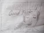
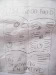
For my latest advertising assignment, I am to make an internal ad for the Square One Bistro at Seattle Central Community College. Tom Lenon required the class to interview their clients to better understand their needs and perspective. I had the privilege of interviewing Mike Jordan, the chef instructor. I had a lot of fun interviewing him. He was open and articulate and passionate about what he does. I took a class on interviewing at UW and conducting this interview reminded me of old instructions: eye contact, open-ended questions, establish rapport, etc. I’m really glad that Tom had us do this because I am always thinking if graphic design has so many little details to learn, each industry as well has its fascinating depths, intense analysis, attention to those details that we take for granted, but are actually hard-thought considerations.

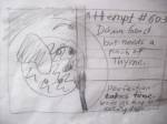
    I proposed a meeting at Cafe Vita for an interview via email. He responded that Stumptown would be better. It’s always a good sign when people suggest a place and time they like. They feel invested and included in the meeting. He showed up on time and I got him a cup of coffee. The promise I made to my interviewees was that though I have little money, if I interview you, I’ll buy you the coffee. In retrospect, I would have gotten it prior to his arrival because it was a little awkward that we introduced ourselves and then I abandoned him for a few minutes while getting his drink.

    I didn’t prepare a question schedule (a list of questions and topics that are the skeleton for the interview direction). I should have, but I wanted it to feel casual and perhaps I was a little lazy and had confidence in my abilities to wing it. I asked questions, “how many people work there?” “What are a few words that you would use to describe Square-One Bistro?” And so on.

    We had a conversation about the bistro, his menu, his audience, regulars, the hierarchy of the kitchen, his teaching philosophy, his origin story of how he became a cook, then chef, then chef instructor.

    Meet Mike Jordan. He grew up in Iowa about forty years ago. Things were different then.  When you became sixteen, you got a job. (Sometimes sooner, ex. being a paperboy.) His first cooking job was at McDonald’s. He was given a choice, either work the front of the house (and  wear a polyester uniform and risk being noticed by your friends) or work in the kitchen. He chose the kitchen. Mickey D’s was a different place back then. Their commitment to food more apparent. Less automation, I’m sure.

    Mike said that the thing about being a cook is that you perfect your station then you get moved to something else, and that’s how you make your way up in the world. It’s not repetitive. It’s about “kaizen.” Continuous small improvements. He emphasized that cooks are not artists, they are craftsmen. Their focus and reliability makes them a good cook. Being able to repeat their success over and over. It’s about understanding the head chef’s palate, his vision and being able to follow instructions. Many cooks never become head chefs.

    Mike told me about his menu. Dishes tell stories. When he makes a menu sometimes he’ll put in dishes that are a part of his life, meals that make connections for him for that time when he first got married or started cooking school. How his grandmother made him strawberry shortcake from strawberries he picked. Whenever Mike inspects a crate of strawberries, he just needs to smell it and if the memory of his grandmother floats into his head, it means the strawberries are ripe and delicious.

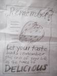
    Mike loves teaching. He wants to influence all of these upcoming chefs through working in his kitchen. He tells his students to taste everything and often. Technique is so important that you can transform an average tomato into a great sauce. He worked for Emeril Lagasse (the “BAM” chef). He’s passing on the advice: pay attention to details. He and his students make everything from scratch. It’s important to focus because each step is crucial to perfecting the dish.

    His commandment to his students, don’t show up as a blank slate to a job. Come knowing stuff ready to challenge yourself and be what the boss wants you to be.

    sharing options:

    • Share
    • Share on Tumblr (Opens in new window) Tumblr
    • Print (Opens in new window) Print
    • Share on LinkedIn (Opens in new window) LinkedIn
    • Share on X (Opens in new window) X
    • Share on Reddit (Opens in new window) Reddit
    • Share on Pinterest (Opens in new window) Pinterest
    • Share on Facebook (Opens in new window) Facebook
    • Email a link to a friend (Opens in new window) Email
    Like Loading…
Previous Page Next Page

Blog at WordPress.com.


Loading Comments...
 

    • Subscribe Subscribed
      • Kismet Arts Tangent
      • Join 104 other subscribers
      • Already have a WordPress.com account? Log in now.
      • Kismet Arts Tangent
      • Subscribe Subscribed
      • Sign up
      • Log in
      • Report this content
      • View site in Reader
      • Manage subscriptions
      • Collapse this bar
    %d