
 This is my design becoming real, slowly from mobile-first. That’s why everything is in a one-column layout. (More to add later.)
Art Collective
This is my design becoming real, slowly from mobile-first. That’s why everything is in a one-column layout. (More to add later.)
Book Making: PrintBookSignatures– Jill created this instructive guide to printing book signatures in InDesign (change printing range to the size of your signature, that way, when something goes wrong it’s not the whole book kind of wrong)
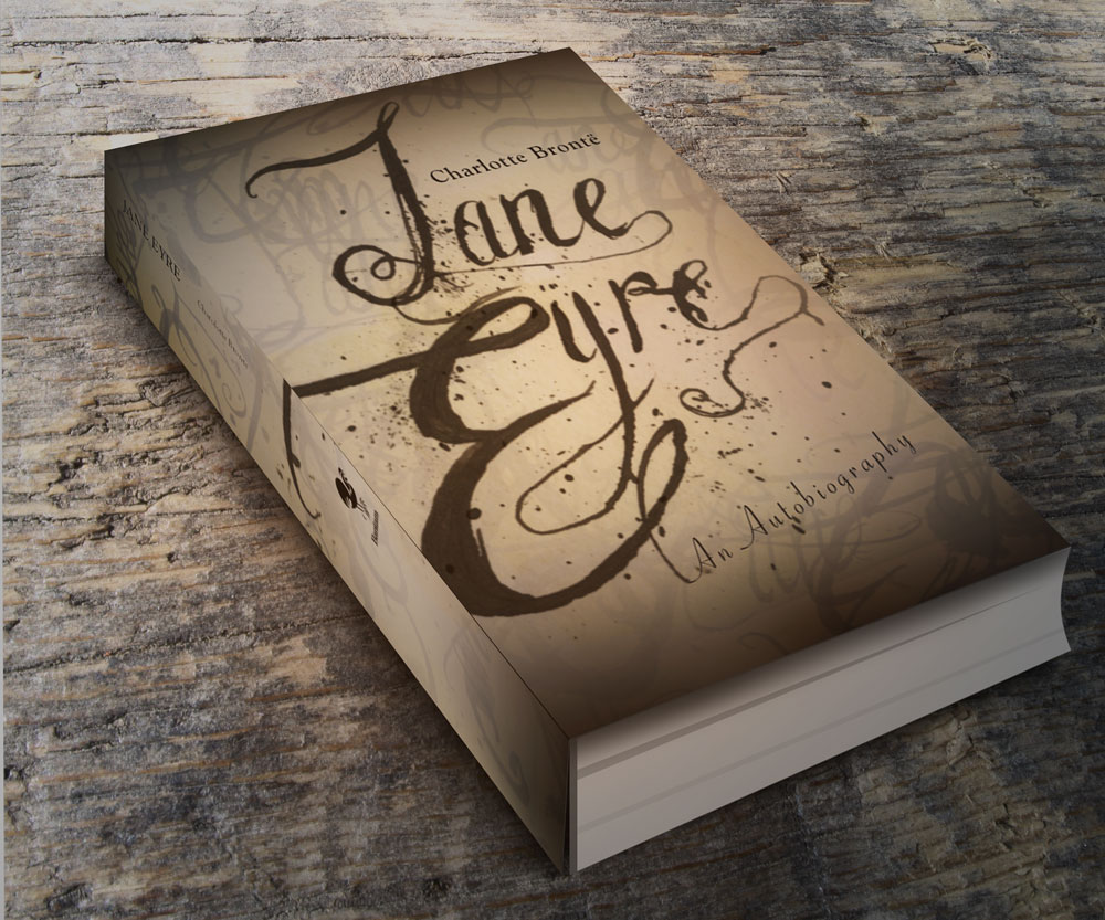
I saw this record with embossed lettering and I thought they had used a photographic manipulation where you offset a silhouette of the type to create depth artificially. I really liked that idea, so I thumbnailed a version of my book cover.

I tried this out in Photoshop, but the text didn’t pop out like I thought it would. It was too subtle and after Jill showed the class how E-PUB covers become so tiny on the digital display of a “bookshelf” on the iPad, I knew I had to take a bolder typographic approach, which led to a bold cover design with sans-serif all caps italic which didn’t have the intimate charm I was going for. And the image I put in the background was a library of congress photo which is available for anyone to use because of their commons-license, but it wasn’t big enough, therefore blurry.

The interior of my book has handwritten script for the chapter heads. So, I went to this idea of ornate typography. This was really fun to do. With handwritten things, it’s a matter of fluidity, so I had so many versions where the J’s curls did twist just right or the ink flowed to strongly. When I looked at them, even in their imperfection, they still were interesting, so I collaged them in my photoshop document along. I really like ink-splatter. You can’t fake it. This is real ink, folks. My favorite layer effect in photoshop is setting the transparency mode to “multiply.”


Update 11-3-12: I realized that grasuc (my conscientious commenter, see below) had a point. Something was lost from one to the other. Boxes are a little modern, but they help make the cover look a little more intentioned. And I think I was a bit extreme in my coloring, so I scaled it back and structured the soft splotches a little and I am feeling good about my design. (The final has the former image of Charlotte Bronte, I don’tknow why it inversed itself in the pdf forming, but I thought it looked kind of cool to keep it like that here.)
U pdate 4-11-13: I made this mock-up using this GraphicsFuel.com | Smart objects 3D book mockup (PSD).
Class Examples and tutorials brought to my attention by Paul Nissen

“Untitled” (He is an English Man) is by Christopher John Olsen
After Effects Project: Pala Tute(by Gogol Bordello) on Vimeo by Sariah Swick
Untitled on Vimeo–“Untitled” (He is an English Man) is by Christopher John Olsen. This one is actually hilarious… don’t be unimpressed by the title “Untitled”
Diamond Mind – Kinetic Type on Vimeo Mr. Courtney Comfort
What Tom Said About Girls on Vimeo by Kevin Cox
Places for Tutorials:
Aetuts+ | Adobe After Effects tutorials from beginner to advanced..
“The type of site is a hybrid news/blog/magazine site, sometimes called a ‘Blogazine’. Each project needs to have a lot of news and content, as well as some form of advertising. Additional requirements: Responsive Images, Responsive jQuery slideshow and/or Video, Embedded fonts from Fontsquirell.com, needs to be under 300k, needs to work on IE8, all modern browsers, phones and tablets. You should surf the web to find similar sites to see what is relevant. Choose one from below:
Geekbot.com is a digital culture magazine for the gamer/techie/maker/cosplay crowd. It has a lot of user generated content, social media integration and the latest news and information for the digital lifestyle. Its tone is hip, urban, youthful and irreverent. The demographic is young, affluent, sophisticated. The typical user owns a smart phone, a tablet, a gaming console and a laptop and is fluent in social media. See http://www.gameinformer.com/”
Phase 1 of Web Design
1. structure information with user-centered considerations (Site Map) *Research the competitors (Links) and content (html)


Joystiq.
Kotaku, the Gamer’s Guide.
The Escapist.
Home – www.GameInformer.com.
2. communicate style and function Branding: I’ve invented the new brand called “NRD” and designed their logo as pictured below.

3.wire-framing explore more efficient layouts (Don’t forget Advertisements!)

4. understand mobile strategy and other media requirements Client wants 3 layouts– mobile, tablet (landscape), and desktop *my audience is a bunch of computer nerds so let’s make that, widerscreen. Responsive Images, Responsive jQuery slideshow and/or Video, Embedded fonts from Fontsquirell.com, needs to be under 300k, needs to work on IE8, all modern browsers, phones and tablets. 20-30 good pictures in the image library and at least the initial paragraph for 12-15 feature stories on the front page.

 I submitted this comp today for critique in Advertising Class. What is a comp? That was a question I was asking myself this week. It is something where you push it as far as you can go. It has to be proportional to your intended substrate (thing you are putting it on) and in this case, flush-mounted on foamcore– I’m sure each boss will have their own ideas of what a comp is when it comes to presentation, but something considered and fairly polished. Using your own amateur photography, or excellent photorealistic illustrative skills or as a last resort filching from the Google Images bin, which never turns out to be exactly what you want. A comp is not about submitting less than your intended vision.
Looking at just the copy, Tom Lenon said that I should say “Seattle Central” and not “education” lest the audience gets confused about the message. I don’t want them to persue just any education, but specifically my client’s establishment.
Tom Lenon said that “Helvetica” is on his list of “Never Use.” I realized and affirmed that I probably shouldn’t use the name “Steve Holt” (even though I know how much fun it is to see it and read it with that voice in your head saying it “STEVE HOLT!” like they do in my favorite television show, Arrested Development. Tom Lenon said that it needs to be more. This picture isn’t the picture of someone that would really buy into this “genie wish” stuff. What I need is a total doofus. I’ll work on making that visual so I can communicate better to my photographer that I am meeting on tuesday.

Advertising Analysis #4 Using Tom Lenon’s Advertising Concept Word List
Summary: (medium, typeface, etc.) Describe the thing.
Full page ad in the Stranger Alternative Weekly magazine, photographic approach, yeti holding beer bottle, slanted italic sanserif font cold palette color with a warm accent tertiary.
visual method:
colorful language
Type Plus Image
Space
Scale
Analysis: What approaches? Audience?
Audience: young people, alternative, students, 18-65. People with a sense of humour, Pacific NorthWesterners who love the Sasquatch myth, snowy weather, evergreens
What’s the emotional/social/personal appeal?
Warm & Fuzzy
Nostalgia
Adventure
What’s the cultural resonance?
Visual/ Verbal Cliche
Post Modernism
Eclecticism
Subcultures (cultural self identifiers)

Today’s quiz involved a Halloween Story. It reminds me of those days in Elementary School where when holidays came around suddenly the homework would take on those themes. Why couldn’t we have designed a Christmas card last year? Was it the lame-stream media’s influence on our liberal teachers?
Chris handed out this really great workflow instruction sheet. I would love it if all of my classes had one of these. A good workflow instruction sheet has the tasks that need to be done in order. I want to use it as my checklist for all my InDesign assignments in the future (and edit it when I find better tactics):
Instructions. A Simple Workflow (40 minutes) Part 1
Create New Doc (Letter)
Create Paragraph Styles
including Next Style
Create Character Styles
Create Nested Styles
Create Object Styles for:
Image Frame
Main Text Frame
Folio
(Include Paragraph Styles as part of Text Frame Anchored Objects)
Create Object Styles for Anchored
Objects (or after place and format): Incl. Drop Cap, NoTres Image Spider image and PullQuote
Create Text frame
Place Text ‘hallowtext’
Find/Change & edits for returns (etc.)
Apply Object Style for Main Text Frame
Add, Create or Insert Anchored Objects – Format


As part of my special project for this quarter, I will be curating a multi-faceted course companion for After Effects. However, I have gotten a bit off track. I thought my best learning would be done while working on something of my own that I liked and wanted to work with, but I am realizing that I won’t learn new techniques and I won’t understand the interface like that, so I am developing a checklist to structure my “self-project” sessions. Next post will be one where I follow the tutorials really closely and glean valuable techniques vs. floundering in a sea of interface.
Today, I wanted to animate this painting of mine to help me explore After Effects. (Am I too lazy to come up with new material?) I learned that negative amounts in scale doesn’t mean it recesses into an infinitely small abyss. I worked with a lot of layers, organizing and toggling visibility to focus on the layer that I was working on. There are a lot of dogwood flower layers in this project. I learned that like any project with duplicated layers, that if one has a value that shouldn’t be there (note the scale on the flowers that show up prematurely) that the mistake will be duplicated and annoying to correct.

Checklist for Classwork:
Review My Timeline
Discover Tutorials
Develop Materials for Executing a Project outline in a tutorial
Work Alongside tutorial until completion
Reflect and Document on newly learned technique
