Skip to content

Kismet Arts Tangent

Art Collective

    • Kismet Arts Tangent
    • About
    • Blog
    • Contact
    • Donate

recent posts

  • Photo shoot with Kayleigh Shawn
  • Testimonials
  • Fractures Poem
  • Poetry
  • Pixel art products

  • Instagram
  • PSD Mock-up Etiquette

    April 4, 2013

    named-layersToday, Chris Sullivan blew my mind with the Photoshop tricks I didn’t know. Barry of Camp Doug is one of our new teachers, schooling his alma mater in website design. But, the school is schoolin’ right back. Chris went over one of Camp Doug’s projects’ files, volunteered for class dissection and said, “well, this could be done better.”

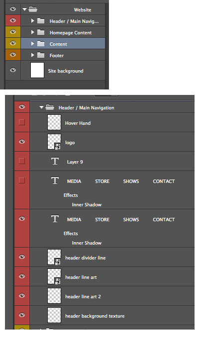
    Reasons for good photoshop etiquette: when you’re on a team, or a big project, keeping organized and having consistent conventions makes everything easier. When you pass off your files to someone else, it’s great for them to be able to dive into it right away without having to ask you questions about where (and what) everything is.

    Organize with Layers

    Naming layers, organizing layers, layers, layers, layers. Chris’ mode of operation is if you can understand it by looking at it in the layers panel, you’re in good shape. Delete what you don’t need. Organize in the way you want to organize a web page. Header, nav, content, footer. Those should be your main folders if you’re designing a website. There are also different things you can do to layer folders that affect all of its contents, masks, and a blending option that is not available for layers themselves: pass through. The neat thing about that is that if you select that, adjustment layers become rays of light and seep through the folder group instead of being blocked by the folder structure. (Metaphor doesn’t work for you? The Pass Through Blending Mode | Photoshop Layer Sets | Peachpit.)

    Be Smart

    I didn’t know this: you can make smart objects out of layers you have in photoshop. That means that they are all linked to each other, so one change changes them all. This is great for things like buttons, things that need to be uniform across the site.

    Scalable Vector Graphics

    Chris says “scalable vector graphics” and the class goes dead silent. An awe blankets the crowd. Chris continues demonstrating an .svg button in the browser vs. a .png. With resizing the image in the browser, the .png reveals it’s pixels, but the gradients on the illustrator button says smooth. So smooth. The class applauds. The neatest trick we’ve seen all week. Use adobe Illustrator to make buttons. Save as .svg (Scalable Vector Graphics – Wikipedia, the free encyclopedia.).

    That’s one thing about web design. You have to keep on top of knowing what the features of updated software can do for you. Chris is going to talk about how we’re going to use InDesign next week for the extra oomph. We can use Adobe digital publishing to create html! So excited.

    sharing options:

    • Share
    • Share on Tumblr (Opens in new window) Tumblr
    • Print (Opens in new window) Print
    • Share on LinkedIn (Opens in new window) LinkedIn
    • Share on X (Opens in new window) X
    • Share on Reddit (Opens in new window) Reddit
    • Share on Pinterest (Opens in new window) Pinterest
    • Share on Facebook (Opens in new window) Facebook
    • Email a link to a friend (Opens in new window) Email
    Like Loading…
  • Personal Identity: First Round of Thumbnails

    April 3, 2013

    thumbnailskc


    On monday, Tom covered how important it is to design your identity as a designer. I was in a brainstorming group where they gave me some input on what my brand should say about me. It’s helpful thinking about the things that make me unique as a designer even though a lot of these qualities make me really anxious. I try to explore and experiment with design but at the cost of making some solidly good pieces. I want to create an identity that expresses my curiosity of how things work as well as my confidence of taking everything through a process. I thought of a concept “method to the madness.” That’s what I feel. I take everything one step at a time and explore the possibilities.

    Tom said that everyone’s thumbnails on the first day of sketching it out won’t be all that good and it’s something that comes with being thoughtful and strategic. Sometimes, a designer doesn’t have to have a hokey monogram for an identity; nicely set type is enough.


    sharing options:

    • Share
    • Share on Tumblr (Opens in new window) Tumblr
    • Print (Opens in new window) Print
    • Share on LinkedIn (Opens in new window) LinkedIn
    • Share on X (Opens in new window) X
    • Share on Reddit (Opens in new window) Reddit
    • Share on Pinterest (Opens in new window) Pinterest
    • Share on Facebook (Opens in new window) Facebook
    • Email a link to a friend (Opens in new window) Email
    Like Loading…
  • Ginny: an App in 2 hours

    April 3, 2013
    Ginny App from Katarina Countiss
    Screen Shot 2013-04-03 at 4.03.12 PMToday, in groups of four, the class tackled the idea of a breathalyzer app. We had about 2 hours from hearing the assignment to presenting it. If you could use your phone as a breathalyzer to measure blood alcohol content, what is the app for that?
    With my team of Scott, Joyce, Nathan and myself, we introduce Ginny. It’s a friendly and simple interface that assists the user in checking their breath and go home via walking or cab. This is an app that uses (would use) geolocation tagging mixed with a social component in a way that it’s a breathalyzer app that broadcasts to your friends where you’re getting drunk.
    Watching the other presenters was really helpful. If I were to do this project over, I would include more progress bars. One of the projects had really clear wireframes, but no skins. Especially with fast projects like this, it’s a smart strategy to spend time on making wireframes that communicate something thoughtful and user-centered than a shiny brand with a smiley mascot.
    I really liked the Drunk app that was presented. It’s most impressive component being the voice of Samuel Jackson chiding you for your drunkenness. An app benefits from being shareable and who wouldn’t want to share that with their friends? It was said in class that the most difficult part about apps is finding the right market and really satisfying the needs of your audience. This app could have been the novel “party” app where you show your friends how drunk you are or the “safety” app where avoiding a DUI (driving under the influence) is the goal.

    sharing options:

    • Share
    • Share on Tumblr (Opens in new window) Tumblr
    • Print (Opens in new window) Print
    • Share on LinkedIn (Opens in new window) LinkedIn
    • Share on X (Opens in new window) X
    • Share on Reddit (Opens in new window) Reddit
    • Share on Pinterest (Opens in new window) Pinterest
    • Share on Facebook (Opens in new window) Facebook
    • Email a link to a friend (Opens in new window) Email
    Like Loading…
  • Drawing Club Meeting

    April 3, 2013
    Alphabet from Katarina Countiss
    Screen Shot 2013-04-03 at 3.52.44 PM
    An alphabet* book from the attendees of drawing club.
    *incomplete. Missing some letters.

    sharing options:

    • Share
    • Share on Tumblr (Opens in new window) Tumblr
    • Print (Opens in new window) Print
    • Share on LinkedIn (Opens in new window) LinkedIn
    • Share on X (Opens in new window) X
    • Share on Reddit (Opens in new window) Reddit
    • Share on Pinterest (Opens in new window) Pinterest
    • Share on Facebook (Opens in new window) Facebook
    • Email a link to a friend (Opens in new window) Email
    Like Loading…
  • Object Poster 40

    April 3, 2013

    pp56

    This is a part of the Object Poster Series.

    sharing options:

    • Share
    • Share on Tumblr (Opens in new window) Tumblr
    • Print (Opens in new window) Print
    • Share on LinkedIn (Opens in new window) LinkedIn
    • Share on X (Opens in new window) X
    • Share on Reddit (Opens in new window) Reddit
    • Share on Pinterest (Opens in new window) Pinterest
    • Share on Facebook (Opens in new window) Facebook
    • Email a link to a friend (Opens in new window) Email
    Like Loading…
  • Object Poster 39

    April 2, 2013

    p6

    This is a part of the Object Poster Series.

    sharing options:

    • Share
    • Share on Tumblr (Opens in new window) Tumblr
    • Print (Opens in new window) Print
    • Share on LinkedIn (Opens in new window) LinkedIn
    • Share on X (Opens in new window) X
    • Share on Reddit (Opens in new window) Reddit
    • Share on Pinterest (Opens in new window) Pinterest
    • Share on Facebook (Opens in new window) Facebook
    • Email a link to a friend (Opens in new window) Email
    Like Loading…
  • Brighton School: Web Design Phase 1

    April 2, 2013

    Assignment:

    screenshot from the teacher's website
    screenshot from the teacher’s website

    Today was the first day of website design and production class. I don’t know if there’s an official class name and to confuse it a little, it’s a split class where both sections take turns with the teachers and so this session is split with Marc for his business class. I’m opting for option 1 track 2 and build a responsive website with working homepage and designs (and mock-ups in photoshop) for 2 sub-pages for my branding project from last quarter, Brighton School.

    Current solution for Brighton School's Website
    Current solution for Brighton School’s Website

    Phase 1 of Web Design

    1. structure information with user-centered considerations (Site Map) *Research the competitors (Links) and content (html)

    Brighton School | Private Preschool Through 8th Grade. I have started my Wordpress build. I’m going to continue to gather content. I’m using wordpress because this site is going to need up to date posts for community events and mentions in the press, etc. WordPress offers an easy to use interface that the client can use to update and add new information.

    site map v.1
    site map v.1

    Holy Rosary School | Homepage.
    Bright Water School | A Waldorf School in Seattle, WA.
    The Bush School, a K-12 independent, coeducational day school in Seattle, Washington.
    Lakeside School – an independent school in Seattle, WA. (I like this one especially)
    Westside School | Westside School.

    2. communicate style and function Branding (style Tile) Version 1, very basic. Typography not fully solved, though I really like this Noto Sans.

    sty-ti

    3.wire-framing explore more efficient layouts (Don’t forget Advertisements if necessary!)

    See Brighton School: Wireframes | Katablog.

    4. understand mobile strategy and other media requirements Client wants 3 layouts– mobile, tablet (landscape), and desktop. I think that teachers’ tool is the tablet. Great for on the go teaching, taking attendance, I think it would be a nice thing for the teachers to look at the website on their tablets and have a great experience.

    3 layouts responsive

    5. Users: audience, demographic. Who is this for? How should that influence the website? I realized that I wanted the website to appeal to the students at the school as well as the teacher. A school. It’s an organization for kids after all. So I’m looking at media that relates to that demographic and taking visual cues.

    PBS KIDS: Educational Games, Videos and Activities For Kids!.

    Links:

    siteInspire – Web Design Inspiration.
    GuideGuide.

    sharing options:

    • Share
    • Share on Tumblr (Opens in new window) Tumblr
    • Print (Opens in new window) Print
    • Share on LinkedIn (Opens in new window) LinkedIn
    • Share on X (Opens in new window) X
    • Share on Reddit (Opens in new window) Reddit
    • Share on Pinterest (Opens in new window) Pinterest
    • Share on Facebook (Opens in new window) Facebook
    • Email a link to a friend (Opens in new window) Email
    Like Loading…
  • Object Poster 38

    April 1, 2013

    pp43

    This is a part of the Object Poster Series.

    sharing options:

    • Share
    • Share on Tumblr (Opens in new window) Tumblr
    • Print (Opens in new window) Print
    • Share on LinkedIn (Opens in new window) LinkedIn
    • Share on X (Opens in new window) X
    • Share on Reddit (Opens in new window) Reddit
    • Share on Pinterest (Opens in new window) Pinterest
    • Share on Facebook (Opens in new window) Facebook
    • Email a link to a friend (Opens in new window) Email
    Like Loading…
Previous Page Next Page

Blog at WordPress.com.


Loading Comments...
 

    • Subscribe Subscribed
      • Kismet Arts Tangent
      • Join 104 other subscribers
      • Already have a WordPress.com account? Log in now.
      • Kismet Arts Tangent
      • Subscribe Subscribed
      • Sign up
      • Log in
      • Report this content
      • View site in Reader
      • Manage subscriptions
      • Collapse this bar
    %d