
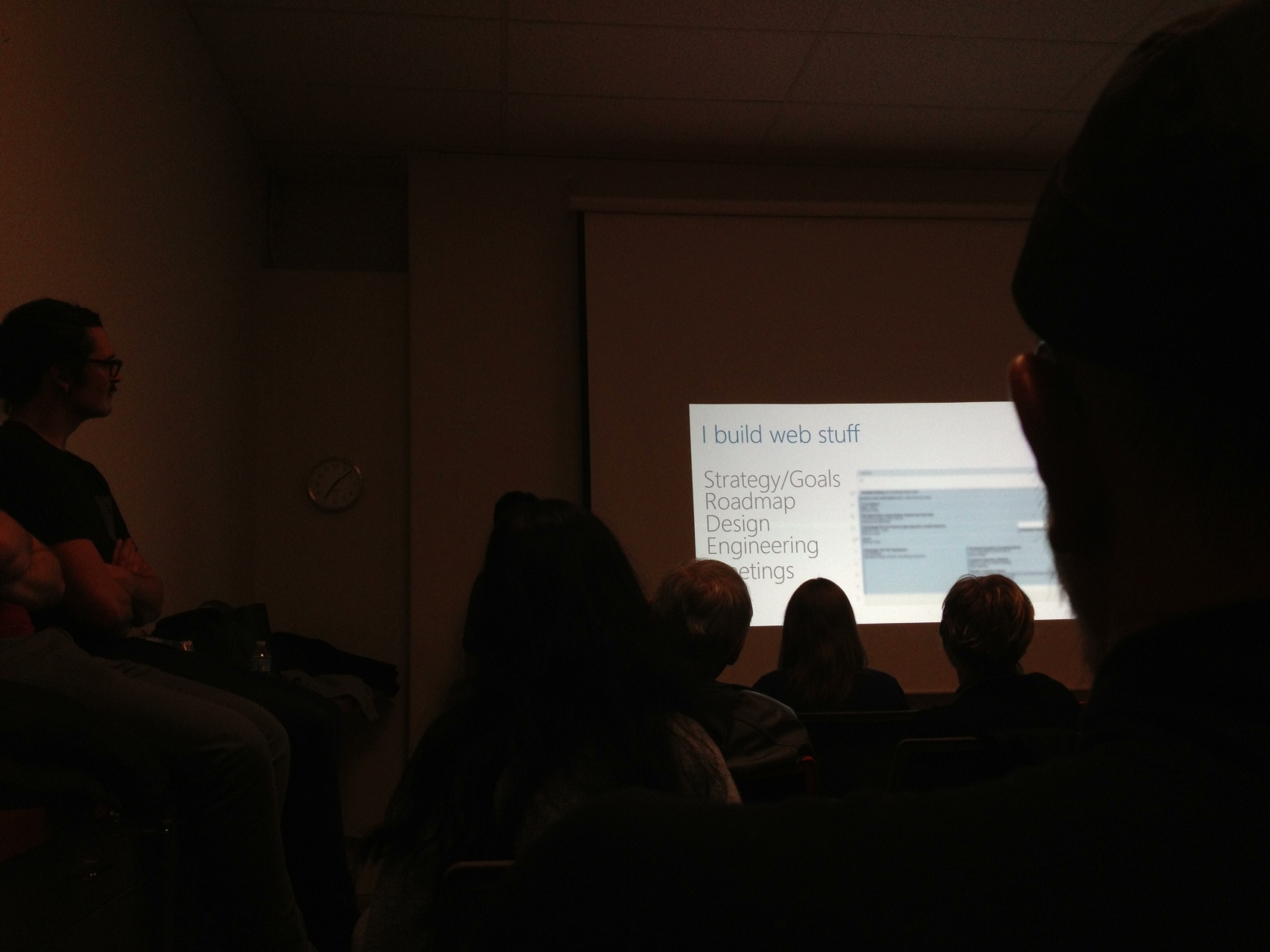
Last night, I went to Aquent where Puget Sound SIGCHI (Special Interest Group | Computer Human Interaction) hosted the talk given by Benson Chan about “How to Plan for the Shift to Responsive Web Design.” The room was filled to the max, people standing for the whole presentation which was a an hour and some change. I heard about the event from my web design teacher, Erik Fadiman. I was a bit unfamiliar with the kind of event that has no registration or entry fee. It was great, arriving at Aquent in Fremont and seeing a bunch of industry people chatting with each other. I saw some SCCA grads, among them, Paul Nissen. At the start of the meeting, they had some people talk about job openings they have at their company and encouraged people interested to come see them after the meeting. After the meeting was a great little networking opportunity. I met a recruiter for the first time. Paul owes some of his livelihood to a wonderful woman named Ann Garber. She told me that recruiters use LinkedIn and Twitter to share and network. Paul introduced me to her in a way that was very flattering. If you ever attend an event with Paul Nissen, make sure you get him to introduce you to someone because he’s a great wing man. I also met someone from
Artefact who told me that they are going to post for internship for designers who can code in the next few weeks. Ooooh, opportunities.
The Presentation
Benson Chan addressed a lot of industry practices and the solutions and lessons learned at Microsoft. The evolution of devices creates new challenges for designers and developers. Benson Chan elaborated on four of these points: pixel density, connection speed, screen size and context. Context: When are you using what devices for how long and to what goals?
Solutions/ Tips from his presentation
Responsive Everything
Catering to phones, tablets, desktops and everything in between involves more than a fluid grid framework.
Responsive content: Using adaptive content hierarchy means having considerations as to which information is more important depending on the device (device= context, adaptive hierarchy= strategy). Some content management systems have rules you can modify to give different content to different viewers based on their viewport, whether it is an Android or iOS.
Responsive text: readability. Set a base font size.Use “em” to scale vs. px or pt. Consider culture-related adjustments. Japanese culture doesn’t like broken headlines. It is imperative to make changes for your Japan site.
Responsive Images: Use the same picture for different devices but produce 4 sizes (or what your resources allow). Keep in mind when photographing or creating the picture to leave extra room so when it is cropped to various dimensions, the important part stays in tact. Other considerations for images should also be made (
Usability Mistakes to Avoid When Using Photos in Your Website). As an example, Chan had one picture produced to 4 sizes in the following dimensions (pixels): 1600×540, 1024×346, 600×203 and 430×162.
Your Team
Benson Chan says “train up your team.” The next step in designer/dev evolution to combat the new way we must design for something like fluid grid or multiple breakpoints is the hybrid: designers who can prototype (html, css and javascript– front-end) and engineers who care about design. Chan also advises to start small. When working with a new team, a simple project to start is helpful. To go through design and dev cycle, people get an understanding of the new communication tactics and tracking systems that may be unfamiliar to them.
Agile
The goal is to go from sketch to code fast using good code that you already have lying around for quick prototyping. The goal is iterating a lot to test and solve the breakdown of designs before you get too involved. Agile development environments encourage the pairing, working together, side by side of designers and developers so they can better understand the constraints of the project like limits of image size because of loading time for smartphones.
Shift to RWD
When approaching management about Responsive Web Design, ask “How important is mobile for business?” and “What is the cost to support multiple platforms?” Chan emphasized the importance of device targeting, depending on common scenarios and devices. In an efficient work environment, the greatest attention should be devoted to optimizing the experience for the device that your audience uses the most to access your site. When answering “How did you deal with IE8 [when working on a new campaign for Microsoft]?” Chan answered, “It’s responsive to a certain point… not completely broken.” So, when some people say, “Mobile First” it’s a nice thought, but it is important to spend time where your users are today.
The Future
More devices, more scenarios, smart cars, smart refrigerators, etc. Be ready to innovate, Chan commands. Apps are a way to control experiences. They create an environment for customers to achieve complex tasks like data processing and we won’t be able to make apps for device. So, for now, Responsive Web Design, good ol’ html, is the way to go.
Links:
Benson Chan recommends
DeviceAnywhere for “on-device” testing for devices that are not your core users’ devices.


 Kismet Arts Tangent